This week, I’ve got a couple things planned. First up, I’ll be talking about how to add an extra layer of complexity and utility to your 3D cards. At the end, I’ll introduce a contest where you can use your deck-building skills to win a 3D card of your own.
Let’s go!
The three most common things people want made 3D are Commanders, creature tokens, and their favorite cards. I’ve done plenty of Commanders, and I plan on making some more creature tokens in a future article. They’re both perfect for 3D because they don’t get shuffled into your deck, so the extra thickness isn’t a problem.
When someone’s favorite card is Relentless Rats, however, a 3D card has less utility.

For some people, that doesn’t matter—they like the card, and they’re happy to have a sweet 3D version to add to their collection.

If you turn a 3D card into a life counter, however, it doesn’t have to sit on the sidelines. There are a couple of ways to do this. One method involves putting a spindown disc inside the card, with a window somewhere on the card to set your life total. Lindsay Burley did that when she made this 3D Forest:

I’ve never made that type of counter; the only type I’ve made have been abacus counters, like these:

That’s the type of counter I’ll be showing you how to make today, and I’ll be cutting up someone’s favorite card to do it.
People choose their favorite card for all sorts of reasons. When I received a request for a 3D Kris Mage from someone named Kris, my first thought was “Kris Mage? That’s a weird favorite card.” I felt really stupid when I finally figured it out . . . a couple of days later.
Kris sent me both foil and nonfoil copies of the card to cut up. Since it’s an old-bordered card, the art isn’t very shiny, so I stuck with the nonfoil copies for most of the 3D process.
Cutting the Art
Since it was going be a life counter, the text of the Kris Mage didn’t matter at all. I decided to swap it out for something more simple: the ![]() from a Mountain. Since the text box was replaced, I needed a card behind the back Kris Mage to hold things together:
from a Mountain. Since the text box was replaced, I needed a card behind the back Kris Mage to hold things together:
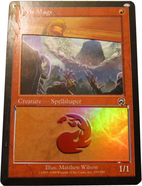
I decided to use a foil Mountain because I planned on using one of the foil Kris Mages for the top border. Also, I removed a large section of the background art to use for further-forward details since it wouldn’t be visible in that layer.
Next, I cut the main part of the wall:
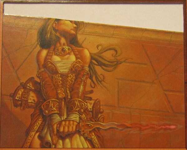
For the molding on top of the wall, I started by cutting this piece:
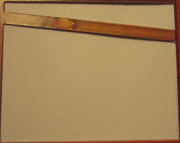
To give it more shape, I cut it away from the borders of the card almost entirely. This allowed me to bend the top edge forward and the bottom edge back. Shaving away the back of the card along the bottom edge also made it more flush against the wall layer, smoothing that transition.
With so many layers, buckles, and straps, I didn’t know exactly what parts of the mage I wanted to detail. My process for figuring out what details to do started like this:
- I knew I wanted to detail the kris and the energy bolt.
- Since the handle of the kris goes under one hand and over another, the two arms would have to be detailed separately.
- The arms needed to smoothly transition from over the front of the mage’s dress to under the straps
Addressing #3 was the most challenging, and after some experimentation, led to this layer:
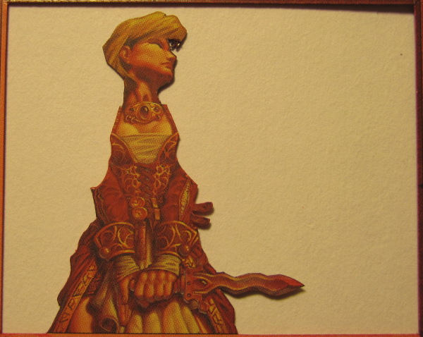
As you can see, the shoulders here have been removed up to the midpoint of the strap line. This means that the seam separating the shoulders from the rest of the body can be hidden by an uncut strap in a further-forward layer, like this one:
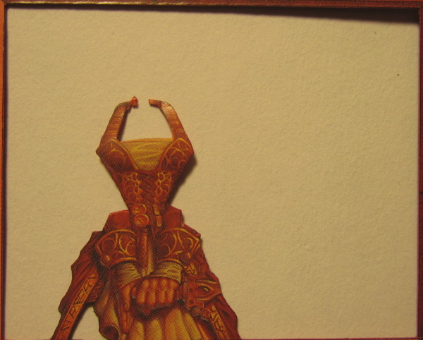
The straps are also extended so that there are tabs to be tucked behind the mage’s neck. More of each arm is removed in this layer, because this is where the arm pieces will cross from behind the dress to in front of it. The visible leg is cut out to leave it lined up with the rest of the body instead of with the dress.
The final layer of the mage is the furthest back, which includes most of her hair and one of her scrolls:
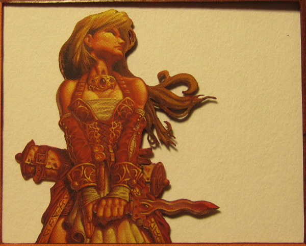
After finishing all of my primary layers, I moved on to cutting the detail pieces:
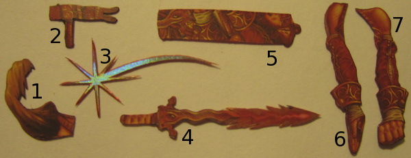
- The piece of the mage’s hair that’s in front of her forehead and neck also falls back behind her shoulder, so this piece has a tab to tuck behind that shoulder as well.
- The last part of the mage’s clothes I chose to detail is her belt. Since this piece was going to be in the middle of a very tight area (where the arms and dress overlap), it needed to take up little room, so I shaved off a lot of the back.
- Early on I decided to raise the old premium symbol. The points of the star are painfully tiny. I knew I wouldn’t be able to cut away all of the red perfectly without damaging the star so I embraced the red, leaving a very thin outline around the whole star and coloring the edges with a red pen.
- Cutting the kris and energy bolt piece was fairly straightforward.
- I shaped both of the mage’s scrolls by pressing them against the handle of a paintbrush, giving them a slight curve.
- On both of the arm pieces, you can see that the tops include half of the strap, to line up with the other half on the first mage layer. On this piece, the back of the palm is shaved away to reduce the amount of cardboard trying to squeeze into a small space.
- Both arms are also rounded similar to how the scrolls were rounded. This piece also has shaping in the wrist and hand to make it wrap around the handle of the kris better.
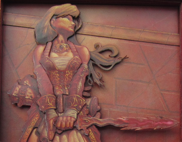
After I assembled the three primary mage layers and attached two of the detail pieces (the hair and the belt), the mage looked like this:
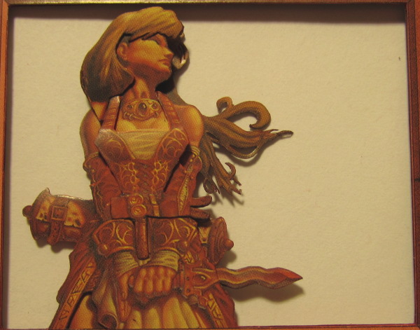
Getting the arms and kris into place was more difficult than I expected, but eventually the mage was finished. This off-angle shot shows how all of the overlapping came together:
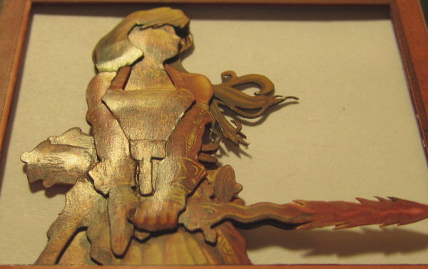
That shot also highlighted a couple spots where I left glue smears, so I went back and cleaned it up using a damp cotton swab before moving on to the life counter.
Making the Abacus
When making a 3D card abacus, one of the first things you need to do is figure out how thick your finished card needs to be. This will vary depending on the size of your needle and beads. For this card, the beads I used are not especially thick, but they still required me to add a lot more layers than I typically use.

The needles I used on this card are 3″ Dritz sewing needles, labeled “Sculpture Doll Needles,” at the craft store. They’re not very expensive—a package of six is $2—and they are very sturdy.
I determined that the bottom of the needle needed to be eight layers above the text box to keep the beads from touching the ![]() . The needles were about 2.5 cards thick, so I needed to cut grooves in three cards to fit the needle. The needles were also longer than necessary, so I used wire cutters to trim them down to the appropriate length.
. The needles were about 2.5 cards thick, so I needed to cut grooves in three cards to fit the needle. The needles were also longer than necessary, so I used wire cutters to trim them down to the appropriate length.
I intended to figure out what layers would get these grooves and cut them before gluing them together, but I forgot to cut the grooves until I had already glued a couple layers.
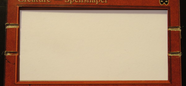
I measured the placement of the grooves so that the bars would be straight, and put them further up the text box than I might on a modern-border card because I wanted to keep the premium star clear of the beads as well.
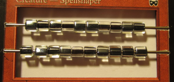
After dabbing a bit of glue on the ends of the bars to keep them firmly in place, the abacus is finished. Wasn’t that easy?
Finishing Up
For the top layer, I use one of the foil copies Kris sent me. Old-border Red cards are designed to look like the border slants down toward the art and text box. I decide to make that slant real. Doing so requires the spacer behind the top layer to be smaller than a normal spacer. Bending the edges cleanly is tricky, but I end up with this:
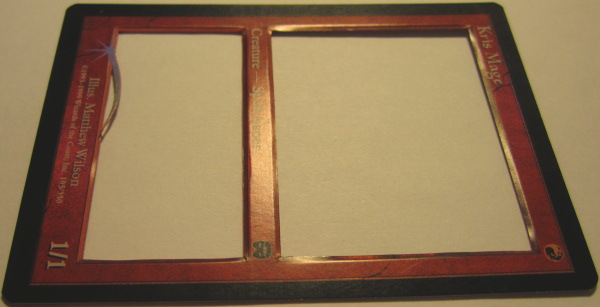
I glue another black border on top of that and add the premium star, then put everything together.
The finished stack looks like this:
| Bottom layer: | Random common (for support) |
| Layer 2: | Kris Mage with Mountain text box |
| Layer 3: | Spacer 1 |
| Layer 4: | Kris Mage – wall |
| Layer 5: | Kris Mage – molding |
| Layer 6: | Spacer 3 |
| Layer 7: | Spacer 4 |
| Layer 8: | Spacer 5 |
| Layer 9: | Spacer 6 |
| Layer 10: | Spacer 7 (with the back scroll) – and the needle |
| Layer 11: | Kris Mage – hair and scroll – and the needle |
| Layer 12: | Kris Mage – body – and the needle |
| Layer 13: | Kris Mage – clothing |
| Layer 14: | Spacer 8 (with the mage’s arms) |
| Layer 15: | Spacer 9 (with the mage’s arms and kris) |
| Layer 16: | Spacer 10 (with the mage’s hand) |
| Layer 17: | Spacer 11 |
| Layer 18: | Kris Mage – foil border |
| Layer 19: | Black border and premium star |
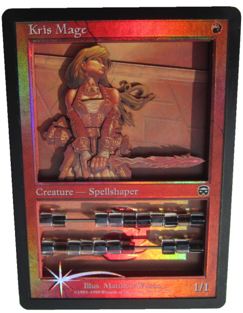
I hope you like it, Kris!
The Contest
Most of the cards I’ve made 3D versions of have been either Commanders or commons, but only a couple have been both. For my next article, I’ll be adding one more to that list, and it’s up to you to decide between the two I’m considering.
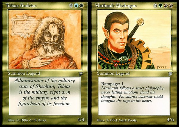
How? By building the best Pauper Commander deck you can.
Either of these two guys would do a fine job leading a stack of ninety-nine common cards. Pick one of them, build a Pauper Commander deck in the appropriate colors, and send me the list. Include with it a bit of insight into some of the card choices and why you think it’s a great Pauper Commander deck.
If you manage to convince me, I’ll include your deck list in my next article, make your chosen Commander 3D, and send it to you!
Because there’s not complete agreement on what can go into a Pauper Commander deck, here’s the rules I’ll be using:
- Only cards that have been printed as a common in paper form are legal. A common printing in a Master’s Edition set is not enough to make a card legal.
- A card is considered to have been printed at common if the Wizards of the Coast Gatherer lists it as a common.
Send all entries to alteredcity at gmail with the subject line “Pauper Commander Deck”.
See you in two weeks!
Drew Sitte
AlteredCity at gmail dot com
@AlteredCity on Twitter


