There are two basic approaches that can be used to make a 3D card. The first approach is the one that I have used most often. It involves cutting away only those parts of the art that are further back than the current layer, leaving in anything that will be covered up by a further-forward layer. This is the method that I used for the Craw Wurm I made in my first article.
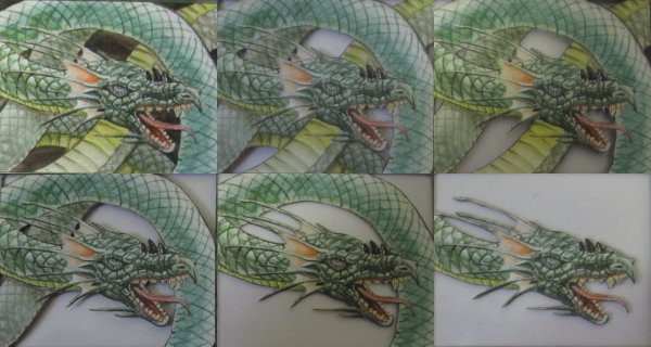
The second approach involves cutting away everything (or almost everything) in a layer if that part of the art will not be visible when viewed straight-on. Anything that will be covered up by a further-forward layer is removed. I used this approach (for the most part) on the Gitaxian Probe that I made two weeks ago.
Each approach has advantages and disadvantages. The second approach has a lot of advantages:
- You don’t have to recut tricky sections over and over again.
- You can potentially use fewer cards since you’ll have larger scraps from which to steal details.
- You avoid the stacked-layers look, which can be distracting depending on the art.
- Some cards simply can’t be made 3D without removing some of these elements.
An example of the last point is this Sygg, River Cutthroat:
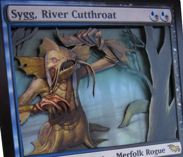
Because the water should smoothly transition from the foreground to the background, it can’t have stacked layers interrupting it. This meant that Sygg had to be one layer plus lots of details.
The primary advantage of the first approach is that it often looks better when viewed in person. Since that is my main goal, it’s the approach I’ve used most often. Having the stacked layers of art actually keeps the eye focused on the furthest-forward layer. When only the furthest-forward layer exists, the art is more visible in the far background, and this can be distracting depending on the art. In Sygg, having such a huge gap between the visible tree and the background tree would normally cause the background tree to be very distracting; because the brain expects the area behind the tree to be the same color as the rest of the swamp, the brown of the tree would grab the eye.
On Sygg, I dealt with this issue by painting away both the tree and part of Sygg’s body. I don’t use paints very often because I’m not very good with color-matching, but for hiding backgrounds, you don’t need to be perfect; anything close is enough to get rid of the attention-grabbing effect of the background.
Another way to eliminate this problem is to completely swap out the background. By replacing the background with something like a basic land or a blanked foil, you can eliminate the distraction factor while keeping most of the advantages of the second approach. Typically, I shy away from doing this because the removed background always matches the color scheme of the card better than a replacement background, but other 3D alterers swear by it.
Gurufication
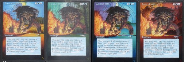
Last week, artist and GatheringMagic.com writer Eric Klug commented on a specific background-replacement trend in painted alterations: Gurufication. People have been painting the art from Terese Nielsen’s Guru lands into the backgrounds of other cards. Sandreline was one of the first, and has put a few sets of Force of Will through the gurufication process:
Recently, someone contacted me for a fairly ambitious project, the first stage of which is the Gurufication of the five Praetors of New Phyrexia. Of course, since I make 3D alterations instead of painted alterations, I’ll be replacing the backgrounds of the Praetors with actual Guru lands.
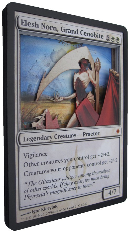
The first Praetor I’m working on is Elesh Norn, Grand Cenobite, with a Guru Plains in the background. Once again, I take a look at a higher-resolution image to get a better sense of the art—in this case, one of the New Phyrexia wallpapers.
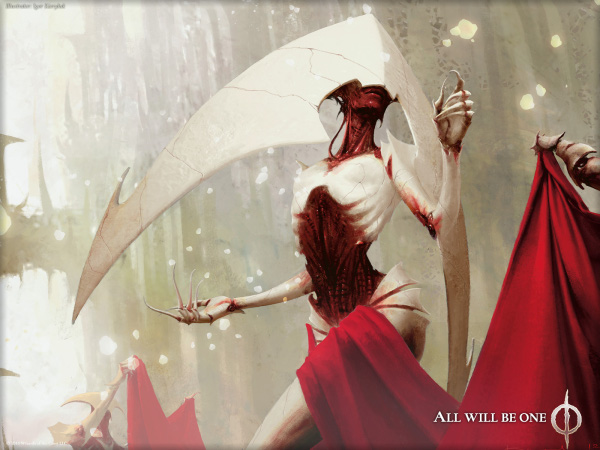
In Elesh Norn’s art, there are a bunch of floating energy bubbles floating around her that have nothing behind them except the far background of Norn’s Annex. Sometimes it’s possible to make similar art elements float, but in this case they’re too small and there is too much space between the anchor layer and the layer in which they should be floating. The great thing about 3D alteration is that often, you can cut out certain parts of the art entirely and it’s not noticable unless it’s pointed out to you.
On to the cutting! I start this one off by cutting out Elesh Norn’s attendants, since the Grand Cenobite herself will be the most complicated part:
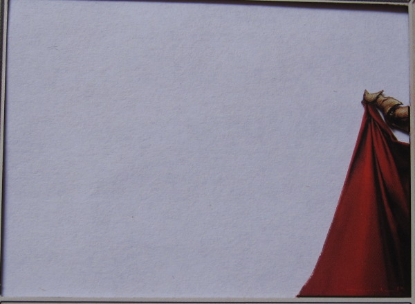
I know that I’m going to want some detail on the attendant in the background, but I leave him flat for now.
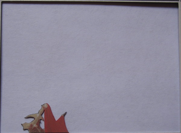
Elesh Norn’s headpiece will need to be detailed to separate it from her raised arm, so when I cut her primary layer, I leave off most of the headpiece. Her other arm should be set back, so it’s removed from this layer as well:
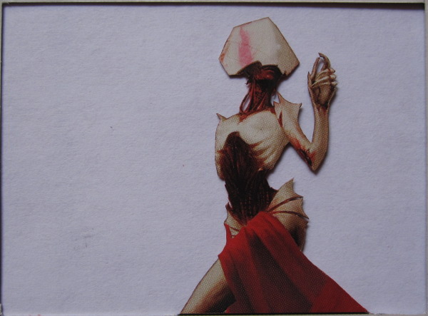
Something I didn’t notice before looking at the Elesh Norn wallpaper is that her hip-slits do not have flesh under their entire length. After realizing that, I remove that cardboard. It’s something that wouldn’t be noticed if it were left undone, but is a nice touch regardless.
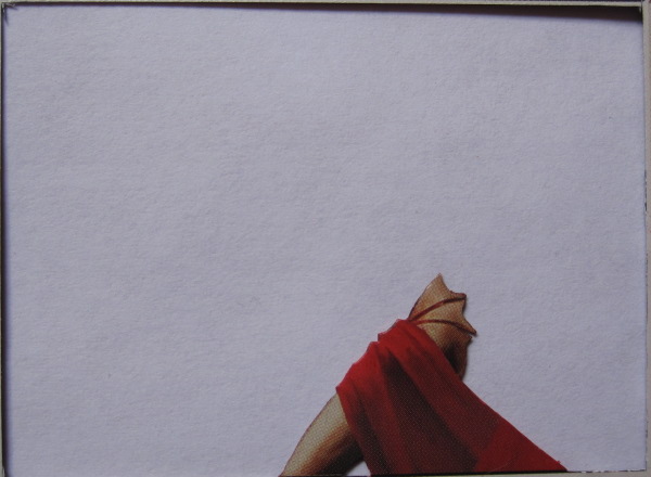
I decide to have the fabric be a bent layer that goes from just below the foreground attendant down to her leg, adding to the illusion that it’s connected to the fabric that attendant is holding.
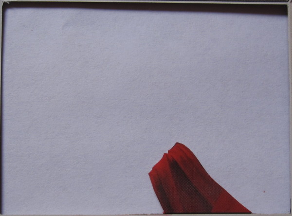
With the layers cut, I move on to the detail pieces:
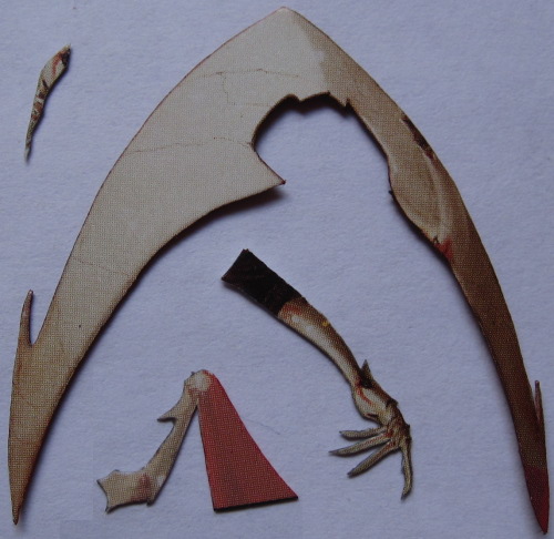
In this picture, you can see her headpiece, her attendant’s arm, and part of the fabric he holds, and her arm. Her arm piece is longer than her arm in order to be able to glue it to her back. I also remove her thumb and make the thumb a separate piece to make the hand seem less flat. Assembled, Elesh Norn’s body looks like this:
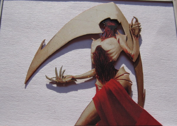
As I’ve mentioned in the past, I color the edges of the cut pieces so that the white inside the card doesn’t show. I also color the inner border of cards to match the color of the card, as seen on Teferi.

For two-color cards with the new border, I usually do a mix. On Jhoira, one side is blue, the other side is red, and there’s a bit of purple in the middle where they blend.

White is a tricky one. Sometimes I just make the inner border black. On Teysa, I didn’t do my normal blend, because the art is so dark that having part of the inner border be white or gray would have been very distracting. Leaving the inner border untouched is a bad idea because it’s more of a dirty off-white:

Because of this, when I want to do a white border, I pull out the acrylic paint marker that I bought just for this purpose and paint the inner border of each card.
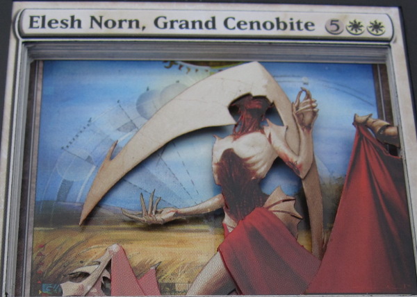
With everything else in place, I move on to the final step: Gurufication! Each of the Praetors in this set will have the corresponding Guru land in their background, which means that Elesh Norn gets this Plains:
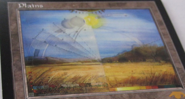
Mixing old cards with modern cards is not a straightforward task. The art frame on old cards is narrower than modern art frames, so part of the border will show. This can look pretty cool—almost like pillars framing the art—but is something to be aware of. The height of the art is the same, but the art frame is positioned higher on old cards, so the art will need to be cut out and shifted down to line up with the modern frame of Elesh Norn.
I lower the text box and raise the info boxes, resulting in this finished stack:
| Bottom layer: | Random common |
| Layer 2: | Guru Plains |
| Layer 3: | Spacer 1 |
| Layer 4: | Spacer 2 |
| Layer 5: | Rear Attendant |
| Layer 6: | Spacer 3 |
| Layer 7: | Spacer 4 |
| Layer 8: | Elesh Norn |
| Layer 9: | Elesh Norn’s leg |
| Layer 10: | Spacer 5 |
| Layer 11: | Spacer 6 |
| Layer 12: | Fabric, bent forward to drape over Layer 9 leg |
| Layer 13: | Forward attendant |
| Layer 14: | Elesh Norn border with text box removed |
| Layer 15: | Info boxes and black border raised |
In two weeks, I’ll be back with another 3D Legendary creature, this time chosen by you! As I mentioned last time, you’re choosing from a list of Commanders that some people think are overpowered. Which one should it be?
[poll id="59]
Drew Sitte
AlteredCity at gmail dot com
@AlteredCity on Twitter


