Early in my stint here, I wrote about flavor vs. function and how the two combine to form compelling game design. “Flavor pulls us in by connecting to our interests,” I argued—by translating mechanics into narratives we enjoy. We don’t need flavor for a game to be fun (I referenced Go, which is pure mechanics), but it helps the game resonate—gives it meaning via cultural context.
The best game design—or at least the kind that really burns my witch—presents flavor and function on completely equal footing. Story should be a perfect repercussion of what’s happening mechanically; flavor’s explanation should jump right out of the function. At the same time, gameplay should manifest the narrative in the language of mechanics; function should execute what the flavor describes.
This is hard to do, and it often isn’t a priority—after all, we’re talking about games, not novels—but designers who pull it off accomplish storytelling and competitive structure with a single set of gestures. This interdependence sharpens our experience of play, collapsing different modes of thinking into one. Comprehension happens quickly because the game’s components inform each other. The game sticks in our memory for being so cohesive.

Blood Scrivener by Peter Mohrbacher
Magic is a game of varied, iterative design from a lineage of teams. As such, its library of cards conveys a pile of design philosophies, each with its own values. I’d like to highlight here my favorite fifteen cards that achieve my favorite style: perfect conversation between flavor and mechanics. They’re from all over Magic’s history, chosen for how well they tell a story and how fun that story is.
A few runners-up:
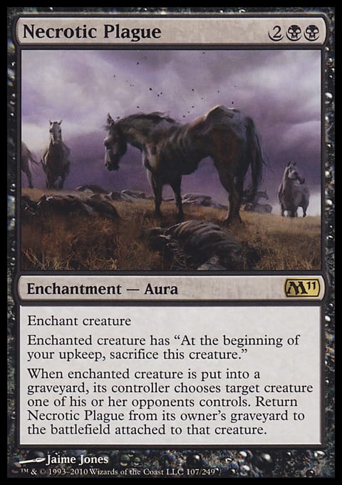
15 – Necrotic Plague
Like any real plague, this Aura transmits and lingers until either someone cleanses it or nothing remains to infect. It starts at the most able host (your opponent’s best creature) and then returns to its origin, claiming your best creature next. Around and around it goes, descending by strength for balanced, dispassionate loss. Hexproof appropriately dodges.
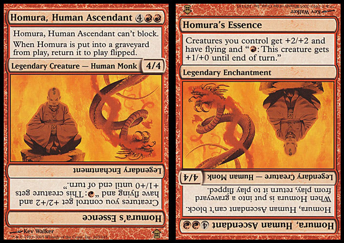
14 – Homura, Human Ascendant / Homura’s Essence
I prefer the double-sided cards to flip cards (more on that later with transform), but the concept of physically reorienting cards to signify a change is exactly the type of narrative–mechanical interplay I had in mind. I suppose the concept began with tapping, which modifies condition, but flip cards change identity; they gain new names, and even new card types, when they meet the right conditions. Homura goes from a monk too angry to block to a furious energy field that enrages your whole team. I could have chosen Erayo, Soratami Ascendant, but Homura’s art has more character and clearer symbolism between one state and the next.
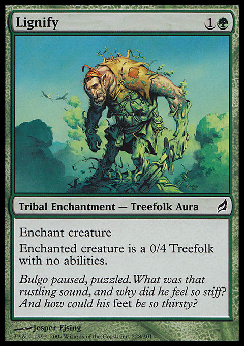
13 – Lignify
Green doesn’t like removing creatures (unless they’re pesky flyers), so what does it do instead? It turns them into a tree, of course. By changing the target’s creature type, Lignify manifests its narrative through a game mechanic. The creature is now a 0/4 Treefolk and nothing else. It gets to sit there, doing whatever trees do (block I guess), and watch the action go by. The flavor text—clever and informed—captures the surprise.
Also see: Guard Duty
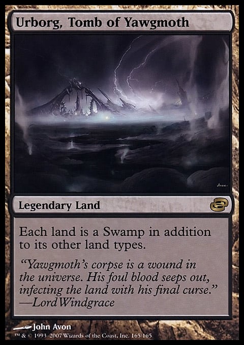
12 – Urborg, Tomb of Yawgmoth
Yawgmoth reads as the most virulent source of disease in all of Magic’s lore. It’s fitting, then, that his tomb—embedded, as it is, in the land—should corrupt all land around it. The legendary status befits the character’s stature, and the flavor text carries that formality with tone. Even the visual distance with which the art recesses the tomb works to amplify the horror.
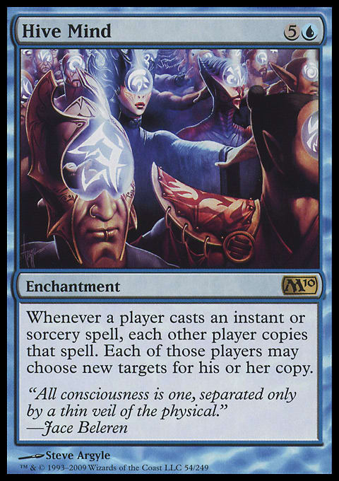
11 – Hive Mind
The term “hive mind,” employed so often on Reddit as self-criticism, refers to peer-enforced homogeneity of thought. It implies a sort of obnoxious claustrophobia, an asinine repetition that can lead to disaster. This card does exactly that. By omitting the word “may,” Hive Mind forces participation. Everybody copies that stupid Warp World (and then scoops to go make food). The art is cluttered with bureaucrats ad nauseam, and the flavor text is a pompous platitude from Jace. Everything contributes to maximum annoyance . . . which makes it a slam dunk.
10 – Demon of Death's Gate
Demons typify the color black, which famously craves “greatness, at any cost.” They offer power, but they make you pay for it with blood. I might have chosen Dark Tutelage to illustrate this principle, but seeing as how a demon is probably the tutor in question, I went right for the source. Demon of Death's Gate is as clean as examples get. He’s big, punishing, and costs a fortune, but he’ll accept a sacrifice of flesh to hit the battlefield early. Also, the flavor text and art are totally metal.
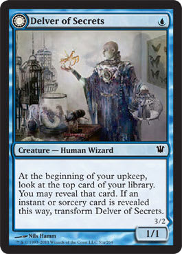
9 – Delver of Secrets / Insectile Aberration
O Innistrad, bastion of gorgeous flavor. This set brought us double-faced cards, which rectified the flip cards’ problems: See, having both sides visible at once undermines the drama of changing from one form to another. There’s no surprise involved, just a lot of data struggling for real estate. With the transform mechanic, cards turn over entirely—a much more theatrical act—and reveal something previously hidden. The “transformation” feels real.
In Delver’s case, we go from curious human scientist to “Insectile Aberration.” This draws on a number of horror tropes: First, the flavor text deploys privileged information (we know what happens to the scientist after his final entry), leaving us to imagine his moment of realization. This is always more personal, more visceral and private, than the garish Hollywood reveal. Second, the visual design changes colors on the back side of the card. Pragmatic reasons aside, the white typesetting achieves a panicked, aggressive urgency by highlighting what transformed. We read the new creature’s name with intensity, flicking down to its new strength. Finally, the whole ordeal is a reference to Kafka’s The Metamorphosis, which is canon in horror and surrealist writing.
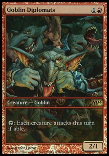
8 – Goblin Diplomats
Wizards branded their own takes on a few fantasy races, but none so distinctly as goblins. The dudes have more character here than perhaps in any other fantasy intellectual property. This card reads like a joke: set-up in the name, punch line in the ability. The idea that this would be how goblins treat with others grows funnier as you take it more seriously (facetious naming earns a chuckle, but firmly establishing this tactic in the lore makes me want to start a goblin summer camp). I find this humor to be much stronger on the Game Day promo (pictured), but the normal version does rock a Monty Python influence (my father smelt of elderberries).
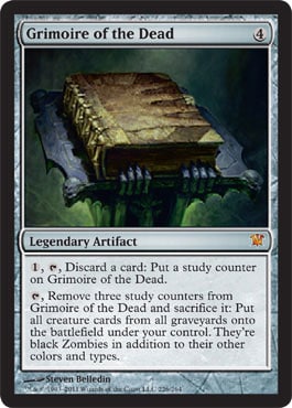
7 – Grimoire of the Dead
This card ain’t too good (slow, vulnerable, costly to progress), but good Avacyn in a box is it a flavor knockout. Interacting with it feels exactly the way black magic should: draining and arduous, but with world-ending promise. “Studying” the book claims pieces of your mind (sanity, I think, in this case, as opposed to the usual cards-as-knowledge metaphor), and the creatures resurrected become zombies, as they should. Continuing Innistrad’s tradition of homages to canon, the card’s art and name are nods to Evil Dead.
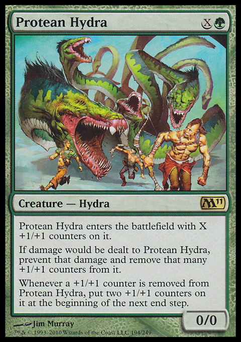
6 – Protean Hydra
In the Greek myth of Hercules, where the first hydra appears, cutting off a head will cause two more to take its place. In Magic, where the Hydra creature type explores variations of that narrative, Protean Hydra is the simplest, most elegant translation. It uses the metaphor of +1/+1 counters as heads (appropriate as distinct units of strength), converts damage into their removal, and regrows the right number after injury. This one-to-one correlation with no superfluous data makes the card’s identity shine.
Worth noting: the early Rock Hydra felt the need to make the counters-as-heads metaphor explicit with parenthesis in the rules text.
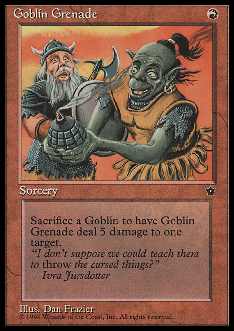
5 – Goblin Grenade
No card exemplifies the goblin tribe like this. Does any card exemplify any tribe like this? I’m a little shaky on it being a sorcery and not some kind of artifact, since nonmagical grenades are physical objects, but the spirit this card captures—as well as its iconic stature—push it up the list. This is what goblins exist to do: die with idiot splendor.
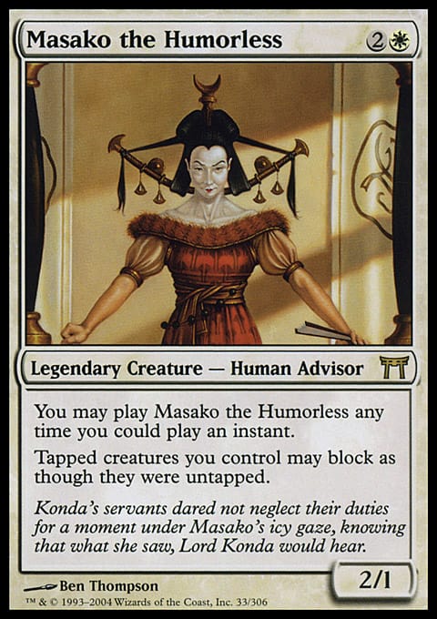
4 – Masako the Humorless
Thought you were sneaking by with that attacker, huh? Thought I was all tapped out? BAM—horrible matron lady shows up in a doorway. Her look reminds me of certain police-women at the Sunday school of my youth, stern and pointy shadows that would fall across our mischief. I know her face too well. As a combat trick, this card catches creatures misbehaving. After that, Serra's Blessing would be a cheaper and less vulnerable alternative, but Masako poses a meaningful distinction to vigilance: Your creatures still bend as they work double-time—servants don’t get to stand. Vigilance in Kamigawa is an honor more suited for the implicated master Konda, Lord of Eiganjo, who seems like zero fun when we analyze his household.
Also see: Village Bell-Ringer
3 – Jinxed Idol
I bought a Japanese foil online before beginning this sentence. I will literally never run it, just hide it in a binder where I hope it doesn’t nibble on my life force. I could kill a cat or something and give it to a friend, but I imagine I’ll keep my horror totem, constantly finding it in different places—my bedroom, the office fridge, empty parking garages at night. If I ever crawl sickly to a draft, expiring on the table, I’m sure you’ll find it waiting on the front page of my trade binder. Take it—it’s yours.
(Reminds me of The Monkey’s Paw.)
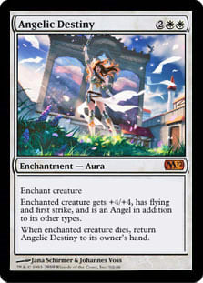
2 – Angelic Destiny
Notice how the wings remain in stained glass, not touching the figure. Wind in the clothing, flags, and flower petals suggests angelic imminence, the moment just before grace. This slight dislocation in time lengthens the card’s narrative: We are able to experience a full plot arc of ascension, glorious duty, and (often) descent, starting from a point we might have overlooked. The art could have gone the easy route and shown us the resulting angel, but Magic has plenty of those—this card is about lifting something lesser to that rank. Showing us the worthy in her original form accentuates the mileage of her change.
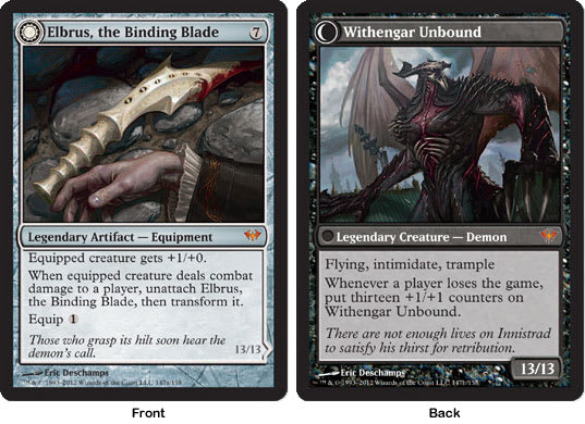
1 – Elbrus, the Binding Blade / Withengar Unbound
This is what perfect design looks like.
A grand demon-in-a-dagger would be hard to obtain, naturally, so the mana cost is high. The demon wants out, however, so the equip cost is low—the blade wants to be used. It doesn’t offer much as far as weapons go, but that’s because its function is containment, not assault. It’s an ornamental prison with a restless occupant.
When Elbrus becomes Withengar, it first abandons (unattaches from) its pawn. Then the actual card changes types, revealing the color identity it had all along. The liberated demon—his power and toughness set with Innistrad’s numerology—is triply persistent at pushing his vengeance through. He swells with player death, a trigger-drama I can only find on Blood Tyrant, which expresses hunger for only the most brutal.
Whoever designed this card established narrative with every mechanical detail, and what a narrative it is.
As always, feel free to discuss in the comments. You can also follow me on Twitter, where I’m like Samuel Beckett at the Teen Choice Awards.


