Happy. Little. Trees.
More than any of the other basics (Plains, Swamp, Mountain, and Island), there is a sense of vitality in a Forest illustration. Being the cradle of so many forms of life, it makes sense that we collectively equate green with health. Even trees from the dead or diseased worlds of Magic are portrayed with a certain vigor. Whether they’re living, dying, or mutating, the forests do it with vicious enthusiasm. It’s only fitting that the artists of Magic bring that same enthusiasm to their work.
Breathing New Life
Looking at a chart of the world’s officially forested land suggests that the majority of us know firsthand what a forest looks like. The other four basics are specific to certain locales, places where players are not guaranteed to have been. It creates an information gap that gives the landscape a sense of novelty, and the audience is that much easier to please as a result. But between the existence of textbook definition forests, green urban spaces, gardens, parks, and the pervasive use of forests for fantasy settings (more on that later), it becomes all but a given that a significant portion of the audience has a personal level of knowledge when it comes to forests.
And that’s a problem when you’re trying to show someone something new.
Magic: The Gathering is a game founded in our reality, given extraordinary new vision and dynamism through the various powers at work in the world. It’s a tricky balance to strike between the familiar and the fantastic. Just as the creators of the world can go too far to the alienating the audience, they can also be weighed-down by an overly-familiar setting. The major problem when painting a forest for Magic is finding the sweet spot, where you push the viewer far enough from the subject matter to make it clear this is a new setting while leaving enough of the source material intact so that it still reads as a forest.
A Special Place
Forests are the point of genesis for so many of our wonderful stories. Creators of all walks of life return to the quiet home of their childhood to find inspiration anew. In the interviews for my Art Heroes series, I found myself hearing similar tales of young artists becoming lost in worlds of imagination among the trees. While I believe there is something special to be found in any natural space, there seems to be a universal love for the woodlands as a haven for creativity. Even among the newer generation of Magic artists, one can see forest paintings occupying a significant part of their personal work. With such a potent combination of familiarity and fantasy, forest artworks come pre-loaded for stellar results.
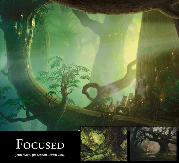
Looking at the artworks of the green basics, I am reminded of the old adage: He couldn’t see the forest for the trees . . .
. . . or, in this case: Tree.
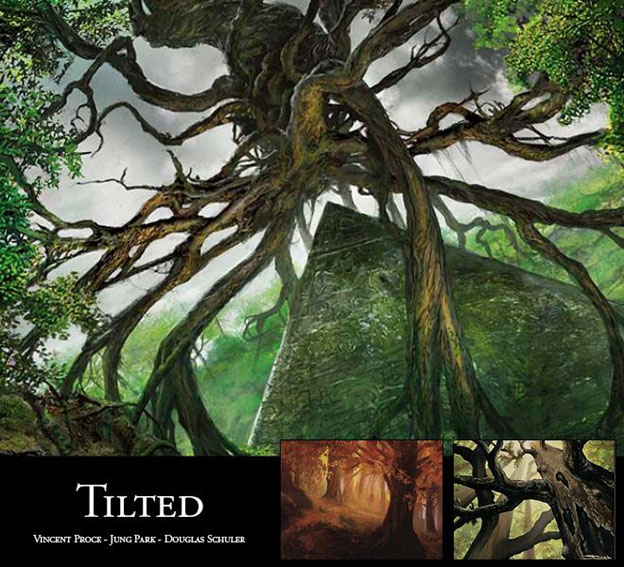
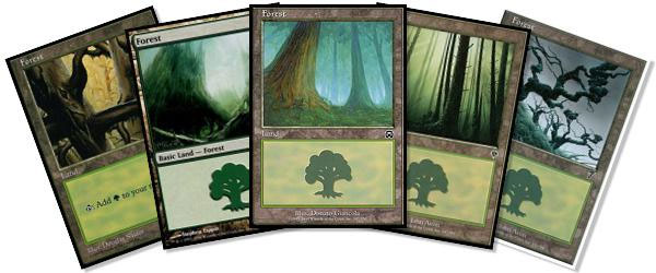
In a suitably brilliant move, many of the MTG artists choose to solve a number of problems with a single, overgrown solution. By placing an ancient tree in the foreground, the painting is immediately simplified, eliminating the painful level of detail work that would otherwise consume hours spent on the background. Forests can be very noisy visually, and the subtle detail of the bark keeps the illustration quiet and serene. The species of the tree, real or imagined, also sets the tone for the piece, giving it a physical and emotional context. The eye is very forgiving to the random nature of a tree’s growth. Compositions in this genre take advantage of conveniently places branches, leaves, and angles to create framing within the scene.
Big trees go great with big critters; these forests are perfect for stompy green decks.
Sets to Look for:
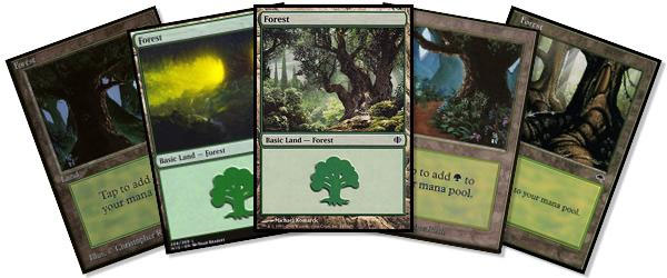
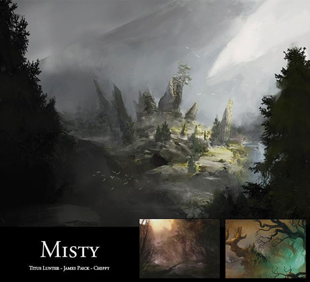
Mood plays an important a part in storytelling; it contributes to the ambience for the events that are about to unfold. In addition to lighting and prop placement, every good stage also comes equipped with a fog machine.
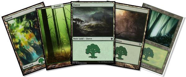
In a setting where a canopy so often obscures the sky, rolling fog banks serve as a workaround to bring clouds into the composition. Mist softens otherwise distracting and unnecessary details, giving tremendous depth to the image. Because we’re in a fantasy setting, it also serves as an easy way to bring new and unexpected color into the composition. Used judiciously, it gives the viewer the information needed to guide him or her along the narrative, but it leaves enough out for the imagination to fill in the details. It’s an incredible achievement, simultaneously offering mass appeal and personal meaning.
With such a strong sense of mystery being invoked, I immediately think elves for these lands. Tucked away beyond the glare of civilization, left to their own devices, the sons and daughters of the woods work best unobserved.
Sets to Look for:
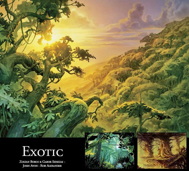
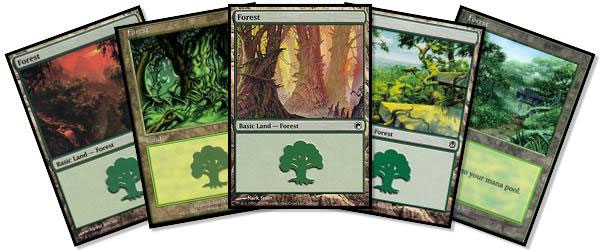
With the majority of forests Magic has to offer, one can’t help but notice how European it all looks. Not to say this is a criticism; the basic lands are here to provide an anchor in a dynamic and alien universe. This is a fantasy game after all, and it pulls a healthy amount of influence from classic stories like The Lion, the Witch and the Wardrobe, The Once and Future King, The Lord of the Rings, and A Game of Thrones. These stories are the bedrock of modern fantasy, and it’s only fitting that today’s creatives continue the traditions that shaped their experiences. That being said, the homogeneity does become apparent rather quickly. Lighting also shifts significantly, the various atmospheres becoming shades of gold, emerald, and crimson.
In an effort to bring the story to different locales, the basic lands sometimes undergo radical change. Traditional pines and firs may be swapped for bamboo, kapoks, or even stranger types of flora not native to planet earth.
Naya is a dead ringer for the lush tropics on offer here, while ’Tron players who rely on green could easily find some suitably bizarre entries from Mirrodin and New Phyrexia.
Sets to Look for:
Trees are big—really, really big. No, they’re bigger than that—even bigger. Keep going. More . . .
It used to be that, when an artist needed to impress upon the view a sense of scale, he or she would just work bigger. There is a definite impact from standing in front of a painting that towers over you. But when reducing art down to the size of a Magic card, a physically large painting will lose much of its impact. Sometimes, the rules of perspective need to be bent in order to provide an appropriate sense of scale. By forcing the perspective, the trunk of the trees become heavy and massive, while branches that reach the tip of the canopy are mere wisps. Other times, the horizon itself shifts, further throwing off the perspective, allowing a tree that is printed only a couple inches tall to take on the stature of a giant redwood. Several artists in Magic rely on this trick time and again, including landscape juggernaut John Avon. There’s a reason that one of the game’s most prolific landscape artists uses this technique so often: It works.
Decks that go for big effect are right at home with this larger-than-life approach. Bloom Titan, Scapeshift, and Genesis Wave all plug in nicely.
Sets to Look for:
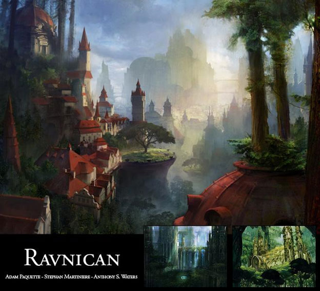
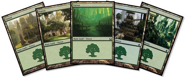
Life in the City of Guilds is all about compromise. There’s only so much to go around, and everyone wants a piece of the pie that’s slightly larger than what is sustainable for the others. Sometimes, this results in explosions, but most times, it results in adaptation, a hybridized approach that is mutually beneficial to all parties involved (or at least clever enough to convince them of such). Forests in Ravnica reflect this spirit of cooperation, the symbol of nature’s fortitude growing and thriving alongside man’s. It’s a symbiotic relationship, a harmonious and breathtaking view of the ideals that man and nature have to offer one another. The colors, the forms, and the narratives are all complementary, and the result is arguably the most visually striking entry the entire genre has to offer.
Golgari scores some great overgrown ruins from these lands, but the real winner is Selesnya.
Sets to Look for:

Forest panoramas are equally impressive from an audience perspective as well as that of an artist. The sheer amount of work that needs to go into such a massive piece is staggering. From design to planning to execution, a panoramic that exists both as a unified whole as well as four individual artworks is a brilliant accomplishment.
Panoramas are the ultimate collector’s paradise, perfect for Cubes and Commander decks.
Sets to Look for:
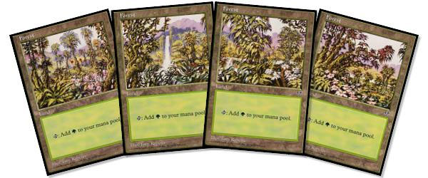
- Shadowmoor (Chippy’s Swamp/Forest combo for Golgari)
- Mirage
- Rise of the Eldrazi
- Champions of Kamigawa
- Scars of Mirrodin
- Mirrodin Besieged
Forests represent the living, breathing core of your deck. With a little thought and planning, there’s a representation out there that is perfect for your style.
Check out the other articles in this series:


