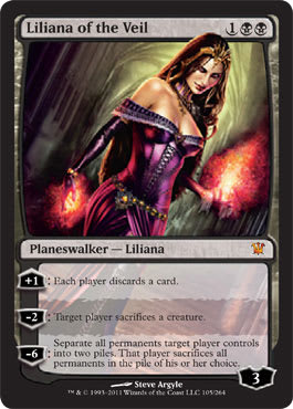
I am not flavor-driven when it comes to Magic cards. In the demographic terminology so common in today’s Magic discussion, that makes me the “person who likes playing the game sometimes but doesn’t really care about all the art and text and stuff.” In my infinite humility, I do acknowledge that cards need some little doodle above the text just so that we can recognize them more easily, but actually caring about what those pictures are isn’t usually my thing. This also applies to flavor text, novels, spinoff sitcoms, and so on.
The exceptions occur when the flavor of the game is so flagrantly bad that I can’t just ignore it and keep on doing my thing. If I’m hanging out with someone and he quotes some silly meme under his breath, I can move past it eventually, but if he loudly declares, “Say, I believe nonmales to be inferior!” I’m not going to let that shit slide. That brings us to my fairly brief mention of stupid, sexist art in the game in last week’s article. That was a Steve Argyle piece. Argyle isn’t the only who’s creating art that’s basically a bunch of fancy arrows pointing at tits, but he’s certainly among the most prolific and (somehow) well-respected in that genre.
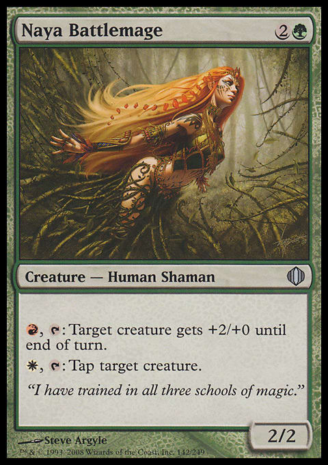
The easy way to start would be to choose that artwork. You know the one because it’s been plastered everywhere by Wizards to promote recent sets. But I have to keep something in my back pocket to keep people reading, don’t I? That’s called a “tease,” kids. But not in the same way that Argyle would mean it. Instead, I’ll call attention to one of his lesser works, Naya Battlemage:
Here’s what I see:
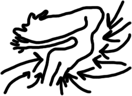
This might look a bit different, but it still captures the essence of The Piece: ludicrously long limbs, a pose that’s actually quite uncomfortable if one’s spine will even allow it, and a bunch of vines that are . . . good lord, I can’t believe I’m actually trying to summarize leafy bondage this week.
I’m starting off with this one to demonstrate that it’s not just showing a bunch of cleavage that can make Magic art eyerollish. In this case, it’s the general pose that accentuates everything sexual about her and nothing else. The entire composition is, as demonstrated above, pointing at her chest and going, “Hey, you! Look at this because that’s what’s important here!” Her pose doesn’t demonstrate strength, power, or magical ability like it would if it were a male in the image. It’s solely about her figure.
Before I go on any further, it’s time to talk about objectification because the non-feminist of y’all (and if we make a pie chart of “all y’all,” the feminist part is a rather small sliver) don’t seem to understand this concept at the moment. Sexual objectification is not any image of someone that’s sexually appealing. Objectification, as the term implies, treats that which is sexually appealing as an object rather than a as human (or vampire, or weird cat thing) with agency of his or her own. It’s often done by emphasizing body parts over the individual. Ms. Battlemage is certainly being objectified, but that’s far from the most objectifying art in recent years.
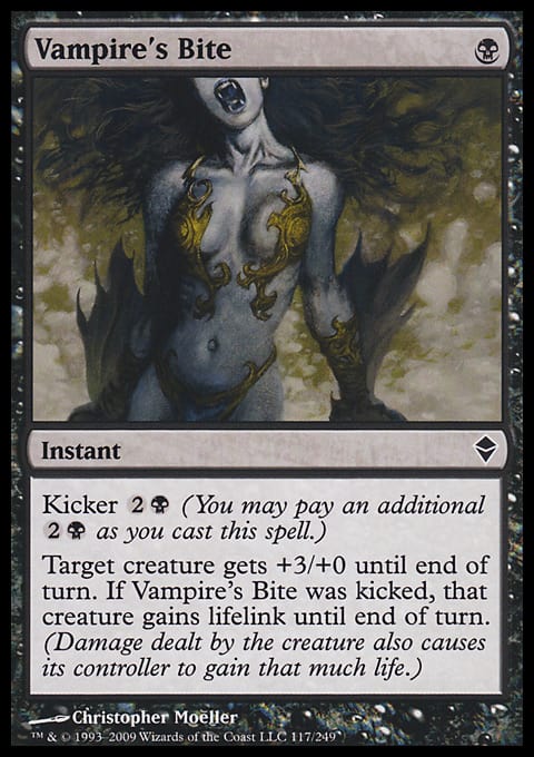
Now, this is just silly.
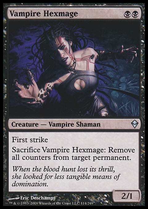
This is a painting of tits. I decline to even call it a true tihtmonster—the focus on the tits overwhelms any possible monsterness of the supposed vampire. Yeah, at the very tippity-top of the frame, there’re some teeth, so it’s justified as being, “Woo, vampire! It can bite you!” but it’s so far removed from the focus of the piece (the tits) as to be entirely irrelevant. Strangely enough, the card specifically calls for a certain aspect of vampires to be non-sexually objectified—specifically, their teeth—and it doesn’t come close to doing that.
While we’re talking about Naya Battlemage: Did someone get paid to write that flavor text? Because Wizards should really try to claw that back and invest in like, a salad bar or something because that just isn’t getting the flavor job done in an effective way. “Okay, guys, we have these planes where only three colors of magic exist on each one! So, let’s have a person hint that she thinks there are only three kinds of magic! She can say, ‘All three schools of magic!’” Then, once the last bit of subtlety was sucked from the room, one of them should have realized that she is a lying battlemage . . . Look at the card! She can plainly only use red and white mana. I am amazed that the flavor text manages to be that insipid while still inaccurate in so few words.
Seriously. Look at this in hindsight, Wizards. What would you rather have: that italicized text or delicious, healthy midday snacks? You could have even had avocado salad. Salads . . . of avocado. You decide.
Quick hit:
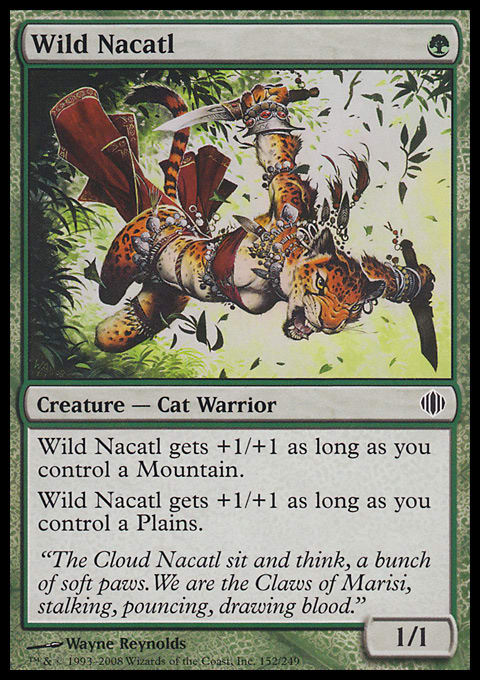
Anyway. A lot of people like to pick on this Wayne Reynolds illustration:
So. It’s a cartoon cat, anthropomorphized enough that it has breasts. But you know what? I’m relatively okay with this. Sure, it’s bizarre. But I genuinely believe that the cat is about to kick the shit out of that text box—she’s not sitting back acting sexy so that we can admire her. The curves of her odd female form aren’t unduly emphasized like on Argyle illustrations.
Now on to our main attraction.
Wait, no. Something doesn’t seem right here. I can’t focus properly. Let’s try something:
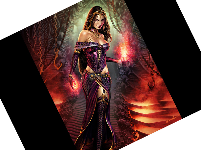
Much better. This lets us focus on some of the subtleties of the illustration—like how the big, scary hooks are gravitationally attracted to her chest.
For any women out there, here’s a challenge: Walk down a flight of stairs with one foot directly in front of the other while tilting your shoulders so that they’re forty-five degrees from the direction you’re walking, but have the breast on the back shoulder (above the front foot) appear just as large as the other one. If you can do that, have I got a great job for you in the booming field of fantasy modeling!
So, what’s wrong with Liliana aside from looking a bit silly? Well, this is sexual objectification at its magical peak right here. Everything about Liliana is constructed to make her desirable to a straight male audience—from the curvature to the body pose to the devilish smile. Here’s where we get to objectification’s close relative: the male gaze. It was coined to describe how films would show everything from a straight male point of view, lingering over a woman’s curves while never doing the same thing with a man’s body (because those are icky). Any objectifying card in Magic is going to assume the person looking at it is a straight male, and Liliana is the nadir of that.
Now, I know that a lot of people who care a lot more about flavor than I do are going to come to Wizards’s defense here: The character of Liliana is a sexy one, obviously—why can’t I see that? She just happened to have some sort of storyline transition that took her from a weird, ghostish appearance to that of an extremely attractive woman. (I have no idea if this actually happened; I’m just assuming and making things up. Writing about Magic is easy.) Did they happen to give her some sort of agelessness, too? That would be super-convenient so that Magic players won’t ever have to look at a declining-in-looks Liliana. I’m sure that Mr. Argyle’s piece perfectly captured what the art direction team was going for . . . which makes this a case of a sexist trope being passed off as a worthwhile character. She’s just a femme fatale in silly clothes.
Liliana is, quite simply, an attempt to sex up Magic in order to win over more teenage and twenty-something men (possibly because the average age of the game was so low for so long; whether it had started rising already or Wizards just wants it to rise, I don’t know). There is no character there.
(Her card isn’t even the most objectifying depiction, by the way. That honor would have to go to Argyle’s alternate version of Snuff Out or the ridiculous depiction used for promotional purposes and Pro Tour t-shirts.)
So, what can Magic fans do about this? Nothing. Sorry! If you threaten to buy less of the product because you don’t like it, you’re committing an act of war—or something.
Jesse Mason
Killingagoldfish.blogspot.com


