Let’s analyze some art!

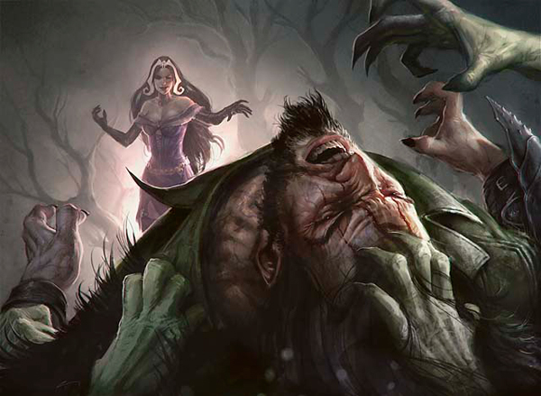
Here’s the sequence of what I saw: Garruk is in pain. Oh, Liliana is Cursing his Veil or whatever from a distance! OH SHIT, LOOK OUT FOR THE ZOMBIES, GARRUK!!!
It’s a very well-composed piece with a perspective (over the head and shoulder of a leaning-back victim with the thing responsible for his victimhood in the background, looking smug as heck) that’s fairly unique. The artist definitely deserves credit for execution as well as delivering something as outside-the-norm as is allowed for planeswalkers in card art.
But hey, there’s a companion piece; let’s see if that’s just as g

Oh, dear. Oh no no no.
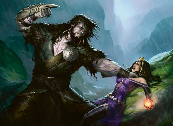
So, what’s happening here, objectively, is . . . the much larger man has his thick veiny arm around the woman whose back is pinned against a rock (looking up at him), and the aforementioned large man has his fist raised to punch the pinned-down-and-choked woman. Also, her hands are on fire . . . or something.
And a bit of her upper leg is peeking out from under her dress.
And his leg is between her thighs.
When I write about gender issues as they relate to Magic, I try to make a bunch of jokes. There are a few reasons for this: Jokes are fun, and Magic is fun (sometimes), so people should have fun reading Magic-related articles. Also, if people disagree with everything I say, maybe they’ll still like some of the jokes. Also, a lot of gender-issues-related stuff tends toward being humorless. (Feminism has a reputation for not taking many things lightly; part of this is because feminists aren’t afraid to call out sexist jokes as being sexist, and part of it is because most feminist writers just don’t make many jokes.)
There is no humorous way to say that the above image, to me, is reminiscent of sexual assault in a really creepy way, nor should anyone assume that anything related to this is hyperbolic for the purpose of writing or comedy. Instead, this is an area where people need to pay attention to word choice.
I do not think the artist is sexist for painting this piece. I do not assume that the art description called for Garruk to appear on the verge of sexually assaulting Liliana, nor do I think that anyone who saw that image and thought nothing of it is necessarily wrong, misogynist, or oblivious.
However, imagine the same image with the Magic removed from it. It’s not Garruk and Liliana, it’s a man and a woman in normal clothes in that same pose. If you showed that image to people (even Magic players) and asked them what was happening there, a lot more of them would see it that way.
Why is that relevant? Because Magic has new people coming to it all the time. Every pack that Wizards sells has the chance of being the first Magic cards a person ever sees.
And with more women playing Magic than ever before (both in raw number and, I suspect but have no way of verifying, as a percentage of the player base), every new potential player has a good chance of being a woman. That means that, for some women, that Garruk/Liliana illustration might be among their first impressions of Magic as a whole. That is not a good impression to make.
That’s why it frustrates me when people give some story-based explanation for a piece of art looking the way it does. Liliana isn’t being portrayed in a sexist way . . . it’s just that her character is (as described by an R&D member) “a bitch.” It’s all right to show Liliana and Garruk in that pose because Liliana wins in the end!
So?
As many of you have noticed at this point, I play Magic every now and then. I even write about Magic for a Magic-related web site. I can conclusively say that I have next to no knowledge of the Garruk/Liliana plotline that’s running through Innistrad, nor do the players I play with on a regular basis. And I’m a Fairly Serious Player.
The justification for that art piece is . . . the plotline? How many people who see it are going to have knowledge of the plotline that, in their minds, makes that image okay?
How many of the new players who see it are going to know that plotline?
What about the people who don’t yet play?
Most importantly: Why does it matter what behind-the-card plot led to that art?
It doesn’t take a lot of creativity to think of plot-related events that are inappropriate for card illustration. Characters sleeping naked, for example, or Jace picking his nose.
Personally, when confronted with art containing two main characters who appear to be nothing more than gender stereotypes (big, burly, angry, wild man!!! Hot woman who is sexy and also attractive who will then try to kill you while looking good!!!), I don’t shrug my shoulders and accept that the art is just portraying those characters; I question the creative process that led to such stock characters.
The obvious response to this is, “But look at Elspeth and Jace; they’re not gender stereotypes.” That’s true, they aren’t. But the existence of some characters who aren’t terribly demeaning doesn’t excuse the presence of ones who are. Serial killers don’t get to point out all the people they didn’t decapitate. Whether game company or somewhat-responsible sociopath, judgment is given based on the worst examples, not the best or even the median.
Obviously, plenty of people who don’t share my worldview are going to read this and say something about how I’m seeing something where there’s nothing, reading too much into it, perfectly innocuous, can find sexism everywhere, and so on and so forth. However, I conducted an extremely rigorous experimental process: I asked a few non-Magic-playing women what their thoughts were on the art. They all came to similar conclusions that I did within a few seconds of looking at it.
When creating the art for Magic cards, intent really doesn’t matter. There are certain issues that, when making art for a mainstream audience, you really don’t want to accidentally hint at, and sexual assault might be near the top of that list. It’s comparable to political cartoons of our last couple presidents: Yes, drawing George W. Bush as a chimpanzee was perfectly acceptable. No, it’s not all right to draw Obama as any sort of non-human ape. Yes, that is a shame.
This means that a quick check is necessary when drawing a woman in some form of combat: Does this look like sexual assault? If no, great! If yes, start the piece over.
Despite the earlier serial-killer metaphor, Magic art normally does a good job of not showing women in situations that imply any kind of weakness or assault. Sure, nearly every Angel has to show a ridiculous amount of leg, but no one can deny that those Angels are about to cleave some zombies in half with cleavage. This is, as far as I know, the first card in modern Magic to even remotely hint at sexualized violence. Because of that, it’s almost certainly just an oversight that no one saw any problem with . . . but if that’s the case, this is the Skullclamp of Magic art in terms of managerial oversight sleeping on the job. I have high hopes that we’ll never see art like this again.


