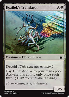
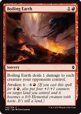
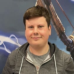
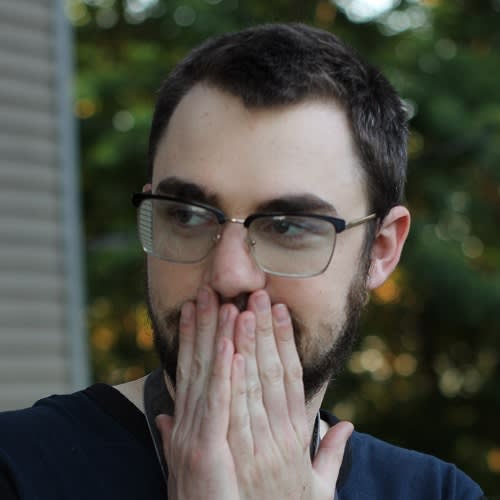
 Zendikar is over for now, and since it’s the third plane we’ve returned to in recent years, I felt it would be wise to examine the plane and sets from a global perspective. We are entering in an unprecedented double-return-to sets, and looking back on what succeeded or failed could’ve been a pretty fun visual column I could’ve written. The problem is that I didn’t work on these sets. This makes my perspective a critique, a lens to see my bias and viewpoints. I already write art reviews on every set, making it a rehash at best and stale at worst. There is interesting information that could be gathered, though, so that got me to thinking, “Maybe I should just shut the hell up and let someone else talk here.”
What if I asked the people who could tell us about Zendikar? If it seems impossible for you to believe I could gather designers, developers, playtesters, and the Creative Team members, you’d be right. While I am outside the norm to have R&D commentary easily accessible to my art focused Vorthos column, asking artists to do so is definitely in my wheelhouse.
So, without further ado, I asked many, many artists, some of whom had no idea who I am, to give a quote on Zendikar. Most artists I have met responded, and this is what they said.

“For me, BFZ/OGW was a learning experience mostly. I did stuff for the first time, like maquettes, and was pushed by my peers and the WotC team to give my best. Environment is big in Zendikar, so I got to incorporate that even though I do characters mostly—fun times.”
|

“I really enjoyed working on the set, as it is a spectacular breakthrough from MTG. With the epic battle, as an artist, I could imagine this set as a very great movie.”
|

“Zendikar has always been one of my favorite settings. The crazy, gravity-defying landscapes and the open design of the Eldrazi are an artist's playground of possibilities. I was excited to do the art for
Slaughter Drone. It was my first opportunity doing an Eldrazi card. The art was also done in a vertical layout, which was a nice change of pace.”
|

"Painting the Eldrazi is like painting beautiful chaos. Their elegant form and color draws you in . . . and then they warp your face off."
|

“Hey, Mike, I think with Zendikar, the setting is modern but not modern—it's a little fantasy here, a little sci-if there, but in the aggregate something, altogether different. It's a challenge, and it pushes your imaginative abilities.
It gets me looking at things for inspiration that I don't get a chance to look at or normally wouldn't with most projects. For example, when designing people and the equipment, I looked at modern soldiers, construction workers, and evens trip to Home Depot to gather reference, rather than looking at a specific time period for armor, etc. It's just different than what I normally do, but it's good to get out of the high-fantasy comfort zone, at least for me. Magic demands that usually, but more with Zendikar.”
— Matt Stewart
|

“Coming down from Tarkir, there was an excellent shift in artistic focus.
Dragons of Tarkir especially was armies, and dragons, and things exploding, and all this busyness . . . And then you have Zendikar, which for me became, “How can I make this landscape, this object, the star?” Very Hudson River Painter in its way of thinking.
It's making me focus more on mood. Settings become far more important in pieces going forward—lighting, and little background elements like wear and tear on fences, all the static, secondary elements in the image now tell more of a complete history.”
|

"I don't feel Zendikar deviated much from the norm in terms of the art style. However, I did find that the landscapes provided some interesting opportunities for settings. The random mutations that are influenced by the Eldrazi presence definitely played to my concept art background—there was a lot of room for design."
|

“It was super-sweet! Lots of daylight and sun and large-scale environments where everything is super-big.”
|

"While working on artwork for Zendikar, my favorite aspect was the otherworldly and desperate atmosphere. Nothing seemed like a triumphant, heroic struggle from the mortal perspective; the prize was survival. Set during the day against an alien, almost indifferent foe, Zendikar was a way for me to express horror by not showing everything. Hinting at a threat off-screen, presenting an impossibility in broad daylight and offering no explanation, letting others wonder and fill in the gaps: That's my kind of horror.
After the spoilers/release of the Zendikar set, I realized not only how much effort my colleagues put into every one of their illustrations, but also how well-thought-out, specific and helpful the concepts and world guide was. I feel the creative team outdid themselves in presenting an insane yet well-structured playground for the artists to create in. When I saw how amazingly everything came out I felt like I was really a part of a grand world-building effort in which everyone gave their all."
|

“Well, it was a fun set. The Eldrazi are always a challenge to paint though. They're coloration and form is kind of made to clash with the MTG world I think, so that they feel more alien in it.”
|

“In my opinion, Zendikar was all about union to face a greater danger/mission. Put away racial differences and unite as one to accomplish something bigger. That was the vibe that I had while working on it. Also, I really appreciate how conscious
Magic is about diversity. I always get a large range of characters description to create and in Zendikar this was even more evident to my commissions.”

"I recall having a hella-ton of work going on right around the time I was working on these BFZ and OGW pieces—I was spread thin! Nevertheless, I did have a lot of fun with a few of the creature cards I did (
Ancient Crab,
Felidar Cub, and the lighthearted
Baloth Pup)—plus, one of my favorite recent MTG paintings:
Munda's Vanguard."
— Steve Prescott
|

"The only anecdote I can really make is that I'm not sure I'll paint another nonland piece for
Magic as large as the Dragon piece I did. I think I was well past the point of acceptable detail loss at card size on that one."
|

“One thing that stands out is how difficult the corruption of the Eldrazi is to paint. The description was something like: a soft, mushy, bony, white, material that's eating away at the landscape.
Like, what is that? I need to paint something that looks soft, yet bony at the same time? It's white, huge in scale, and odd-shaped, so it's really hard to integrate into the landscape without looking cartoonlike. How is this structure created? It's just all very weird.
It would be easier to capture those descriptions if the scene was animated, but we illustrators had to do it in a still image. That's what stands out to me, and it seems every artist has their own interpretation of what the corruption is. I'm not saying the art direction is bad, it's just one of the more difficult things I've had to paint.”
|

"A first full line up in
Magic for me were the "Return to" set. Landscapes are not my strong suit, so I was surprised when Dawn Murin sent the commission. It was a slog because I haven't had a lot of assignments that were landscapes—and having a full line up added to the stress of getting things right, but both the art team and I were happy how things came out in the end. It was fun getting to work on such alien like landscapes."
|

“Ever tried to paint a giant pile of neon blue and pink ramen with a halogen bulb in the center of it? Now I have.”
|

“Every set has its unique feel and atmosphere. Whenever I work on
Magic cards, I try to dive into that individual world. In this manner, this set gave me plenty of room because much was about wide landscapes, scale, and dimension. It was kind a like being on my personal adventure.”
— Volkan Baga

"Having worked on a few of the story-heavy pieces, I was struck by how helpless the usually dominant Planeswalkers like Jace and Nissa felt—totally outmatched and out of their element. In the few pieces I worked on, the heroic Planeswalkers were being subjected to some pretty horrific torment, sometimes all at once. Just felt to me like they'd finally stumbled onto a plane where they were unprepared for what awaited."
— Ryan Barger
|

“Most of the cards I did for Zendikar were Eldrazi (plus a couple hedrons). Their twisted anatomy was like nightmare fuel, and really fun to paint. The infected and broken landscapes in the background were also an interesting departure from the norm.”
— Craig J Spearing
|

“Zendikar is for a lot of fans, myself included, this savage place where all the awesome things are combined. For me, trying to hit those notes of giant floating branches, volcanoes, and scorching lava fields, I felt like a kid again. Sometimes, you have to wear your designer hat, sometimes your attention-to-detail hat—with Zendikar, I was just a kid smashing one toy into the other and going, “FFFGGGHSSSHHHHWWWWOOOOOOHM!”"
|

“For both
Battle for Zendikar and
Oath of the Gatewatch sets, I had to paint elemental creatures. It was an interesting challenge trying to match the feel of the creature with the unique magical aspects of their environments.”
— John Severin Brassell
|

“As for my work on the Eldrazi cards, I enjoyed the surrealism of this world. That pinch of Lovecraftian spice is what makes it so unique. :)”
|

"From a visual standpoint, Zendikar is definitely my favorite plane. Aesthetically, it shares a lot of features that carry over into my personal work: functional armor, vast expanses, and pared-down, gritty beasts. While other planes may focus on conflicts between factions, the classic man vs. nature conflict of Zendikar has a visceral impact on me."
"If I could make a living illustrating only Kor, I would. Everything about them is cool."
|

“Well, I'll say that the Eldrazi actually present a unique challenge because they are so bizarre, and anytime you're given complete freedom to create, you can end up psyching yourself out, overthinking things, second-guessing yourself. The trick is to create a bold and relatively simple silhouette early one and stick to it. This compounded with the fact that I'm a guy who likes drawing perfectly draped costumes and shining armor, and then has to force himself to scuff everything up afterward to make it feel lived in. So drawing twisted freaks takes some effort, and I always got comments saying weirder, add more eyes, more limbs, things like that.”
— Joseph Meehan
|

“What I like most about Zendikar is the light—it feels like crisp, sunny days and fresh air.”
|

“But I can say that I really loved working on the Zendikar block, this awesome plane where everything is going to shit. In fact, I loved the art in general; it turned out great. Sadly, I didn't have the chance to work on any Eldrazi, but probably for the best, because the guys who did really did an awesome job at it.
Since characters were my thing, I must say that I really enjoyed the fact that armors were made mostly from scrap—they didn't have the need to be pretty, they just needed to be useful. In general, I loved Zendikar—there was no place for bullshit formalities, only hardcore action and survival.”
|

"I will go a bit more sentimental, since my card "
Null Caller" from
Oath of the Gatewatch was basically the first card I ever created for MTG. It was a really special and definitely ‘
Magical’ moment to me. I love the whole world: dark, intense, and immersive, overall very inspiring! Creating new pieces was definitely very challenging as well as enjoyable. Nothing more to say than I just loved it and I still do!"
|

“l loved revisiting these worlds. l especially loved how the Eldrazi turned the lands into dust and bone. l thought it was a beautiful design.”
|

"As a huge fan of Cthulhu, Zendikar was always one of my favorite
Magic settings. My first assignment was for the 2011 core set, so I missed the initial chance to contribute to this world. It was quite exciting to not only make good for that, but also to get the opportunity to be part of one of the most colorful and creative world devastations in
Magic history! When looking through the art for these sets, I think a lot of people must have felt the same way, as my jaw still hurts from dropping so much. The mix of mainly bright daylight with the prismatic reflections of the Eldrazi and their remains make the visual appeal so unique for me. Usually, my work is quite dark and a bit monochromatic, so it was great to get forced out of this comfort zone."
— Mathias Kollros
|
We returned to a plane, a beautiful world where landscape is the focus. Without an amazing concept team and the best artists in the entire TCG industry, we would be playing a lifeless card game that would struggle to stay relevant amongst the noise of an entire industry. We are lucky these brilliant minds take ideas and concepts into a cohesive whole, of enemies rallying against a common enemy, an otherworldly terror that struggles for definition. Without the best art directors working with the best artists, returning to a world could become recycled mechanics and entirely slush art.
And at the same time of this massive war, desolation, and returned world, we are graced with Steve Prescott. May he be in every set forever to paint more puppers:
-Mike
@VorthosMike
 Zendikar is over for now, and since it’s the third plane we’ve returned to in recent years, I felt it would be wise to examine the plane and sets from a global perspective. We are entering in an unprecedented double-return-to sets, and looking back on what succeeded or failed could’ve been a pretty fun visual column I could’ve written. The problem is that I didn’t work on these sets. This makes my perspective a critique, a lens to see my bias and viewpoints. I already write art reviews on every set, making it a rehash at best and stale at worst. There is interesting information that could be gathered, though, so that got me to thinking, “Maybe I should just shut the hell up and let someone else talk here.”


