
Amonkhet marketing art by Greg Rutkowski
Amonkhet, a Temporary Society
Amonkhet shares a unified purpose that Kaladesh strived for but ultimately felt unconvincing. The premise for Kaladesh was dangerous inventions were commandeered by the Consulate, with Tezzeret being the mastermind behind it all, stealing new artifact technology. The issue with that is the renegades and revolutionaries were from an incredibly privileged class of inventors. Frankly, to most citizens of Kaladesh, some martial law to protect them from terrorists made a lot of sense as their culture had few external threats and was relatively peaceful. As the page turned, the entire “evil” part of the consulate changed back to its normal, boring law-abiding nature. Instead of diving deeper into the evils that the White part of the color pie could produce, we turned the page and didn’t get to see the reconstruction, the staring of citizens and the government at each other to see what went wrong, why it went wrong, and how to prevent it from happening again in the future. It had real life parallels, made over a year in advance.
We now visit Naktamun on the plane of Amonkhet; and, visually, the world building is plausible. The diehold vorthos community tried to ascertain if Dragon Planeswalker Nicol Bolas made this plane or commandeered it, creating the culture from scratch or warping it.
Nicol Bolas arrived here. He did not make this plane.
How does this relate to the art? Nicol Bolas arrived here after a cataclysmic universe event called the Mending, trying to regain some of his lost powers. As all Planeswalkers were powered down, he wished to regain some of his former power in the game’s storyline. For us to know, in order for Planeswalkers to be brandable, relatable characters, they had to stop being all-powerful gods with limitless powers and also shapeshifting abilities. They needed stability for a brand to build around them and serve as an approachable marketing tool. Visually, we saw nothing during this time. The page turned from Time Spiral to Lorwyn, and all background info wasn’t visited concurrently.
As for Nicol Bolas, he headed to Amonkhet first for his dabbling, and then off to Alara, if you’re curious about the timeline of these schemes for regaining power. This is all roughly 40-80 years ago from current storylines. So, the entire culture changed in a manner of a few generations.
You’ll need a lot of labor to build all those monuments, making the ongoing necromantic spell or curse raising the plane’s dead an invaluable tool for creating a servant class.

Edifice of Authority by Florian de Gesincourt
Digital, and a lovely bit of near monochromatic color. It feels very Dune.
The base of the structure is being built, making me assume it’s on the facade final touches, compared to Oracle's Vault, which looks like it’s under repair.
With the help of Cary Thomas Barkett and this tweet, we put together a little timeline to explain how quickly this all happened.
https://twitter.com/MTGAlison/status/857974151381778432
Generation 1:
Bolas arrives, kills everyone that isn’t a child.
Within ten to fifteen years, the youth are old enough to begin the trials. Without any elders, there is no way to know if some 8-year-olds tried and were killed immediately. We also do not know if the elders that Nicol Bolas annihilated are what is depicted in Wrath of God or if that’s an outside the Hekma event. Regardless, he somehow removed three of the original eight gods, declared himself the main god (which is so Egypt it’s amazing), and made everyone forget that pre-Bolas Amonkhet ever existed outside the one city of Naktamun, protected by a protective bubble called the Hekma.
We only get to see the barrier a few times in card art, and outside surely looks terrible. The Planeswalkers visit and the community recognizes that visitors are possible from outside the barrier, so full xenophobia isn’t explored as the only thing outside the Hekma is dead things. Besides, the initiates need to train instead.
Generation 2:
The kids of the first generation still have a shot to enter the trials and become Worthy.
Generation 3:
They that were born from the second generation are taking the trials now. They won’t be having children because the risk for them to not become worthy is too great, and with so little time left before Nicol Bolas returns, the time now is to train before the God-Pharaoh returns. They know when the sun hits the horns, it’s over. Everything happens then.
What I have been asking over the last few days was, with everyone wanting to go through the trials, why would any woman want to have children?
I’ve seen Serena Williams win a grand slam pregnant but she also wasn’t killed and turned into a mummy if she fell short of her goal. I knew of two women on my counterpart track team and college; and, while they could train for a while, starting blocks didn’t quite work after a few weeks. Neither was turned into a mummy and both did return to the team after a year off.
I get how dissenters were put into coffins if they disagreed. You’re pregnant but don’t want to keep it? Looks like you’re going into a sarcophagus.
I don’t want to think that world builders went that deep, but having worked in gaming, you have to build from the bottom up, explaining everything from economies to family structure. Without it, the veil of plausibility falls down.
We can see the cutthroat competition and not just the Black Trial of Ambition which forces you to turn on friends and teammates. If injured, you were just removed entirely from combat. This isn’t like Jordan with the Flu Game, or the countless ice tubs that any collegiate or professional athlete will endure. If they falter, they’re simply out.
While there is a healing vizier, I can guarantee if you have an ACL tear, you’re just killed, put into a coffin, or allowed to enter the trials with everyone knowing you’re the American Ninja Warrior contestant wearing jeans and nursing a knee injury.
We, after all, know that many of the embalmed have multiple cartouches. I won’t go into stylistic variation in the cartouches but they’re all pretty similar visually for artists preference.
And yet, with people doing anything to keep competing in the trials, we still see children depicted in the set!
Spring // Mind and Protection of the Hekma both show that children do still exist on Amonkhet. We just don’t see many because it doesn’t make logical sense to have a lot when Nicol Bolas is soon to return. They’re in an Olympic village and shenanigans will occur, but family planning isn’t a widespread cultural happening because of the condensed timeline. We’ll return to this image soon.

Mind by Josu Hernaiz
Digital
This is a North Korea culture, walled out from the rest of the world, if you are curious how a real world example could be like Amonkhet. Except, in the case of Amonkhet, grandparents grew up as babies with no one older than them.
Top Down Youth
Akin to real ancient Egypt, if you visited Egypt or Amonkhet as echo of the past, the people shouldn’t live often past the age of forty. On Amonkhet it’s because they’re likely killed from a trial, public infraction, or a variety of other terrible occurrences outside the Hekma.
In real Egypt, without modern medicine or public hygiene, life expectancy was low. (There are a ton of references on that, I grabbed one. They all mimic each other with debate on how long exactly. Regardless, it’s short.) Let’s not assume that people didn’t live to old age. Sculptures in Egypt show us as such. Though plagues, wars and malnutrition were rampant. Without refrigeration and the river Nile which flooded every year, scurvy and anemia were common. Amonkhet tries hard to show that the people are not in ancient Egypt in terms of things like civic life and food. Taking the Trials as a visual cue, we can see this is a top down set, where a culture and flavor drove the design rather than mechanics.
We can see this young woman, perhaps a teenager with the newest hair fashion, mentioning in her flavor text that she will also be harvested, though she doesn’t say if that is by participating in the trial or by other means. Surely she doesn’t pick the fruit. They have mummies for that.
“Like fruits in the field, we will be harvested when the season is right.”
It’s a lovely scene that mimics the Sheltered Aerie scene except their dragons are back and the fauna doesn’t fit the top-down design.
Beyond just the cultural issues of Egypt, like Amonkhet, there were real dangers outside of cities. Snakes are scary, sure, but cat snakes and giant spiders are terrifying.
This painting isn’t fantasy, it’s a live photograph of Australia.
Personally, I’d be way more wary of hippos. They kill hundreds of people still in real life today. Can you imagine getting water on a trek outside the Hekma as an exile when you see this guy looking at you from below? You won’t be long amongst the living.
There’s some beautiful coloration mixing from blue to green. It reminds me of SyFy’s FaceOff in how the anatomy of the horns is plausible and follows animal anatomy. Add in some wicked god minimalistic hues of greens and blues and you have a great hippo.
It’s the actual scariest animal on Amonkhet. Truthfully.
Cramped City
Cozy.
A term to describe a tiny home that others would describe as a cottage.
It describes this idyllic setting where the Tiny House Hunters aren’t seen as delusional, and instead just want to Break the Twitch, intentinoally live within their means and own few things.
I don’t see this city as cozy. It’s cramped.
Check out all of Titus’s land artworks. Look at them closely.
Look for walkways, gathering spaces or a place where your favorite food truck could park.

Mountain by Titus Lunter
Digital
Yes, we can make a point about how this isn’t a mountain and only Chris Rahn’s version is, ok, fine. What we should be asking is why is this considered a mountain? What does Red mana do differently than the other colors visually?

Forest by Titus Lunter
Digital

Island by Titus Lunter
Digital

Forest by Titus Lunter
Digital

Plains by Titus Lunter
Digital
One of the lands is under an international highway or pyramid!
This place, this Naktamun after a few generations, has built upon itself quickly. Even overgrowth is pretty minimal, as we can see in Foul Orchard with slightly overgrown sarcophagi.

Foul Orchard by Mark Poole
Head Scratchers
In every set, I have a few artworks that make me stop, look at, and wonder what’s happening here. These aren’t necessarily good, bad or otherwise. They usually catch me off guard because I’m not prepared to see them. I often look for people talking about them online and hopefully, I find a discussion to jump into instead of staying perpetually confused like this dog.
At card size, this art is great. It is a simple composition and harkens back to 1990s art with very little subtext or meaning behind it. This could be as close to 1994 art in 2017 as we will receive. Many, many people like that. I can appreciate that.
Though, I’m not sure why photoshop’s smudge tool was used here so visibly instead of actually painting a shadow. Sure, being a digital artist is easier for transparency over a sand dune, with Min Yum’s beauty of Sandblast back from Tarkir being the seminal example of a Chesley art award finalist. In Mind Twist, his feels like time saving compared to the normal Igor quality standard. The art is only supposed to be made for usage at card size and this is successful. Sometimes we see a few images larger and we see the Hollywood makeup and seams on the otherwise perfect depiction.

Concept Art
I don’t often talk of the concept pushes that precede each set’s creation and I figured I would touch on it today. This picture was posted on Facebook, showing who the team was for the push.
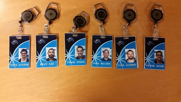
The concept artists of Amonkhet were Titus Lunter, Ryan Alexander Lee, Chase Stone, Steve Belledin, Tyler Jacobson, Victor Adame Minguez.
You can google what a style guide push or concept team is pretty quick, but sufficient to say, these artists are all rather talented and can work quickly with new ideas, honing to create a mold for other artists to work around.
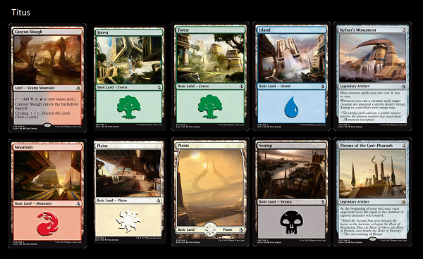
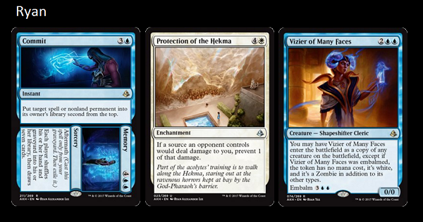
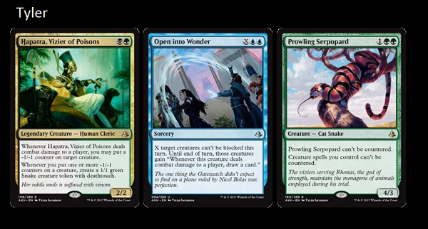
Personally, I’m always interested to see what card arts they receive, as often, an artist who created a concept could get the final card. Below, you can see what ultimate card commissions they received.
 |
 |
 |
 |
 |
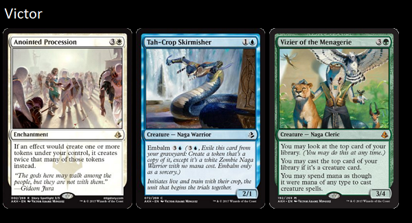 |
Notice that each concept artist received an above average artwork. Getting a basic land is always above average, in case you’re curious.
All things are not equal with Titus being commissioned (or accepting?) double what everyone else did over this period of time. A discussion broke out on Twitter about the time it required him to do all of these pieces and pay in the industry.
https://twitter.com/TitusLunter/status/849315631883333632
In a later column we’ll talk more about industry pay, but for those of you not on Twitter, it’s a pretty deep dive into the artist community and one of the few large, public discussions. Not all of the conversation is connected to that one tweet, but with a little searching, you’ll see more.
And yes, Chase did receive all five gods. He did a great job on the, no questions there.
Art Direction, Two Things
If you don’t know, Wizards has many art directors, yet only a few work on actually commissioning card art. They are Cynthia Sheppard, Mark Winters, Dawn Murin and Sam Burley. Jeremy Jarvis is no longer commissioning and if you noticed, Sam went from their concept artist to art direction. By doing this, Tyler Jacobson is now an in house concept artist. Kieran Yanner just joined the creative team, working with Jeremy Jarvis himself though we’ll see if any other shake ups happen in the near future.
I do think (and know) that the creative team there, especially their art directors, are incredibly talented and work tirelessly for their artists. We don’t hear from them much because double the blocks means their workload is far from light.
Seb is back into creation from a small absence.
His demon here is alive, guarding a horcrux, with beautifully subtle sand twisters behind him, bringing a focus that Kev Walker would be proud to see in a younger artist.
It’s a lovely demon with an Imaginative Realism head, composition and crooked fingers atop its wings. Seb has a strong grasp of how digital art can mimic watercolor, bringing the softness of texture into his brushwork. You see art similar to this at most art conventions painted out. Granted, it’s not this clear in places it needs to be, and we all wish Seb would paint things traditionally, though we’re happy he’s back making art.
We look at Mark Behm’s Dispossess and that is a lovely demon too!
Except it’s the exact same demon.
So . . .
Who made the demon, or did neither make it and it was in the style guide for them to copy in their own style? If both had to copy someone else’s creation, I feel for them.
Should we praise each for their handling of the application of a creature to a specific scene, or did one of them create the demon, making the other copy someone else in another wave? I can’t imagine a style guide getting quickly changed, but setting standards does happen. Oracle of Dust by Jason Rainville was the standard sent around to artists saying, “this is your quality bar, please reach it.”
Behm here has a good grasp on musculature and how it stretches to fit a need. It’s plausible and the fingers on the wing are begging to be animated into a horror scene as it steals this weapon from you.
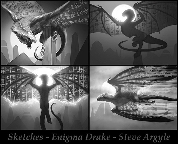
Why would hieroglyphics be on a drake’s wings?
Sure, they mirror each other from the left to right, look close, but we must beg the question. Why are they even there?
We look to the sketches and when you see the same element in all four depictions, that is what is required by the art description. Whenever you see a set of sketches, look for the thing that’s the same in all of them.
I’m just confused why they have to be included. This sounds cool in theory, until you think of composition, trying to make them clear, while also creating a creature that reads at card size. It feels like filler.
Sure, this one uncommon ![]()
![]() drake could be pivotal to the storyline but with repeated hieroglyphics, that isn’t intentionality. Someone just thought it was a good idea but didn’t quite think through how much it hamstrings an artist.
drake could be pivotal to the storyline but with repeated hieroglyphics, that isn’t intentionality. Someone just thought it was a good idea but didn’t quite think through how much it hamstrings an artist.
Who tattooed them on this drake? What significance do they have? If the drake didn’t have them, would that matter? Not every creature needs extra tweaks to hit the set. Sometimes just a drake sitting atop an obelisk will do. Horses are nice, we don’t always need zebras.
Diverse Depictions
I feel it necessary to have a check-in every time I have an art review on how the card sets are doing in terms of representation, diversity, and inclusion. It’s easy to have wide representation, it’s harder to make it truly diverse and near impossible to have constant inclusive elements in each set. It’s still a game about combat, duels, and people fighting each other with spells, yet the minor improvements or missteps help the game and field grow because Magic leads the industry. No brand creates as much high quality art in the gaming industry. It’s pretty unique, which makes it more important that it continually pushes the envelope, striving to always be improving.
Let’s start slow and build our way up.
Below, we see the invocation special artwork Oketra by Bastin Deharme.
His use of atmosphere and light is second to none; and, were I living in Ohio, I would definitely audit one of the classes he teaches. He was born in France and has a good perspective of idealized female forms without being trite or tired, simply copying the same model pose of everyone else. Maybe he didn’t see as many idealized comics as a kids. Perhaps so.
This is a simple composition: Paint the cat god by some obelisks.
What Bastien added was silhouette to Oketra. The Chase Stone version is shown from below in a power stance. Instead, Bastien calmed down her pose, and showed a realistic looking high waisted pencil skirt that I see hundreds of times in downtown Minneapolis, except this time it was on a cat queen. The term for a female cat is a queen.
It’s simple and helps give cosplayers perfect reference for anything they might want to make in the future. An idealized form would go nearly straight down at the hip, as if size 0 models would be the cat queen, right? Asking for “a little more hip,” is sometimes hard and Bastien just added it. I saw what he did there.
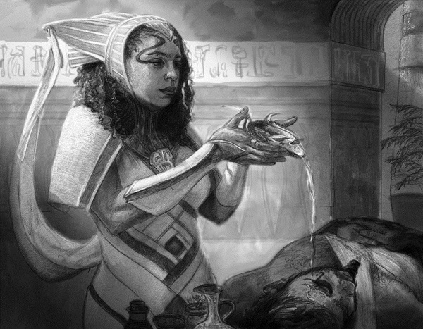
Speaking of realism, the unused sketch from Randy Gallegos has some great looking hair though she’s a healer and it’s a bit unrealistic to not have her hair showing as much. Fantasy, it fights realism even when realism is great.
And yes, Magali is trying hard.
https://twitter.com/Cathaoir1/status/852997416387301376
And then we come to something worth noting. Perhaps this is where the review begins. Walk with us.
I noticed a few things, odd, about this particular artwork and I reached out to a few community members to see if anyone was talking about it.
Nothing.
 Not nothing I suppose, some people were talking about the cat ears on this figure. I know there’s more to discuss than just head adornment and to help me and you, reader today, with insight into how to deconstruct and understand what happened in this image, I reached out to Monique Jones to help with some background into our Honored Crop-Captain here.
If you recall, she was the consultant on Kaya, Ghost Assassin that Kelly Digges worked with and even gave us some additional insight with 6 Questions You Might Have About Magic: The Gathering’s Kaya, Ghost Assassin Answered. She runs Just Add Color, a blog on multiculturalism in pop culture, amongst writing for Ebony Magazine and a variety of other notable literary outlets.
Okay, so let’s talk about the artwork for this particular card. The artwork, by art director Cynthia Sheppard, features a beautiful Crop-Captain, modeled by Danielle Wilson, walking proudly among a crowd of people, either other crops or just lookers-on.
So, there’s something that could be said about the elephant in the room, the ancient Egyptian-ness of it all. That could be the subject of another post entirely, particularly the fact that as of where we are right now in the story, there’s no person of color in the group of Planeswalkers that are trying to save other people of color. But I’d like to wait until the entire story is published before revealing any thoughts about it. What we’re here to discuss is the picture at hand.
First, let me say that the artistry of the piece is great, but that kind of goes without saying doesn’t it? If you’re employed by Magic: The Gathering, you know how to draw, paint, and design composition. The major flaw with this piece is with the lack of diversity in the characters.
“But this picture is full of black people!” you’re probably saying. And yes, it is. But something that could block this piece from being a home run in some eyes is how the darker-skinned individuals are in the background, as the character with seemingly the most clout and stature is a light-skinned person, walking toward the foreground, triumphant in her position and status in society.
I think that the optics of this picture comes about from a well-meaning perspective, actually. I don’t think there was any ill will meant by this picture, and the fact that a woman of color was chosen as the model for the Crop-Captain shows that Magic: The Gathering wants to do right by its consumers. In fact, I believe that the people were made darker skinned in order to serve as an artistic contrast to the Crop Captain, in order for her to stand out even more from the crowd. Also, the folks in the background are in shadow on top of the majority of them (save for that one bald dude on the left) being darker skinned. The Crop-Captain herself is in the sunlight, making her glow even more.
However, the fact that most of the darker skinned folks serve as background dressing to set up the Crop-Captain as the focus remains. To the artist’s credit, she gave the background folks their own personalities through their poses, clothing, hairstyles, and expressions. She did work to make them feel like real people looking on as something awe-inspiring happens. But what they’re looking onward at could be seen as an unwitting display of color politics. While the folks in the background are just as adorned as the Crop-Captain, the image reflects a pattern in American society to equate lighter skin with success and respect. For instance, the blue vein societies in America was a social phenomenon in the early 20th century, in which light skinned African Americans would separate themselves from other African Americans in the form of clubs that only allowed entrance if a person’s veins could be seen through their skin. Membership in these clubs were ways for light skinned black people to at least feel like they had a type of white privilege in black America, despite the fact that none of that privilege trickled over into the mainstream white society. This image, in its own way, reflects some of what America is battling itself over, which are the effects of white privilege on a society. In a nation in which the “lighter is better” approach is still too stubborn to completely die, the idea of light-skinned privilege and even the idea of the “model minority” can exist.
Also, darker skinned black Americans have been pushed to the background for a long time in American pop culture. Storm, for example, is a darker-skinned African X-Men character, yet Halle Berry was cast instead of Angela Bassett. That’s just one small example of lightwashing, if you will. Do darker skinned characters have to be pushed back in Amonkhet, which is essentially an Afrofuturistic storyline, as well?
What would happen if:
- the Crop-Captain were painted as a darker skinned individual,
- more members of the background group were various shades of brown, or
- all of the above?
I think the image would be much more balanced. There wouldn’t be a focus on a lighter skinned individual being put in a higher position over a group of darker skinned people, and there’d be better equity all around. No one skin tone would be put in a “background” position if all of them held that spot at the same time in this image. Then, regardless of if the Crop-Captain was a light or dark skinned person, her skintone wouldn’t become a big socio-political factor as it is now. If the Crop-Captain were made darker, then it would go far with darker skinned black Magic players, who see themselves in so little pop culture as it is. Just like how the character I helped develop, Kaya, Ghost Assassin, was darker skinned, had kinkier hair, and resonated with other black female players, a darker skinned Crop Captain could reinforce Magic’s position that all players from all backgrounds (and, indeed, all skin types) can and should see themselves in the company’s characters.
But with these criticisms laid bare, let me overtly say this: I don’t think there’s any malice inherent in the making of this picture. I don’t think the artist meant ill will, and I don’t even think they realized that having darker folks in the back gawking at a lighter skinned person could be seen as anything other than what it visibly is on the surface. All it could be is just a good old-fashioned blind spot. We all have them, including me, and I’m sure some of my own blind spots have been apparent in my artwork of the past (such as not having enough variance in body shapes, I’ll readily admit).
Speaking from my experiences with the company, the Magic: The Gathering team want nothing more than to entertain and represent their demographics, not offend them. (Also: I’d certainly like to be able to work with them again to finish Kaya’s story.) But they do admit that there is no black woman on their team. That’s why I was brought in as a consultant in the first place. And, they are quick to admit errors and learn from them (again, from my experience). I think that what this piece ultimately needed was a black person—man or woman—to take a second look at the color drafts of this piece and offer some suggestions. Of course, does that mean every black person thinks alike? No. Whereas I see a potential unforced error in regards to the nation’s ongoing conversation about colorism, someone else could see absolutely nothing wrong with this. But, still, it wouldn’t have hurt to ask, right?
Colorism has real consequences; and, even in our game, we can and should address how it appears in a game. We can only advocate for mindfulness and strive for improvement. A big thanks to Monique for being available for a mini writing gig to help us understand.
Male Angels
Ant Tessitore and I spoke about Magic referring to itself, and even breaking its own established tropes on our SnackTime preview card episode. Angels are male on Amonkhet, compared to Magic’s established norm of female, with a handful of exceptions like Gabriel Angelfire, Malach of the Dawn, Melesse Spirit, and an effect for Akroan Skyguard and Asha's Favor.
We’re still unsure why they have yellow eyes, blackish skin that looks like dried lava with fire beneath. No explanation has been given.
We do know they carry out “justice” by bringing people out of the city, as showcased by Never and the card Comply. They’re also servants, like the mummies, but they don’t appear dead. Now, illusions can be made into mummies, as shown by gods are made of leylines, but that's as far as we know.

Never by Daarken
Digital
On the art itself, the angels do have a great visual aesthetic that feels new to Magic. The differences in wings is especially lovely.
Min Yum's are colorful like Nils Hamm, yet maintain a regal feel without establishing if they're magical wings or feathers.
Jason's went full feathers, showing us the musculature and how it works. As each muscle group changes on the anatomy, the in between areas are glowing, perhaps because they move more.

[card]Angel of Sanctions" href="/p/Magic%3A+The+Gathering/Labyrinth+Guardian%5B%2Fcard.+But%2C+beings+of+pure+mana%3F+Angels%3F+We+do+have+the+example+from+The+Hand+That+Moves+that+the+%3Ca+href+%3D+%22http%3A%2F%2Fmagic.wizards.com%2Fen%2Farticles%2Farchive%2Fmagic-story%2Fhand-moves-2017-04-26%22+target%3D%22_blank%22%3Egods+are+made+of+leylines%3C%2Fa%3E%2C+but+that%27s+as+far+as+we+know.%0D%0A%0D%0A%3Cdiv+align%3D%22center%22+style%3D%22clear%3A+both%3B+margin-bottom%3A+10px%3B%22%3E%3Cimg+src%3D%22http%3A%2F%2Fs3.gatheringmagic.com%2Fuploads%2F2017%2F05%2F03%2FML_41.jpg%22%2F%3E%0D%0A%3Cstrong%3E+Never+by+Daarken%0D%0ADigital%3C%2Fstrong%3E%3C%2Fdiv%3E%0D%0A%0D%0AOn+the+art+itself%2C+the+angels+do+have+a+great+visual+aesthetic+that+feels+new+to+%3Cstrong%3EMagic%3C%2Fstrong%3E.+The+differences+in+wings+is+especially+lovely.%0D%0A%0D%0AMin+Yum%27s+are+colorful+like+Nils+Hamm%2C+yet+maintain+a+regal+feel+without+establishing+if+they%27re+magical+wings+or+feathers.%0D%0A%0D%0AJason%27s+went+full+feathers%2C+showing+us+the+musculature+and+how+it+works.+As+each+muscle+group+changes+on+the+anatomy%2C+the+in+between+areas+are+glowing%2C+perhaps+because+they+move+more.%0D%0A%0D%0A%3Cdiv+align%3D%22center%22+style%3D%22clear%3A+both%3B+margin-bottom%3A+10px%3B%22%3E%3Cimg+src%3D%22http%3A%2F%2Fs3.gatheringmagic.com%2Fuploads%2F2017%2F05%2F03%2FML_43.jpg%22%2F%3E%0D%0A%3Cstrong%3E+%5Bcard%5DAngel+of+Sanctions">Labyrinth Guardian[/card. But, beings of pure mana? Angels? We do have the example from The Hand That Moves that the gods are made of leylines, but that's as far as we know.

Never by Daarken
Digital
On the art itself, the angels do have a great visual aesthetic that feels new to Magic. The differences in wings is especially lovely.
Min Yum's are colorful like Nils Hamm, yet maintain a regal feel without establishing if they're magical wings or feathers.
Jason's went full feathers, showing us the musculature and how it works. As each muscle group changes on the anatomy, the in between areas are glowing, perhaps because they move more.

[card]Angel of Sanctions by Min Yum

Comply by Jason A. Engle
Digital
Lighting Round
Let’s fire through a few images, get through some notes to make for the future and gain some insight for your FNM this week. Not every image needs pages of analysis today. Frankly, getting every image is an effort in futility anyway. I do try hard to get as many out in the open as I can, though. Only a few artists tend to say no, or refuse to post theirs. Normally they’re out traveling or like Izzy, on a houseboat with his dog, clearly without internet access to upload a good image, making sure color corrections are happening. He’s another one to follow on Instagram, if you’re into artist adventures.
Let’s dive in.
Did you see the cartouches he’s wearing? Of course you did, you’re on the ball.

Riches by Greg Opalinski
Digital
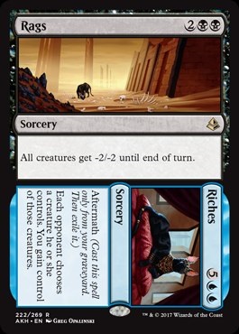
You saw that the cat from Rags // Riches has one white ear and one black ear?
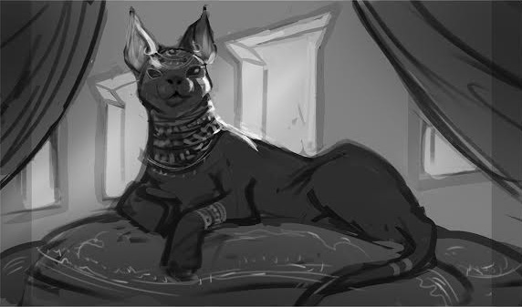
You already saw the sketch and made the connection that was going to be a ![]()
![]() spell but likely got changed to Blue with the development team fixing things? All right, I’m just telling you things you already know. Great.
spell but likely got changed to Blue with the development team fixing things? All right, I’m just telling you things you already know. Great.
By now, if you’re even remotely a Vorthos, you saw that these crocodile gods were basically the same image. Of course they are, they’re invocations to show an iconic, idealized form. That crocodile wants you to see the white under her neck when she’s bringing the Bontu doom.
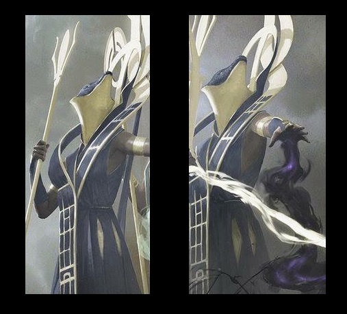
But, did you see how the “front” god serves as the “main” part of the spell. Just as destroying permanents is very possible in White, especially non-White colored ones, it makes sense that Oketra would “lead” with Bontu playing back up.

Crocodile of the Crossing by Kev Walker
7.7 x 10.5”, acrylic, ink and coloured pencil on artboard
Original art is sold.
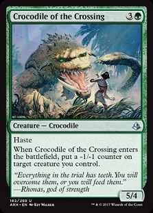 | 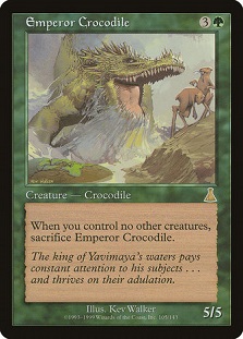 |
Throwbacks are fun.
Copying art descriptions are lazy.
What Time Spiral should’ve been like.
Couldn’t Kev have been given something more playable?
I like seeing art that people are polarized on. I think that adds to its fun and appeal.
If we ignore it, it didn’t do its job.
Art that Catches My Eye
Just as Snack Time argues that top 10 lists are fruitless exercises in proving what is technically better, I try to highlight some art that is notable from the set, knowing full well that some art is just not out by the time my articles goes up. Again, have you seen Izzy’s life? He’s just the coolest artist, but posting art in a moment’s notice isn’t going to happen.
As of late, Seb McKinnon has been the go-to artist for anything highly conceptual.
And then Vincent drops this bomb.
Seb normally gets those. Look:
 Sure, VIncent did the seminal bowl island piece for Zendikar, which appears to be same inspiration for Nissa’s ultimate planeswalker ability except she makes a land be a bowl of sand that gets flown in the air to land on an opponent, but I digress.
Vincent has sat on numerous concept art teams at Wizards, which is worth following him on Instagram for, and brings the Escher into Magic with Decision Paralysis. This image represents the Trial of Knowledge on Amonkhet, competing for Kefnet, the Blue god’s favor. A whole story explains how Nissa passed that test in The Hand That Moves. Ken Troop explains how Nissa gains the Blue mana color in the story and gives us some insight into how the trials are conducted, showing the callous cruelty that they are for us as players.
I didn’t get the cruel punishment like the story explained visually shown in Proce’s artwork, but rather the confusion aligned to the tapping down mechanic. There's room for both, and I’m happy to see digital images get the weirdly conceptual work, it’s more plausible and frankly, changing light directions is much easier to make look believable.
I really love this piece. The scarred chest, showing potential lashing scars and weathered appearance focuses in on the creature itself, and his story compared to finding out where he is located.
It reminds me of Phil Hale or Rick Berry. Hale, if you don’t know him, is a titan of the Imaginative Realism scene. He worked on Dark Tower and a ton of other properties.
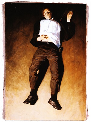 | 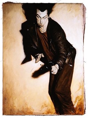 |
Image via StephenKing.com
Rick Berry was the master to Phil as apprentice. If you have heard of Volkan Baga apprenticing under Donato Giancola, it’s a similar situation.
In both cases, these are incredibly expressive figures, singling out figures to show thick brushstrokes showing tension in eerie portraits.
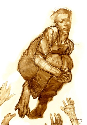 | 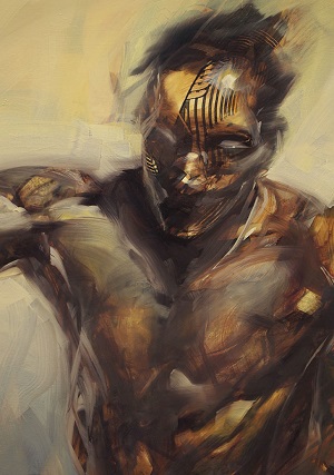 |
Jump and Puglist
Images via http://rickberrystudio.com
Here’s a masterpiece of color placement with composition.
It reminds me of one of my favorite blogs, People of Color in European Art History or as most people know it, medievalpoc.tumblr.com. From Balthazar and the Moors to all variety of depictions, it breaks down the barrier that art history courses may overly teach that paintings were of white people.
Rather, some of the best paintings use Chiaroscuro, meaning light and dark or high contrast. By showing two different skin colors, the painting can play with the background and margins to show movement between figures simply by lighting, letting the skin colors be anchors for your eyes to examine and dance about the piece.
Tyler here paints the vizier in clear detail, but lets the two snake guards fade into their respective light. We can nitpick about whether the mechanical Green snakes should be Black, and thus allusion to black guards as servants, breaking the one model of Amonkhet with mummies doing all servile work. Perhaps the snakes were supposed to be mechanically Black, to match their color originally.
Ultimately, it’s a beautiful work that builds off Tyler’s previous award-winning Exalted Angel by adding soft linen drapery to her vizier’s legs, giving us yellows upon greens and whites, matching the light sources and minimizing the color palette for shadow. Luckily it’s a legendary creature, making the replayability value high for this artwork to be seen outside the Standard format, serving as either a -1/-1 counter or snake commander. One would hope great art would be seen more, right?

Mountain by Chris Rahn
18x24” oil on masonite
Original is sold
https://twitter.com/RhysticStudies/status/849433177542324228
A public $5000+ basic land hasn’t happened since Noah Bradley’s paintings of the full art basic lands in Battle for Zendikar. For a massive painting, he definitely earned that paycheck.
A few things to note in this painting:
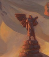
- This is a former civilization that was lost to the sands. Note the angel status there. Now, it could be male or female but with a mid-calf robe, I’m guessing male. So that means the angels there have been male the entire me.
- Notice the light source coming from a high upper left, which informs all the sand dunes. It’s also a cloudy, likely sandstormed day.
 |  |
Harmony.
Like a good song, or a freshly cleaned room. Everything is in its right place.
If there is an image that inspires godliness, with a strongly worded art description, it’s this piece. Art like this make the masterpiece series worth their weight. This is grounded in the plane, with an effect so simple, so clear, that it’s impossible to ignore. Water is diverted but since it’s water, it can be diverted back with a little effort.
If Enigma Drake was an odd art description choice, this is the opposite of a perfectly created scene that tells a simple story. It’s beautiful in its simplicity, which nods to Egyptian art. It was direct, to the point, like this art.
This art needs no explanation why it’s exceptional.
https://twitter.com/livingcardsmtg/status/849729347984302080
Where can one even start with the Palumbo brothers.
If you get them confused, Dave wears glasses, Tony is dating Winona Nelson.
They're both mega friendly when you meet them.
Their art is a bit different from each other and while I like Tony's work, Dave's piece here stands out.
This piece stands as exceptional for an idealized, incredible figure painted with thick brushstrokes, as if Dave is telling us "yeah, it's Egypt but I don't care, look at this magnificent man." He blocks in the color and darkens the floating obelisks at the top of the painting, drawing your eye upwards at this staff, at this triumphant moment. Again, they have a 2x3" box to put art in, having a strong movement effect is much, much harder than it appears.

Spring by Josu Hernaiz
Digital
Josu, a Chilean artist, is showing us what digital art means in 2017. He’s stretching the limited what an even smaller tiny art box can contain. This image gives us the lushness of the Luxa River, with allusion to both Egypt’s cataracts, mixed with some of Josu’s own heritage. Chile has a ton of waterfalls, and it takes a mere second to wonder if he intended for us to allude to the figure to a favela. Is this youth poor, in his training, gaining access to mana, representing the Spring? His lonely nature makes us wonder his place in the trials, with access to everything, including the time to bathe, for a moment, he may relish in the beauty. He surely cannot relish too long or the very real threat of being exiled or killed will take hold. He’s still training but he’s too young to complete the trials. We’re shown the process of training that isn’t with weapons but rather with calm, with visualizing in deep thought.
Were this made even a decade ago, it would be a revelation to come. As it stands now, it’s a lovely image that begs for Josu to show us more landscape pieces. He’s flexing his talent.
We see more of it, in Mind, the connected image.

Mind by Josu Hernaiz
Digital
Showing inspiration is hard. You can take the clear and obvious route like early art descriptions asked for, or you can go deeper, allow the player to build in the story.
 This image combines a few major things in one piece. Youth poses challenges for artists. Very rarely do artists get model reference for anyone that isn’t an adult, making musculature difficult. Josu had no problem painting it. Muscles are developing and even idealizing needs understating. Keeping realism prominent to capture the right feel, the right mood, is handling an unfamiliar subject. People painting elves often struggle with oversexuailzing reference to a child, making an elf feel over developed for the image shown. You’ll see a lot of it with fanart and artists painting without actual models. Good reference is hard, as using the same model is just so much easier than finding a variety of body forms.
Again, as I often stress, the easiest and cheapest, way to get reference is find a local college with a track team and hire them as models for reference painting. You can get giant discus throwers, stout sprinters, and nearly every idealized body form to choose from likely for pretty cheap if you get another artist or two to join you. Add in a womens team and people that look like they’re 15 or 25 all can be found with ease. Making $40-60 for a couple hours is a lot of money for students, but incredibly cheap for perfect reference.
 I’d love to see more of this softness in Magic. We get strife, aggression and war, but there exists a multitude of options that aren’t in a duel. It’s much harder to show brotherly love, compassion between men and camaraderie vs. antagonism. Toxic masculinity in its base form is easy to paint, and frankly hard to show without going full homoerotic. The card Start is close, yet has to balance with Finish, showing both the logical conclusion considering the Trial of Ambition but also, of course male teammates end up being at odds with each other. It’s painted quite nice, it’s the concept that makes Spring // Mind so notable.
Mind gives us fragility, a delicateness that should not be confused for weakness, only a moment of contemplation. It shows us the training and I’m happy art directors were able to bring it to us through Josu’s command of painting adolescence.
Overall, it’s a good set based on a real world culture. We can see the improvement that Kaladesh could’ve been, had it been a top-down designed set. While Egypt has fewer tropes that aren’t tired mummy related options, and stays entirely in antiquity, it stands as a beautiful looking set.
The temporary culture makes me think it’s the Arrested Development episode, The One Where They Build A House. They do build it, but it falls down nearly immediately. The facade of culture that Nicol Bolas severed, planning to hit a conclusion within three generations makes for creations to be painted over, recarved in the style of their new god. I struggled to find much other than destroyed cities. Even the missing three gods were obliterated visually from the plane.
I found a bunch of quick points, but still wonder about those male angels. Other than religious iconography, I don’t see the connection yet. It’s also the deepest I looked for this set and found nothing relatable to the archangels, yet. We’ll see their fate and importance soon. There aren’t enough kids to maintain this plane and how Wizards handles the continuity will be delightful to see.
—Mike


