Sometimes you need more than one writer for more than one flavor. For example, I’m a Lemonade Flavor plus Ice Tea Flavor equals Amazing Golf Pro Flavor. Even makes for a wonderful adult beverage when you’re Cubing.
Speaking of cubes, here’s a flavorful mix you should know about.
Enjoy today’s section of the Innistrad art review.
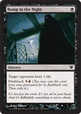
![]() – Sorcery
– Sorcery
MJS: I like it. It’s heavy-handed, but cute.
ML: It’s a trope. I love it. I’ve seen this exact image in Mimic. It was just on TV. I absolutely watched it.
This off-center view works. You’re likely in bed.
I guess the traditional vampire hindrance of not being able to enter homes without being invited in doesn’t apply in Innistrad. Write that down.
![]()
![]() – 4/4 – Creature – Human Werewolf
– 4/4 – Creature – Human Werewolf
MJS: I have died and gone to . . . wherever. There is an Asian woman in the Outcasts posse, and there’s also a black man! Woohoo. What I love the most, though, is that the black guy turns into—yep, you got it—a black wolf. And what do the Outcasts’ name change to? Yep! Won Tons. That’s flavor for you—the flavor of a light pork broth and tasty dumplings.
MJ: First, read the artist’s blog post here. Thanks, Randy.
I saw the race first—sure, it’s obvious. But what jumped out at me?
The glass!
In medieval Germany, glass blowers had to spin the glass and flatten it for windows. As they finished, the stick that held the glass would leave that circular “defect.” Germans called it putz glass, because no matter how many times you tried to clean it, it still looked dirty because of that imperfection. Good job researching, Randy.
There’s more to this wanton madness, and we’ll find out in time.
![]()
![]()
![]() – 3/3 – Creature – Vampire
– 3/3 – Creature – Vampire
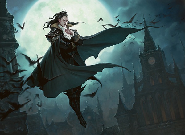
MJS: Looks like Lord of Illusion. I mean, seriously—it’s the same guy.
Perfect transition of the same background, but not identical. Chan zoomed in to the church, and it’s beautiful. I’d love to know which family of vampires this lord is from. Can we get a “Savor the Flavor” article on them? Please?

![]() – Sorcery
– Sorcery
MJS: I’ve said this before, but that guy is so dead, and I laugh at his fate. I think this piece rocks socks because of the darkness that’s incorporated, the textural elements, and the Street Fighter one-on-one duel action. Ready . . . fight!
ML: That’s a lot of green. This feels like a challenge from D&D art director Jon Schindehette from his ArtOrder website. The movement, the flow, and the mood of the piece feel very D&D to me. It’ll work in the horror set quite nicely.
![]()
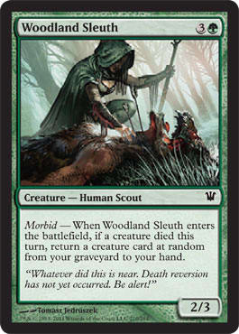
![]() – 2/3 – Creature – Human Scout
– 2/3 – Creature – Human Scout
MJS: Flavorwise, it sounds like she does more than sleuth. She brings back. There are arrows—presumably from humans—buried in this . . . zombie werewolf? Yet, she seems not to know who killed it? Or does she mean she doesn’t know who zombified it? Death reversion—is that a technical term?
ML: Seems pretty technical.
MJS: I’m not sure this all works together and makes sense, but I love the art. She’s hot and dressed fairly appropriately, and that corpse looks awesome without being disgusting. Is she bleeding onto his shoulder? Nice touch.
ML: High-resolution work, where are you?!
I love the subtle sexiness of the piece, but yes, MJ, it is confusing to me as well. When werewolves die, do they transform into a hybrid?
![]()
![]() – 3/4 – Creature – Human Rogue
– 3/4 – Creature – Human Rogue
ML: Nice fourth-wall break. Horror set with 20% more tropes! I can dig it.
Wayne’s a very accomplished artist, and so I can’t find a high-resolution image anywhere.
I like the angular, framed composition. The bars, the steel, the fire, and even the figures feel constituted and planned.
MJS: Oh yes, triplet wolf-lover dudes, I can get down with this.
![]()
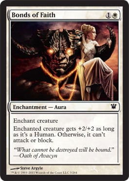
![]() – Enchantment – Aura
– Enchantment – Aura
MJS: I like the flavor synergy of the card, but I don’t care for this Gaga-Diablo take on King Kong.

Of course, it could also be interpreted as a pretty fun role reversal of this:

ML: What does “bound” mean?
![]() – 1/1 – Creature – Human Soldier
– 1/1 – Creature – Human Soldier
MJS: The name of this dude is so pathetic; why would I ever want to play him?
ML: Because Equipment on a 1/1 flyer seems good.
MJS: That said, the art is fantastic.
ML: Agreed.
MJS: The blithely marching bro has his destiny all laid out on the rock to his left, which he isn’t noticing. Not sure the lighting makes sense at all, but the drama is super-nice. I will forgive technicalities in favor of quality theatrics.
ML: I do love subtle aesthetics. Light equals spirit. So fresh and so clean, clean.
![]()
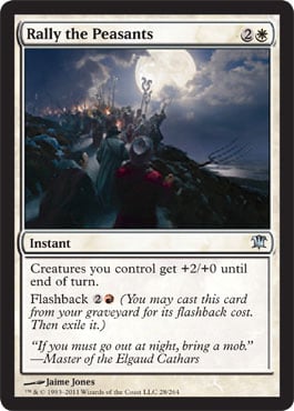
![]() – Instant
– Instant
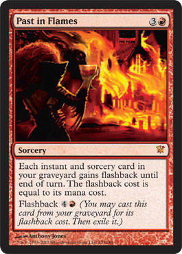
MJS: Spot-on. Marching under the blessing of the moon, with Avacyn’s symbols distinctly set against its white face. Requisite pitchfork, check. Torches, check.
ML: Fantastic top-down design, even down to the red Flashback cost indicating that passionate rage is required to reignite the spell. My only question: Who are they fighting?
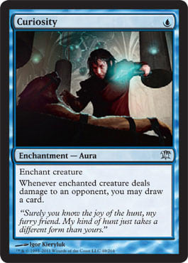
![]() – Enchantment – Aura
– Enchantment – Aura
MJS: Should have been called “Sadism.”
ML: It’s a reprint, MJ. But you made me laugh!
This breaks the game-within-the-game rule. So this human is branding? Casting an Aura on the werewolf—got it. But to gain knowledge, or power, or what have you, he has to allow the werewolf to go free and attack another planeswalker. Right?
How did he catch the werewolf?
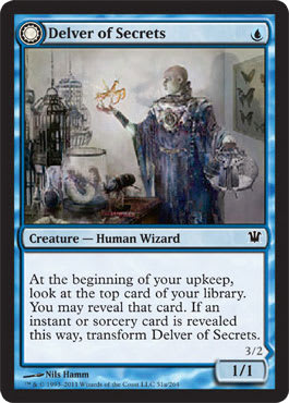
![]() – 1/1 – Creature – Human Wizard
– 1/1 – Creature – Human Wizard
MJS: I just . . . don’t like it. Mike?
ML: It’s in a similar vein to Ludevic’s Test Subject. The art is dirty and grimy, which I can get behind, but it can feel unrefined if taken too far. The human side works, but the insect dropped a little flat because of the lighting.
The cages are the connection, and they cannot be seen because of the light on the insect. We could go back and forth on whether a connection should be made and how, but the fact remains that creating easily recognizable cards is key to Limited formats. That fact cannot be ignored. It’s why we have art. Images resonate with us more clearly than words. Smells are even clearer, but that’ll be in the seventh state of design. Scratch-and-sniff bees . . . or zombies. Mmm, flavorful.
![]()
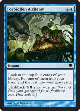
![]() – Instant
– Instant
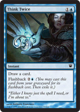
MJS: Sci-fi for my taste . . . is that a penguin in the jar back there? Now I’m sad! Morgan Freeman does not condone your experiments!
ML: I bet steampunk fans are buying up prints of this set in hordes. The detached lens on the figure is from Steampunk 101. (I only audited the class.) Here’s another Standard staple for the next year or so. Why is it forbidden? Is it really alchemy—taking one thing and making it into another? Technically, yes, but they aren’t making gold.
![]()
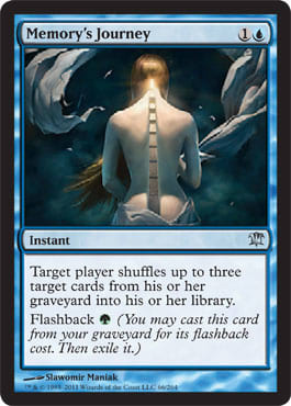
![]() – Instant
– Instant
MJS: Oh . . . big sexy. A risk taken and done well. Stairway to heaven, if you will. This has got to be a favorite for a lot of people. It’s just aesthetically stunning, and it illustrates what I told Mike earlier: Women do have a built-in thong. Born with it. Always there to lend a divide or pathway when you need it.
ML: Yes, MJ, they do.
Abstracted art in Innistrad: Check.
![]()
![]() – Instant
– Instant
MJS: Her hand looks big and flat to me.
ML: Yup.
MJS: Also, as I’ve said repeatedly: A woman going into battle should know to keep her hair back—unless she’s a planeswalker who can afford the mana to cast a gel-spell to keep it styled (ML: White spell: Hair Bind), or she’s an angel who travels with her own divine breeze that pushes all the wayward strands into place. Humans—it’s ponytail, bald, cropped, or braids! No exceptions.
ML: Another Constructed powerhouse that has some perspective-shifting.
![]()
![]() – Instant
– Instant
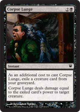
ML: What is that wood panel in the top-left? Is that a bar for the door to keep it closed? Gotta lock your doors, yo.
MJS: Sounds like . . . Postmortem Lunge. Wow, that Lucky Charms or Notre Dame spokesmodel sure looks surprised in this illustration! He’s after yer pot o’ gold, me friend—watch your, uh, back . . .

ML: I almost went to Notre Dame.
Maybe it was the hullabaloo over not enough cereal choices in the dorms or the touchdown-Jesus not shining down on their sports team enough anymore . . . .ah, hell. Avacyn is losing power? Have you seen the Irish sports teams lately? The story wrote itself.
Who is going to be the Rudy in Innistrad?
I’m on to you, Creative Team.

![]()
![]() – 2/2 – Creature – Vampire
– 2/2 – Creature – Vampire
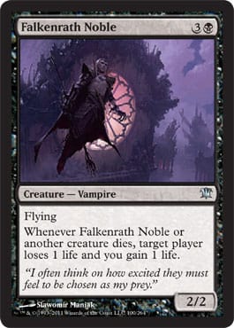
MJS: Purple background is well suited to this sultry fella.
ML: Purple is the regal color. You could have your guild license removed in Germany if you used a regal color without express consent from a king. They had official breweries, too. Ever been to Munich? Imagine the Dallas Cowboys. Yes, Texas equals Bavaria. They’re the largest states in their respective countries, and they feel like it.
MJS: He’s confident and good-looking, I’ll admit it. But he’s totally outdone by that gorgeous window and intriguing building in the background.
ML: It’s beyond Gothic and into the Baroque/Rococo style of over-ornamentalism. This got me thinking—are they in their vampire stronghold? They must be.
![]()
![]() – Sorcery
– Sorcery
MJS: Weird . . . weird-looking? . . . I don’t know what to say. The art doesn’t seem to match the card much, at all.
ML: All right. She’s an heir, then? Is “sever” the right word for falling into a hole?
I’m really confused about how killing one woman could mean that an entire family disappears. What was the original card? Did it just kill one person? Why not wipe out an army of oozes or similar-looking zombies? There appears to be a story here, and I’d love to hear it.
![]()
![]() – 1/2 – Creature – Wolf
– 1/2 – Creature – Wolf
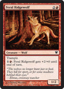
MJS: This wolf looks and is acting feral. Nice job, Martina Pilcerova! The red haze coloring the picture makes us feel that we’re another mad-eyed wolf, looking at this scene with bloodlust-dimmed sight.
ML: This is a perfect usage of color saturation. If you use too much blue or green, it can feel forced. In this case, in the autumnal woods of Kessig, it hits right on.
I do seem to be staring at the neck and head of the wolf. The neck hair is standing on end, and the expansion seems out of place. But watch a larger dog bark—it’s spot-on. Deliciously flavorful.
![]() – Instant
– Instant
MJS: Oh, I get it, there’s a skull face in the sword fire! This is neato art, but the card itself just really makes me want a Geistning Bolt.
ML: Diablo II! Bone spirit 2.0? Those pesky necromancers always spamming up the servers.
I love the interplay between not wanting to be raised as a zombie and taking full advantage of geists. Sure, the idea has been used before, but it’s freshly used in the block. I hope the future sets really unravel the interactions that geists and humans have in everyday life.
![]()
![]() – Sorcery
– Sorcery
MJS: I’m venturing a guess that that’s Miss Voldaren featured?
ML: Well, it ain’t Lyzolda.
Odd that vampires would like fire. Everyone loves a fire show, true, but wouldn’t that diminish their “food”? You can’t kill everyone. Maybe she’s like a mob boss. “Don’t you fight back, ya hear? Huh?! Do something.”
![]()
![]() – 2/3 – Creature – Human Advisor
– 2/3 – Creature – Human Advisor
MJS: Terese does such beautiful work. I would bet money that guy is a closet vampire, though.
ML: I want this in high resolution.
Another case where I’d love a designated day for artists to release their work. Artists might not want to release every card on their blogs or DeviantArt pages, but having a “go” or “no-go” e-mail or date would be awesome. I know art directors are busy, but it’d be a great delegation duty to a support person in creative, branding, or marketing.
The Avacynian symbol reminds me of big German pretzels. I hope they make those pretzels in Thraben. Can we get soft pretzels in the symbol at every GP this year? That’d be awesome.
![]()
![]() – Sorcery
– Sorcery
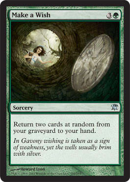
MJS: Reminiscent of the infamous upward view in The Ring, this picture rocks. This is in the top three of my favorites from the set. The storminess of the weather behind the girl, her serious expression, and the detail on the coin get me all worked up. She should have been wearing a cloak, but kids run out all the time without the proper attire.
ML: German folklore? German folklore. My father did his masters thesis on German folklore, and this absolutely fits the ominous tones they enjoy.
The card has a great use of perspective and great flavor text. Top-down design integration wins again.
![]()
![]() – Sorcery
– Sorcery
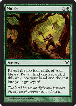
MJS: Such a true statement. We’re all dirt, eventually. Not sure that the illustration matches very well. Where’s he mulching? Is there a grave somewhere? I see orderly rows of vegetable and a busy tree-cutter.
ML: Yup.
Great usage in an all-land deck.
Love the fairytale-looking art. Remember—not all horror is scary. You need an ebb and a flow.
![]()
![]() – Enchantment
– Enchantment
ML: Abstracted art #2.
MJS: Different and cool. If I were to get a tramp stamp during my impending midlife crisis, I’d get this. I also like that it brings this classic to mind:

ML: Do all abstracted art pieces need flavor text?
Does it lessen the power of the image?
![]() – 2/3 – Artifact Creature – Scarecrow
– 2/3 – Artifact Creature – Scarecrow
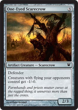
MJS: Haha! I love him! Right, he can’t attack—he’s tied to that infrastructure. He weakens the aggression of flying creatures . . . and that glowing, luxuriously shabby art is fantastic!
ML: Gorgeous, gorgeous use of light. Scarecrows and autumn go together like ham and cheese. The scarecrow tribe felt odd to me the first time around, but in a horror block, especially one with curses and shamanistic paganism, they flow directly into the set’s flavor.
The house is a little large for a farmhouse (I grew up in a rural area), but maybe a large Roman Catholic family lives there. You need a lot of hands to tend a field, and that scarecrow wouldn’t be at the edge—he’s either in the middle or in the middle of the first quarter of the field. So, the house works. Just something to think about.
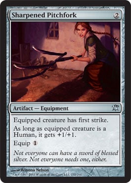
![]() – Artifact – Equipment
– Artifact – Equipment
ML: Don’t poke my eye!
MJS: She’s gonna stick ya. I like this gal, but my critique is that the attention falls on her rather than the subject, which is, of course, the pitchfork. In other words, she’s an actress and not a model.
ML: Models shouldn’t be the focus in fashion shows, either, but when they’re awkward or need to eat a sammich, I’m gonna point it out.
She’s such a stereotypical German farmer: beautiful and simple, but aggressive and headstrong.
This reinforces my view from the cleaver: technical item with killing ability.
![]() – Artifact
– Artifact
MJS: John Avon land in a nonland card! Simple and effective.
ML: Go, John, go.
Who cast this? What magic still works that strong?
I love John’s background; it’s a perfect fit. Is this the edge of Kessig on the border of Stensia? I’d venture a guess that it is.
![]()
![]() – */* – Creature – Elemental
– */* – Creature – Elemental
MJS: I wanna play me some of this dude. I wish I could see his face. He does look rather humanoid for an elemental—sort of downsized. Make it female, and like that chick in The Grudge, and it would be ridiculous. This guy is just too unassuming, in my mind.
ML: A female in a traditionally male role would’ve been awesome.
I do wonder why Avacynian priests would allow such ornamental and large tombstones while knowing that many of these humans will become zombies anyway. It’s not like people can visit the tombs, because, well, there are elementals like Splinterfright.
![]()
![]()
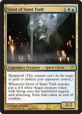
![]() – 2/2 – Legendary Creature – Spirit Cleric
– 2/2 – Legendary Creature – Spirit Cleric
MJS: Splashy candles. Overall, the piece looks to be on the computery side to me.
ML: There are seventeen mythics in Innistrad. Does this feel like a Legendary, mythic creature? Well, it’s trying to find a home in more than one Tier 1 deck, so I’d assume so.
I love the candle usage and the almost photographic quality of the saint—aspects that force me to look at the piece very closely. Why can’t photographs, being slightly stylized, fit in fantasy art? If it fits the aesthetic, put it in. Digital art usually is what it is, but this is subtle; it takes a medium and pushes it ever so slowly.
I also had a flashback to seeing my grandmother working at the church across the street in Freeport, Minnesota (Lake Woebegone, if you will), and seeing antique photographs on the walls of the refectory. Eerie, but it made me smile.
![]()
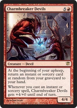
![]() – 4/4 – Creature – Devil
– 4/4 – Creature – Devil
MJS: Ah, the goblins of Innistrad at play . . . I appreciate the glee in this piece.
ML: Why u no keep anything?! Chaos is what it is, I guess. Good light integration on the back-right devil; it integrates into the background to prevent things from being flat.
ML: We keep mentioning the flatness of pieces. I’m going to get more into this.

In older cartoons, they painted the backgrounds, and only the characters and props were actually animated. It’s faster and cheaper. Lilo and Stitch used that old technique.
That’s good and fine in the past, but when you don’t integrate any artwork in a moving medium, it looks wicked-cheesy today. Digital artists, keep this in mind. Every layer has to blend with the one below it. Lighting is so important when you splice things together. Collages are flat, and award-winning fantasy art isn’t.
![]()
![]() – 2/3 – Creature – Human Werewolf
– 2/3 – Creature – Human Werewolf
MJS: Do not like the biohazard suits of Estwald.
ML: It’s cold, yo.
MJS: The flavor text on the Howlpack side made me laugh, though.
ML: Vorthos connections: Where the best part is the taste.
Great usage of weather differences while keeping the same subtle background.
“Ostwald” would be German for some sort of Eastern forest village.
![]()
![]()
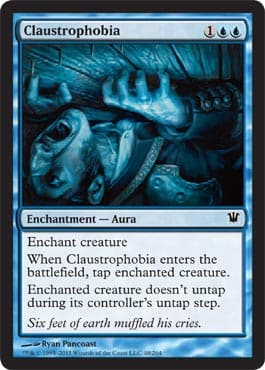
![]() – Enchantment – Aura
– Enchantment – Aura
MJS: The perspective and the palette here make me feel the lack of space. He really needs to do like Uma Thurman did in Kill Bill and show that pine box what’s up.
ML: Come at me, Pai Mei.
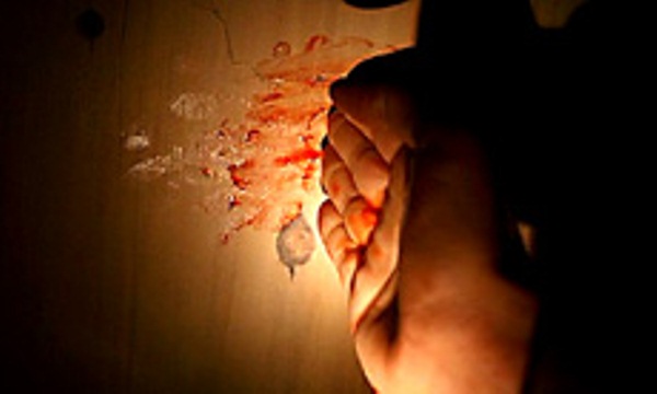
ML: Looks like his ring isn’t helping much.
![]()
![]() – Instant
– Instant
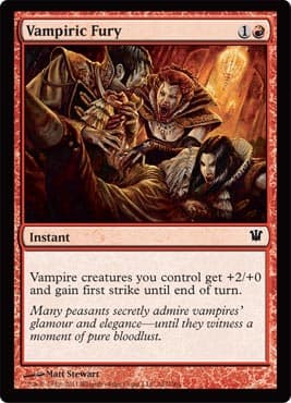
MJS: As a close personal friend of Sorin, I have to say on his behalf that I object to that white-haired fellow who’s a Sorin doppelganger. Sorin does not participate in such orgiastic feedings. Look—there are no napkins with which Sorin could wipe his face. I don’t like the word choice (“fury” seems like the wrong adjective) with this picture. The flavor text talks about bloodlust, which is different than fury. Sloppy drunks is what these vamps are. It’s very Interview, yes?
ML: Louis would not approve. It does create the culture of red vampires, though. They’re young, rash, stupid, and unrefined. Elder vampires hate them, which is odd, considering that the opposite was true in Interview with a Vampire. If more vampires get flying in later sets, this will be a blowout Overrun in red.
![]()
![]() – Enchantment
– Enchantment
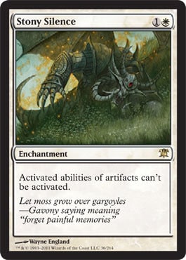
MJS: Mike, the gargoyle fell down!!!
ML: Plus 1 Vorthos point for MJ.
I hope this gets an alternate art in the future, because this card will be relevant for a long, long time, and people will forget about Innistrad before they’ll forget about the white Null Rod. It hurts me to say it, too. It’s a sad thing, but most serious tournament players won’t keep up with storylines for decades, and the art will seem out of place in a vacuum.
![]()
![]() – 0/0 – Creature – Zombie
– 0/0 – Creature – Zombie
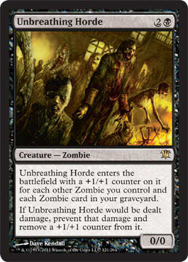
MJS: Sexy and interesting. What is that female doing on the right? She looks like she has something to do even after death. Must have been a mom. If you haven’t seen the Japanese movie Tampopo (Dandelion), rent it. It’s about food lust. And in one vignette, a mom rises from the dead because her family needs dinner. Hilarious and poignant.
ML: Another off-center art. So many of these in this set.
Gawwwwd, MJ. I can’t unsee that.
I like me some zombie hordes; they never roll alone.
![]()
![]() – Enchantment
– Enchantment
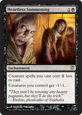
MJS: Funny! That guy in the front looks just like our local sake distributor.
ML: It is him. Most of Portland is filled with zombies—true story.
Considering they’re dead, their clothes are in great shape. If I were a wealthy ghoulcaller, I’d want to church up my horde. I gotta compete with my other ghoulcallers. How else am I going to get haters?
Nephalia’s a funny place. Must be an ugly place if they’re having pageants. Miss America ones with talent segments, I hope, and not the creepy little-kid pageants.
![]()
![]() – 1/5 – Creature – Human Warrior Werewolf
– 1/5 – Creature – Human Warrior Werewolf
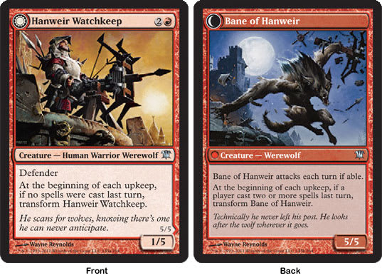
MJS: These are fine; I like the dynamic pose of the werewolf. I assume he’s holding the crossbow mostly to reference the Watchkeep side . . . but if that is the same weapon that was mounted on the battlement, that transformation resulted in a huge werewolf. The same problem I had with Gatstaf Shepherd comes back to haunt me on this one—does he attack his own castle when he transforms? Do the citizens not know? Who is he a bane to—intruders, or his own people?
ML: How large is this art? You can barely see the tower on the left or the castle on the lower right. I want to see the originals of these, because they’ll deepen that flavor considerably. This guy and the Thraben watchmen are probably friends.
![]()
![]() – 6/9 – Creature – Zombie Giant
– 6/9 – Creature – Zombie Giant
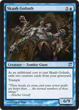
MJS: This is a zombie giant I can like. He’s silly. All his faces look enthused about bashing; it’s believable, and his pretty, gold-plated, cheerleader-length skirt is so ornate that it’s at odds with his ugly stitching. It’s comical.
ML: Like Glee’s cheerleading skirts?

ML: The perspective here is a little weird, but the thing is huge—we should be looking up to it. I just wonder why we’re not on the human’s perspective level.
Tune in tomorrow for . . . Vorthos Tuesday! Okay, not really, but we are bringing a little Vorthos flavor with our second-to-last installment of the Innistrad art review. See you then!


