Heads up, this is an art terminology article.
It's prohibitively elitist, yet exciting, for me to learn, after all these years, that fans of the game don't know what is meant when talking about artist sketches. I was asked what a tonal sketch was this past weekend, so I scrapped my previous article and started working on this. Of course, some amount of confusion is to be expected since what a sketch is changes from artist to artist; however, if you're looking to pick up a sketch from an artist, being precise isn't entirely necessary. So, for anyone interested in the world of artist sketches, this article is for you.
Enjoy!
Thumbnail Sketch
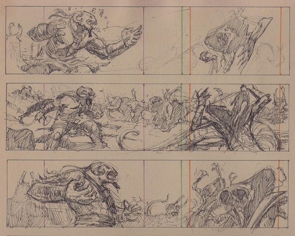
During the first idea generation phase, artists will go right to their sketch book and, at the size of a thumbnail, make rough sketches on to plot out what they want to create. There are generally no fewer than three sketches at this stage. Some artists turn those over to art directors for approval before beginning work toward a finished piece. Below, due to the odd framing, Lucas Graciano played with compositions for his giant diptych painting of Insult // Injury before even going to pencils.
Noah also loves making a ton of them for any Magic painting he does.
https://twitter.com/noahbradley/status/815631455552409600
Working Roughs
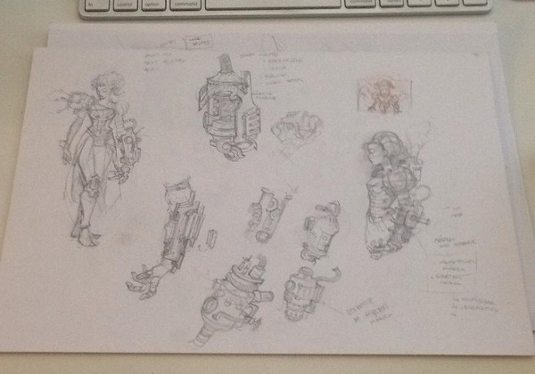
I don't have great term for the "Leonardo DaVinci" sketchbook pages, though I have heard the term "working roughs" used. These sketches usually exist in pencil, and occasionally ink, and serve to show how things work in the world of the artwork. Brainstorm, shown below, by Will Murai is a great example.
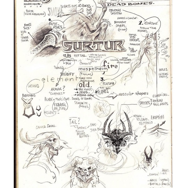
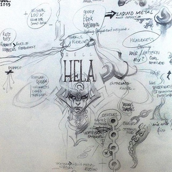
These would also include the thought process roughs that Aleksi Briclot makes as well. He made the following "mind maps" of Hela and Surtur for Thor: Ragnorok.
Pencil Sketch
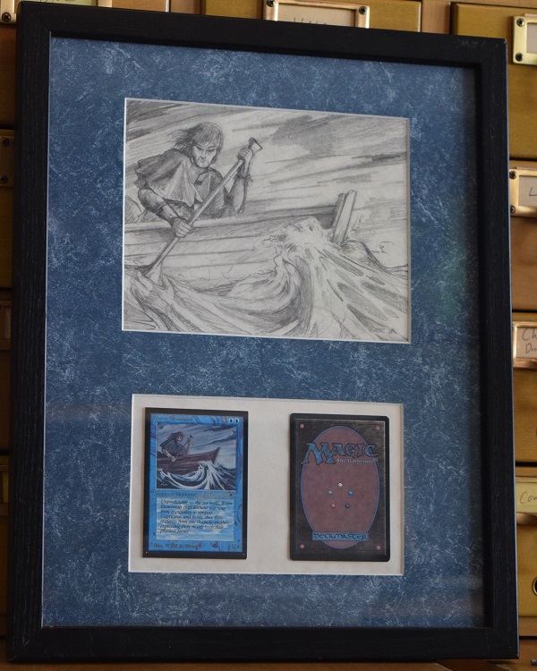
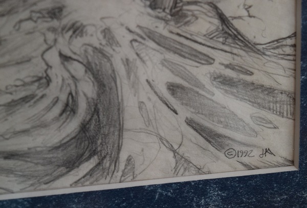
When collectors ask an artist if they have the original sketch for a piece, this is generally what they mean. Most sketches are in pencil, details are all there, though some lines to show depth aren't fully clear. The composition is shown clearly and artists tend to turn this into art directors at sketch stage.
Tonal Sketch
Popularized by Donato Giancola, shown below with his three tonal sketches of the Grand Prix promo lands, these show the darkest darks and lightest lights of a piece. Christopher Burdett also makes sketches like this for Magic. The sketches below are made with watercolor pencil and chalk and are 8" x 24" in size.
 |
 |
 |
Value Study
Value studies are similar to tonal sketches, though the terminology differs.
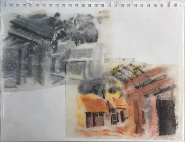
When you see a black and white photo, the shades of gray are the different values within the painting. Value is how light or dark a color is. For example, look at this value study of An-Havva Township by Liz Danforth.
Recently, I covered the difference between a tint, tone and shade. Tint is when you add white, tone is how much gray, and shades show how much black is in a piece.
Transfer drawing/Transfer sketch
Direct from Jeff Menges from a past interview I did in 2011:
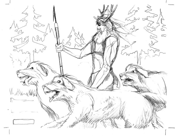
Jeff has a sold a few since then, like Master of the Hunt, shown below.
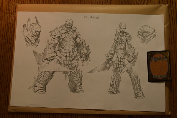
Concept Art
Wizards brings in a group of artists before each block, over a year in advance, to sit in a room for a week to a few weeks, and they pound out the visual look and feel of a plane. It's called the concept push, and some artists stay the whole time, and others only get brought in to work on one thing. Folks who work and think fast are valued, like Wayne Reynolds, who worked on New Phyrexia's concept art push. The information gathered there then informs and become the style guide that commissioned artists get to when producing art for each set.
Until a few years ago, concept art never left the Wizards office . . . until I started asking. Artists then got their concept art back and some started selling it. They tend to be pencil only, with a fully traditionally painted piece being exceptionally rare. 99% of it is pencil drawings with one or more figures, often with simple descriptions and helmet on/off perspectives. This is the art I largely collect, on a personal note.
Color rough/sketch/study
These terms are all used interchangeably by artists. The pieces of Deadeye Harpooner by Ryan Pancoast below are 5x7" each and are oil on canvas board. I would call those color roughs, as they block in color for the piece.
 |
 |
 |
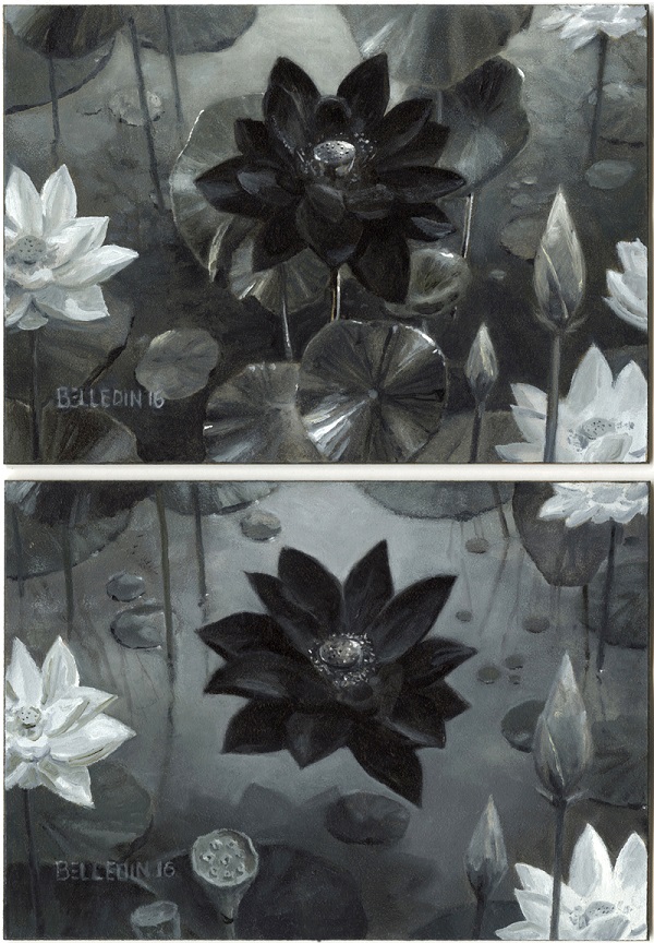
Color Sketch
When I hear color sketch, I think of Steve Belledin's promo Black Lotus card artwork. It has everything the final piece will have, and often they're just a small size with fewer colors. David Palumbo also makes color sketches, though his skew closer toward tonal sketches with using the color red.
Color Study
Digital artists will sometimes paint an unfinished painting only to revise it digitally. I would call those pieces color studies. I own the Magic Online promo of Reflecting Pool by Pete Mohrbacher, shown below. Maybe one day it'll see print on physical cards, though perhaps not. In any case, it's a fun piece.
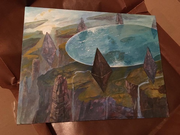
Notice how he has the general colors, shapes and composition in place. He can then edit, shift and finalize his thoughts in the digital space while still having a unique offering that he can sell in the secondary market.
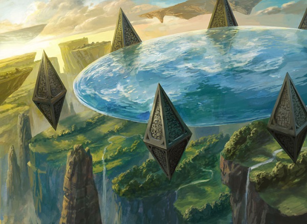
His final digital painting is shown below.
Again, Noah has a good example as well:
https://twitter.com/noahbradley/status/639025007662919681
Underpainting
If you see the unstoppable Howard Lyon or Ryan Pancoast mention an underpainting, it's basically a color study except with one major difference. An underpainting is any sketch where paint has dried and is painted upon again. That's really all it is.
The more technical term is a monochrome version of the final painting that fixes the composition, gives volume and substance to the forms, and distribute darks and lights in order to create the effect of illumination. Though, that's far from uniform. In the Renaissance, this was called "dead coloring."
An underpainting is generally temporary. They're often in warm earth tones like Pancoast's process video, shown below of Sparring Mummy.
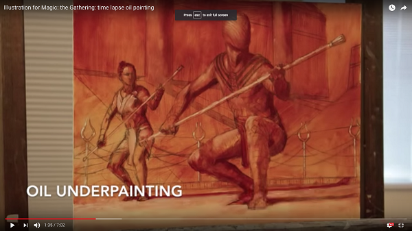
Sometimes artists make underpaintings in one color, and in other cases, they're a variety of colors. Artists can scrap a painting at this stage, though it's fairly rare for Magic.
Painting
This is obviously a finished acrylic, oil, or a variety of other mediums, painting.
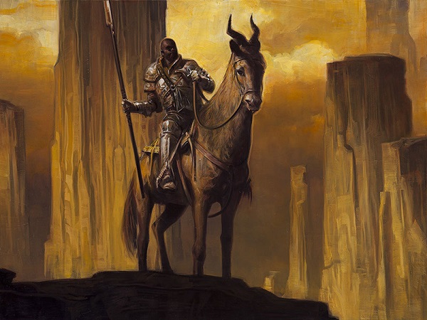
Makindi Patrol by David Palumbo
12x16 inches, oil on panel, 2014
From the Magic: The Gathering: Battle for Zendikar expansion set. For sale on his website.
Painting -- Digital Edits
There are a few cases where a sketch is approved, and the final painting needs a change after the painting is finished. Very often, an artist will photograph the painting or scan it and then edit it in Photoshop. The final is then sent to Wizards and everyone is happy. The card Switcheroo is famously a green, not red, dragon in the physical painting.
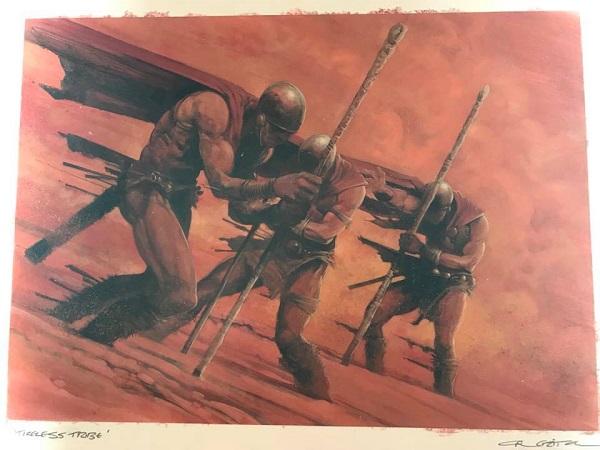
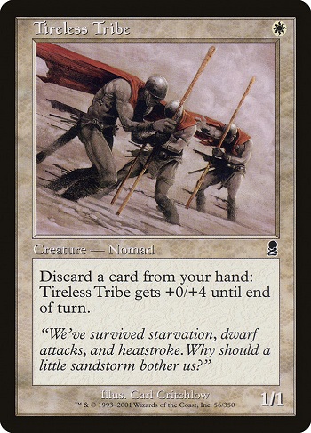
While the color study for Reflecting Pool I own could fit into this category, the better example is a finished painting that could be edited, like Tireless Tribe by Carl Critchlow. It was originally red and then edited in Photoshop to fit the White card.
Painting -- Cropped
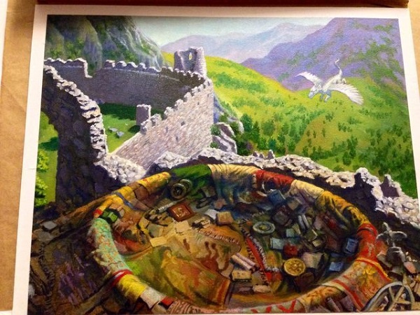
There is a small group of card artworks that were cropped significantly in the past. It's quite rare in the past few years and in the thousands of cards in Magic, I've only seen a handful. Here's my favorite example, Treva's Ruins by Jerry Tiritilli.
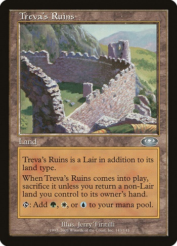
The original contains a lot more content, including a dragon and a nest that was cropped out.
Of course, variations and nuances change for every artist, but I hope this helps clear up some questions about what, exactly, is in a sketch.
--Mike


