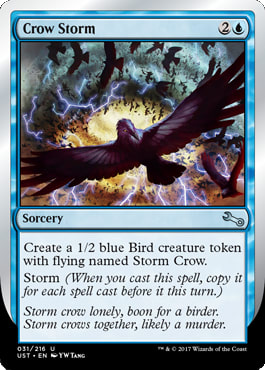
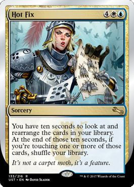
What is whimsy?
What does that even mean?
You know it when you see it, but do you?
You know it when you see it because children's literature, and formative experiences as children have informed you when you experience it. But, I ask you, can you say what is or what isn't whimsical? When does it not count?
When is something whimsical or not? It is in a word, nonsense.
Whimsy is a silliness mixed with optimism.
But what does the sense, or nonsense, mean in context?
To define what whimsy is in art, we look at what it isn't. Using the Heinrich W�lfflin concept of art history of comparing two images side by side, let us look at something that is whimsy, and something that isn't:
 |  |
| Buffalo City County Building
Via Reddit | House from Oh, the Places You'll Go!
Via Seuss.wikia.com |
While choosing a Dr. Seuss architectural structure may seem like cherry picking an obvious choice, showing a very popular and well-known American artist is resonant and known.
It's obvious, isn't it?
I'm comparing these two images because one is very well known. Dr. Seuss is a quintessential experience for young children in elementary school. His whimsical artworks have become a shorthand for kids literature, imagination and uninhibited fun. I am contrasting that with the architectural style of brutalism.
If there is anything as far as physically possible from whimsy, it is this style. It's denotes bureaucracy, it feels like structure. It's dull and imposing but it's also strong, unwavering.
It also feels more evil, doesn't it?
The lack of color in Brutalism itself and being parodied by Saturday morning cartoon evil villains both play a role. Even in Magic, we can see the starkness. While white is often the "good" color, look how in Kamigawa, the Eiganjo Castle is shown as what it is, arguably evil. (Kamigawa flipped the color pie you're used to: white was evil and black was good) Let us compare that to any of the Secret Base cards, and the whimsical nature is participatory, and not evil.
Historically, whimsy hasn't had a strong association with happiness or optimism. It connected itself to randomness and chaos. And that is how I will transition to the start of this article, explaining art and the Un- sets from a base in surrealism.
Chronology
I am skipping ahead to the 19th century because whimsy has lasted for thousands of years, from graffiti on cave paintings to carvings of names and humor into Roman columns themselves, but a thorough exploration of that history would require more pages than I have your attention span.
We haven't the time to discuss the whimsical nature of bored medieval monks who would have to hand transcribe illuminated manuscripts and religious documents, adding whimsical creatures or scenes in the margins, like the Book of Kells. The monks would break up the monotony, hand cramps and long hours with doodles with whimsical creatures, curses, commentary or translation suggestions as they see fit. As these became more common, you would simply see them more often in major texts, with animals to match. From visiting the Hill Museum and Manuscript Library often as a teenager before St. John's football games, my father and brother's alma mater, I saw first-hand countless examples of these.
You thought Unhinged had butt jokes? You have no idea.

From Dante's Inferno, Commedia, Inferno XXI, 139 via Reaccions Medievals
You may not know this, but if you spent ten minutes on Discarding Images on Tumblr, you'd see what I mean about bored monks. Consider it a norm for a few hundred years until news became standardized, cheap and fast with movable type becoming commonplace as we moved into the 1500s, the "end" of the medieval time period.
Instead of covering everything at an inch deep and a mile wide, we are starting with 19th century literature to explain how it has impacted our sets, how whimsy is depicted, and to squash the myth that Dali is the quintessential example. For our common cultural thought did not start with art; it started with literature.
Carroll and You -- 1800s
What is a Whangdoodle?
It's a thing, a gadget, a "doodle-hopper" as my father struggled to remember the English word when he meant for a teenage Mike to hand him the remote.
Lewis Carroll blended the idea of whimsical things in fantasy escapism with fairytales where they were approachable. He was much more than just Alice in Wonderland. While the Grimm brothers documented German fairy tales nearly fifty years earlier, Carroll actually wrote his, not merely documenting what was already around in folklore. His story acted more like a fractured fairytale, common these days but back then fairy tales served a purpose to teach morality to kids, trying eliminate bad behaviors. You didn't comb your hair? You'll probably be eaten by a witch or cooked into a pie.
His story was a basis for countless other stories and broke down what was considered a norm in storytelling. It served little "practical" purpose.
Surrealism, Whimsy and You - 1900s
At the same time, during the mid 1800s and into the early 1900s, artists were deconstructing and breaking down what was considered art. When Da Vinci already existed, and neo-classical style looked back to Romans and Greek for an ideal time in art, writers and artists began to explore what art meant. Perfect human sculpture or paintings were no longer a goal. That ideal was already done.

Enduring Ideal by Daren Bader
They broke the model in doing free association, free writing, where a pencil would be held and simple movements would slowly turn into something, whether it be one person writing a word and passing it to the next writer and they'd write a word,passing it on to create sentences and so on. Think of it like Mad Libs, except more experimental and nothing like it had ever been done before. It was revolutionary for writers, and they would not accept two-dimensional artists because they thought art was too structured and could not handle the free association of a surrealist or work with dreams as inspiration. They were classically trained, the artists, and as such could not disassociate from the training, thought the writers.

Browse by Phil Foglio
Surrealism is an artistic attempt to bridge reality and the imagination, and it feasted on the unconscious. It began in Paris in the 1920s and lasted until the 1940s, when World War II put a damper on the movement. Andr� Breton wrote the Surrealist Manifesto as a push back against the way art was understood. You have to remember that after World War I, art was controlled by politics. By having supported art, it was used as a means to maintain order and keep revolutions at bay. Surrealists pushed back on the barriers, the restraints on art, and did so in a positive, optimistic way. To free the art, it was to begin healing the wounds of World War I. Their timing was also, in a word, terrible. World War II was coming. So, to escape persecution, many surrealists moved to the USA.

Persecute Artist by Rebecca Guay
Surrealism is strange and shocking and forces people out of their comfort zone.
It's very complex, but a there are a few thing that characterize literature and art:
- unreal or bizarre stories full of juxtapositions. It expands the reader or viewer's reality and makes new connections, previously unknown.
- They use free association from Freud, to unhinge people from societal influences.
- They use symbols and metaphor to get viewers to think deeper.
- Subconscious meaning. There often is no "meaning" or "plot", but rather a focus on characters, discovery, imagery, or emotion. You are to analyze and form your own meaning.
- Instead of linear understanding, it is free association.
After that quick Art 101 lesson on surrealism, let's steer us toward the Un- sets and run downhill.
Dr Seuss -- mid 1900s
As a rather private interview, Theodor Seuss Geisel did not talk openly about his influences, giving us near zero insight into what influenced the whimsical creator. But what we can understand is that Dr Seuss was a visual artist and spent time in Paris producing surrealistic paintings with contemporaries like Salvador Dali and Paul Klee, and it's not hard to see such surrealist influences in his illustrations.
Look at the images below and compare/contrast their views on weight, whether a tiny train supported by a raised track, a staircase that's impossibly small, or braces to keep forms from falling over. Those themes of dream-like realities tie them together, despite their symbols, narrative, and intention being wildly different.

Tower of Babel by Dr Seuss

The Burning Giraffe by Salvador Dali
The animal is on fire, but somehow, in this dream-like state, things seem less dire. There is a future, despite that it may be odd.
To Now
These days, what we look for in whimsy is generally film and television. Things like Willy Wonka, Tim Burton films, or the TV show Face-Off with a whimsy challenge. The concept of whimsy has a wide ranging applicability to a wider audience. Perhaps the children's literature stranglehold on the idea makes it a universal concept in that everyone has experienced it as a child, making it relatable and safe for TV executives.
Film is where we see a lot of these themes of showing a dream like state of whimsy. Whereas we see one side with "The Cell", directed by Tarsem Singh and costumes designed by Eiko Ishioka, using incredible surrealism to explain a serial killer:
We don't get the optimism of whimsy. That's where Tim Burton movies like Beetlejuice, Sweeney Todd, or Edward Scissorhands shine in their absurdity. What unifies the work is the good intentions, the optimism shown in the latter three movies. It's just so silly, it's hard to be scared or challenged. It has separated the surrealism camp from what it was originally intended to do, and what the only byproduct we have in 2017 to get us through: escapism, optimism, and humor. Basically, whimsy.
Face Off, Season 6 had a challenge where "Burtonesque" was a theme. It's almost like drawers were taken directly from Burton, directly from Dali.

How this relates to Magic is as follows:
Fine art has no such overseer. Sure, there were patrons from the Catholic Church to the Medici family, but artists could deviate as they saw fit, as long as the final goal was fulfilled. As Magic has had more clearly defined worlds, branded style guides and a clearer vision of what they want, the lack of fun people are missing is the space of whimsy, easily missed by no Foglios making art anymore.
The Foglios
It is often requested that The Magic Man Sam do an artist study on the Foglios. I suspect he questions how to tackle the subject, as he would need to explain how they fit into the game that was far from uniform at the time; and how do you reconcile what you thought they made when you only remember some of their art?
This is how most people relate to their art. It was playful, yet had no light source. The emotional gag was the card, rather than the quality itself. It was easy to understand, to grok.
 |  |
 |  |
This is what art directors strove for from the Foglios, complex pieces that were open-ended masterpieces of narrative. The former cannot exist anymore in a mega worldwide brand. These however, still can.
 |  |
 |  |
As you attempt to prove wrong the good vs. marginal Foglios, look for the shortcuts in a character design in Runed Arch, or large brushstrokes that are unfinished in Redwood Treefolk. Those artworks were a product of the time, but they were also necessary to see what could happen when open-ended descriptions were made, like Renewal, an utterly beautiful work. The intentionality isn't there, making whimsy a gag, not a planned surrealistic escape or optimistic concept during a card game duel. When there was no correct, there was often a better created piece and a rushed job in the same set. That was allowed then. These days, you'd commission the person to fewer cards and raise the bar for quality.
This raising of the bar brings us to the whimsical Un- sets.
The Un- Sets
The Un- sets will always be judged on how beautiful the full art lands are, which help sell the sets. That barrier cannot be diminished as a driving marketing strategy for the set. Without the gimmick, the entire set does not reinforce the norm of trading card game, especially with the inability to use silver border cards in any of your other decks.
But that investment in lands also allows ideas to flourish, the real reason behind the sets.
I disliked the Un- sets because artists couldn't sell their paintings. I now see the set itself isn't the triumphant part, it's the ability to control the chaos of R&D, test boundaries of printing processes, and nourish internal staff idea generation without anyone noticing the testing as obtrusive if some things fail. They are future expansion set prototypes, with flavor layered atop them.
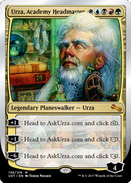
For the first foremost example, how strange is blurring the line between fantastic duel and the real world by integrating a website into the game? While both are fun and give additional experiences, the first example wasn't updated and no longer works. Will the required Urza have it in ten or more years? Does that matter or will there be a workaround? The hypothesis worked, but the payoff didn't meet the expectation of fun, so they upped the ante. You are now forced to separate your mind from cardboard and enter chaos itself. No free associating surrealist writer could argue with that.
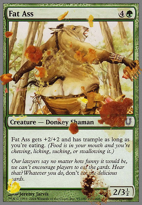
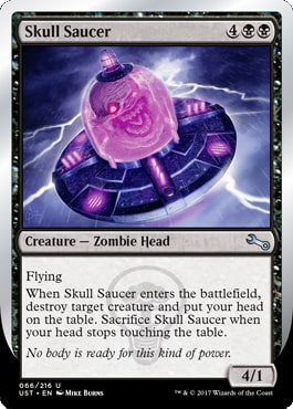
You have to respect that designers are pushing boundaries and we do have to hold them to high standards when it comes to a diverse fan base. What if someone has an eating disorder, or needs a special diet, or can't eat for a variety of health reasons? A five-drop 2/3.5 feels a lot less fun. Imagine you're in a wheelchair trying to play Skull Saucer. Sure, players will work around it, but the designs, while well-intentioned, could be another test that wouldn't create feel-bad experiences. That can be part of the untested, un- feeling creations, sure, but it can be chocolate and peanut butter without killing the kid's experience with the peanut allergy. Given that we've only had three iterations, of course there are still many things to smooth out and experiment with first.
Unglued
The original Un- set was whimsy. It showed all the ideas that Magic couldn't do in a normal set. Trading card games in the mid to late 1990s were playing with foiling, trying to incorporate ultra uniqueness and had sport cards with pieces of actual game-worn jerseys as precedent. Seeing a Magic card need two-cards to cast was incredible. Expanding your reality is a linear connection from 20th century art to a card game. It may not seem like it be, but it do.
 |  |
Catering to different fans, which they knew played the game, was fully shown in Unglued. And for the enfranchised player, Unglued gave fan service, with a ridiculous cost that was diametrically opposed to what one could do to a real lotus. 4 mana though!
Affecting other cards, announcing a card early, something you'd never do or think of, was introduced early on. It's all a bit quaint now, though much of the early post-modernism art seems obvious too now in comparison.
Though, I still hear of folks in cube that "won't do that thing" or "won't call that urinal a sculpture." Those are good interactions.
Unhinged
It's hard to understand what exactly made Unhinged whimsical. Some of the art is playful and downright silly, but is there whimsy? Drafting the set and playing the set is a lot different than the nostalgia of people remembering the set. It had new effects, which was great, like Booster Tutor, which is still played heavily in the Cube draft format.
This set delivered on some aspects, though it was too conscious of the design process, a bit too self-aware, similar to the Minions franchise, to be as successful as they could've. They also overprinted, meaning it had to be a rousing success, though there wasn't enough time or research to prove it would be.
When the attempt to be funny tops the whimsy itself, needing someone to explain the joke, it's a miss. Unhinged had many iterations of these in my opinion, the eyeroll of gamers wanting to be fun and funny, though coming off as desperate, unfunny and unnecessary:
I personally just didn't find that fun, it wasn't that funny, and was a nightmare with having to remember half points of damage or being forced to make a butt deck which was unfunny the first time. Restraint is hard to teach and this set didn't have any.
Students "practicing" surrealism just copy Dali, but don't understand the symbol, the nuance or meaning behind why things were chosen. It isn't interchangeable, just as Dali vs. Miro's work is radically different looking but similar in meaning in many ways.
Unstable
The newest set in the Un- series righted the boat. We see tests with never before tried concepts:
We see fan favorites, despite the protest of some fans.
We see variation in the experience itself, never replicating the process of draft or even memorizing a known card!
The whimsy showed in the art, from making hats matter - easily seen and understood in every language, to merely changing seasons, a concept as old as 1994's Antiquities set.
Manual dexterity is back too, with players clamoring to try them at rare instead of a more common occurrence. That level of actual development is well done.
Personally, I'm seeing the art be appreciated. There are long overdue themes like artist tributes, here to Wayne England, who is no longer with us. The community has supported the effort overwhelmingly.
Whimsey Going Forward
Whimsy isn't dead, nor is it gone. We just see less of it; and, I'd like to think that makes it more special. We cherish it more because it often does not fit a gothic world, or a metal depressing post-apocalyptic hellscape like Mirrodin.
When we do see whimsy, where an art director feels we need some optimism to push back the darkness, let's relish in it, knowing it's at a high technical level and it's not random. It's no mistake we still have it. I will be letting art directors and those in charge know when I see something whimsical, separating me from the duel of the game. I'll tell them I love that and wish we could see more.
In doing so, we should be specific on wishing, wanting or asking for the playful and the optimistic, the whimsy. When I hear "please make art like it used to be," yelled into the void of Twitter, it impacts no one and the deliverable is nonexistent. Rather, saying, "with the core set coming back, Conspiracy and Commander products all existing that don't need to fit a visual narrative for story, can we please have more whimsy in those?"
I will be waiting to see them at a higher rate in our supplemental products coming soon to a local game store near you.
--Mike


