For those of you who don’t know, the Chesley Awards were just given out during the World Science Fiction Convention (WorldCon) weekend to artists and those who work with artists for the year. The full list is here. Initially called the ASFA Awards, they were renamed the Chesleys after the death of Chesley Bonestell in 1986. The awards are chosen from the entire Association of Science Fiction & Fantasy Artists.
Six finalists were accepted in the category of Best Gaming-Related Illustration Art for 2010. What’s notable to the Magic community is that five Magic card arts made the finals.
The winner was not a Magic card art, but one of the finalists was a Spectrum winner.
Without further ado, here are the five Magic Finalists:

“Gaea’s Revenge” by Kekai Kotaki |
He wrote briefly on his blog about the piece.
I like how this piece gives a massive horror feeling to it, akin to seeing Cthulhu for the first time. It’s strange and alien.
I won’t say any more because the emotion itself is enough to warrant its own space.

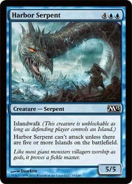
“Harbor Serpent” by Daarken |
Viewer, you’re on the boat with your fellow patriots and you’re into some serious trouble.
That thing isn’t a hippo, accidentally flipping your boat, or a shark that’ll bite and then swim away. This serpent is hungry and isn’t satiated eating tiny fish; it wants you.
If this piece had no environmental factors such as a tumultuous ocean and a storm, it would simply be good. That added attention makes it great. New artists must always realize that once you have the figures completed, the location needs to be defined, which informs the mood, which informs your timeframe, which informs how bad you want the piece to succeed.
10 out of 10.

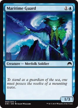
“Maritime Guard” by L. A. Williams |
This piece is just so damn strong.
The lighting is fantastic. Look at the end of the spear and the reflections of light.
The color is dynamic. Look at the right middle section of the frame. The purple turns into white and then into the blue of the wave. The green looks and feels like the sea.
The movement is incredible. Look at the lines Allen made. What lines? The spear and arms make a triangle. The wave behind the merfolk is circular that jars the viewer with the angular rocks below and the flowing hair of the figure. Your eyes flow in, through, around, and back into the piece. I can look at this piece for a solid five minutes just seeing how my eyes “enter” it. Where do you start? Where should you start? Where will most people start?
There’s a reason this piece made Spectrum 17 last year. It’s a strong, strong piece.

“Eel Umbra” by Howard Lyon |
Howard posted a small blog entry on being nominated.
Erase the figure and eel layer in Photoshop. The piece still stands by itself. It’ll turn into a strong background pattern for your laptop, but still stands out as fundamentally strong. Look at how minimally he needed to make the fish, but they still pop out of the frame with muted colors.
I forgot the card existed, as I don’t play it in my Commander decks and the Green auras overshadowed it. I have to remember to get a player’s guide each set to really scour the art with a magnifying glass, or I will miss a piece like this again.

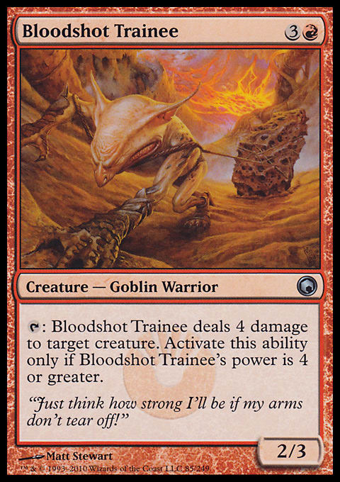
“Bloodshot Trainee” by Matt Stewart |
Look at his strain.
Just look at his left bicep, closed eyes, thumb scratches from his left hand and flared nostrils. The details are all there, and with an original art, a viewer can relate to the tremendous weight of that rock.
I’m always a fan of artists using perspective from the onset of their design. The strip-mall glamour-shot pose is beyond cliché in fantasy art. Perhaps it’s a piece of development that you have to draw your Dungeons & Dragons character, and having him or her in action isn’t optimal. I’m not sure.
I am sure of seeing this art again and again in drafts, wondering how I could get his tap ability to work. He’ll be usable in Block somehow.
It’d make for a fantastic original art for a climbing enthusiast.
Also notable is another award for Best Art Director.
Jon Schindehette, the senior art director on the Dungeons & Dragons side, won the 2011 Chesley Award for Best Art Director. As a historical lesson, Magic’s art director, Jeremy Jarvis, was nominated for the Chesley Award for Best Art Director in 2007 and 2009. He’ll win it one of these years. His direction keeps improving every year.
Congrats to the finalists and Jeremy Jarvis for his dedication in pushing for greatness.


