A source of joy for many in the Vorthos community is the genuine artistry that went into the creation of the Magic cards we fell in love with. It’s always a treat to make contact with one of the highly creative minds that have been a part of our beloved game—doubly so when the artist in question was one of the founding members who helped define this amazing world some twenty years ago. I recently became one of the lucky ones to find myself (digitally) in the presence of Amy Weber.
History
Amy Weber is one of the original twenty-five artists to work on card art for Magic: The Gathering. She has worked on sixty-two official cards, including one collaborative piece with fellow Magic artist Tom Waenerstrand. She worked from Limited Edition Alpha through Alliances, hitting a perfect fifty-fifty split between artifact and nonartifact cards.
“After the first set or two, artists would often choose the most powerful creatures, etc. I was just as inspired to work on artifacts, so that is probably why I ended up with so many.”
Amy earned her B.F.A. in Illustration from Cornish College of the Arts in Seattle; and an M.F.A. in Illustration from Syracuse University in New York. It was while earning her degree that Amy had the chance to work with fellow students who would themselves become part of the original twenty-five.
“For me, it was completely accidental. I went to college (at Cornish) with Jesper Myrfors and Sandra Everingham. Jesper asked me to make some work for a fledgling company he was art directing for. I was still in college and in the middle of finals when I made the art for the Alpha set.”
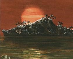 | 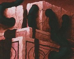 |
| Island Fish Jasconius by Jesper Myrfors, Primordial Ooze by Sandra Everingham | |
The freedom that Wizards granted in the early days allowed Amy’s style apart from her fellow artists almost immediately.
“There was no detailed style guide to follow. Often, we only had a title to go from, and even then, sometimes that changed.”
In addition to her work with Wizards of the Coast, Amy also worked as art director for The Duelist magazine from 1994–1995.
Style / Work
Influenced by the masters of realistic fantasy art, such as Boris Vellejo, the fantasy art environment of the 1990s was dominated by the need for realism. Artists such as Gary Ruddell, Brom, David B. Mattingly, and Steven Assael were winning awards in Spectrum, an art publication that is still considered the gold-standard for fantasy artwork. Even the world of comic books, stylized though it may have been, was still highly reliant on detail.
Against this highly competitive climate, artwork for many of the original cards in Magic: The Gathering was gloriously simplified. Many artworks emphasized bold colors and focused designs that reproduced well at small scale. Though the style of MTG would later come to resemble the hyper-real work of this period, this flagship effort was unique and easy to identify.
Amy is probably best-known for being the illustrator of one of the power nine: Time Walk. It is a highly sought-after card, an oft-referenced piece of artwork, and the source of numerous commissions for Amy to this day.
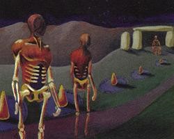 | 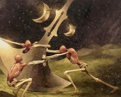 |
| Time Walk by Amy Weber, Walk the Aeons by Jeremy Jarvis | |
Amy’s original illustrations drew a lot of inspiration from classical masters such as Da Vinci and Hieronymus Bosch. Instead of the more overt techniques of many modern fantasy artists, Amy used a number of more subtle design elements to impart of sense of wonder.
Artifact Cycle
One of Amy’s most notable “series” of painting revolved around a Da Vinci-esque approach to artifacts. In these pieces, she addressed relatively unexplored concept in Magic artwork: the functional breakdown of an artifact. Even though many of the individual components still relied on the fantastic to function, it presented a playful, inquisitive side to the concept of magic that was rarely seen elsewhere in the game.

Urza's Avenger by Amy Weber, Sketches by Leonardo Da Vinci
Massive Scale
Another recurring element in this period of Amy’s career is a sense of scale that made many of her creations impossibly large. Even within her deconstructed artifacts, she used human figures as constructs, golems that formed the moving parts of a much larger machine. Much like the mega-furnace of Metropolis or human power cores of The Matrix, this lent an overall feeling of grandeur by providing a very intimate point of reference for scale.

Stone Calendar, Divine Intervention, and Knowledge Vault by Amy Weber, Ascent of the Blessed by Hieronymus Bosch
Many of these themes and ideals can still be seen in Amy’s contemporary work, which still retains her trademark playfulness, sense of grand scale, and gentle spirit.
Process
I recently had a chance to ask Amy a couple questions about her current work in the art field.
“I don't actually work as an illustrator much anymore. I like to paint what I want without the confines of most illustration jobs. I work almost entirely as a fine artist now and paint whatever I feel like in the moment. I have always walked the line between the two in that my work is illustrative but prefer coming up with my own imagery, ideas, and story behind the work.”

Amy makes custom illustrations and artwork for sale on sites like Etsy.
I also asked Amy about her process, dream project, and any advice for burgeoning artists.
“As far as when I do my best work, I am a night owl. I love painting at night when most everyone else is asleep. Although I usually paint long hours through the day into the night. I rarely get up early to paint. I usually have coffee, and I enjoy listening to podcasts while I paint. I don't have TV or Internet at my cabin to distract me.”

“If I could work on any project, I would love to work on a children's book.”
“My advice for any new illustrator/artist is to be yourself. Paint what you are passionate about. Draw all the time. When you are done? Draw more.”
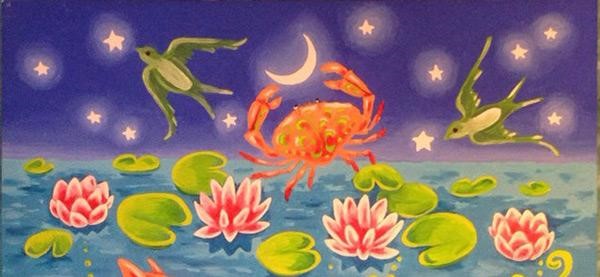
You can find new projects and keep up with Amy Weber’s work on her Facebook page and at her personal website.


