Winter of ’96.
Me. June, my grandmother. Andrew, my best friend.
A special trip out to the mall in the back of the powder blue Corolla; Christmas cash in hand; butterflies in my stomach.
At the back of the Waldens, a small case of collectible X-Men cards, baseball cards, Spellfire, and a strange card game with a box that looked like a tome.
My very first Magic: The Gathering box; the Fourth Edition Starter.

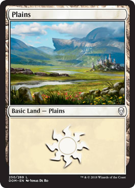
I remember very little of what happened during the ride back—or most of the rest of the day. But I can tell you the sight, the smell, and the feel of those cards as I flipped through them time and again, my mind glowing. At first, I skipped the basic lands in favor of more attractive options like the Hurloon Minotaur. But there was something special in those land cards that kept me coming back for another sift: an intriguing lack of fussiness. The Plains had a wonderful simplicity to them: a single line of text, the illustration of an open field, and nothing else to confuse the message. It became my anchor as I set about learning the game.
Artwork for the basic lands has changed significantly from those days, but there is still magic in those humble, rolling hills. So simple, so elegant, so open . . .
. . . anything but plain.
It is the illustrator’s job to take complex and visually stunning narratives and compress them down into a small space. As if that weren’t enough, illustrating plains is significantly more challenging than the other four basic lands.
It’s all about focus.
Focus is critical; if you don’t have a good story to tell, you won’t have a good image to show. And what the hell are you supposed to do when the story is literally nothing?
The crux of the issue is a lack of content. By their very definition, plains are large, empty spaces. There’s nothing to focus on, no distinguishing features to speak of—it’s a painfully empty canvas. Modern MTG artwork is a content-rich environment, and such an empty space sticks out like a sore thumb. In a world that is defined from every angle, a place without definition is, to many, anathema.

Photoshop gradient or a blurry pic of Nebraska?
Contrast this with the other four basics

All Artworks by John Avon
It’s not to say that the other four basics get a pass. Certainly, the work that has gone into the nonwhite basics is a topic worthy of its own articles. But when you’re illustrating a card called Mountain, you certainly aren’t hurting for a lack of focus.
Coming back to the plains, we are now confronted with the question that forms the very core of visual alchemy:
Glad you asked.
Over the years and various sets, a small army of illustrators has been called to answer this question. And answer they have, in a beautiful variety of ways. What follows is a loose guide to the artwork and sets that address this issue in their own particular fashions. This can make a great themed land base for your next Commander deck, to maybe help you find a couple artworks you didn’t know about, or just to let you enjoy some really great art.

In these, the open plains of the world are presented as places of peace and natural beauty—as somewhere you could spend an afternoon with a loved one, somewhere you wish you could build a lifetime. These are the artworks of idyllic landscapes you’d expect to see from painters like Albert Bierstadt. The use of light and shadow is a critical part of any painting. With a large, open area to push the exchange between the two sides, artists can really take advantage of the plains as a playground for luminance. The sun provides a natural focus for the piece and gives the story a comfortable anchor. The sun spends a lot of time near the horizon in this school of thought; they don’t call it the “magic/golden hour” for nothing.
Sets to Look For


Story is another critical component to any painting, and in Magic, it’s not always a happy story. In stark contrast to the warm embrace of the idyllic stands the jagged teeth of the apocalyptic. This is a world where things can, and quite often do, go terribly wrong. The Eldrazi awaken, the Dragons of Tarkir overtake the clans, Phyrexia . . . well, Phyrexia. Here, we see color has been largely removed in favor of desaturated and muddy hues. The sky often plays a critical role in plains artwork. Unopposed by any vertical features, the clouds speak volumes about the tone of the painting. It’s all reminiscent of Tenebrism, a style made famous by Spanish and Italian painters that takes advantage of dark tones and subject matter.
Sets to Look For


Though every set brings its own flavor to the mix, I’m giving Ravnica the spotlight as a poster child of what makes plains unique. As they fill the canvas, a lot of artists will choose to style the look and feel of the basic land to match the larger world of the set. This can sometimes lead to some truly original ideas as compromises (e.g. make an island in the city). But with no additional features that need to be included, plains become even more pronounced in their adoption of the canon. The image becomes more harmonious due to the lack of competition for the viewers’ attention. Ravnica is free to be a densely packed urban sprawl, Theros can stretch in every direction with infinite fields of wheat and cypress, and even the shards of Esper, Bant, and Naya are all free to exist comfortably within the single block of Alara and all under the singular title of Plains. They are at once distinctive and unified, an impressive combination.
Sets to Look For


The real genius of the basic lands is that they all exist on earth. The fact that virtually every deck includes and is rooted in this concrete reference is part of what makes the narrative so approachable. No matter how crazy things become, no matter how many different worlds we are introduced to, we always know there are going to be some constants, some baselines that we can look at and identify from our world. It stands to reason, then, that some of the plains are so rooted in their real-world origins that they are virtually indistinguishable from traditional landscape paintings. In fact, there are several lands from Magic’s past (the Asia-Pacific and Euro Lands) that are direct painting based on real-world locations.
Sets to Look For


One of the interesting items of note about the majority of basic lands is the lack of human presence or influence. Most of the time, we’re shown untamed wilderness, areas that may have seen travelers just a few days past, or perhaps never at all. It’s an intentional move to create a world yet to bear any real influence from individual personalities. It creates a backdrop that is free to mold itself to whatever players and spells find their way to the table. Though all of the basics break this rule from time to time, plains seem to be more willing to bring a face to go with the name. Perhaps it is the very hospitable nature of the plains that makes them so constantly occupied. White being the color most often associated with the everyman, there seems to be a place in the world of Magic even for farmers, friends, and wanderers. It contributes toward the relatable side of the game lore, the human side.
Sets to Look For


Though not unique to plains, multi-card panoramas are present in great numbers. As the sweeping vista requires a certain amount of openness and long-range visibility, the plains make an ideal candidate.
Sets to Look For

- Ice Age
- Kamigawa
- Mirage (two sets)
- Mirrodin Besieged
- Rise of the Eldrazi
- Scars of Mirrodin
- Seventh Edition (two cards by Rob Alexander)
- Urza’s Saga
I look forward to new sets, as we all do, but I’d be lying if I said the basic land artwork isn’t the most exciting reveal for me during spoiler season. With Magic Origins just around the corner, we’re going to see our last core set ever. It’s been a long time since that snowy afternoon at the mall with my Fourth Edition starter in hand. But there’s no doubt that, in a month or so, I’ll be poring over the new plains, just as excited as I was twenty years ago.


