I recently had a chance to talk to another Art Hero of mine: Scott Kirschner. Scott’s work dates back to the early days of Magic. His work is genuine, edgy (literally), and emotionally intense. He paints with color, but also with stories, ideas, and symbols. In my opinion, his work stands up better because it was done with heart—and with the intent to speak to the human experience, regardless of the fact that it’s fantasy art.
History
I – First Contact
In 1991, Scott graduated from the Hussian School of Art with a degree in Illustration. Interested mainly in commercial print illustration, he remained in Philadelphia, seeking work from local newspapers that catered to younger audiences and presented more controversial topics. His preference for symbolic illustration made Scott a natural fit for the work he picked up.
In 1993, Kirschner attended a local comic con and had a chance to interview with over a dozen companies in the industry, one of whom was none other than DC Comics. After a successful interview with the DC rep, Scott was offered a chance to work on the Vertigo series. However, by the time he reconnected with the rep, Scott found out he was too late, and the job had already gone to another artist. DC’s loss turned out to be Wizard’s gain, though, as Jesper Myrfors had also interviewed Kirschner that weekend.
Having secured his very first set of cards in Legends, Scott Kirschner received his first work orders from Wizards via phone. He painted a total of nine cards, only half of which ever saw production. And what were the five cards that remained behind closed doors?
- Rainforest (not the misty kind)
- Death
- War
- Pestilence
- Famine
That’s right; Scott Krischer illustrated the Four Horsemen of the Apocalypse for Magic: The Gathering. Legends was originally slated to have the bringers of the end times as playable legendary creatures.
I’m just going to let that sink in for a minute.
Wizards of the Coast was facing down opposition from various conservative-values groups for some of the original card sets that contained references to the profane (Demonic Tutor, Dark Ritual, Contract from Below, Darkpact, Unholy Strength, Sacrifice). Rather than add fuel to the proverbial fire, Wizards pulled the horsemen from production.
With his work complete, Scott sent his paintings off to Washington, figuring he would never hear anything further on the subject. About a month later, he received a letter from an avid player in Alaska, along with copies of the cards he had painted, asking for signatures. And then another envelope arrived with more cards with a request for him to sign them—and then another, and another, and another . . .
II – The Magic
Scott continued to work on Magic cards for several years, up through the beginning of Urza’s Saga in 1998. As he continued to work in the field, he become more confident and expressive in his own style. Starting out in the Legends set, Kirschner was unfamiliar with the game of Magic: The Gathering, often learning as he went along what fit and what didn’t. In my interview with Scott, he mentioned his wished he had more experience under his belt before becoming involved with such a runaway hit.
Kirschner struggled in these earlier days to be able to “finish” a painting to his own level of expectation. Of the more than forty cards he’s illustrated for the game, Scott feels truly good about roughly ten of them. It became more difficult to deal with his own sense of dedication to the craft when pieces he wasn’t fully satisfied with were being displayed in such a public space.
It came to a head one day when, passing a local comic book shop, Scott saw a piece of his, Zelyon Sword, blown up from the intended size of a playing card to a gigantic, five-foot-tall window display for Fallen Empires. Scott was upset by the decision to make what he felt was an incomplete piece so public. Calling up Wizards, he was surprised and flattered that the marketing department felt the piece was so conceptually strong that it represented the set as a whole.
Despite, or perhaps due to, the increasing success of the game and his own visibility in the public eye, Scott quit the industry after completing his pieces for Urza’s Saga.
III – Searching
Free of the industry, Scott spent the next thirteen years pursuing a variety of different creative endeavors. Apprenticing under a mural painter for two years, Kirschner eventually was able to open his own mural-painting business. Working in the homes of extremely wealthy patrons, Kirschner was painting, gold-leafing, doing restoration work, and more.
While financially very successful in this period, Scott still felt the need to return to painting. He realized that it wasn’t enough to just make money; he also needed to feel fulfilled by what he did.
IV – The Arch Enemy Years
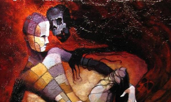
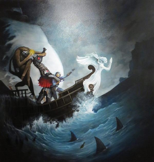
With the loss of his father and brother in less than a year, Scott’s work as a fantasy illustrator came rushing back to the forefront. He began writing, creating, and painting with renewed vigor. It was during this time in the early ’10s that he began work on the My Famine series. These paintings represent a significant step in Kirschner’s career, both a major source of inspiration and a critical connection to the gallery he would call home for several years to come: Arch Enemy Arts.

Scott has produced and sold dozens of large-scale fantasy paintings with Arch Enemy and continues to work with them today. Arch Enemy is where he feel he is currently doing his best work. They are his go-to for inspired work that resonates with an increasingly-fantasy-friendly, fine-arts audience.
Style and Work
Gaining Confidence
One of the first things I noticed about Kirschner’s work from during his four years working on Magic was just how quickly he grew as an artist. With such a well-documented period, it’s easy to identify outliers, such as Phantasmal Fiend, from the early blocks as being prophetic of the work that is to come. You can see the foundations of his style in the poise, the overly-long limbs, and the twisted face. Then, Scott went ahead and made my job easy.
Looking at these two pieces side by side, it’s clear that Scott hasn’t just grown better, but more confident in his work. The skill may have advanced, but the willingness to express the skill to such a degree is what changes.
The cityscape in the background is unblocked by mid-ground elements in the Minion piece, letting it breathe and opening up the beautiful textures of the sky. The figure in the foreground is no longer partially obscured, and it’s in a much more dynamic pose. Values are being pushed further, giving the Minion a great amount of depth between the hand on the left, which is almost charcoal, and the hand on the right, which is bone-white. There’s less going on in the Minion piece, but there is a greater sense of movement and energy.
Them Bones
Though almost never directly visible, there are skeletons everywhere in Scott’s work. They can be seen in the back and hands of the figure in Energy Bolt, the skeleton-like construction of the Basalt Golem, and the ribcage exoskeleton of Hibernation Sliver. His backgrounds are of a similar nature, using thin, wiry figures to convey complex forms and features. Scott’s world is a minimalist one, and he shares the sentiment for the creatures that inhabit that world.
Symbolism
With his painting heavily steeped in the tradition of symbolism, Kirschner’s work can be viewed from several perspectives and motivations. His work contains a certain sinister nature that makes you wonder who it is he is truly intending to portray in the composition. Who is pulling those puppets strings anyway? In this way, he is able to address highly controversial topics that otherwise could never exist in this space: slavery (Illicit Auction), self-harm (Consuming Ferocity), and abusive relationships (Hymn to Tourach), just to name a few.
Mastery
In stark contrast to the bulky, oversaturated details of standard fantasy images, Scott’s visions are grim, brooding, and gaunt. The goal of his paintings is less, not more. This can best be seen in his stunning piece: Lurking Evil.
Stripped down to its essence, this creature almost doesn’t have enough weight to look as though it can stay together at all. It just looks wrong, out of proportion, sickly, and thoroughly twisted. It is at once organic and mechanical, spewing pollution from its spine with every step. By leaning off the ledge and leaving the foot suspended in air, Kirschner creates a sense of tension and unease about what happens next. Does the creature fall or fly? It seems to be stepping out as though there is a secure foothold just off to the left of the border. We’re left to figure the rest out from a piece that provides more questions than answers.
The background is trademark Kirschner: simple yet speaking volumes. Similar to other fantasy greats like John Blanche (the guy responsible for the look and feel of Warhammer and Warhammer 40k), Scott has used small patches of dark color in the background to create the suggestion of windows and doorways, turning what could have been small beams of wood mere feet from the viewer into impossibly massive structures that span miles.
I use this piece as the high-water mark for Kirschner’s achievements in this era. He has moved beyond the safety of his early works to a piece that defies the viewer with an impossible image that is just balanced enough to be horrifyingly feasible at the same time. You don’t want to believe something like this can exist, but Scott doesn’t leave you much choice in the matter. The dream is real.
So Why Keep Going?
The quality of Scott’s paintings has only improved over time. His modern style is confrontational, presenting the viewer with images that are at once intriguing and difficult to look at. He wants his viewers engaged, enraged, and anything but unresponsive. Whereas his earlier work would present a scene that you were an observer to, his new images are alive with creative energy. The canvas becomes the steel bars between you and the monsters on the other side, and the bars don’t appear that they’ll hold up much longer. The only way Kirschner was able to achieve this high level of skill and style was through continual practice.
I asked Scott why—with so many different avenues and twists in his life—he continued working.
His answer: because there just isn’t any other way. Sharks have to swim; Scott has to be an artist. As a person with introverted tendencies, Scott uses his artwork to reach out and communicate with the rest of the world. His artwork becomes the release, the sense of fulfillment in his life.

As a more experienced artist, Scott has redirected his focus from the product to the process. What used to be a misery-inducing grind fraught with disappointment and frustration has taken on the light of a great journey. He now finds himself holding onto pieces in progress that he would have thrown away previously. By allowing himself to make mistakes, he now allows himself to learn from those mistakes and grow. He’s realized that even if a painting isn’t technically superior to the one that preceded it, there’s always growth in having gone through the act of painting itself.
And that’s what makes this series so special to me and, I hope, to you: the act of taking delight in the mindful repetition of that which you call your art.

You can follow Scott on his Facebook page.


