The nice people in Renton, WA last published a piece of Quinton Hoover art three or four years ago.
If you're a relatively recent player and your only experience of my favorite Magic artist of all time are reprints in Jumpstart and Time Spiral Remastered, you're missing out. Quinton Hoover was one of the twenty-five original artists to work on Magic... All the way back in Alpha; and in my opinion? The best of them.
Hoover's style in the 1990s differed substantially from the work he did around his comeback in 2007; this article is going to talk primarily about Quinton Hoover version 1.0.
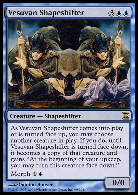
Vesuvan Shapeshifter is an obvious artistic call-back to Alpha's Vesuvan Doppleganger; the Time Spiral update being the "Morph" version of the 5-drop Shapeshifting classic; I simply adore that they gave Hoover the card to echo himself. It was a sweet little Easter Egg for the longer tenured players.
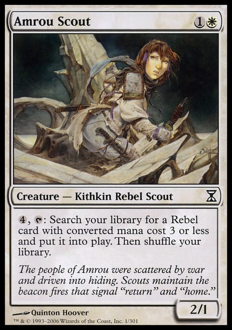
Compare for a moment Amrou Scout, versus its spiritual ancestor, Amrou Kithkin. This is another Easter Egg echo they gave Quinton specifically...
But you might ask yourself... Who cares about Amrou Kithkin? She wasn't a format-breaking card in 1994; nor a particularly exceptional Hoover illustration. But Amrou Kithkin was still A HOOVER ILLUSTRATION and brimming with all the things that made him so unique as a Magic artist. Soak in the drapery on Amrou Kithkin's clothes... Her sleeves, the set of that pink-purple jumper-thing she's wearing. Stare into the precision - nay, perfection - of the random rocks, leaves, and grass around her. Look at the pool she's looking at.
If anything binds the background elements together, it's how not-overwhelming they are. That's incredibly hard to do while making them so playful and detailed. Hoover controls our eyes with line weight and line density, so the kind of faded out color he uses (relative to his foreground character) don't have to work very hard. We know they're not important, all other elements held equal. They don't have to scream they're not important; they get to whisper it.
Again, Amrou Kithkin isn't exactly the best ever Magic: The Gathering illustration. But it blows most everything else ever drawn out of the water in its composition and judgment. When I look at the smudge-y pink background, so obviously "behind" the yellow circular design in a two dimensional space, I can't help but remember the legend of Jackson Pollock hitting his own doorknob with a spot of paint flung from a precision brush-fling from across the room. It takes a lot of specific skill to look that arbitrary.
From way back in 1993, Quinton Hoover was a master of two things that in 2024 remain untouchable: subtlety and storytelling. In large part because Magic is mostly "painted" art (but really, it's a lot more digital these days; shrug emoji) he doesn't even have a legitimate challenger in the line work department. Only Richard Thomas (another Alpha-era artist) is even in the conversation.
Most of Hoover's version 1.0 work excels in at least one of the three areas, and the best pieces kick butt in two or even all three.
Stroke
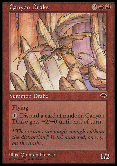
Canyon Drake is simply the avatar study of line weight and line density. The main differentiation between the Drake itself versus the Canyon it flies through is simply in how many lines compose the Drake, from a details perspective; and to an almost imperceptible degree, how comparatively thick a few of them are.
This card also blends into the subtlety and storytelling wings.
Canyon Drake is a predator that blends into its environment, like so many predators of specifically IRL canyons. The kind that "if you see them, you're already dead." Hoover doesn't have to hit you over the head with this concept... He just uses the same colors between Drake and canyon and the story tells itself. You just have to squint a little. He wants you to squint a little.
Hoover didn't use paints, at least not in the same way that we imagine thick oils building up thickness or sticky texture on board or a stretched canvas. He used inks, markers, and probably watercolors. His work is, over and over, example after example, of limitation breeding creativity, and laughing along the way. Consider this Drudge Skeletons wannabe:
Look at all the different stories he tells with lines. Wavy lines conveying being under water. Round lines making bubbles. Lines for seaweed, floating cloth, the odd skull.
And on a throwaway card! Let me tell you a 1/1 Regenerator for two was not good in 1994; but he still put forth the best line work in Magic on it.
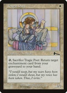
A masterpiece. Everything good about Amrou Kithkin, but dialed up to 11. I feel like this is Raphael or Barry Windsor-Smith aping ancient Greece, winking while they do it.
I'm awed at the textures Hoover can convey, again mostly with ink-lines. Metal; hard, round, surfaces; draping cloth; ringlets of hair; plush pillows; paper.
A masterpiece.
Subtlety
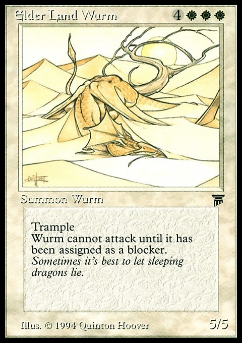
Just look at this thing.
I have no desire to summon a 2/2 for 3 mana with this particular ability. But nothing ever made me want to make a Unicorn theme deck more than staring at the interplay of stars and shadow.
I wish I could read the art direction for this card.
"Make a perfectly composed Dragon Wurm, but have it blend into desert dunes. Make it look lazy but did I mention perfect?"
In 1997 Wizards of the Coast bought the parent company of Legend of the Five Rings. Hoover lent his inks to Magic's little sister game, putting in some truly exceptional trading card game work.
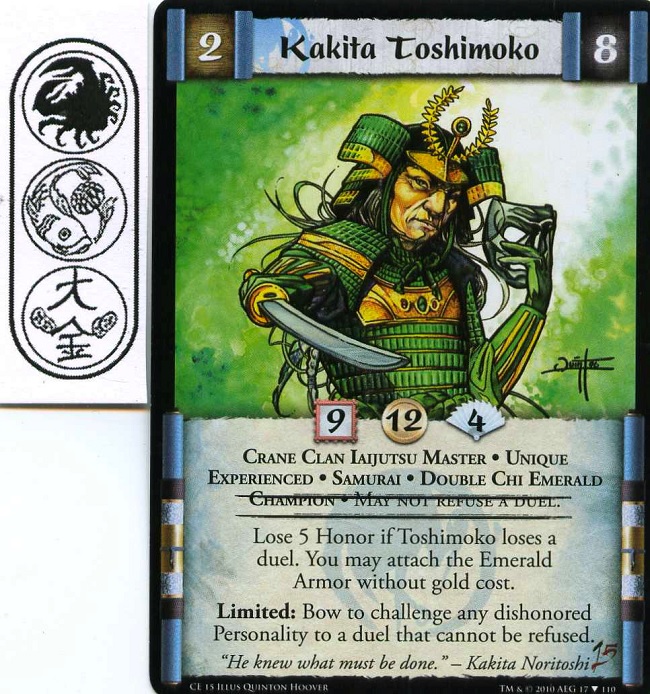
As an illustrator far, far, less talented than Hoover, it's really difficult for me to articulate just how well Quinton handled the perspective on Kakita Toshimoko's right arm. This is a flat, two-dimensional, image with no big shoes aspirations and no way to cheat visually. A lesser artist would have used a big black blob, pretended it were a shadow, and crossed his fingers. But Hoover wouldn't break his own rules stylistically. In order to convey the perspective on the outstretched weapon, he varied the size of the lacquer plates on Toshimoko's armor, and overlaid the light source individually in as many places as there were to overlay. I could stare at that sword for an hour.
Storytelling
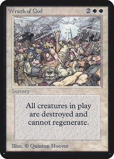
Let's just start with the granddaddy of Magic "storytelling" art, from way back in Alpha:
Like all the best Hoover pieces, this one hits all three of his especial points.
Wrath of God is ridiculously detailed. It's lines and lines and very judicious use of black fill-ins. The light source is perfect and specific; and perfectly specific to the story being told in this piece: God got mad.
Despite being a depiction of destruction, Wrath of God is also funny. This one has a bare bum, chain mail, dead orcs, beards, wooden shields, scale mail, smoke... And an abstract Angry God in the style of 1741 preacher Jonathan Edwards.
To contextualize this a little, think about any equipment. Technically sound artists can often make an object. They can draw or paint, say, a sword. A legendary creature? That's easy. They draw things. Maybe not as good as Hoover's Kakita Toshimoko... But swords and legends are almost by definition easy to communicate. Maybe not easy to execute, but that's something else entire.
Actions, concepts, events, abstractions? Much, much more difficult. But Hoover's art style was perfectly suited to it.
His biggest advantage? In 1993 Hoover's style was was more "comic book"-y than "fantasy art"-y. In 1993 Neutral Ground was not yet a twinkle in BDM's eye; there wasn't really such a thing as a Local Game Store yet. WotC wouldn't buy TSR, the parent company of Dungeons & Dragons, until 1997 (the same year they bought Legend of the Five Rings). So, the concept of Magic art being fantasy paintings in the style of Larry Elmore or Brom hadn't been cemented in any way. Realistically, Magic in large part was sold in comic book stores.
Comic book art isn't just about pretty pictures. It's about telling stories. What Hoover excelled at is translating those stories to a single panel, often without crutches like "speed lines" or meme captions. That is even more difficult to do than it is to describe. That's Art with a capital A that simply doesn't exist in many other places. God getting mad is the most iconic of Hoover's execution in this way but it's not my favorite.
Here's a little bit of apocrypha you might appreciate.
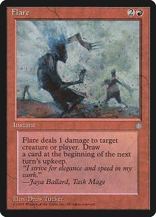
Wrath of God is one of the most iconic, epic, piece in Magic art history. It was not in fact the original piece of art for the card Wrath of God. That belongs to Flare by Drew Tucker.
My friend Brian David-Marshall clued me in on this one. You can kind of see how Flare might tell the story of the Wrath of God, right? But it wasn't "epic" enough for that showcase card. I love Flare for what it is; but I'm really glad that Quinton got to tell the big story in his single panel.
This is my second-favorite:
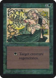
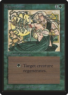
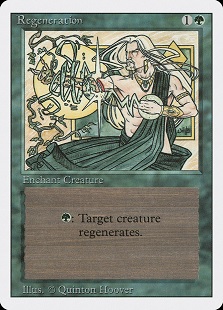
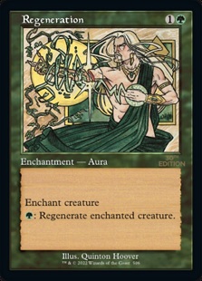
While not the most beautiful marriage of line weights and that old Quinton mastery, Regeneration is one of the best Magic cards ever of simply telling the story. "Regeneration" as a concept is active. "Regeneration" the word is a noun, but it's a noun conceptualizing a verb if that makes any sense. How do you convey the concept of regeneration visually, without something like time-lapse photography, or a moving video?
I think he did a great job. This one hits "subtlety" at a 10/10 for me. I think the Alpha printing does the best on colors, but my personal first exposure was Revised. It's remarkable how different printings all hit such different notes on the "subtlety" scale.
I was a teenager when I started playing Magic in the mid-1990s. Have you looked at the comic book covers from that era? All chromium wraparounds and impractical costumes and implausible anatomies for female superheroes. So of course the more salacious aspects of a card like Earthbind would have appealed to me to start.
Just for some context, here are two depictions of Sue Storm, or Susan Storm Richards, the Invisible Woman.
This is one of my all-time favorites:
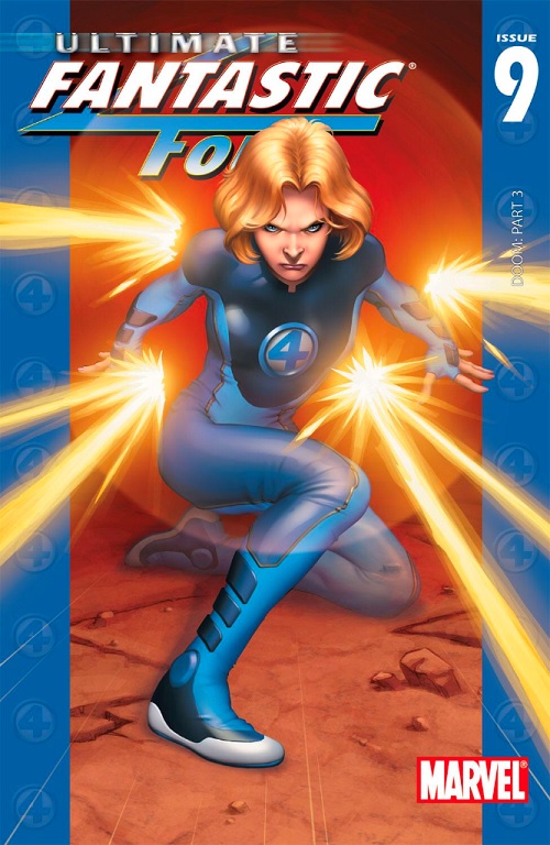
What adjectives would you say about her? She's probably fit but beyond that it kind of doesn't come up. In fact she's mostly covered up. As a character the first thing that pops into my mind about Sue is that she's Franklin and Valeria's mom. Even before I think about her as Reed's wife. Sue has historically been kind of conservatively depicted, the mom of the comics industry's First Family.
This is how they dressed Sue in 1993, the year Magic first debuted:

"Let me tell you how we should depict the '4' logo on Sue's uniform..."
Again, Magic was bought and sold in comic book stores.
That was all for context.
What I came to realize later is just how good a story Earthbind tells. Imagine you really did want to visually describe a creature losing flying, not as an instant, but as an aura. Those tendrils? Especially around the neck? The card is a 10/10 on storytelling, isn't it?
What I came to love most about Earthbind as I got older is - even once you get past the giggles - is how it's a 10/10 on all three of Quinton's specialties. Its line work and line weight variation are among the best of any Magic card. It visually describes the "movement" of an aura in exactly a way that makes sense; it's like DuoLingo were a fantasy art camera! Okay, maybe it's not that subtle.
But two out of three ain't bad.
LOVE
MIKE


