So, I like art.
A lot.
My laptop’s screen is half purple because every time I save up over $500, I buy more art again. I swear my computer will have to die before I don’t just buy art again. It’s why I’m a Vorthos. I like the art, what it means, and how it added to the flavor of the game.
Overall, the integration of different planes has been a great study for Wizards this go around of the Commander product. I love how odd products, such as Commander, Archenemy, and the like can pick from Mirrodin to Kamigawa, showing glimpses into each plane we haven’t seen in a while. Noticeably absent is Dominaria. We just haven’t seen it since, well, Time Spiral block . . . in 2007. Six years in a formal sense in Magic is like a hundred in Internet time.
The reprinted cards with new artwork could be a future article—in case you notice that they aren’t here. With fifty-one cards, I’ve learned that over roughly fifty is just too damn many. Also, I found that the sectioned-off artist bio plates I made for the Theros art review were pretty helpful to me, but no one commented on them. They take an enormous amount of work and for no one to care, well, I’ll just cut them for future reviews. Maybe we’ll make a resource in the future instead of “asking Mike on Twitter.”
To art!
John Avon
- Restore
John, I see what you did there:
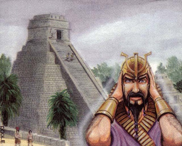
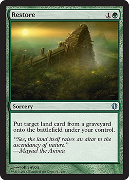
This is a pretty nice work and good allusion to an older card. These meta images need to be made more; Magic has thousands upon thousands of artworks for homages, Easter eggs, and fan service. I hate to keep “fan service” in the T&A category, so I’m taking it back. Break the fourth wall, and I’ll see what you did there. Keep doing that.
I hear John is trying to go back into making original artworks. He hasn’t gone back to making them for Magic, but I wouldn’t be surprised to see one within a year. John is managing his health, and from what I hear from his agent Guy Coulson, he’s doing pretty well, all things considered.
Ryan Barger
- Tempt with Vengeance
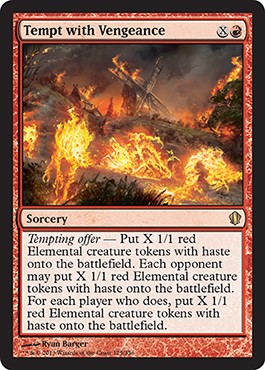
BURN ALL THE THINGS!
I need to see this in high-res; I just can’t make out the details at card size. It’ll be a recurring theme and something I need to examine for the future. These happen at the onset, but perhaps we at GatheringMagic should e-mail all the artists, asking them to post high-res things, and then curate the art together, engaging the Tumblr community. It might be a recipe for success.
Ryan, good job. First thing I see is fire, and I then see that the fire is alive, and then I want to see what else is in the frame. I figure that’s good storytelling—or it’s a hard prompt. Either one.
Mike Bierek
- Tempt with Reflections
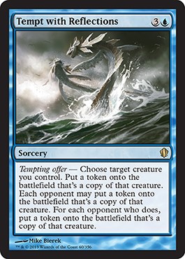
So, it’s a Clone that has upside to make more Clones. I get the card, sure.
I also understand the difficulty in showing a card’s full effect. Whenever a card has more than depiction, when writing the art description, you have to choose. It’s not one Clone or a group of Clones, all looking at each other in a Mortal Kombat circle. We don’t need to be hit over the head, so keep it simple. It’s a blue card, so make it a blue thing, except two of them. That point is clear. While I think there’s a bit too much water represented, I think the image is a success and could be a fantastic promo card in the future due to the open-ended art description. It doesn’t need to be flying fish creatures.
At first look, I thought, “Oh man, he made a pair of his Screeching Silcaws. Wait, are those Mulldrifters!?” Artists, if you want an instant fan base, make that homage. Seriously. It’s time-consuming to learn what matters, and, of course, you want to make original creations, but there’s a difference between sitting at a convention by yourself eating Cheez-Its and having a long line in which you’re signing, altering, and making that $1,000 in $5 increments. I feel as though I’m just preaching to the choir now, but preach on, brother man.
Zoltan Boros
- Illusionist's Gambit
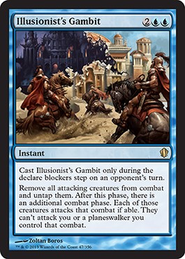
Zoltan’s a phenomenal artist, and this could’ve been a great artwork, but the composition is hard to understand. This feels like a cool sketch idea that should work out great, but it, um, turned into this.
The design is that an assault has been interrupted, and they get to start again. It’s used to nullify combat tricks or other ninjutsu combat shenanigans. I don’t really see that in the art, but I suppose we don’t need to.
This looks like some sort of time effect or rift, which it is, kind of . . . right?
I understand the fantastic horse depictions of them stopping—but not the rest of the image.
Eric Deschamps
- Oloro, Ageless Ascetic
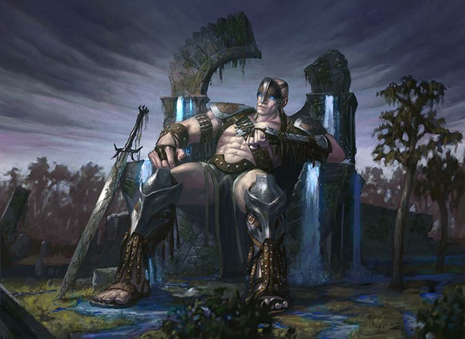
When I first saw this image, I immediately thought the knee braces were reused facemasks, plundered like trophies from other giants. Upon closer inspection and finding that to not be the case, I saw what Oloro’s trophies on his arm-tiny swords. Check the image on Eric’s Facebook page. That is fantastic to learn; A+ work.
I like the waterfalls on the throne. It feels like my Mirage Forest by Tony Roberts—you can see the pushed paint. Since Eric works digitally, that’s a real feat. The lighting is great, but that minor water detail is hugely important. It makes me gloss over the bulging abdominal muscles despite that he’s sitting or the undersized hilt on the sword. No image is perfect, but if you’re a young artist reading this, get the major parts right, and the rest can fall as it may, and you’ll still be set.
Jesper Ejsing
- Naya Soulbeast
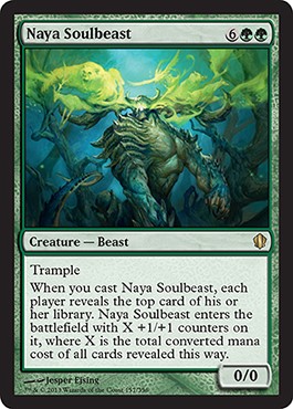
I’m used to Jesper’s normal color palette of warmer colors (reds, oranges, etc.) with some great musculature and a tail whipping in the frame. This image seems like a black card that was made green. Ghosty-type stuff happens in green, but it’s pretty uncommon. With the giant horns, I forgot what the Alara creatures looked like. Jesper did Beacon Behemoth and Rakeclaw Gargantuan for the Shards of Alara block, and not a single creature from Meglonoth to Godsire to Paleoloth to Wooly Thoctar fit the aesthetic of this Naya Beast. It feels . . . out of place on purpose. Alara had its five shards torn apart and then put back together, and all hell broke loose. Perhaps this is what has survived. I like the idea of a green creature, calling upon ancestors for aid. It feels like an area where green mechanically interacts with the graveyard compared to black. Whereas black is selfish, forcing humans into zombie servitude, green asks for assistance from the past and—in some cases, as with this card—the future. I like that idea.
I would bet this image is much taller than we can see—that tail peeking out alludes to a much larger image from the cropping. I like it, as it forces me, who reads a lot into images, to see something about the current state of Alara.
Jesper, love those tails; keep them up.
Jason A. Engle
- Curse of Chaos
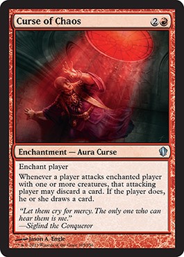
This is an awesome idea that I fully support.
If you’ve been following along, I am a strong advocate for artists using card illustrations to say something without the context of the card frame. In this case, Jason swung that metal bat to the fences and hit the shit out of that hanging curveball.
I grew up rural, and near my hometown village in central Minnesota is a catholic university that has had its abuse stories and prosecutions. I feel zero sympathy for those evil men, and seeing Jason commenting on that is ballsy at worst and very clever bringing realism into fantasy art of what’s arguably a children’s game.
This is one of those images that needs to be seen in higher resolution. Jason works digitally, so you can see his massive amount of work creating a church that was only hidden by the more opaque red lighting. At first glance, the sense of place is hard to see at card size. Is he in the gallery? The rose window seems nearby, but is it? I would love to see this huge.
Anyway, when Jason posts this on his DeviantArt page, check out the architecture around the figure, and give him a high five for stepping outside the box.
Lars Grant-West
- Bane of Progress
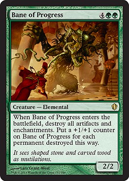
This isn’t exactly what I think of when I hear of Lars. It’s a bit outside his normal jam.
That said, I asked him about the card a bit, hoping to learn a check out a little behind the Oz curtain. I asked him who the foreground character is, and he laughed:
If you know artists, be very careful if they ever ask you to pose for something; very quickly, you’ll end up in an illustration. In some cases, people are thrilled, such as my boy Abe.
The best thing at conventions is absolutely asking artists about their works. It has come with time that I’ve learned what to ask. Saying, “How’d you do it?” or, “What was your favorite part?” is a fun way to gauge if the artist is having a morning without coffee and seeing how he or she interacts with fans. I know Omar Rayyan is an absolute delight when you ask him about a piece; he goes into quite deep detail on where he used a new technique, such as stacking up paint or making a natural shadow, or a funny story about a reference, such as Lars here.
I hope Lars knows this card will be an all-star in the Commander format and that his artist proofs will all sell within a year or so. I’d also tell him to practice Bane from Batman alters over the top and have a good price in mind when people constantly ask him.
Yeong-Hao Han
- Diviner Spirit
- Eye of Doom
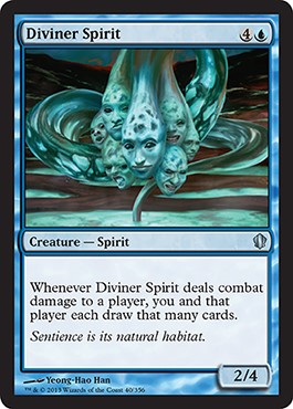 |  |
So, did art director Jeremy Jarvis or one of the Creative Team art description writers, such as Jenna Helland, watch The Abyss lately? I can dig it. I am a Donnie Darko fan, after all. Diviner Spirit is odd as hell, and it looks to be Kamigawa—right? If so, neat. It’s a bit Netrunner-feeling, such as the virtual reality depictions in the mid-1990s, but a few deviations fit into our flavorful-encompassing world.
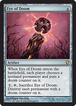
Eye of Doom feels like the early Magic art kitsch of, “Oh, yup, fireball, yup. It is what it is.” A ton of new strategic card games have those type of cards. This one is just confusing because I like the lighthearted feel of the eyes—it has a very Nevinyrral's Disk feeling. The one Vorthosian question I have is this: Where is this? We have dozens of hollowed-out planes from Planechase, so finding really any card that doesn’t fit anywhere just feels odd. In the 1990s, the default became Dominaria; today, everything has a place. He kept it stripped-down and simple, and I appreciate the Eye of Doom as central focus with everything else being unimportant. Some of Kev Walker’s pieces do this: “Show me the damn thing; remove the rest.”
Also, check out his iOS app Blendoku. It’s pretty neat.
Ralph Horsley
- Terra Ravager
- Marath, Will of the Wild
- Widespread Panic
- Derevi, Empyrial Tactician
- Tempt with Glory
- From the Ashes
- Witch Hunt
- Darksteel Mutation
- Surveyor's Scope
- Prossh, Skyraider of Kher
- Angel of Finality
- Act of Authority
- Gahiji, Honored One
- Sydri, Galvanic Genius
- Curse of Shallow Graves
- Roon of the Hidden Realm
- Spawning Grounds
- Fell Shepherd
- Opal Palace
- Curse of Inertia
- Price of Knowledge
- Sudden Demise
- Jeleva, Nephalia's Scourge
- Tidal Force
- Ophiomancer
- True-Name Nemesis
- Mystic Barrier
- Primal Vigor
- Tempt with Immortality
- Djinn of Infinite Deceits
- Toxic Deluge
- Order of Succession
- Shattergang Brothers
- Curse of Predation
- Hooded Horror
- Nekusar, the Mindrazer
- Curse of the Forsaken
- Tempt with Discovery
- Unexpectedly Absent
- Baleful Force
- Serene Master
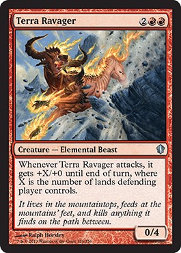
Thank God Ralph is still doing cards. The man is awesome.
I like this piece. It’s a fun, vertical-romp study of falling motion. He seems to be moving fast, maintaining his color palette. I feel that, upon looking at it, it’s almost Wayne Reynolds–feeling. I suppose the two are contemporaries and both Brits. I have noticed that schools and even geographic regions, usually by country, have styles. Style is a bit broad, so let me explain. Looking at a Chinese art portfolio and one from Brazil will have dramatically different color palettes. Brazil is a bit bolder and more colorful. I was taught to look for 1980s, side-of-van paint schemes, and if you see that, it’s probably South American—usually Brazilian. The same goes for Eastern Europe and how they approach environments. I say environments because it’s not always a landscape, but rather a speed painting of a giant spaceship crashed with debris in the foreground with the beginnings of light blocked in.
One day, I’ll have to make groupings of contemporaries and see how they interact and appear to one another.
It’s a great piece by Ralph—a sleeper Commander hit, as this creature will be routinely 10/4 or larger, which enables all kinds of shenanigans. He didn’t get an unplayable uncommon, that’s for sure.
Tyler Jacobson
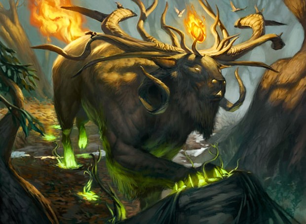
Arcana is my favorite part of DailyMTG.com, and the October 14 edition explaining this art was no different. The hooves creating life everywhere they touch and the myriad of antlers is very cool. I’m more impressed by how clean this composition is. I feel a strong sense of place that he’s walking through the scene and not just standing. The tree on the far right and the root on the left help to frame the figure and push us back to his flaming tail. That movement of drawing your eye backward helps to make it feel that his head is farther along than it actually is. That’s the freshman-weeding-out class Movement 101, folks! Force the eye to move so you don’t have to show motion-blur lines. Tyler’s good at the arts, and it’s so subtle that you don’t notice it, but you are forced to partake in his path set out for you. I like that. Good work.
Knowing Tyler, he’ll have a few giants (bigguns at least) in the near future. We have two more sets before Theros ends!
Dave Kendall
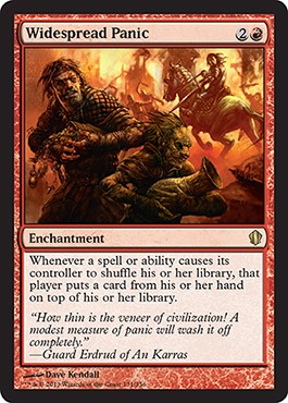
Widespread Panic . . . really? Who named this card after the terrible jam band from Georgia? I had to listen to them “jam” for minutes on end at the 10,000 Lakes Festival with some friends. They were just awful. There wasn’t a Creative Team member on the Commander team despite MTG Salvation’s wiki saying that Jenna Helland was on it, when the official listing said she wasn’t. Grumble.
Dave does well with the art. It doesn’t look like a Magic card due to composition, which isn’t a hard and fast rule, but the low-opacity background with the movable Photoshop foreground layer isn’t exactly Magic-feeling. The little Goblin is wonderful and needs a full story for himself. I wish this were a more Rakdos-feeling card instead of being pretty calm, but the artist has to follow the art description and probably didn’t push that angle.
He fit the card’s mechanic, and the art will be great to alter. Two friends looting—how perfect and wide open that angle will be. This feels like the new Stranglehold, surprisingly amazing in Commander, and I expect it will shoot up in price once the sets go out of print from Target and Wal-Mart.
Michael Komarck
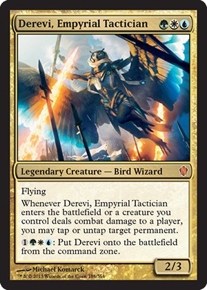 |  |
Is that a Bird Wizard woman? Look at the waist and hip twist. That’s not normally a guy’s pose. Then again, medieval angels were totally effeminate. He made some neat digital effects, and it’s something in the vein that Komarck rocks out with ease. Good job.
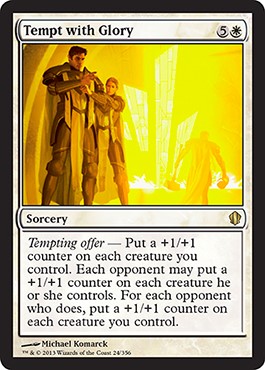
Tempt with Glory is an utter saturation of light, and the proportions are absolutely crazy! Look at the man’s size! He’s at least 6’5” compared to that woman. Unless she’s Hollywood-small like the 5’2” Hayden Panettiere, that dude must be enormous. Per the mechanic, it makes sense, too. I see what he did there. I like the armored woman also—good touch. That could’ve just as easily been a fifteen-year-old squire but isn’t. I hope this is Bant and the pair are partners like fellow cops, ready to get all up in someone’s business, like SVU Ice-T. I don’t recall the weird knee poofs, but armor fashion is super-weird sometimes. Codpieces alone need a full thesis to understand why the hell someone would wear them.
TL;DR: Basically, swag was the reason.
Karl Kopinski
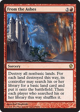 |  |
A giant comes to town, bashes things, leaves, and goes to a new town. It’s not unlike an American city urging taxpayers to pay for a stadium or the cultural offering of tackle football leaves. In this case, the only difference is that a church needs to be rebuilt. The visual storytelling is some of the best in the entire set. That said, that story isn’t what the card does. It’s more like a monastery or shipyard is burned and then a forest or island appears in its place, all magic-like. That’s lazy art-description writing, but you don’t lose something and gain that something back. That’s not what is happening. Yes, I understand that the tree is supposed to represent this, but at card size, you see church being built, a giant leaving, and a church (presumably in the past) being burnt. The tree doesn’t get its due and is very easily lost. This is a sketch chosen that looks very cool, but at card size, all that coolness disappears when the concept isn’t able to be seen. All the space is being taken by fire—a figure and a tree. Perhaps a change of perspective could’ve helped this piece. Warhammer, where Karl worked for a long time, has a ton of “sweeping armies” at nearly eye level. That’s not too apparent here, but I could see how it would play a role. In any case, it’s phenomenal storytelling.
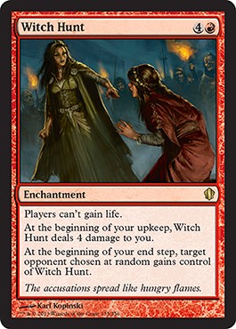
So, is Witch Hunt Liliana accusing another person of being a witch? All those crimes and zombies had to come from somewhere. Of course, Lily isn’t one to be personally responsible for anything. Worst. Girlfriend. Ever.
If that isn’t Liliana, that’s a hella tragic miss.
I like the two figures interacting. Karl is quite masterful and giving people space without crowding the frame. He had some room so you might as well show the mob.
Daniel Ljunggren
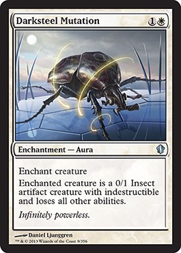
I’m super-excited that I have two ways to “Lignify” creatures in Commander, blanking those annoying commanders in my Naya deck. The wording is a little weird, requiring an explanation, but the art is pretty clean.
Isn’t Mirrodin/Argentum all Phyrexianized now? Is that untrue? Whatever; maybe this is in the past. I guess. A Phyrexian trying to extract unsuccessfully would’ve been my art description idea, but I’m a Vorthos. We like to continue storylines. I was looked at oddly for pushing narrative visually whenever I could in the past while working as an art director. It takes more work, but to the ten people who understand what you’re doing, they lose their damn minds on message boards. Trust me, they do. That’s Reddit fodder you guys. There’s no way an artist can know this unless he or she is ingrained in it, and Magic is just one illustration commission among many, you know? Since they can’t talk to others, being under a nondisclosure agreement, those over-the-moon moments are really quite rare.
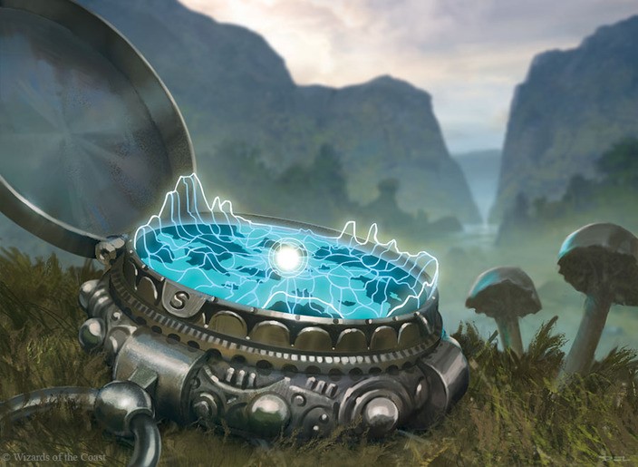
I love the digital-map readouts that Magic is slowly pushing into the artworks. I saw Jace finding the path in Ravnica in Uncovered Clues. I’m not sure if all compasses or scopes would have NSEW as directional choices, but so it is. Those are some great additions of mushrooms. That’s a very clever way to show scale instead of being cheesy about it. It’s small; I got it.
Todd Lockwood
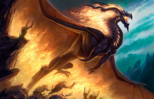
Todd made the cover to one of the better books on dragons made by Tor Books. The man knows dragons. He’s one of the best artists for making dragons, and like Paul Bonner for trolls, if available, you slot him in. Yes. You just do.
That’s just physical paint in all its glory. That’s how you make a fire-filled pyromancer excited for the boom. You can’t see the end of the dragon and where the fire starts . . . that’s the point.
Howard Lyon
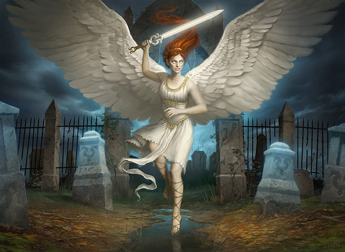
I retweeted this the minute Howard tweeted about it. The big thing I noticed is that his Angel of Flight Alabaster is the same angel. Apparently, when Avacyn comes back, the meek and shy angels love to lay down a whupping.
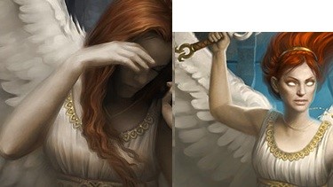
It appears that Howard had less time to work on this angel. Compare this image to Angel of Flight Alabaster. Look at the wings, the hair, the edges of the arms, and the faces. This feels like two different artists. The one on the left is Spectrum-included as one of the best of the year, but the one on the right feels incomplete. It’s not bad; it just doesn’t look completed to me or completed up to Lyon’s standards, as far as I can see. Not every image is award-winning, but this is the same character and makes me feel that different artists made it. The lighting alone feels wholly different. Perhaps it was to show the transformation, but that quiet, brooding light made the angel so strong, so meek. It’s just one image, nothing to be worried about, but some fans do notice this, and folks who know a thing or two about art definitely notice it.
I also found out this week that Howard and I are both Eagle Scouts. Neat.
Veronique Melgnaud
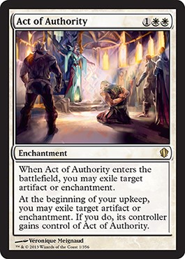
Humans are not artifacts or enchantments.
Enchantments are more like . . . I’m going to just stop. It’s obvious what this is supposed to be, but it makes zero damn sense on the mechanic, name or art. This is a top-down design fail. Someone internally at Wizards didn’t look this over. Why would an act of authority punish a person but affect an artifact or enchantment, neither of which is human? Have we moved back to the 1990s, where the art doesn’t need to make sense? Is this slush art that was bought a while ago and had its card chopped but is being used now?
It’s a neat artwork by Veronique, it’s just muddled because it doesn’t fit.
Let that be a lesson to artists: When art makes no sense, some people really love that. “It’s whimsical and wacky!” Most folks, in my experience, don’t care for it. Folks ask me sometimes about things like this. “This doesn’t make sense to me; can you explain why this is depicting an unrelated thing?” Um, in this case, no. Sorry.
Brynn Metheney
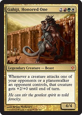
Brynn finally made it into Magic! NICE! She’s been making beasts, monsters, and dinosaurs for a long, long while. Not quite Chris Burdett long, but getting there. Happy to see more convention folks finally make the jump. I also love new people because they post their art because they’re proud of it. When you’ve had over thirty—I swear it’s thirty—you stop manically posting them online. The only thing is that new artists want to be totally sure that the NDA is lifted by seeing the art on official sources. When that goes up, they’ll then post like crazy.
Her dinosaur background is really shining here. The light falling over the beast gives it great-sectioned shapes for us to pick up on. I just wonder if “his” pectoral muscles are indeed that. I dislike the plan of slap-boobs-on-something-and-it’s-therefore-a-woman, but I can’t look away when I see something that looks like them. Anywho, great image. I love the worshippers, and let’s move on. It’s a good first card, and God knows Magic has plenty of beasty things for her to work on soon.
Terese Nielsen
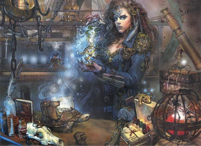
When you have an entire article on your character and that character isn’t on the front of the product, you know you’re in demand as an artist.
Let’s focus on my favorite thing about this piece: the bits! I love me some Easter eggs, and while I didn’t see any Magic artifacts from the past, the amount of sheer detail in this piece is fantastic. I’m sure Christine will be cosplaying it in the future, as will dozens of other people. Steampunk things will always be popular with fans. It’s not my jam, but if the people want bread and circuses, you bring the peanuts.
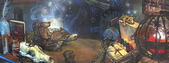
I heard this original artwork was already purchased, and frankly, I’m no longer surprised. Her pieces are becoming rarer every set, and we never know when she’ll go the way of Rebecca Guay and Donato Giancola.
Also, check out her alterations. They’re expensive, but they’re incredible and in a league of their own.
Karla Ortiz
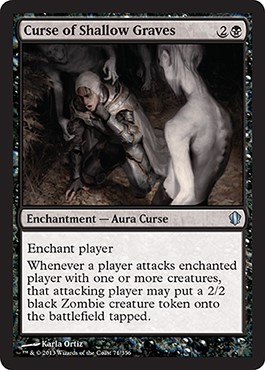
Hell. Yes.
That elongated neck has my spider sense tingling.
That zombie is the best depiction I’ve seen since I took History of Renaissance Art with my favorite professor Dr. John Steyaert, and he was enamored with the Mannerist movement, and that moment was when I knew that an affair with art would be a lifelong passion of mine. He called them artist hipsters, and that stuck with me that a man with a tweed jacket would mock the established art world. I traveled to Paris with him on study abroad, too. Fun fact: Art history study-abroad groups are 85% women nearly every time. Just saying.
Mannerism was art on the tail end of the Renaissance and was characterized by being the wink and a nod with some changes of things. It wasn’t breaking rules like deconstruction, which came two hundred years later. It was really the start of Post-Modernism. Once Da Vinci painted from reference perfectly and was able to show the human form, how do you get to a higher ideal? You just don’t. You still need to eat as an artist, so you try something else and deviate from the perfect ideal, making tension in composition, stylized forms, and perspective all over the damn place. It’s the meta art style if that makes sense. “I’ve already painted a zombie, so I’m going to make this thing amazing, ignoring perspective, and if you don’t understand it, well, you just won’t.”
I honestly think Karla is the most underrated artist in Magic right now, and that’s with only five printed cards. Her Teysa, Envoy of Ghosts and Ashiok, Nightmare Weaver show that digital painting isn’t always of plastic, flat forms. I hope we see dozens of new artists like her because she’s setting that bar high. New artists should be following everything she does and really study her pieces.
Steve Prescott
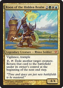
Well, that’s one way to show the green, white, and blue colors of the Bant shard: Put them in the image clearly. Upon first look, I wondered how simplistic it felt, but as I stare at it, I’m beginning to really love the brightness. I miss Steve making a bajillion images in the Lorwyn/Morningtide block. It was bright and garish at times for a Magic plane, but Christ, so many settings are just jet black on gray on a highlighted blue-gray.
Wizards, please, please keep using artists like Steve to keep color alive. I said it. I’ve seen enough environments that are dull in composition with muted colors. Give us more images that would make Bob Ross proud.
Good work, Steve. Love the simplicity of the armor as the gold interacts with the gray on his skin—it almost looks purple.
This is an original artwork, and if he makes it larger than average, there will be a buyer before Christmas as it is a commander. If you love it—and I mean love it—watch for it on eBay or e-mail him immediately.
Vincent Proce
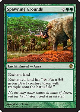
Colors! Yes!
Vincent doesn’t gravitate normally to bright colors in much of his horror work (check his website), but he does a great job here. The red dirt is mindful reference done right.
Interesting flavor perspective on this card: Local tribes won’t check out this oasis because of giant beasts there. Planeswalker must have visited here or somehow know about it to summon these beasts again and again.
Brad Rigney
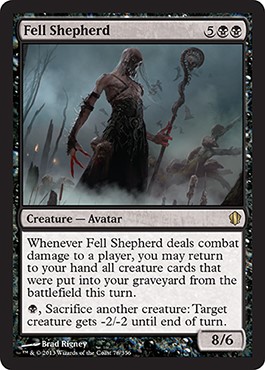
Great oversized hands, Batman! It is an avatar, after all.
This is a great silhouette by Brad. While it feels more zombie-shepherd than evil-thing-given-divine-power, with enough play, people will remember it.
I saw this as a foreign spoiler, and I wondered why a zombie was 8/6. For reference, a soldier is a 1/1 creature, basically being able to kill another human with one strike. Alpha’s War Mammoth was a solid 3/3, and most Dragons are in the 5/5 range. This makes him crazy-powerful and oddly numbered, being able to hit just a little harder than giant Wurms and nearly every Dragon. Divine power does that I suppose.
I hope Brad has a full-length version, showing the cat tails below a little better in depth to show scale. This would be a fantastic Arcana selection by Trick Jarrett to learn more. Ahem.
Andreas Rocha
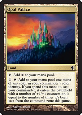
Yup, that’s an opal palace.
It’s also Superman’s home.
It’s also every sorcerer’s castle from half of the 1980s.
I mean, how can you, as an artist, win with this one?
Artist: “I got another Magic card commission!”
Spouse: “That’s awesome; what is it?”
Artist: “It’s a land called opal palace.”
Spouse: Laughs. “So, it’s a Lisa Frank–colored castle?”
Artist: “Pretty much.”
Andreas, you did what you could, man. You kept it serious, and I applaud for that effort. It’s hard making princess-colorful into a Magic illustration that is cool to put your name on. You pulled it out. I feel you kept it similar to a 1980s-reminiscent castle to keep that homage alive. That doesn’t feel like a punt, it feels very intentional, like a VH1 Remember the 80s TV show, and you’re giving us all a thumbs-up if we catch that reference. I see. What you. Did there.
Jasper Sandner
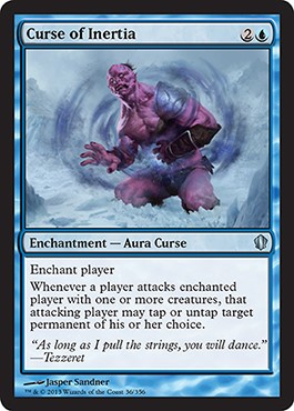
Is that a Coldsnap tie-in with a planeswalker flavor text? Is that taking Magic’s history and using it for a top-down design? Vorthos players love when everything falls into place. This is the polar opposite of Act of Authority. That piece doesn’t make sense, and this has everything in its Radiohead right place.
It’s a nice-lookin’ giant, the show looks believable (I’m from Minnesota, land of snow), and the magical effect isn’t distracting. It’s just solid work all around.
Dan Scott
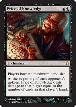 | 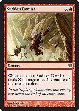 |
Ugh, Sudden Demise is frickin’ awesome. Price of Knowledge is fun and depicts the mechanic, but that Zendikar scene in Sudden Demise is my jam. I live for these artworks. Notice that since it’s on Zendikar, Kor are present, and the ropes are clearly listed—you can see an art description taking shape. The color is red, the action is people falling, the mood is tense, the location is on a mountain, and the focus is the only Kor member holding on. That’s the description, roughly, and it’s very clear. The inclusion of the hedron dates it as before the Eldrazi-being-released hot mess, but perhaps not. We don’t really know, and frankly, I didn’t read that novel due to everyone I know who did telling me how terrible it was.
I just love the motion and even the possibility of getting a glimpse into a recently-passed plane. That and Dan’s good with the art making, so we get the goods. Between these two, look at the versatility. Artists like Dan are dreams for art directors because they can give them location, figure, beast, whatever, and there isn’t any stress. You have no idea how comforting it is to know that an artist will just take care of an assignment without handholding. It’s a damn godsend.
Cynthia Sheppard
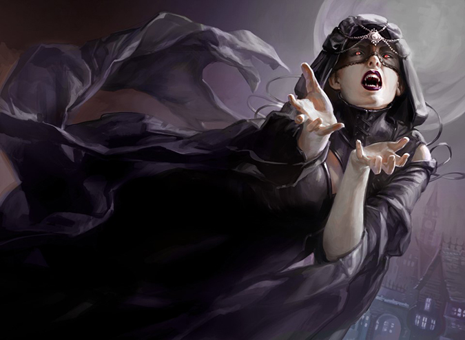
Cynthia posted about this piece on my birthday on her blog.
It’s great obviously.
Upon seeing this, I’d immediately think, “Huh, let’s give Cynthia some close-ups of hands and items in case we’re ever short.” Donato’s always busy, and current cats we use might need some help from time to time.
Otherwise, it’s stellar work. Not much else to say.
Phill Simmer
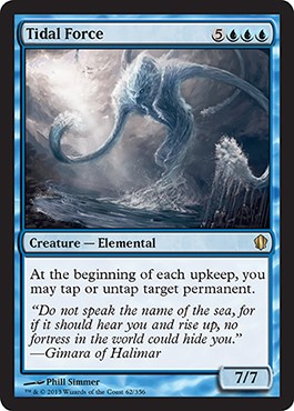
So, he’s new to Magic.
Question of the day: Did he know about Water Servant or not?
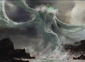
Was he given it as reference? Or not?
What do you think?
It’s a good variation of a depiction in any case.
John Stanko
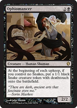
Yeah, Ophiomancer does sound better than “snake wizard.”
I’m happy to see John return to his bread and butter in making humans. I’m not in love with the snakes, but at card size, so much is lost. It’s hard to tell if the snakes on the left are right next to the shaman. The lighting doesn’t tell us. Due to their size, they have to be considerably closer. They look like a Photoshop layer, especially apparently around her sandaled foot.
Were this just a figure and tiny snakes on the ground, it’d still get the point across because snakes that are large probably aren’t 1/1 creatures if they have deathtouch, but 1 is the lowest denomination for damage. That said, the standard 2/1 Snake with islandwalk is considerably larger, making a smaller snake possible, but I like the size as compositional element. Works for me.
John always makes one painting of each piece. He works digitally and then paints over the top of the print out (however it’s attached to a board) and then adds layers of paint. Those snakes will really pop in a traditionally painting. We’ll see if John will be so nice as to take a snapshot of that final form. We shall see.
Zack Stella
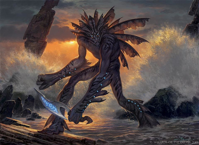
This is a merfolk rogue that has protection from a planeswalker (player) that looks like a lion fish and is on the shore. While I like the aesthetic of the lionfish, I guess my inner Vorthos is confused how a very venomous fish gained protection from spells or damage. By having venom, things don’t want to interact with it. Is that it?
It looks gorgeous in any case.
I think the white glow dots and the sword detract from the overall piece, but that’s me. They feel added in to fulfill an art description because the actual creature is awesome. It’s a damn lionfish; does it really need a weapon? I mean really?
Great work, Zack. Your two waves might seem overlooked, but they just fit into the composition so well that people will have to notice them late to see the quality in the piece.
Matt Stewart
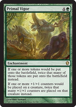 |  |
So, Matt got a must-have card in Primal Vigor for Commander players. Kudos to him for getting it! Hope he prices his artist proofs aggressively.
I heard it’s already being scooped up, and that makes me a little sad. I always want player collectors to have the art. Rarely does Magic art change hands when it’s a pretty prominent artwork. They are admired for years.
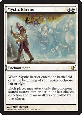
Mystic Barrier breaks the fourth wall, showing a figure looking at us, the player, and giving us a nod like the Un- sets gave us in the past. While I think an Un- set wouldn’t burn as hot now, as Magic has aged, instances like this that are very mechanically driven, even calling out players in the rules text, needs some lighthearted interaction. If this becomes a trend where Planechase, Commander boxed sets, and the like have artworks like this, sign me up. I love them and am happy Matt received it and nailed it. These less serious depictions really reward enfranchised players.
Phillip Straub
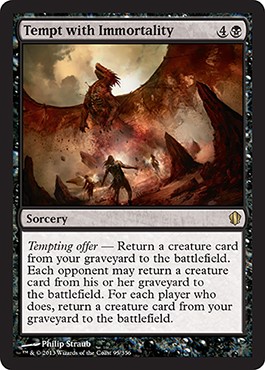
I’m a flavorful dude. Killing someone with a dragon’s breath weapon is money. Having cards that play up Vorthos’s loves of flavorful interaction are bread-and-butter staples of our interests. I love how this flavorfully makes sense. You’re raising something from the dead, a fellow wizard brings back a fallen dragon, another brings back a beast, and in the end, you have a powerful lich, some undead goliath, and some sort of demon. That’s an awesome story, no matter if you win the game.
Phillip’s rusty/dead wings are fantastic, and the slight shift of the depiction down and to the left gives us the rumble of the ground. Great work!
Robbie Trevino
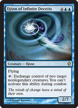
This card is silly-powerful in multiplayer games.
Seeing this swirl flashed into battle will annoy me to no end in the near future.
That said, I don’t feel this was a good assignment for Robbie. His drapery has been amazing in the past, showing form with really subtle lighting angles. This image has no drapery, a big Photoshop effect, very little forms to create new, or really anything innovative to make.
That’s just what this look like to me; why did they use him for this work?
Svetlin Velinov
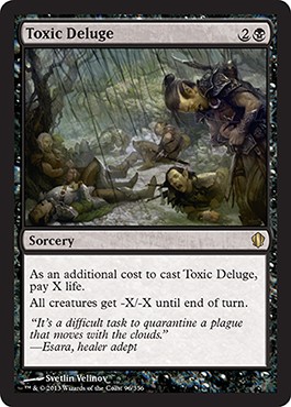
Mmm. That is some well-illustrated pain.
I immediately understand the situation, and it feels like a new image to me.
It’s not Kamigawa, though the lines feel like arrows from the sky, and the figures could be anywhere. That open-ended nature fits with Commander, but placing them on a plane is an art-description choice.
That elf on the ground is great usage of reference.
Good work!
Magali Villeneuve
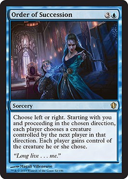
This is another one of those great-image-but-the-concept-doesn’t-make-sense works.
On paper, it should make sense that you gain a creature, thereby gaining influence for political gain, showing how a new ruler creates a trickle-down effect of loyalties. That makes sense. The problem is that the last person can inflict power over the person casting the spell. That doesn’t compute.
I suppose all the little people you pass on your way up to power will be the same people when you descend to the bottom, and there’s always one person who has a secret on you that could ruin you. That could make sense?
I’m thinking too much about this.
Magali makes pretty people. She’s great at that.
She’s French, so she should know how light interacts in a cathedral; don’t doubt that her lighting is spot-on. That far-right blue light? It’s probably smaller windows and blue glass. Blue translucent windows actually allow very little light through, as shown. You’ll notice that Jesus’ mother always wears blue, but the color is super-light, as to allow light through.
Kev Walker
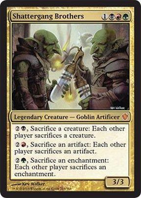
I like Shatterbang Brothers, but bang brothers likely didn’t get through the naming-selection committee. Last thing Wizards needs is people coloring our shatter and getting bang brothers. That wouldn’t create any issues for them.
Kev makes a mean goblin, and I like his framing element to show that the goblins are currently hiding, waiting to blow something up. Walls with a lip create that without really painting all that much more. I mentioned before that Kev knows how to edit down a scene, curating it to its essence. There’s a reason he’s been making so many illustrations. That mindful choice is what makes two goblins into two brothers planning some boom-booms. That takes years of being an illustrator to learn that skill. Of course, his usage of paint shows the scene and the colors are on point too. A+ work.
Jack Wang
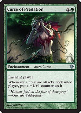
So, this Curse actually helps other Commander players gang up on him—literally. The others might help by drawing or whatever, but this actively says, “Target that player, do it now.”
How do plants attacking this figure represent that?
I’m banging this drum because I need people to see that some of these concepts aren’t top-down designs. A Creative Team member wasn’t on the Commander design team. This is an incredibly important omission because punts like this happen.
Is this creature growing larger? No, clearly.
Is this creature a player, therefore, a planeswalker? Maybe, but doubtful.
Is this creature a player, from one of the Magic Online images we see? Likely.
Even if it were a player, the vines don’t represent what the ability actually is. Is this a last-minute change? It sure as hell looks like it, and Jack Wang was thrown under the bus. “The art we needed it for, yeah, it got changed. We’re still going to use it and pay you regardless, but it’s a square peg in a circle hole now.” “Um, thanks.”
Maybe, just maybe, this is what it’s supposed to be. If so, that’s a terrible art description. If not, it changed last-minute, nullifying all meaning.
Both are bad. Not sure which one is worse. I just feel bad for Jack. Sorry, bud.
Allen Williams
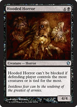
Allen is a master of pencils. His line work will melt your face off. This artwork will probably gain a lot of nuance if you remove the color and see it at a 11”×17” size. I know the legs alone will probably trend downward, giving us a great sense of place.
Just another day in the studio for Allen, drawing up innovative figures that make you examine the new creation.
Mark Winters
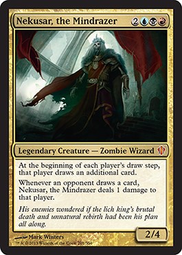
Location: INtereesting
Color: Grixis, as shown by the reds, blacks and blues
Focus: Bad-ass lich
Mood: “Biscuits, shib is about to get real.”
Action: PS3 epic hero strut
Magic should really use the type lich better. Every lich made has been terrible, but every Zombie Wizard has been pretty good. I swear one of the Wizards employees mentioned that they need better liches. Might’ve been Doug Beyer. I can’t recall.
Anyway, Mark did a pretty good lich. People will play this card, and he’ll be signing them for a long, long time. He’s been settling into his role as a Magic artist pretty well. He keeps doing legendary creatures—that certainly helps for having people constantly wanting you at Magic events!
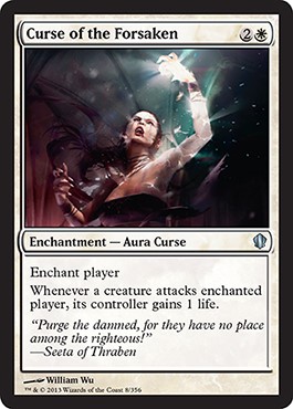
William Wu
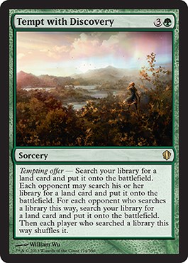 |  |
I really wish William would get on Twitter because I’d love to have a tweet chat with him over a lunch hour. He could have reference images prepared for uploading because, obviously, this Tempt with Discovery comes from somewhere. Was he on a hike? Did he find inspiration in a local museum? That pink sky with light blue next to it feels like some old depiction of what mana looks like, showing it as colors without hitting us over the head with “COLORZ, YOU GUYS,” in the image. This is a great, new-school approach to an old-school-type image. This could just as easily be an elf in the forest with five blobs of color. While you might not be a Photoshop fan, dear reader, let’s be grateful that Magic has incredible artists like Wu who can do subtlety.
Then, I saw, late in writing this article, that he made another image that was on a polar opposite from his environmental piece. It’s over the top, using Photoshop effects everywhere, literally lifting a layer directly from a photo. I can see it’s in some type of church, but the effect is so damn bright that I can’t see any of the architectural elements. Yes, I know, the curse is supposed to be over the top, but, well, you win some, you lose some.
Nin Yum
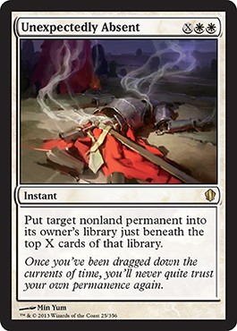
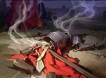
We have flavorful explanations for what a library is, what a graveyard is, even what an exile zone is like. We don’t have something explaining what a “tuck” into the library represents. I figure it’s like purgatory—a space between spaces. I’ll have to consult the experts on this one.
I love the loose brush strokes on this. I truly wish it were painted traditionally because more images like this, especially showing clothing and armor, need to be made. Noah Bradley has tried to go back to traditional, as has Steve Argyle and John Avon. Maybe Min Yum could be next. God knows, with original art now hitting the $400 starting mark for anything, there is a definite monetary benefit to using a physical paintbrush.
I love this piece. It feels painterly, and losing the context, it still shines. No doubt, it’s in the top five of the new cards being printed.
Eytan Zana
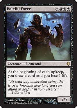
Eytan has received a lot of environment commissions for Magic. He’s a concept artist for Naughty Dog—you know, it’s the place that made The Last of Us, an amazing game.
Can we all agree to keep giving him lands? His pieces in Innistrad were some of the best I’ve ever seen. His figure here is okay, but isn’t breaking boundaries or bringing anything innovative into the fold. It is an elemental, but compare that to these:
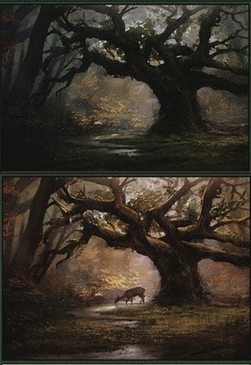
C’mon now. A lots of folks can make elementals.
Very few people can create light that looks natural while keeping the land different for each block. Ask John Avon how difficult it is to paint the same thing while keeping it fresh. It’s crazy-hard. He makes environments all day long, and I know he wants to branch out; we can see that. But if we are denied awesome environments as trade, I’m not sure I’d be inclined to say yes to that.
Mark Zug
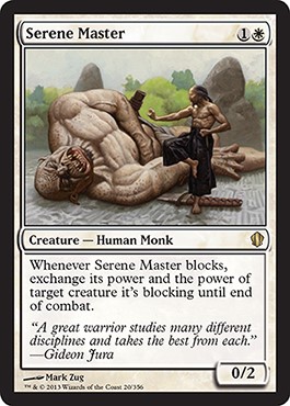
Well, isn’t this artwork odd? I hope this is a new artwork because if this is from Kamigawa, wow, that was a long time for a piece to be in the slush art pile.
That’s a great future Ask Wizards question:
Huh. I’ll ask that soon.
Anyway, Zug is a crafty veteran, and that monk looks like a well-oiled Bruce Lee. His bottom foot looks a bit flat in color, and the shadows on the giant look a bit odd to me. They’re flat. There should be a shadow beyond just the side of his face that faces the ground. Maybe this is slush, an old piece of slush art. The background greenery isn’t in his normal wheelhouse. Maybe it’s an earlier work that’s been sitting around a long while or one he threw down in an afternoon. Sad to end on that note, but so ist es.
Thanks for reading, and let me know if alternate artworks for Commander is something you’d like covered.
Also, in other news, MTG Tactics is going away. No one even appears to have noticed. Huh.
Christmas is right around the corner; would you like a Vorthos wish list again? Maybe a black Friday deal, too? Let me know.
- Mike


