Archenemy is one of those sets that is a direct response to a competitor. Back nearly a decade ago, the World of Warcraft TCG did a few things right and the game’s multiplayer experience, in the form of raid decks, rivaled its namesake MMO . Normally, cooperating to take down one person is unfortunate or necessary in a game of commander. The idea of teaming up to take down an intentionally more powerful foe was a copied concept.
Even now, I find it hard to tell if people bought fewer Archenemy sets the first go around in 2010 or if they just printed fewer, trying to impact collectability as compared to the widely popular Planechase format. The idea was sound. The execution, especially flavorfully, didn’t quite fit.
I had hope they would learn from their first attempt and, wouldn’t you know it, a planar antagonist in the form of Nicol Bolas could not be more perfect for the set. The Archenemy and Planechase products are rich with larger than average artworks showing us glimpses into worlds we have not seen before, both what is to come and things in the past, snippets into what was going on across the multiverse. It’s as if the entire Future Sight set could have been done as fragments amongst planes, or hyper focused, centered around an ancient, scheming dragon. I think this set succeeds in building the alignment of flavor.
I’ve often told art collectors just starting their collections to immediately look at the oversized schemes, phenomena, and plane artworks because that art was wildly underappreciated and generally larger than the average piece of Magic art.
This iteration is no different, commanding some of Magic’s most prominent artists to complete scenes of devastation on the plane of Amonkhet. I did find the quality to be a standard deviation lower than what I would expect from Magic, probably due to the overwhelming amount of supplemental works required by the product. When everyone paints the same dragon, inevitably there will be a best one amongst the group. When everything is good, some artworks will be objectively great in comparison. I think that’s ok too. It’s natural to have people stretch and strive for exceptional when given the chance, the young artist wanting to upstage a Todd Lockwood, as it were. Let’s see if it happened.
Let's go over the images shall we?

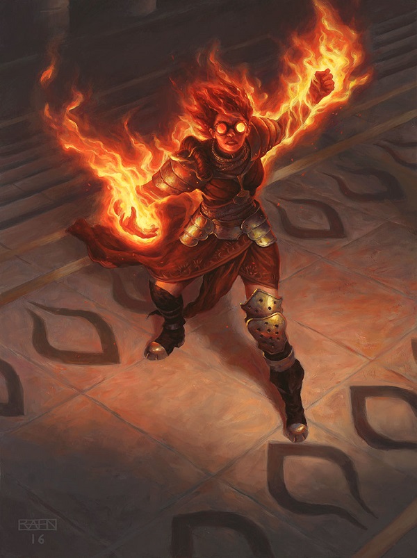
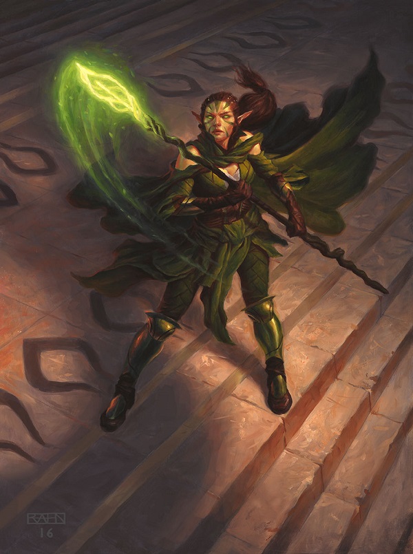
Gideon, Chandra, and Nissa all by Chris Rahn
All three, oil on birth plywood, 22.5 x30” each.
Oil on
What a lineup to start out the set!
One artist was given four Planeswalkers to recreate in a scene that rivals the game’s intent itself, as each player has a deck corresponding to each Planeswalker. I connected the images into a triptych, as each painting is actually separated on separate pieces of wood. This image existed in the wild, and seeing the Bolas horns as shadow can’t be unseen when the team is together.
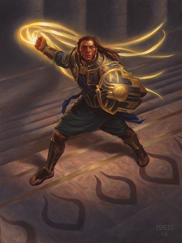
Of the three, Gideon stands out as being the most complete and the most quality of them, perhaps due to the radical difference in his clothing and armor. He feels different because he is different. Without the sural, he is some traditional Biblical warrior, having heraldry from his culture, beating back the goliath with a whip instead of a sling. The lighting is all over the place from a variety of sources, though the angle of focus, our lens, is from the dragon’s perspective. That is why his head appears to float. You don’t see necks when you’re that many feet above people. So while an untrained eye may see his head needing to be moved a few times by an art director, it’s the angle itself.
I feel goggled Chandra came in second, with Chris adding some detail on Chandra’s robes and neck scarf/gorget to show us a change in character. She looks older, more in control of her power. Yet, in Kieran Yanner’s Chandra's Defeat, she is the student who failed the final she needed to pass to graduate. She lacks surprise in this Archenemy depiction, though who wouldn’t have LaVar Ball level of boasting arrogance after disintegrating an Eldrazi titan?
Note the slight drops of paint between her hip and her raised hand. That’s traditional paint evoking embers slowing coming down. You don’t normally see that level of realism in dealing with fire. It’s very well done.
Oddly, Chandra sold the worst out of the three Planeswalkers. Nissa, shown below here, has a ton of adoring fans, including Nissa, Worldwaker being a phenomenal card. I don’t play the Standard format, though I’ve seen four dual lands be untapped as a result in the Cube format from her. The card’s good, but how about the art?
Nissa is shown as youthful, normal by elf standards. The green bodice as covered vs. uncovered is fixed as a final note, with white showing beneath. Linen would make sense on the Egyptian plane I suppose.
Her hands are painted sufficiently, her green glow looks traditionally painted, and the blurring of her cape is subtle yet effective at showing motion. Everything is minor in difference but all the parts add up to a sum work of high quality art.
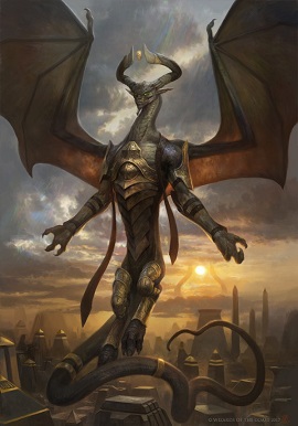
As for the dragon itself, I don’t have much to say.
Chris doesn’t punt on Planeswalker commissions. He always executes at a high level and his dependability nets him additional prominent card commissions, as he has earned them. It’s good. It looks nice. It’s another creature standing atop a rock, which like Frazetta, he does often. It works. I like it. Everyone likes it.
What I would be remiss in saying is that Chris, unbeknownst to him, was competing against another card artwork. Zack Stella also received a Nicol Bolas artwork; though, his was a scheme, not a Planeswalker card, and it is phenomenal. When a digital artist moves over to traditional paint and feels like they have something to prove, even a master like Chris Rahn can be upstaged.
Though, upstaging is relative when you sell for the second highest total for a Planeswalker ever, and barely under Chris Rahn’s own Black Lotus in 2012. (Sold for an astonishing $16099 then.)
I won’t compare social media statistics because neither are ultimately all that active, but I look at artists. I look at who they comment at, and stare in awe at. Collectors wanted Chris’s because it was the new card art. All the artists wanted Zack’s.
Look at them.
Put on your art history hats and compare the difference of using entirely accurate lighting (Rahn) in the wings, to allowing the Planeswalker’s face and chest to be prominently lit for player recognition. (Stella)
You stop after about a minute because it changes from a, “who did it better,” to asking yourself if who the artist is impacts your decision. Objectively, I like when young bucks force the established to keep pushing. One slip up and there exists a line a mile long behind you, even at Magic’s level. We’ll talk more about that soon.
 |  |
And if you asked yourself, why didn’t they switch the Nicol Bolas paintings around? That is always a pretty serious decision and a massive controversy for artists behind the scenes when it happens. It’s a breach of trust. At Magic’s level, you have to trust your art director and, likewise, your artist.

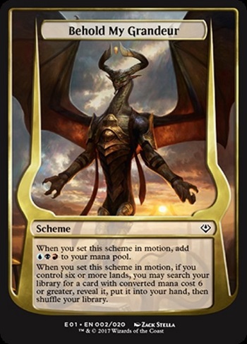
Behold My Grandeur by Zack Stella
Where do I start with this?
Do I enjoy the tail the most, seeing the strong serpent’s whip for effect?
Is it seeing the armor, showing us detail that isn’t necessary, but Nicol Bolas surely would?
Is it minimizing the scarves, pushing us away from an anime depiction of layers of fabric for effect?
I enjoy seeing a dragon bicep muscle. I find it fun to see how this dragon’s neck differs from Smaug’s. I am given joy when I see the ever so faint kaleidoscope of color emanating from his hand and above his head, connecting us back to the 1990s when every color had to be shown in an artwork. It’s such fan service and so unneeded yet Zack plays. He knows. He was given a shot and he took it.

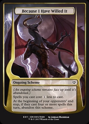
Because I Have Willed It by Adrian Makrzak
Digital
Adrian has been around a little while and this painting gives us a little more realism into Nicol Bolas’s armor and how it attaches to his musculature. While we saw in Zack’s depiction, seeing a strap go over his well toned booty is actually kind of funny to me now that I look closer.
I just can’t unsee the wings
I don’t like being negative and it doesn’t accomplish much, months after an illustration is finished. Brushstrokes aren’t blended. They look hastily done. It's not quite fan art rough, or speedpainting on a stream, but it’s pretty close. Seeing an artist stretch for greatness is delightful, especially when you see them in person all proud saying, “I have some fire coming.”
You don’t hear that from an illustration like this. One just hopes no one notices.
I argue with myself over these things.
“Should I even include the artwork? Maybe I’ll just forget it on purpose and no one will be the wiser. I’m sure the four people who notice aren’t going to be upset.”
And then I realize that I’m the only person talking about the art. If I genuinely cannot find a higher resolution image, in a set of 300 card artworks, it’s forgivable. In a small supplemental set, omitting one is sheer laziness and that’s on me. When 99% of card artworks turned in are at least good, the 1% do need to be shown from time to time.

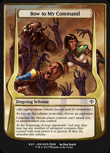
Bow to My Command by Dan Scott
Digital
Notice that this card does not kill these creatures. While the purple hands are digging into the goatataur’s shoulder, it’s intentional that he's not bleeding heavily or being heavily wounded by it. The mechanic states that it is not damaging. Having the sand go to their wastes, effectively making it annoying quicksand and creatures from a Mel Brooks movie slowing a team, but not stopping them.
I wish we could see this as a larger scene, because it’s targeted to likely an entire army. I do wonder if the effect would be minimized though, as eight power is technically eight 1/1 soldiers, or in this case, two to four more people to stop the effect considering a goatataur is present.
I also can’t tell if the hands are demonic or necromantic in nature. If the art description didn’t say, good on Dan to not make it clear. Nicol Bolas doesn’t (or didn’t) really work predominantly in either area to be frank. A non-zero contingent of vorthoses are puzzled why Nicol Bolas became so enamored with zombies considering he never did before and Planeswalkers are given unique grids for what they’re into. Liliana of the Dark Realms made no sense as to why her ultimate was creating more mana, when nothing about her indicated mana production was important.

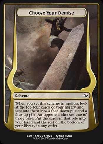
Choose Your Demise by Nils Hamm
Digital
How fun is looking at Nils Hamm art works? One can never tell if it's traditional or digital as his process is near identical for both in its final execution. This one is totally digital and I hope it doesn’t print dark or that khenra will become muddy quickly as Nils made his features subtle.
I don’t quite know how letting your opponent choose ammunition for you would result in a khenra (a jackal) being stranded on an obelisk in a flood, while locusts attack. How does that help the player? How does that show them?
That isn’t Nils choosing that. That’s the art description.
Perhaps we are to assume that the khenra is going to die regardless, and somehow has gained an advantage (?) that will not matter in the end anyway? I guess? I’m confused.

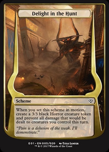
Delight in the Hunt by Titus Lunter
Digital
He really fooled us with this one didn't he? Got bamboozled, didn’t we?
We all thought that one of these creations was going to be one of the missing gods and none of them were.
This art is one of focus. Some things are richly detail like the mosaic in the bottom left to the hand grasping the building, yet the weather elements are quickly done additional brushstrokes here and there to keep you from staring at the whole picture and instead laser point your focus at four things: the foreground demon, the scale birds, the Lazotep building on the left, and the jackal demon.
You'll start to see this quite often if you look for it — the focal points. Trying to find the three points artists bring from a speedy sketch into final, a sketch into a tighter composition, a tighter image that has the required things shown. Magic art directors are really in tune with this as three out of the four are digital artists themselves, and not traditional painters of watercolor, acrylic or oil paint. They know that having detailed focal points are incredibly important.

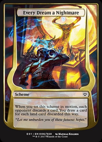
Every Dream A Nightmare by Mathias Kollros
Digital
Matias definitely understands the usage of blue as magic. From his Call of Cthulhu days of needing to put mist or haze or fog in nearly everything, taking that experience and moving it to a magical ability that removes memory is an easy translation. The blue by the figure’s knees and in the bottom right is exactly on point and feels perfect.
I'm struck by the scale of the Planeswalker dragon here. Look at the size of his claw in comparison to the top of the pillar of this building. I knew he was large, but, at times, a scale bird or a scale person next to him does not convey how large this dragon actually is.
I also love the yellow here, as the primary colors show the spell being cast in blue and the spellcaster, a balance of yellow, down to a little bit of red adds to the construction of the piece quieting down the scene. Color sure is fun here.

For Each of You, a Gift by Marco Nelor
Digital
This piece shows the stylized representation of two figures, one alive, one seemingly dead version of the minotaur on Amonkhet, the goatataur.
I asked Marco Nelor about making this and he was brief:
I finished it while the movers were moving my stuff across the US to SF, and finished it sitting on the floor on my small laptop.
Well, there’s that. Everyone has time crunches from time to time and I often forget that in writing these little art reviews. Granted, many artists have numerous grandmothers that pass away, though very real incidents happen like moving, a horrific car crash, or a death of a sibling. We don’t often hear of those because artist interviews aren’t ultimately that common with each set. I will see if I can incorporate more of the human side to why an artwork looks like it does.


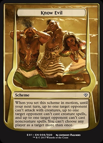
Know Evil by Anthony Palumbo
Digital
Oh what a fun usage of three different mechanics into the description that fits the culturally Japanese adage.
You can't attack if you can't see, you can't cast spells if you can't think or hear, and you can't cast spells if you can't speak. It's a clever play that we haven't seen before. I like the idea of using adages as our descriptions, connecting them to magic somehow, expanding the vocabulary of what a water spell is or what attacking may be.
There's one problem though.
See no evil, hear no evil, speak no evil is actually an adage on someone refusing to act via a lack of moral responsibility, looking the other way or a gangster not snitching. It is a feigning of ignorance that they actually do know all three of these things and are choosing not to because you wouldn't need to cover your eyes or your ears of your mouth if you were innocent. So, in actuality, it's an interesting idea conceptually but the execution doesn't really make sense when you think down to what it actually means.
It's a lovely painting with a really great backlighting by Anthony Palumbo including the woman who seemingly is puking instead of trying to protect herself from speaking. That's comical, and the zoomed in look is a clever way for us to see what clothing is like for cosplayer reference.
I am always surprised by steps in fantasy games that have temples with stairways up to some sort of throne. If you look at reference images of the pyramids now they are no longer smooth due to earthquakes and rocks being reused for mosque building. The originals were smooth, and almost glistened in the sun. So when you see these things painted and you see chips off the brick steps it's because of the reference they are using not actually what they should've looked like at the time. A little bit too much realism in your fantasy, isn't it?

Make Yourself Useful by David Gaillet
Digital
As the point I made previously about bricks being uneven comes into play here. Look at the background pyramid in this depiction. You wouldn’t assume in a perfect culture that has servants to fix these any fifteen seconds that imperfections would exist. Look at any modern day football stadium with bricks and you can see how often they need repair from the elements. I live in Minnesota and bricks are constantly being redone because of the snow and 100° summer. The expanding and contracting of mortar between bricks does that.
Personally I just don't like this image because the lighting references are just ignored. The elements of the armor are great, the scene is well composed, but the light just doesn't make sense. There are two suns here and how the person is lit reflects none of what the setting would say.
There are about five artists that can fall into this trap pretty easily and, depending on time and necessity, it isn't always needed to fix those sorts of things. At card size, most of the time you wouldn’t notice it. For a larger card like a scheme or a plane, it stands out a lot.
It’s still so pretty though. For every thick brushstroke David Palumbo piece, does Magic have room for David’s work of idealized forms, lighting and armor? I think it does. I just want more realism in my fantasy than other people because the highest quality artworks tend to want it as well.


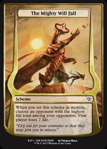
The Mighty Will Fall by Volkan Baga
Oil on board. 15 x 21”
Sold for $3550 at the MTG Art Market group on Facebook.
This scene by Baga is phenomenal.
The background sun in the middle is muted yet part of the scene without interacting or being forceful into the main action of someone being decapitated. What a fun art description.
This was another of the auctions that suffered in comparison to Chris Rahn and Zack Stella’s dragons.
The building with its weathering that is happening because of the devastation and destruction is actually quite well done. But, in a set dedicated to the Planeswalker dragon, if your depiction of the dragon isn't better than the above average, it will stand out like a sore thumb. I love Volkan Baga’s work, don't get me wrong, but he is not at his best depicting dragons. There are other illustrators who can do this better. Another artist could give us phenomenal and sometimes you have to give your tier one artists a pass to get the right illustrator for the job.
I personally think their overusage of Kieran Yanner, Tyler Jacobson and Chris Rahn on legendary creatures to story spotlights shows the lack of bench strength in the artist community for Magic's highest level. There are no people like Donato Giancola or John Picacio to call up when you need a boom boom illustration. There isn’t a Dan Dos Santos who will pick the call up at a moment's notice. Magic is learning that it has to build it from within.
I say this because while I was an art director for a lesser TCG over five years ago, people like Filip Burburan, Lake Hurwitz, and Sidharth Chaturvedi were the stable artists then. I remember scouting for them. From five years to today that is where we are, what you should be looking for is people who started two years ago and have transcended into the highest level today. And there aren't that many of them.

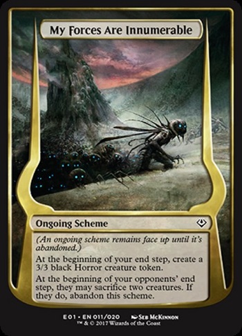
My Forces Are Innumerable by Seb McKinnon
Digital
Cute, it's the dark tower.
I'm not quite sure how sacrificing to creatures will stop a horde of horror's being created. It feels as though the tower or the gateway that was created that keeps spitting out the horrors could be the thing created not just the scheme. They could've gone one more level to say something was created, maybe an obelisk or a gate, though the planer gate concept has not been fully examined yet in the storyline. It’s obviously what is coming and Nicol Bolas is creating these eternalized zombie creatures. But showing a gate is like what Innistrad did with a demon summoning does not fight the storyline but rather gives us some insight into how powerful and how far reaching this dragon’s power is.
While necromancy was not a central tenet of his as of late, bringing in horrors or demons from another plane should not be something outside his color pie or even outside what he is accustomed to. Instead we have an image that feels incomplete as a concept; something that is 90% there and could be changed ever so slightly to get removed from play or impacted in some way in the art description instead of sacrificing two creatures to stop the horde.
That said, Seb has been on fire as of late for really interesting compositions and beautifully rendered textures. The, “is he digital?” questions I field on Twitter are far from zero and that’s wonderful. Nils and Seb are keeping people guessing, forcing people to appreciate the art first, and think about medium second.

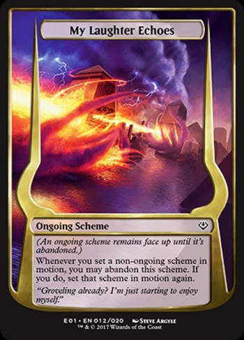
My Laughter Echoes by Steve Argyle
Digital
Steve sure does love purple and red doesn't he? I wish Steve would've been given the option to paint a little Nicol Bolas in here. Maybe in the form of a cloud, or in the form of a hand like the card conflux which shows his hand could’ve shown the mechanic and the dragon simultaneously. That, or we should just appreciate the scaling of a projective back into the piece showing depth, never questioning what it would look like to have it scream toward us on the water in a boat.
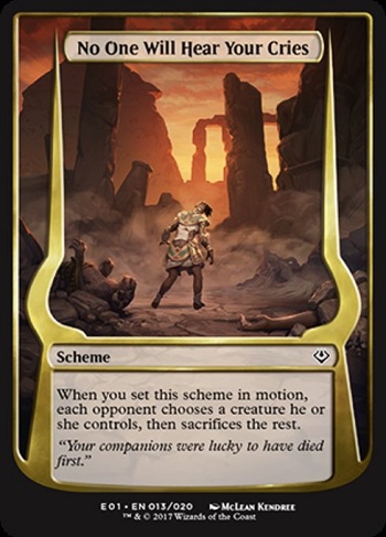
I love this art description. This idea of the cataclysm, the sins of yours will make your friends pay for it, is such a fun thing to show because there are so many different angles and emotions that you can convey with it.
I'm shockingly surprised that they didn't include Gideon in some way considering he was the only one left with all of his irregulars perishing on Theros. This could be such an easy call back to that, connecting in the art descriptions, perhaps on the ground with the fiery circle around the person. That’s also forcing an art description, which is a cardinal sin.
It could feel cheesy very quickly to reuse a concept, but the concept can be re-examined in Gideon's Defeat. He can't survive everything. He is not invincible and the flashback, the traumatic event should be reused more often because it is critical to his story line. His responsibilities and his actions do not only affect the indestructible him, they also affect others.
McLean is also a newer artist to Magic and I can't see what is in store next for him because the scene really doesn't give us any insight into what the art directors have him pegged as. I look forward to seeing what his role will be going forward.

Pay Tribute to Me by Aaron Miller
Digital
Novel cover.
The first thing I thought of when looking at this image at the Magic Art Show in Las Vegas. Aaron gave us the tonal sketch to show in the Amonkhet area.
It does not show an exact scene or an exact scheme happening. Rather, it is a representation of the battle of what is happening. This is like the Napoleon paintings back in the day where they would recreate what happened without showing any sort of narrative. This is supposed to make your opponent lose something and by showing three of them, it shows who will be sacrificed from each player in a four player game. Notice that each is of a different race, a different type of participating warrior of Amonkhet. It's conceptual in that sense, like a novel cover.
Hopefully Aaron can get back to doing a few more traditional paintings. He does work very large at times and I would love to have more of his paintings in future art shows!


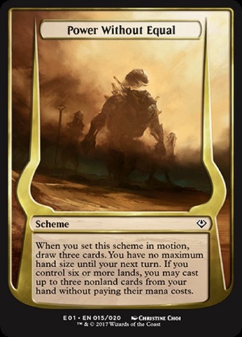
Power Without Equal by Christine Choi
Digital
This painting is so good it hurts me. Showing the three gods that were missing from the pantheon slowly returning obscured with a dust storm counteracted by greens by their feet.
These three gods are not saviors to the average person, but rather three of the four Horsemen of the apocalypse with the fourth being the Planeswalker dragon himself.
I like the minimalism of this piece.
I like the nod of the three spells that you're able to cast from this piece and the impending doom that the entire archenemy set is supposed to convey. There is no chance anyone who is not worthy can defeat three new threats, with three additional cards being drawn as future threats as well. Archenemy encapsulates itself in this card in how it feels, and separates the noise into the inevitable with a color-muted beauty of an artwork.
Phenomenal.

A Reckoning Approaches by Yeong-Hao Han
Digital
Images like this are what make Archenemy and Planechase so different from the average Magic expansion. Look at the aspect ratio of how large this image can be, and look at how much we lose because we do not see the perfectly executed reflection including the green sky at the bottom of this larger image.
Were this a traditional painting and a collector using The Scorpion God as his or her commander, this would be in the marquee artwork that shows the commander in a scene beautifully painted. I would still consider a canvas print of this to be in someone's house with a large black frame to be an utterly stunning piece of art.
This is both a storyline moment in an introduction to this god. How fantastic.


There Is No Refuge by Tomasz Jedruszek
Digital
We get a lot of visual information from this at work. We can see that three damage does not kill the warrior who has been through at least two of the trials. We can see what a 3/3 horror looks like up close, and we get to see clothing references again from the style guide.
We also see this woman is really quite thin. Her biceps are small, her thighs are not strong from lifting and training, and she looks like a multi event decathlete more than a seasoned warrior you would expect. This is the idealization that many artists utilize in stark view. This is comparable to Aaron Miller's Hero of Leina Tower, a very tall thin woman of Theros. I don't think it's a bad thing to show idealized forms, he just pushes it out of realism for a warrior culture. And yes, tall women need to be represented too, but they should not be the default, especially when they're so visible everywhere else. It’s better than average and perfect is just out of reach.


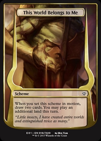
This World Belongs to Me by Min Yum
Digital
And then there's this.
This is not part of a larger image, making you wonder if it is cropped and that's why the rough lines aren't made clear or seem unfinished.
The sand turning into blood is an interesting concept as a grinding blood out of a stone but I'm reaching here. I'm trying to find something good and interesting about this piece instead of really just pointing out the obvious that it looks unfinished. It looks rushed. It looks like a color sketch turned in before final and something else needs to be added or fixed.
When I hear people complain that they don't like digital art, I think the tendancy is that digital art can look unfinished. Bad habits can arise from the culture of speed painting that actually come through in the final commissioned piece. Add to the fact that this is an oversize card it just seems odd. There should be a story behind this. I searched to see if this is part of a larger depiction, part of a larger image, and it is not. This is it. I guess in a full set about a dragon obviously they were going to be a few close-ups right?

What’s Yours Is Now Mine by Steve Argyle
Digital
Ah yes, Slave of Bolas.
Steve Argyle returns to the image that got him into the art annual Spectrum. I don't quite understand how the lazotap is being funneled into the angel but I like the idea that the dragon has to personally do it. The angels were the only things universally aligned to the Planeswalker dragon. The gods meant nothing to them, you see.
Strange to me how many of the eternalized creatures can look like the X-Men villain apocalypse. Right?


When Will You Learn? by Yohann Schepacz
Digital
I applaud what Johann did here. He's the only one that actually gave us another view of the city.
This crowded city with a protective barrier around it is packed. Look at how close everything is in an antiquity advanced city. Even the urban planning doesn't reflect ancient cities. How fun. I feel as though the dragon itself is from a culture I don't quite get or understand. Maybe it's anime’s influence or a video game I haven't played with a large barrel chest yet having thin legs and exaggerated neck muscles.
I like seeing that the city isn't totally annihilated yet. There is unrest in the city as if they were given time to try to understand or try to cope with what is happening. Much to their dismay the dragon clearly didn't hide or deceive where no one could see him. They saw their God Emperor dragon in full view utterly betray them.
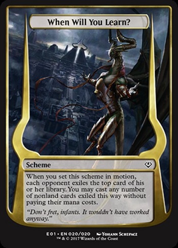
Boy it’s a lot of dragon.
The idea is sound that the raid boss is a major antagonist, and the only choice at this time is Nicol Bolas. I just wonder if some of the schemes could've been retooled to give us some storyline information or some additional information about the plane that we hadn't known. They have that whole world building guide and I only see a few additions, like the horrors and the city layout.
In future iterations, clearly we will see Archenemy products versus the phyrexians or against another faction. I think there will be a few more improvements being done and iterations are how to get these to perfection as an ancillary product. I don't think we’ll have to wait nearly a decade for the next one of these either and I look forward to seeing them touch all of the villains for full compleation.
—Mike


