Commander 2016 is the sixth iteration in the series with fifty-six new cards and five reprinted cards with new art. While a few commander art reviews like in 2015 and 2013 covered a ton of cards individually, the images I was able to obtain are at the end.
Before you dig into the art itself, let’s talk shop about a few things from the set.
Who made this again?
- Ethan Fleischer (lead)
- Ken Nagle
- Alli Medwin
- Sam Burley
- Robert Schuster
Of those people, Ken was the lead designer of the very first Commander product, Sam Burley is one of their concept artists who is doing more designing and art directing as of late, with Tyler Jacobson being hired on to do more concept work alongside him.
The lead designer on this set, Ethan, was on the Commander 2013 design and development team. He lead the design team for Commander 2014, was on the design team for Commander 2015 and is back to leading Commander 2016. Alli, all I know, is working on Magic Online with Robert Schuster. Schuster, in case you don’t know, is the commander player you want to play with if you somehow get a tour of Wizards. His decks are weird and he’s a delight to play with. Relevant to this set is how Ethan has been leveling up in deep Vorthos lore.
I own nearly every Magic book and I’ll admit, I’ve read about half of them. Some of them, like Time Streams, are delightful. While I loved Agents of Artifice, and it was lauded as stellar, Test of Metal has since been unofficially banned for being out of continuity and the quality being dubious.
If you don’t follow Ethan on Twitter, you may have missed a tweet or two talking about staying up all night reading, reacting like the rest of us did and people have come to know that. He owns it and it relates to how the cards are made.
https://twitter.com/EthanFleischer/status/743305090455371777
There is a development team too, fixing final costs, but they’re outside my column of expertise. I’m sure they’re all lovely. I’ll mention them again later.
Additionally, often overlooked, are the creative R&D team members who work on the set. Often we overvalue the design and development teams, omitting entirely the professional vorthoses of the creative team in R&D. Mel Li oversaw the freelance flavor text and naming for the set, which included one of the best ever in Rei and my co-host for SnackTime, Ant. They’re all brilliant people and they do show up to GPs. Say hello to them the next time you’re at one!
- Kelly Digges (lead) (creative designer)
- Cynthia Sheppard (lead) (art director)
- Jeremy Jarvis (Now Principal Designer, Worlds and IP, formerly Sr. Art Director)
- Mel Li (creative designer)
- Ari Levitch (creative designer)
- Brandon Kreines (freelancer for this-he works in digital)
- Christa Knott-Dufresne (freelancer)
- Rei Nakazawa (freelancer)
- Ant Tessitore (freelancer)
Rebecca Guay Returns
Were you as confused as I was in seeing the basic land announcement of Commander 2016? Guay, pronounced “gay” is back? She was one of Magic’s most recognizable artists and as of late, she’s been really emerging in the New York gallery art scene. Her original paintings are more expensive, on average, than any other Magic artist with a significant amount of card arts and it’s not close. Everyone from Twitter cries of joy to humor has covered her returning:
I wrote a little Twitter moment on her color roughs or original sketches, being sold from her gallery, R. Michelson:
This is a complete set and we are offering it as such for $38,400.00 — first come, first serve (we will allow a monthly lay-a-way with no finance charges if $3200/month is easier on your cash flow). This offer is only going out to previous clients who have emailed us in the past 2 days. If no one steps forward we will send notice to our full list next week. We have received offers for individual studies at $9,500.00 each but we are hoping to keep this together as a very special set. The plains watercolor is on 7x9 paper; the others are on 5x8 paper.
 It feels expensive for paintings that aren’t finals but you may be comparing her to other Magic artists and that’s incorrect. She’s in a different sector entirely. Were you or I to be able to purchase a working rough from Jasper Johns for less than $10,000, I’d push people out of the line waiting for the gallery to open following the announcement. You can purchase Guay’s personal work and watercolors but her Magic work, especially her landscape works are fabulously expensive when it comes up for auction from collectors, if they do at all. There’s at least a few people a month visiting the art collecting Facebook groups asking about Guay’s works, to see if they could purchase them for $100, $1000+, trade lesser paintings for them if even at all.
She’s been out of our public eye for a little while for this niche of gaming art. I felt it necessary to touch base, as it were. She didn’t attend Illuxcon this year, which is nearly a must attend for traditional painters in Imaginative Realism. To learn what she’s been up to, I was able to catch her for only a brief few moments, but enough to secure a quick interview on her newly released lands.
How did these come to be created?
Three years ago MTG called and asked if I wanted to come back and do a few special land cards. I thought It would be nice.
Will people ever be able to see the originals?
The originals for the most part have not been sold — one was given as a gift and one mostly digital — and I don't know if they will be shown. The R. Michelson Galleries has the original sketches though they are watercolor and more involved than most of my sketches.

Swamp by Rebecca Guay
Do you have any other pieces in limbo, like these, as it were?
Nope, not now! :)
How does it feel to be printed anew in an IP that you honed your style and grew up with?
Always sweet! Even though I do mostly gallery work now it was indeed nostalgic to do some cards again that I thought MTG fans might like.
Can you give a quick pitch for IMC as you’re a faculty member there?
I love the Illustration Master Class. There are so few places you can be actively working under the instruction of such great people for such a period of time.
We are all friends by the end of the week and the community grows. Many of our alumni have gone into great careers through the IMC community including MTG artist and art director Cynthia Sheppard who's a guest teacher with us this June.
Do you have any upcoming events/conventions/things were the general public can see you?
Yes. I have a solo show at SITE Brooklyn in partnership with the R. Michelson Galleries, this spring in NYC. If people follow me on Instagram they can get info or they can sign up for notices with the gallery.
2017: can you share with us what galleries or shows you'll be in that have become public?
The above show is the next big event planned in the US, though I will also have work in the First Beautiful Bizarre exhibition in Australia and two pieces down at a curated show called Now or Neverland for Miami Art Week in December.
Were a player want to have these lands signed by you, what's your process?
Card signing and all the details on how to get you cards signed are on Rebeccaguay.com
Thanks for the time Rebecca and good luck with the rest of 2016’s shows.
Kev Walker and his Cube
Jeremy Jarvis heard from Josh Krause and a few others how artist Kev Walker was only a few cards short of a full Cube of 360 cards. While Kev continually receives Magic commissions, the lands are what made the Cube impossible to create. While he could’ve gotten the remaining two lands he hadn’t created yet, his forest, mountain and swamp were prohibitively priced for many. His promo Euro forest is nearly $10, his mountain is under $5 and his swamp is under $10. Now, to any normal player that wanted a few special lands in their commander deck, getting a handful of $3-5 basic land isn’t that weird. Making a Cube full of them moves basic lands into unglued or unhinged territory of having real value, an actual cost.
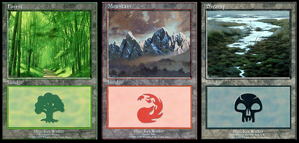
Looks like Jeremy Jarvis (JJ) got the note, and did us one better, gave us a full new cycle from Kev. How fun!
https://twitter.com/RobertJSchuster/status/790930453901434882
Enjoy the artworks below!

Forest by Kev Walker

Island by Kev Walker

Plains by Kev Walker

Mountain by Kev Walker

Swamp by Kev Walker
Due to timing, reaching Mark Poole for his basic lands was not possible. He hadn’t been home in six weekends and wasn’t able to send over images before my deadline.

Atraxa, Praetors' Voice by Victor Adame Minguez
I am never going to remember that apostrophe in her name. (All angels on Mirrodin/New Phyrexia are, and now were visually depicted as women.) A new motion graphics person to scene, joining Geoffrey Palmer or @LivingCardsMTG is Balam Najera. I’m all for new folks engaging art, especially when they make it move!
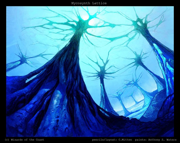
As for Victor’s art itself, I don’t have a ton to mention on it. The wings are lovely skin stretched flesh. She is underground, showing the mycosynth roots of the ground. Victor had the job of showing the current state of the lattice holding up the ground, it’s a bit more broken down and toxic than when it started! Also to note that Cara Mitten is the sister of Ant Scott Waters. They actually created a few pieces together and Cara was left off the artist credit. Sad, huh? Maybe an art director can make a note of six cards for reprinted versions to include her: Mycosynth Lattice, Nim Grotesque, Ferocious Charge, Fold into Aether, Opaline Bracers, and Quicksilver Behemoth.

Kynaios and Tiro of Meletis by Will Murai
Finally, a gay couple was made.
Adding to the diversity count is good, sure. Add in some stellar looking armor, a bright harbor scene we haven’t seen the likes of since Rishadan Port and subtle alpha/omega snake armor symbols and you have a blog post driving image for years to come. Images like this push Magic to the top of their industry. It’s a delight to see representation, it’s phenomenal when Will puts forth the extra effort, the added polish to make a good image truly great.

Yidris, Maelstrom Wielder by Karl Kopinski
Karl painted this traditionally and it’s a good move. He’s still weighing out selling it at the moment, but I’m sure he will. Any commanders traditionally painted, and any of an iconic Magic creature should net a pretty decent sum for any artist.
I just like the purple in the scene. Since he has a strong background in Warhammer and Warhammer 40k, the pink/purple colors are very aligned to the Chaos Gods. I see that nod and wink he did to connect the IPs, having a wielder “wield” the power of the warp itself. Clever work Karl.

Breya, Etherium Shaper by Clint Cearley
Oh she scary.
Only etherium has seamless open spaces to skin and we see no transitional areas compared to phyresis by the Phyrexians. We also never really see what the skin looks like at the edge of the gaping side. Is it burnt like scar tissue? Can we see organs or blood vessels exposed? We never really got to see that in Esper’s group on Alara. I hope on the return trip, which is inevitable, that we do. I also love Tumblr discussing Breya, which is delightfully comical.
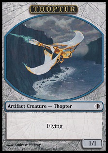
Clint also did a phenomenal job with incorporating the multiple Thopter tokens. I suppose we’re all so used to the Kaladesh constructs that we forget that Sharding Sphinx created them in Shards of Alara. Since I didn’t write an art review for it and the only touch is Mason’s view that it started the style guide era of conservative creation-the homogeneity argument I often argue with people to say whether it exists or people merely believe it exists. I figured the full art of Andrew Murray’s token should get some love here.

Thopter token by Jim Murray

Saskia, the Unyielding by Greg Opalinski
If there is something to find negative about this depiction, it’s simply because we don’t know Saskia’s plane and backstory. Her armor is reasonable, her body type is one of a warrior not unlike the javelin or discus athletic women I knew in college. I’m always a proponent of using track teams for reference because there exists a variety of body forms including tall women who look like they can wrestle bears and life, with ease. I’m happy to see Braveheart making its way into Magic and thrilled to see a larger women not exaggerated to show excessive curves or weight. She’s just larger and she looks awesome.

Reyhan, Last of the Abzan by Chris Rallis
The Dragons fighting on the elevated bridge in the top left is a nice touch. It’s the penultimate moment in her life, so says the co-lead creative designer:
https://twitter.com/kellydigges/status/794195790059012096
Her armor is noticeably lighter than other Abzan warriors in full plate armor. When you’re rather powerful, you wear lighter armor, not heavier as the hero is likely faster, wishing to be less encumbered by weight. That’s a nice touch. A note on talking about art, always look for lineups to show iconic races and depictions of a tribe, clan or group. You’ll often find them in cycles, like the below image.

Abzan Ascendancy by Mark Winters

Ludevic, Necro-Alchemist by Aaron Miller
I feel for Aaron.
This is a really strong, interesting piece of Magic art.
He spent a ton of time making a truly clean composition, working with different lighting and adding fun details to make a stellar commander picture for years.
Instead, he got nerfed. He got hosed. Ludevic is a marginal commander due to his abilities, likely done in balancing the card by the development team.
Players may have heard of Ludevic. Vorthoses know who he is and are let down by how uninspiring he became. He doesn’t make zombies, he doesn’t reanimate and his prominent status seems to have been on another card. In the end, the card plays but it doesn’t result in more signatures, more print sales or anything immediately beneficial to Aaron.
That sucks.
That sucks a lot.
This happens quite a bit with supplemental set when things move around or swap a lot. It had such promise. I just feel for Aaron.

Kraum, Ludevic's Opus by Aaron Miller
Oh, it’s music. That’s not just electricity, it’s also making music. That’s clever. I couldn’t see that at card size.
Also comically not able to be seen is the makeshift fence on Ludevic’s house. Maybe he has goats? Cows? He must not care much for them because his creations are magnificent and his homes are beautifully massive.
Aaron made these digitally, as he can work traditionally or digitally on a whim. The digital effects are easier for Magic, sure, and the figures lend themselves to more traditional paint. To tell if an image is digital? I can’t always be one-hundred percent sure with some artists, but I did write an article to help if you’re ever unsure titled “How to Tell if it’s Digital.”

Ishai, Ojutai Dragonspeaker by Zack Stella
What’s the more important color here, turquoise or light blue?
Trick question: it’s red.
Zack is another of the artists who is dancing between digital and traditional painting. His usage of light on the wings give you a sense of movement, a quick hand clasp before massive action and his color palette choices show why he’s at the Magic level of illustration.
You see, were this to be made by a random art studio, the colors would be more singular. You can see poorly created art with the ice archer being basically, covered in blue robes, a blue belt, a blue satchel or ornamented with blue runes. When team games have the red vs. blue vs. green team, you’ll see a “bird warrior” painted, but with blue arm bands to differentiate from the red bird warrior. It dulls the art due to brand needs and it annihilates good art to marginal art. I can tell this from the white and red stole. (The thing around his neck, the scarf thing.)
Since Magic employs stellar artists, they can integrate a background creation into the creature, like the red, white and blue of Jeskai, and also add turquoise and green as he sees fit because it helps the art. Were the stole to only be white and blue, it would blend into the bird’s wings and background art. Red adds pop. It’s so minimal and yet, if you work traditionally, it’s a lot easier to see when one part of your paint palette is all blues or gray/whites. Add red and you have a Stella piece. You just need his hours of practice and hustle and you’re set.

Sidar Kondo of Jamuraa by Ryan Alexander Lee
His one day is now.
This is Gerrard’s adoptive and Volrath’s real father. The weatherlight block was weird.
I like Ryan’s minor addition of purples in the undergrowth, it lightens up the piece without going full Kincaid. Frankly, his attention to detail is startlingly strong from a leopard skin saddle, writing on the horses’s reins, Sidar Kondo’s forehead, and the geometric armor, interlocking each piece differently. This painting is a digital work of control. The background is minimal, almost speedpainting fast on purpose. It’s to show a sense of space like Kev Walker manages with finesse, forcing you to refocus on the grandeur, the details of this hero. Everything he wears matters. His clothing is not mashed together, but rather intentional. He’s a hero and likes the colors, the sigils, the meaning behind them. He doesn’t need camouflage.

Ikra Shidiqi, the Usurper by Josu Hernaiz
Ant and I were given this card as our Commannder 2016 preview card for the SnackTime podcast for Episode #42. It’s worth a listen if you want to hear some commander tech.
What I’m super interested in is talking about the card itself. Visually, she is a lore character — one that is story driven. She sold out the Sultai Brood to the dragon Silumgar and you can see some icons like Tasigur’s chair, covered in acid behind her. We talk about it a lot more on the podcast if you’re interested.
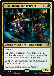
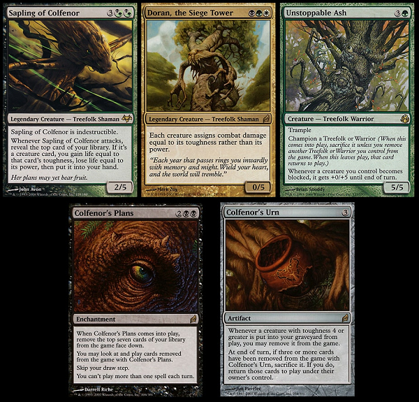
Notable from having a serious Vorthos lead the design team, the creative team killing it per usual and a set begging for legendary creatures to be built for partner. From a tip and from some research, I can see how Ikra was slotted to be a treefolk. A toughness that high on a naga? The attack trigger isn’t quite the original, “Whenever Sapling of Colfenor attacks, put a -1/-1 counter on all creatures defending player controls” changed in development, but the similarities are striking.
It was probably Colfenor, then changed in development entirely.
Probably.
And I’m still happy with the card. That’s a good R&D team you guys.

Vial Smasher the Fierce by Deruchenko Alexander
Alexander is a Russian artist
His agent, Ilya Shch, sells his original pencil sketches usually for a few hundred dollars, as there is no traditional final. Some of them are rather beautiful, ones that artist proof sketch collector Sam Luton collects. If you’ve never heard of him, he is the guy who is on a quest to get an artist proof from every Magic artist with a sketch on the back. He has massive binders he brings to events and they are utterly beautiful. Some artists are no longer with us, and he even has many of those. He’s on my short list of people to help connect to artists. So if you’re one of the more reclusive artists and I’m emailing you randomly, this will be why.
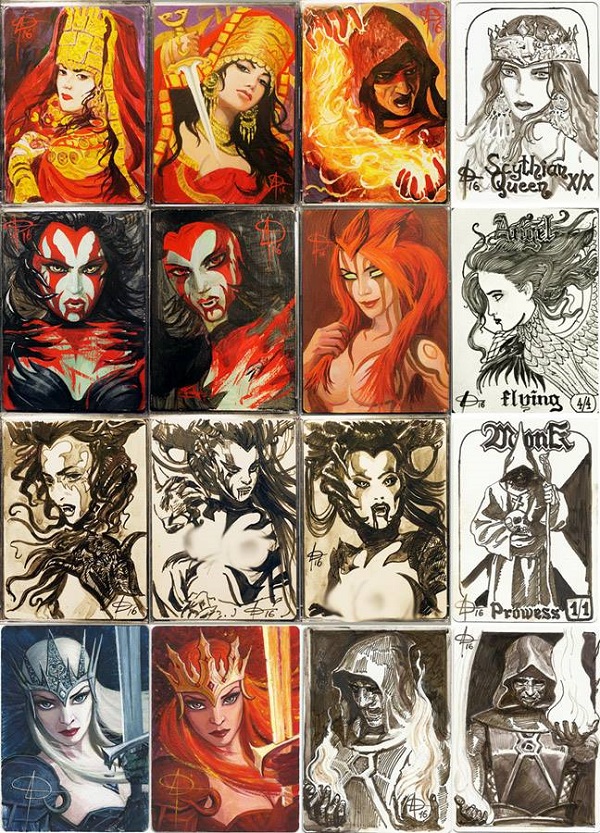

Akiri, Line-Slinger by David Gaillet
Where is the sun in this artwork?
How does it affect shadows?
I guess it does not.

Bruse Tarl, Boorish Herder by Anthony Palumbo
Humor.
It’s not gone, you just don’t have it on every other draft common anymore. Is a hairy guy with a gigantic mustache and a bored ox comical? Does that have a place in Magic anymore where homicidal angels reign, a toxic disease threatens entire planes and feuding clans, guilds, and groups combat each other?
Levity never left, you just have to look for it.
Steve Prescott is the artist normally getting the fun, but Anthony has a great depiction with looser brushstrokes off his shoulder to show us hair, strongly lit and still comical. It’s really great stuff.

Silas Renn, Seeker Adept by Joseph Meehan
I know, he looks smug.
And sure, mixing a hyper real face with a literal soldering iron is pretty odd next to his body made entirely of woven metal. Since he’s so arresting with his smugness, I can’t even look at his construct, which is in the foreground covering over half of the artwork. He gives a visceral dislike with just his hair and smile and that’s before it’s explained that he is actually that annoying of a person. The comic he’s in with Tezzeret, the Seeker’s Fall is a beautiful web comic that you should absolutely dig into.

Tymna the Weaver by Winona Nelson
This is digitally painted and lucky us, it’d be far too expensive had it been a painting. The loose threads on the chair look like paint, though the spider web gives it away as digital.
Some hits:
- Her elongated forearm is delicate, yet strong.
- Her earrings? Fierce.
- The location is humble, honest and doesn’t reflect her skill.
- A muted color palette makes her skin color pop.
- ”Soft” digital wool that is flowing through the chair.
The concept of negative space and pushing “dark” into focus and the white being push to the background. The longer you look at this piece, the more you see the woman’s skin color. Look for a few moments longer and your eye juts from the center to the pile of woven string, then back to Tymna, then back outward. It’s a circular journey to keep going back to her. Winona’s good at this.

Ravos, Soultender by Zezhou Chen
I like poses. I like a depiction of an oracle or demigod of Theros. It’s obviously Nyx due to the background sky and the gold mask on the staff. And sure, they explain it too. He’s rather idealized for a male oracle. He’s also made to look young, notice the adolescent shoulders for a male, yet stylized pectoral muscles. It’s as if Ravos was made to stay at age sixteen. Perhaps they find lovers early on Theros.
And yes, people like Ravos.
https://twitter.com/OriginalOestrus/status/791287393366241280

Tana, the Bloodsower by Magali Villeneuve
Is she on Ravnica and as intense as the elf Radha, Heir to Keld or is she on Ravnica, fighting all Gruul?
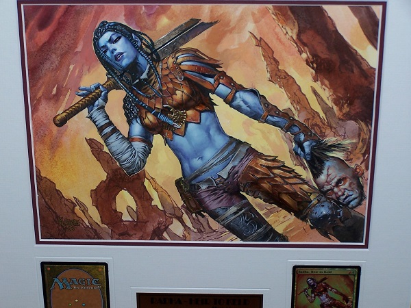
Nice looking painting there by Jim Murray.
It’s hard to tell as there is a saproling, tieing to both planes. While her skin is human flesh colored, we won’t know until we have a deeper story about her for some time. I’m going to assume she’s on Dominaria until told otherwise. The stone tools feel pretty barbaric and the amount of city of Ravnica would probably not make her an abandoned elf in the woods, someone would find her to prevent her from being feral. At the very least, she’d be able to trade pelts for tools instead of a rock axe, you know?

Kydele, Chosen of Kruphix by Bastien L. Deharme
If there are arguments that all Magic art looks the same, they aren’t seeing Bastien Deharme.
His work does not look like 1993 Magic and it does not look like what you think 2016 Magic looks like either.
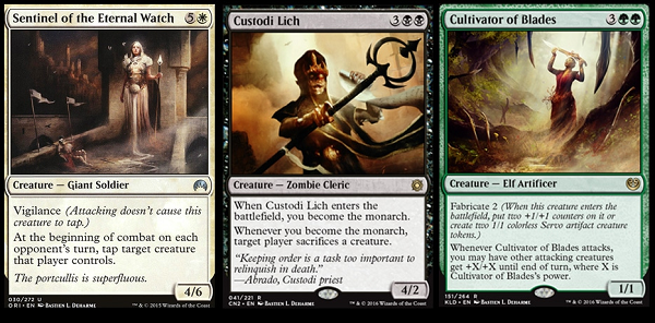
Bastien is in the contemporaries of digital artists that have a dreamlike quality to them. Some of Guay’s art has a similar feeling, but it doesn’t look the same. Of the five aspects of an art description: color, mood, action, location, and focus, the mood is what makes his art unique. His strong diagonal lighting feels more Karla Ortiz and Cynthia Sheppard than Steve Argyle. It’s a softness of brushstrokes in a digital work, yet romanticized, idealized with a strong basis in drawing from life that has weight and looks believable.
Other than the eyes of purple, this could be painted traditionally in 1850 and it would be hard to tell at card size to tell what medium it’s in. I just wish he would get more commissions on major playable cards so he is appreciated as he should be!
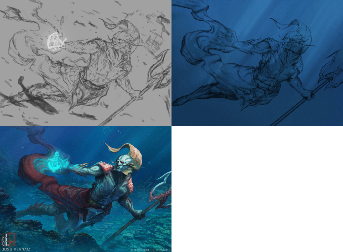
Check out the magical net on his waist that he added at the original sketch stage.
Notice the splitting of the legs to not confuse with a mermaid or merman.
He’s colorful without being garish.
He fits into Magic’s iconographic elements of merfolk.
Great work by Josu.

Treacherous Terrain By Titus Lunter
This is probably Innistrad.
The cracking of the ground could be demon or devil inspired even.
I see Fachwerk buildings, (the white German looking houses with brown vertical and horizontal beams) and gothic buttresses coming off a church. It just doesn’t have iconographic elements on the buildings to see Avacyn or the new angel deities. What it does have are lovely bricks with minimal brushstrokes, a zig-zag pattern to give you a road through the artwork and a dynamic scene crumbling the structures within.
As a sidenote, in case you don’t read Titus’s blog, his posts on Art Block and Fear and the Glamour of GP Life are must-read material. Add them between the Muddy Colors or Belledin blog reading you normally do.

Prismatic Geoscope by Steve Belledin
A lot of art collectors were talking about this painting when it was first previewed. It could potentially be an upgraded Gilded Lotus, with beautiful landscapes hidden within the crystals. Let’s not forget that one of the most prominent Magic art collectors is a mineral/jewel dealer. Oh he knows.
A fun art description painted with Donato level attention to metal gives us an incredibly difficult painting to look effortless. A lesser painter would force in the color of Magic into stiff depictions, likely having magic effects around a destination to achieve this. Steve painted crystals, then had the scenes distort by the crystals themselves and not fight each other for prominence, making an overall dark scene with a bottom light source, in traditional paint.
This is one of the best artworks in Commander 2016 and it’s not close.

Entrapment Maneuver by Filip Burburan
Do you feel the weight of the cyclops here? Do you see Filip’s careful choice of how the foreshortened hooks and goat’s collar impact the scene? We’re in a fish eye lens on a Magic card. It’s the only way to give us the 1980s Dungeons and Dragons depiction of the whole adventuring team take down a giant thing, yet still be readable in the tiny frame. It’s an homage. Fun huh?
I posted the sketch to original below, so you can see that Filip does indeed work traditionally.
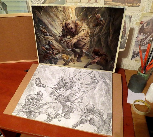

Boompile by Filip Burburan
I wanted to go back to back Filip to emphasize one point:
Check out his usage of browns, tans and yellows.
That is a tell, a characteristic if you’re unsure, to know if it’s Filip’s work. If you’re aware of Warhammer Fantasy, that color palette is definitely in the venn diagram of brand acceptable. Check out his depiction of Lyssa, a rather prominent elf in that (now dead) universe. It’s him, and yet you can see analogues to Magic and other properties.
The Boompile above is also similarly applicable in that universe due to the overlapping and overkill when it comes to explosives or spikes.


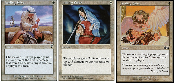
Benefactor's Draught by Scott Murphy
This sure is an odd depiction.
It’s a traditional healing salve effect, as you can see has been done numerous times to even the exact same card, a near repeat for an art description of “healing.”
The card does none of those things. It doesn’t deal with life at all. It deals with making your team not exhausted anymore and a mechanical add on to gain knowledge in gaining defense. What does that have to do with a dying soldier? I’m not sure. I love the card art, Scott is a phenomenal artist and is actually teaching as of late. I’ll be writing more on Scott soon, stay tuned for a future article.

Cruel Entertainment by David Palumbo
How fun is this art description? Fantastic.
How smart are the Wizards art directors to give David a lot of leeway in creating a scene in his looser brushstroke style? Stellar.
This is a weird effect that will likely be that card for years to come, slowly rising in value because it’s such a unique effect.
I just like David’s traditionally painted face. Creepy!

Deepglow Skate by Jason Kang
Group A
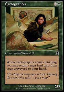 | 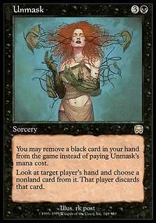 |
These are masterpieces.
One is a decent card and the other is a quite good card.
Group B
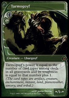 |  |
This is are incredible cards with rather marginal art.
In both cases, the card art is hard to see and is difficult to grasp how it depicts the mechanics.
I think it’s obvious where I think the skate belongs.

Migratory Route by Winona Nelson
Winona is so much better than even you think she is.
Oh, her Voice of Resurgence negative space deer? That’s pretty cool but does it top a wildlife painting with slightly fantastical birds with perfectly painted reflected water next to a mountain range.
I want you to look at the pink in the sky, seeing the distant rains.
I need you to see the thick brushstroked mountains in the reflection.
I have to point out the grass edges on the pond to show framing.
This is also in the top artworks of the entire set, without question. It’s delicate and has incredibly strong reference. It’s digital and not what people think digital should look like. It’s magnificent.

Goblin Spymaster by Wayne Reynolds
It’s almost like Wayne knew he was comically called a goblin spymaster. The oversized nose and hat? Great choices. It has his characteristic sharp points and triangles that Magic Man Sam covered in his seminal artist series, teaching you how to identify them on sight alone. He’s a one man connoisseurship teacher and they are delightful.
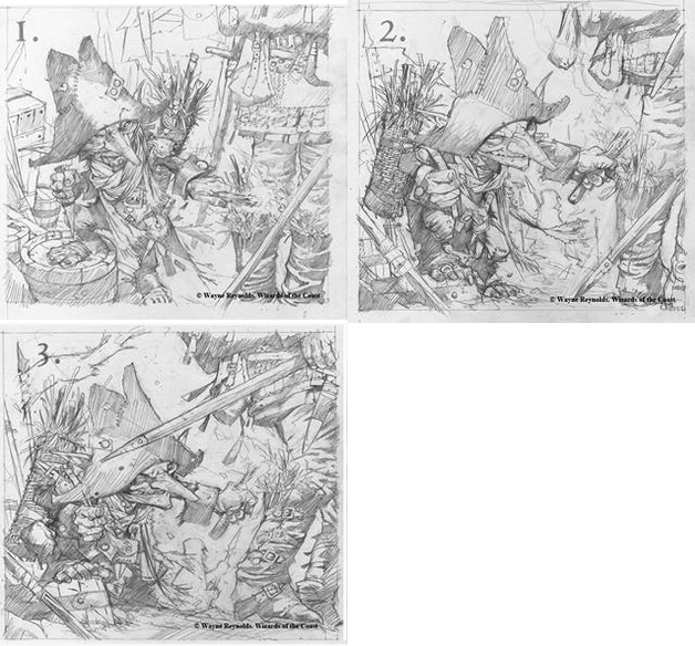
I found Wayne’s sketches and his token, which you have to see and just stare at to enjoy. They’re just so much fun. I like the token’s toenails. He’s a fun and gross little guy.

Goblin Token by Wayne Reynolds

Grave Upheaval by Vincent Proce
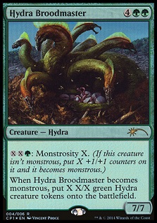
While Vincent did create the clash pack alternate art to Hydra Broodmaster, I don’t think he was painting them. The points at the mouth openings don’t quite match. I did like the search though, to see if he did create one. Artists referencing themselves is something that Wizards will not always write in art descriptions, but when artists do create references to their older art, often art directors will give it the green light.
I’d like to think

Stonehoof Chieftain by Tomasz Jedruszek
Things I see: a giant rhino body, rhino feet, strong lighting on a foreground tree, a very shallow stream, scale birds, a centaur holding a boulder?, soft trees in the background, and roots (veins?) on the centaur.
This is a digital piece, in case you didn’t know and this depiction has no real place. It’s not really Dominaria or Lorwyn, and Alara sure seems odd for a gigantic centaur. I suppose we relegate him to plane unknown for now.

Crystal Walker by Jason Felix
Jason did a pretty good job making crystals appear that they can walk and got to revisit Zendikar one last time. Good for him.
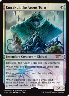
If you haven’t been following the ongoing Vorthos discussion about hedrons, do I have a deep dive into trying to comprehend an impossible task. Hedrons went from prison objects, to magical containment units, to well, really anything needed at any given time. Check out the masterful depiction of Emrakul by Vincent Proce.
 | 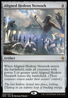 |
Now look at Aligned Hedron Network.
That ring of hedrons, aren’t when they align them, they make a binding prison? So, they bound Emrakul? Or not?
And now Hedrons can make colored mana? Weren’t they just supposed to be colorless?
And what of the square hedrons? Did we just forget about them?
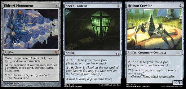
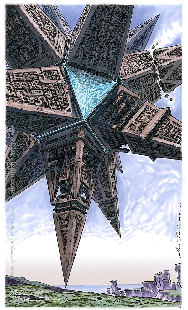
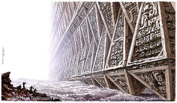
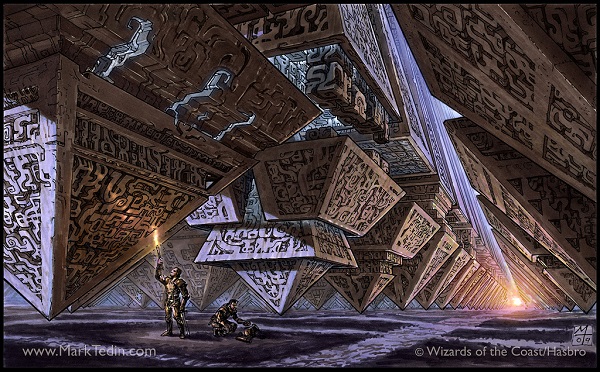
We even got to see some concept art of hedrons, they’re all kinds of weird shapes, yet in the set, they’re basically all 8-siders and can do basically whatever is needed.

Manifold Insights by Tommy Arnold
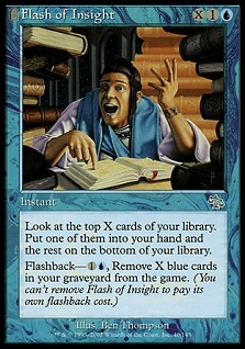
*THIS* is what a Brainstorm actually looks like.
Check out his confused, “oh man” face. That insight is exactly what a card like Brainstorm would look like in 2016 instead of a weird check the top x cards and draw some cards chosen by others. There is no other in this artwork.
Was this supposed to be a Brainstorm, or actually a Flash of Insight? It’d be a solid reprint for a reprinted set like Conspiracy or Modern Masters.
Regardless, this is a lovely depiction of facial modeling off reference. He nailed the subtlety of gaining insights without going, well, literal.

Seeds of Renewal by Jesper Ejsing
Directly from Jesper:
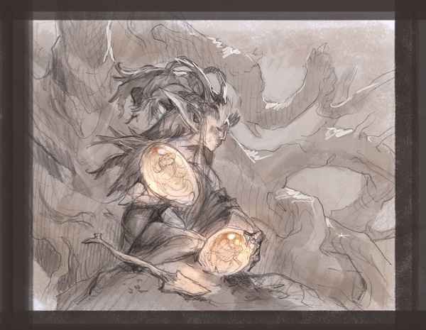
“I know it looks like an elf-girl at first glance, but I was trying to capture a very feminine man elf. Since this was one of the rare times I was not giving a style guide and had to invent an elf type myself, I went with a deer like face and those very bushy eyebrows, Notice the lack of breasts? Guys can have long hair and sexy hips too. I know about the hair at least from personal experiences . . . ”
Yes, he’ll be keeping the original painting for a little while. He seems to love it, which I can understand. It’s a beautiful piece, the eggs that look like amber to the delicate acrylic eyebrows. Just look at the sketch and the final and tell me I’m wrong. Go ahead.

Coastal Breach by Titus Lunter
Titus got another building scene, didn’t he? This is clearly not Innistrad, as even Nephalia doesn’t look this bright or colorful. This feels like Dominaria or a weird street in Ravnica.
I do like the claw pincers in the wave, which is just a fun throwback to creatures and wizards in waves, a staple of Magic since its beginning in 1993.
Despite the hyper realism on the buildings, the wave itself is so soft. It’s painted like a traditional painter would suggest the shapes with larger brushstrokes. I think it’s a very solid image with a difficult art description — show a city with a giant wave.

Magus of the Will by Vincent Proce
This is a strict art description.
- Vincent had to reference Yawgmoth’s Will in the human’s arms.
- Vincent had to paint hands in a semblance of a wave, which is absolutely planned.
- The Phyrexian mask has to be added. (Not sure if the tongue is needed though? Creepy.)
I don’t see a lot of Proce in this artwork other than the little bugs lik the dragonfly in the lower left and I wish we could see more. I’m sure his sketches tell the full story of what other ways he made the undulating or wavelike hands work in a 2x3” card art box.
Even if the card was terrible, we’d still have a spooky artwork created at a high quality level. Since the card appears to be good for commander, Vincent has yet another card to sign and alter for years. Good for him.
Reprinted Cards

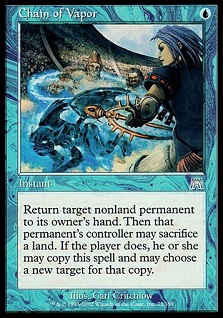
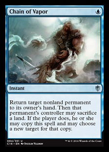
Chain of Vapor by Svetlin Velinov
Could this be another card?
Could it be any Unsummon, arrest or stopping a creature from attacking?
The figure is tied to no plane, making it feel like it was made for Commander or it’s an older piece of unused art. I’d like to think the art description did call for a “chain” of vapor. The mistiness adds to the homage to the original, a nice touch.
 |  |
Reins of Power
I couldn’t get the larger image for Reins of Power in time, but putting them side by side sure rewrites a narrative from Weatherlight, that’s for sure.
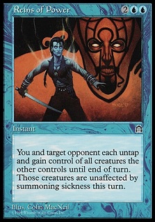 | 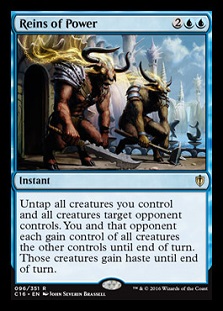 |

Beacon of Unrest by Joseph Meehan
I never quite understood the original beacons. The novels don’t really mention them other than the Green one and the abilities, while cool, didn’t mesh up to the locations that they were based. They’re all mega strong for a cycle, not unlike the command cycle in Lorwyn.
I do like Joseph’s saturation of purple in the scene, one of the few instances we’ve seen lately that didn’t involve Eldrazi. One of their often uses color schemes were fuchsias and purples. It also rewrites the narrative design into one of tutelage in Black, a weird bend of a selfish color having an apprentice. Why would Black want to teach another necromancer? I’m not sure, but a graveyard scene is fitting and great flavor text can make a default scene into a full story.
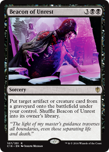 | 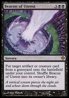 |
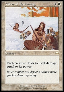
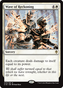
Wave of Reckoning
Again, another image I could not obtain in time for this article.
The new art description really brought the default, “this is what the ability does in game. There is no storyline moment for this card that we know of for the Commander 2016 set. It could be a reused, slush art, as this could be an Elesh Norn, Grand Cenobite ability, for example.
 |  |

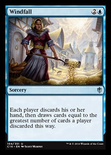
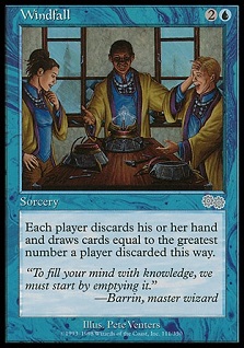
Windfall by Scott Murphy
I wish I could've’ seen this up close. I love fachwerk houses, the criss cross design that I even wrote about in the Architecture of Innistrad. Instead, I try to understand if the mountains in the background are to represent the mountain range to the south of Bavaria (the Alps) or a religious scene of “pennies from heaven.” I do like seeing the woman shoveling the coins like it’s a nuisance. Not everyone likes to discard their hand when you have fire in it.
Scott paints traditionally and this would make for a beautiful painting to own, considering it will be reprinted eventually. No flavor text on this card is not lost on me. It’s quiet on purpose, allowing a future set to fill in a new meaning.
 |  |
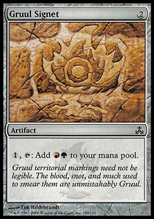
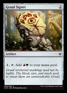
Gruul Signet

Gruul Signet by Efrem Palacios
This is such a old timey gaming still life.
Does it have skulls that are impossible to explain why they’re there?
Is there a civilization able to be seen that used to exist?
Is there a totem showing the current inhabitants?
Gruul are and always will be the “dumb” clan of Ravnica. They’re quick to rage, prefer utter freedom and don’t really build things. They live in the outskirts . . . of a planet covered in city. It never quite made sense where they actually lived. This image helps to show that they live where calamity happened. Imagine a massive earthquake has occurred. The refugees leave the area, to be in safer housing/homes via aid of their guild. They try to move back or rebuild and a bunch of Gruul guild members found a “wilderness” for them to claim. They don’t live underground like rats or the Golgari but rather, they want to live in tents, shelters that move and not be beholden to any guild or anyone.
While the skulls make no sense, the scene itself gives more depth into the Gruul guild than the years of my own reading, including the novels, have instilled in me.
 |  |

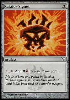
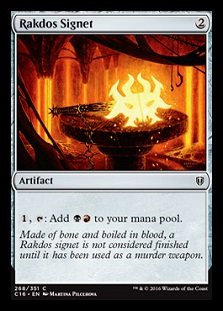
Rakdos Signet by Martina Pilcerova
That flavor text sure didn’t make sense on the original artwork did it? It sure does now.
This original painting resides in my house for now, as it is for Ant Tessitore, he being a Rakdos himself. When I saw it for sale from Martina, since it had been used in MTGO already, I knew it was a matter of time before it saw print. When “slush” or unused art is for sale, it’s often so much cheaper than had it been printed as an actual card. You don’t often get to buy a piece during that time, though Rebecca Guay sold one of her basic lands not long ago that we see in this set. I’m sure that collector now realizes the $10,000+ basic land they now own.
 |  |
While there is still some unused art out there, I own another unreleased one that I hope to show one day. As for the signets, there’s still two to go on that front:
https://twitter.com/ReserveList/status/795679397319741440
There’s plenty of images still out there for the community to dig into, find easter eggs and appreciate the expertise applied to the artworks. I look forward to see the next group of people examine artworks. When you find them, tag me on Twitter, I look forward to seeing them too!
— Mike


