The people who make Magic are doing a bang-up job. Everything from Theros block to Conspiracy to the early spoilers for Magic 2015 demonstrate that the designers and developers are taking the game to the next level. Not only are the individual cards fantastic, but the way they fit together for Limited have created some very dynamic Draft environments. The insight into the process has been well chronicled and communicated, giving those who design our own Limited sets (also known as Cubes) a wealth of information to aid in our endeavors.
At the same time, Cube designers have to work within a different set of parameters. While some Cube builders will add custom-designed cards, many others will pull from those created by Wizards of the Coast. This actually works against one of the recent advances in Limited design.
In a recent Drive to Work podcast, Mark Rosewater detailed the nature of modern design as it related to common cards. He recounts the story of crafting commons for Zendikar and wanting to use a mechanic that would play well with the theme of lands. This meant using a device that would let the land-matters theme shine while holding its own. The team selected kicker as a known quantity, and it just so happened to stick.
The underlying message here is that when building a set, the designers have to convey a message. In order to improve the quality of the play experience, mechanics have to work together in a way that is mutually beneficial. Going back to Theros block, we can see this in the interplay of bestow and monstrosity—both are mechanics that act as mana sinks in the mid- and late game. In turn, this lets decks play out their cards early and upgrade them later. Bestow also worked hand in hand with heroic, another key mechanic of the block. This interlocking nature makes sense when the card pool is pulled from scratch. When working with a set card pool, the options to fix problems are far more limited.
This is where modern design principles can diverge with the needs of the Cube curator. Regardless of whether the Cube in question is fully powered or completely Pauper, the Cube will tend to pull from cards that already exist. This means that if a problem exists, the potential solutions are limited—we cannot just go create a whole mess of cards. Instead, we must cultivate what already is there.
Once again, the benevolent Rosewater has discussed this subject. In a recent article that delves into the realities of designing sets comprised exclusively of reprints, MaRo focuses heavily on theme. This presupposes that a Cube has a theme other than just Draft. Modern Masters and Vintage Masters had the primary purpose of introducing cards into the market, and drafting them was secondary. These sets both had two-color, guided draft pairs, but few of the cards overlapped to secondary archetypes. Here is where modern design and the Cube philosophy I have been discussing really come into conflict.
When working from reprints, it can be easier to build themes into color pairs than it is to build them into the Cube as a whole. This, in turn, can lead to drafting on rails.
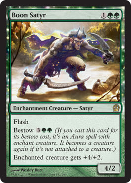
Let’s look at some mechanics from Theros again. Heroic and bestow can both play well into the G/W “little kid” (creatures and enchantments) style of play. If this is the theme for Selesnya in your Cube, how can you integrate these cards into other colors? Will smaller white creatures with heroic play as well in Boros? Will a Golgari, grind-style deck really make the best use of Boon Satyr?
When Cube designers run into issues, they should look to those who make Magic professionally for guidance. Yet, it is in this problem-solving area where modern design does not work with Cube. Unless the Cube in question is built around a block, there simply may not be a critical mass of cards strong enough to make the cut.
So, how can Cube designers use a predetermined card pool to solve their problems? The solution comes in a few different varieties.
The first is to determine your theme or themes. Mark Rosewater discussed this as a key point in his article “Building a Better Mousetrap.” If your Cube has a distinct theme, the answer to problems might be finding cards that work alongside the theme to shore up holes. If you are designing a combat-focused Cube and notice one color lacking, the answer might be focusing on a tribe as that color’s main theme. This can be seen in Vintage Masters, wherein red’s struggles were patched by leaning heavily on Goblins—the Mountains needed something to keep up with all the busted stuff from Magic’s past.
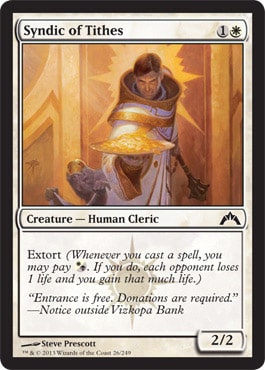
Another way to make a Cube feel more cohesive is to look for cards that work in multiple facets. I touched on this in my look at lenticular design. A better example might be the recent Return to Ravnica block. With ten distinct guilds, the ability to have them all overlap was a challenge. In my opinion, Wizards made it work. Golgari and Simic cared about +1/+1 counters, and this worked with Gruul’s take on attacking with bloodrush. Meanwhile, Rakdos and Boros both loved attacking, and Orzhov had cards like Syndic of Tithes to slot in and provide some aggressive reach. Finding cards that fit roles for multiple decks in your Cube is a keyway to keep your Drafts dynamic.
These are two additive options to fixing problems. Another path to follow is that of reduction. If you are unable to easily identify a theme in your Cube, it may be that your Cube is too muddled and trying to do too many things. In this instance, paring your Cube down to the barest essentials is probably the best way to find a solution.
Let’s use my Cube as an example. When I first put it together, I wanted it to be everything. I wanted there to be tribal elements and a focus on good gold cards. I also wanted to include the very best commons available. This led to a Cube in which the only thing that mattered were the abjectly powerful cards, and the colors that had the most of them (also known as blue) were the best. Fixing this is an ongoing process, but it started by stripping away some of the weaker themes. In a Pauper Cube, tribal and multicolored are going to suffer. Decks based on creature types are worse due to the lack of good lords and enough support to spread a given tribe over multiple colors. Multicolored is not a viable theme due to a small and underpowered card pool. This led me to focusing on playing with the most powerful cards available.
However, this too proved to be a poor choice of theme, as certain colors were just plain better than others. Instead, I focused on a loose theme of enjoyable gameplay. I wanted games to be played, and I wanted them to focus on interaction—it could be said that my Cube is the Interactivity Cube. This influenced many of my more sweeping changes, such as cutting shadow and creatures with protection. From there, I started to focus on two-colored pairs, and the rest, as they say, can be found in my article archives.
What would have happened if I had followed MaRo’s dictum from the podcast? I would have tried to solve the issue of a muddled theme by trying to fill my draftable stack with cards that would enhance what was already problematic. This would not have worked. Instead, by focusing on a theme, I was able to slowly fix the Cube.
And this is where it ends. Sometimes, the problems cannot be fixed given the current card pool. This is the sad truth for Cube designers: Occasionally, the cards just don’t exist to patch every hole.
But that’s what makes set releases so exciting. Maybe this year they’ll give you something you need. And it’s part of why we keep playing: The game keeps changing.
Keep slingin’ commons—
-Alex
SpikeBoyM on Magic Online
Check out Common Cause on iTunes!
Discuss Pauper on Twitter using #mtgpauper.


