The story begins with Trick Jarrett, the man behind the scenes here on GatheringMagic, and JR Wade, financial writer on the very same site. The two record the Untapped podcast every week alongside Frank Lepore and Jonathan Medina. If you’ve never listened to Untapped, and I recommend that you do, the guys have made it a habit to contract prop bets on the show. In Episode 13, Trick and JR bet on the number of copies of Koth of the Hammer in the Top 8 of Pro Tour: Nagoya.
I’ll spoil it for you: JR won. The loser was to provide a copy of Koth to the winner, which leads me to the origin of this article. Trick asked me to alter the Koth. But there’s more to the story. A few weeks after the episode aired, before Trick commissioned the alter, MJ Scott posted this article. In it she juxtaposed Koth to the actor featured in a popular Old Spice commercial, which if you also haven’t seen I highly recommend. The comparison struck me instantly. I tweeted at MJ:
Well, you know what happened next. Trick and I worked out the details, and I picked up a copy of Koth at SCG Cincinnati. Up until now, I’ve kept the alteration details secret from JR so that the card can be presented to him at GenCon Indy. Trick will be attending, and better yet we already have a GatheringMagic staff dinner planned!
Trick also asked if I could write a walkthrough for the alter. I would love to write an article weekly, but my schedule just doesn’t always allow it. I hadn’t done a “portrait alter” tutorial yet, so this seemed like the perfect opportunity. When it comes to altering portraits onto cards, a lot of the process remains the same. My goal here is to try to highlight the differences and also emphasize some of the techniques I’ve recently developed in my work.
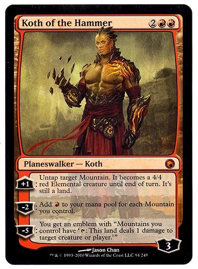
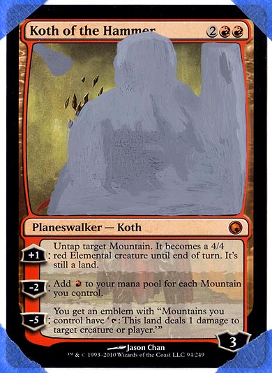
As per usual, I primed the card with normal gray acrylic. The shapes here are just approximations of the figure I planned to lay down.
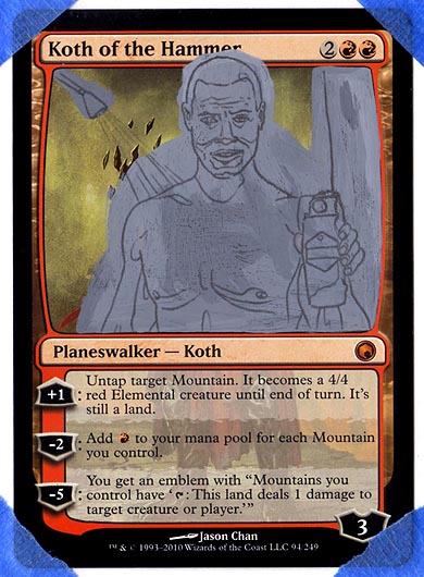
I want to give another quick explanation regarding the carbon-copy method I use on a lot of my alters. I start by mocking up the alter in Photoshop and printing it out at actual size. I then coat the back of the image with heavy graphite simply by shading with a normal 3B-6B pencil. I can then tape the image over the card and trace the lines I want to transfer. If you’ve ever filled out a form with a white and a yellow copy, the process works exactly the same way. Actual carbon paper is available at art-supply stores, but this method is cheaper, and in my opinion more effective. The carbon-copy method is especially helpful for portraits and other figures because you can get exact proportions down on the first try.
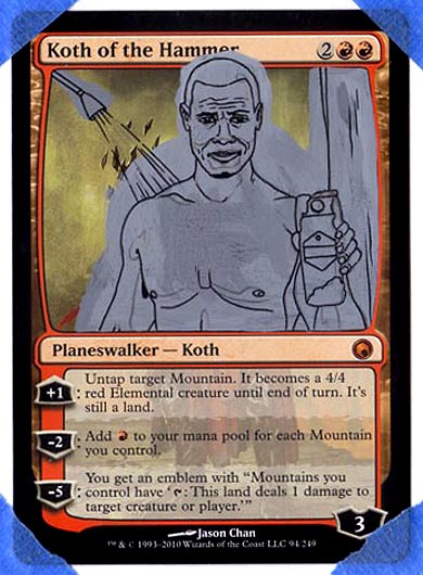
Following my normal process again, I drew over my graphite lines with 0.1mm Sakura Microperm pen. Unlike other alters, however, I don’t do a lot of outlining on the final product of portraits. These early outlines merely act as a map that will be easy to see throughout the remaining steps.
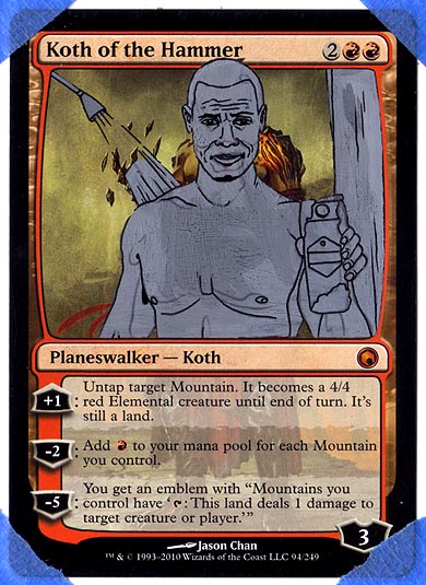
Usually I would skip right to the color, but in this case, I wanted to take a moment to highlight how to take away paint. After the card is primed and outlined, I have the job of clearing away the excess primer. Toothpicks are great for this. The key is to scrape in such a way that you don’t scratch the card. Wetting the end of the toothpick works especially well. In addition, I sometimes like to break the tips off of my picks so the wood begins to fray and forms a sort of wooden “mop.”
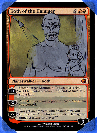
There’s a fair amount of painting out elements in my alters, and that may not be very apparent at first glance. What’s apparent to me is that this process is not very enjoyable. Because of this, I like to get it out the way early. With Koth, I needed to paint out the remaining parts of the figure, as well as his body showing through the text box. This is a lot like extending the art, color-matching what’s there, and blending.
Regarding blending, sponging the paint with my fingers has been a technique that I’ve used more and more in my work. Light fingerprints add a lot of texture and help create subtle transitions in color and opacity. There are some important things to know about getting this to work. One, the paint needs to be very thin, far more than if you were normally painting a card. Two, you need to vary the angle and pressure of your finger in order to achieve a random pattern. Three, clean your fingers often. The paint dries quickly and will flake off onto the card if you don’t wipe them off.
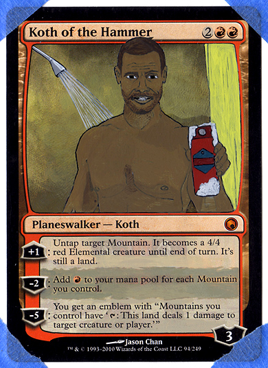
Finally, a little color. It’s amazing to me how bad the alter looks at this point. There are numerous details that needed tightening up here. The thing with portraits is, they’re a labor of layering. Slow build-up is the way to go. It’s easy to get discouraged when results aren’t immediate. For me, the solution is to dive in head-first. There’s light at the end of the tunnel.
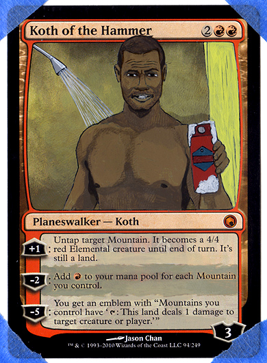
This is looking slightly better. I went in with some darks, again sponging the paint lightly to create soft fades and texture. After establishing a mid-tone, I find it helpful to start bringing in my darker values and gradually move on to highlights.
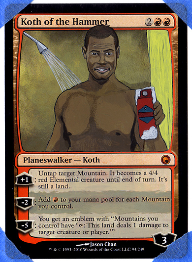
Upon scanning the previous image for this article, I compared it to my reference photo to check for discrepancies. Needless to say, there were many. For the next step, I decided to focus in on the facial features—when push comes to shove, those are what count most in a portrait. In this particular instance, if the figure isn’t recognizable, a lot of the humor is lost.
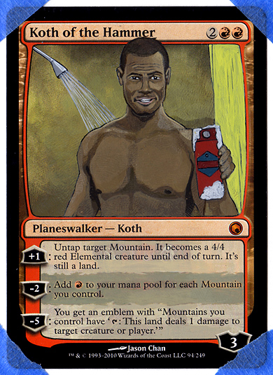
After making several adjustments to the eyes and mouth, I carried over the highlights into the body.
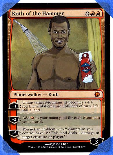
With the majority of the painting resolved in the figure, I simply finished up rendering the remaining details. Usually, I wait until everything is finished to sign a piece, but I couldn’t resist replacing the Old Spice logo with a swooping “EK.”
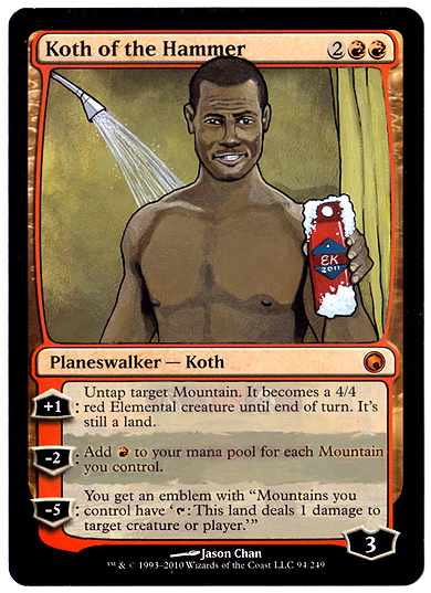
The finished piece. As I mentioned previously, I try to keep outlining to a minimum with portrait work. A few well-placed lines help the figure “pop,” but for the most part, I want the light and shadow to do the work.
As I write this article, I’m tying up loose ends in anticipation for GenCon. In addition to handing over the Koth to Trick, I’m looking forward to four of the most fun-filled days of the year. For those in attendance, I’ll see you there. For those stuck at home, my condolences.
Thanks for reading!
Eric
eaklug to gmail dot com
@klug_alters on Twitter


