We started the Theros art, and a few big themes have emerged when previewing a set. You’ve noticed that I have to grab a few cards instead of high-resolution artwork to show the art. This is not because artists can’t or won’t post them; no, it’s because they often have no idea when a non-disclosure agreement is lifted, and the entire spoiler season is unique to any gaming medium. Newer, savvier artists will see a post on Reddit or the like and then post on a Facebook wall, where new arts are shared among artists. I really wish Wizards would have an announcement for the set, stating, “Card list is up; your NDA is lifted!” but apparently that doesn’t happen. I used to do that with artists working in TCGs, and frankly, they really appreciated it. Why wouldn’t you want free advertising from an artist? Are they not good enough to share content on their own social media pages and sites?
Let’s get back into it starting with the next artist on the list. It’s our boy Eric D.
Eric Deschamps – 4
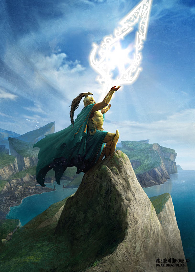
Eric’s Vanquish the Foul piece was used in marketing this set, and I feel it’s one of the strongest pieces he’s ever made. Everything works. The color is on, the composition elements of front-to-back depth are very apparent, and it summarizes an entire block in one image. I hope it makes it into the next Spectrum Annual. I’ll be pretty fired up if art director Jeremy Jarvis didn’t submit it for inclusion.
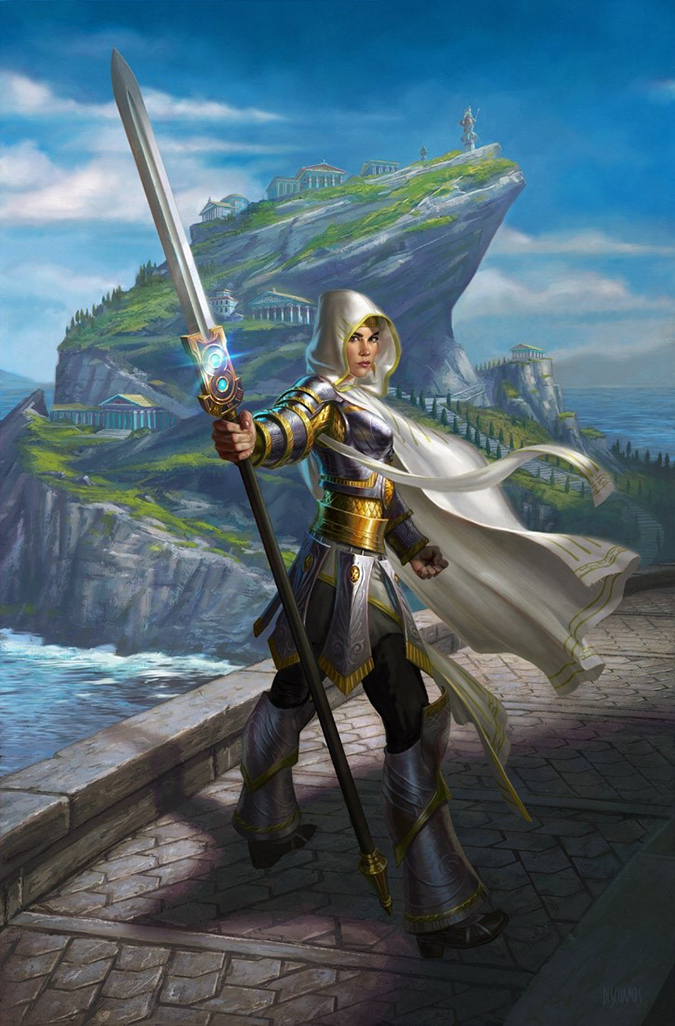
The Elspeth is nice, sure, but it’s in that gray area of twisted-women-to-show-the-boobs-and-butt variety. But it’s nice! I look into images a lot, and when I even see an homage—a reference, a nod, an I-see-what-you-did-there—and if you didn’t mean it, you should look at how huge Magic is right now to understand that everything will be scrutinized. When planeswalkers are involved, people pick up even brighter lights with a magnifying glass, especially when women are depicted.
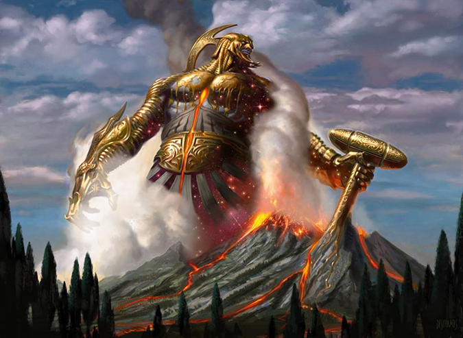
Purphoros, God of the Forge will become a very iconic image, but it looks like two images put together in Adobe Photoshop. Yes, I know, it is made in Photoshop and that the “canvas” is mere inches, but some shadows and light play would’ve been made it a lot more integrated into the scene.
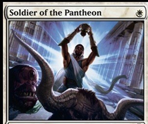
Eric Velhagen – 1
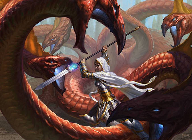
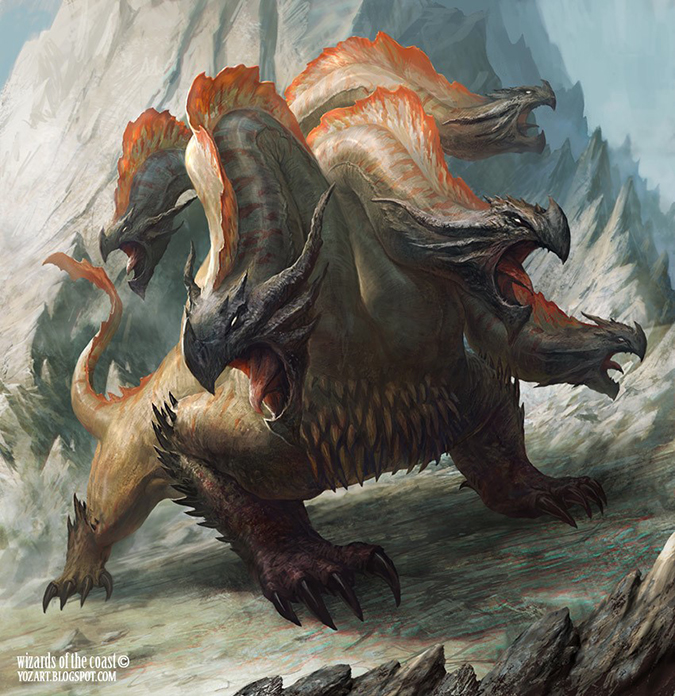
Eric’s an odd artist. He’s only been commissioned one artwork per set since Return to Ravnica. He works traditionally and hasn’t hit that marquee card yet. He does really great monsters, not unlike Justin Sweet and dragons. Let’s hope Eric does a really strong laborious monster or mythological beast to come. I want him to because it’ll be huge and look amazing on a collector’s wall!
Watch out for him. He’s slowly building a base. Let’s hope he blows it up, like you thought he would.
Franz Vohwinkel – 2
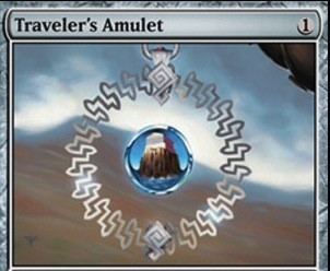
I really like the Traveler's Amulet that Franz remade. I think it absolutely has a story behind it. What’s in the droplet? Also, it’s begging to be altered by Franz during a convention. It’s a very, very smart nod to his fans. God knows they’ll ask him to elaborate on it a bit. “Fill in the amulet” for $5 to $15. Clever.
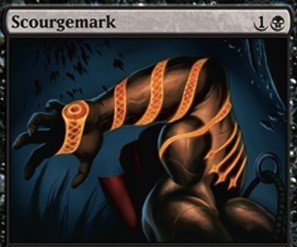
The Scourgemark is all right; it just needed a response from creative team member Doug Beyer on his blog to explain what’s going on. That hot, red arm is wrapped with the Whip of Erebos!
Gabor Szikszai
I just found out that Gabor moved to Boston. That’s neat. He now works at Nuukster, a social gaming company in Cambridge, MA. It’s basically where MIT is in Boston. They went big and picked up a seriously great artist to join the team. Let’s celebrate their tenacity. Getting to the USA is huge for an art career, especially when working with Magic on the convention circuit. It’s the same reason Franz Vohwinkel moved to Seattle from Germany and why Steve Belledin moved from New York to Seattle. Artists start east and moved West in the imaginative realism community—well, unless you’re Donato. There’s always he as an exception.
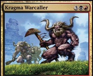
This Warcaller is pretty good. I can see some social gaming . . . influence—if you will—but it still works great and conveys the lord concept. It’s memorable and will be casual-friendly for years and years.
Greg Staples – 4
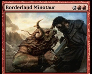
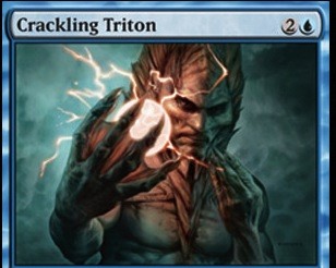
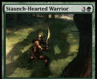
While I love the sheer anger of the Borderland Minotaur, the human figure isn’t as expertly painted (perhaps on purpose), and it doesn’t pass the sofa test. The Crackling Triton has amazing color, and light by that Staunch-Hearted Warrior has the David and Goliath homage. I love me some homages, Easter eggs, and hidden meanings of works. When you remove the context of the border, does the art stand by itself? Many of the angels do, but with multiple figures, you need to dig a little bit to find meaning. Those pieces stand out, and curators—were an art exhibition to mount—will be looking for them. Great work on that piece. I love it.
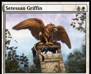
Howard Lyon – 3 (4)
Howard’s such a nice guy. I love his little insights, and the most recent anniversary post speaking of his wife, as reference model, was superb.
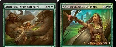
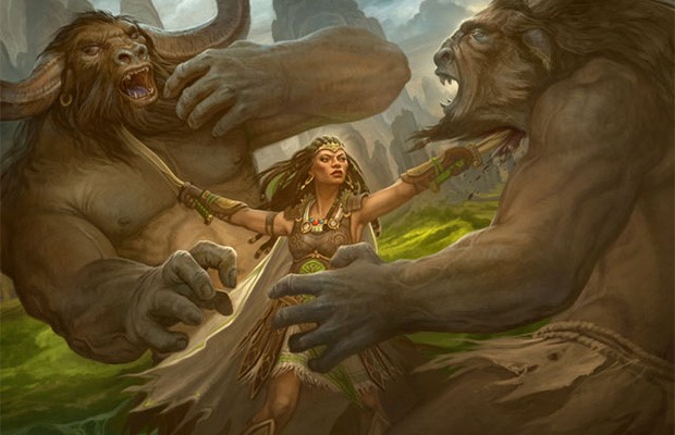
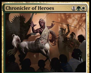
His work in this set urges me to yell about shutting the front door and letting it speak for itself. He received both green heroes, one of whom is a promo, and the “normal” one is on the front of the intro pack. It will be seen a lot. A shame the card doesn’t cost a little less to make it Commander-playable. The figure is just beautiful in both versions. It’s really great work to recreate and own a figure so much. He made a powerful, idealized (as I said would be coming), figure that also retains some sex appeal. That’s just so damn hard. The hair alone is incredible on the figure, and for a man with a beard like that, he takes any hair pretty seriously. Great work.
Igor Kieryluk – 4
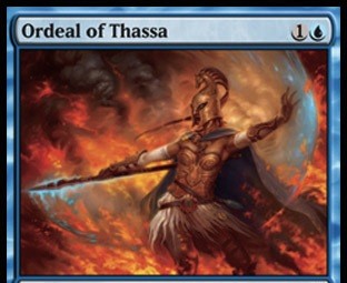
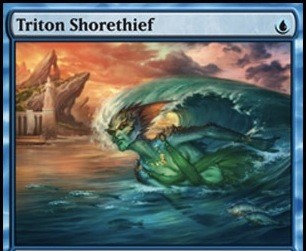
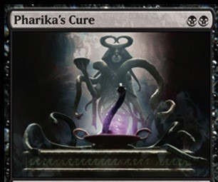
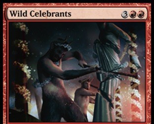
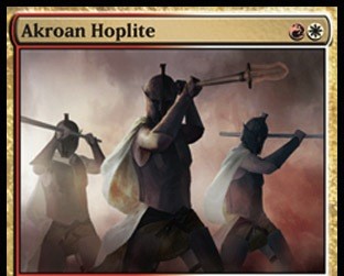
Igor’s a concept artist. None of these four images is in his wheelhouse of concept art, of forging new ground. They’re pretty simple, straightforward illustrations. Ravnica block only had him gain four images total. Obviously, the Scars of Mirrodin block was his wheelhouse—he loves the creepy, and he basically did the white Phyrexians, including Elesh Norn, Grand Cenobite, for a whopping twenty images throughout the block.
These four images just feel like head-scratchers for images. They don’t play up his rough environment talents, using atmosphere and mist. Sure, he has mist and incense—that makes sense—but it’s all too ordered, too clean for his rough final images.
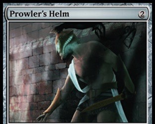
These feel like the last ten or so images that needed homes, and Igor was available, so a phone call was made to Igor to see if he was available to pick up a few. They’d be “easy art descriptions” and such. With Daniel Ljunggren being an awesome item guy—ahem, the Prowler's Helm—I figure this could be the case. It appears his Pharika's Cure works to his strengths the best.
Jack Wang – 2
Contact info? Anything? sigh
Nothing aggravates me more than when I can’t easily find an artist online. It’s now become the standard to be able to find a portfolio, a Facebook page, perhaps a Twitter handle, and a DeviantArt page. Jack is not easily found. If someone knows him, point him to this. Players want to know if he sells prints, if artist proofs are available, and what he’s up to on a blog. It’s 2013, you guys; there are some levels that people do expect. It’s not essential, but it’s become odd if people don’t have an online presence.
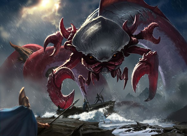
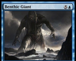
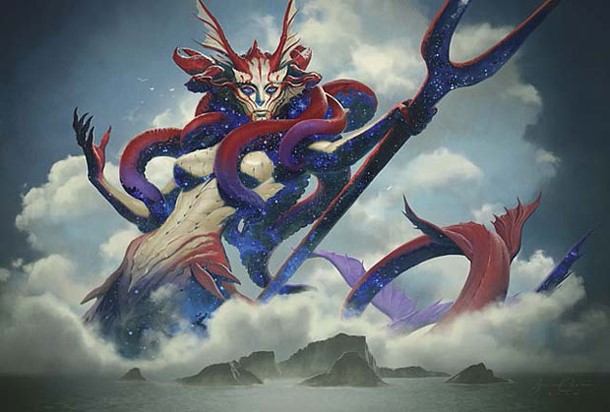
His big ol’ Kraken is the better of the two, but the creature as center of the image takes me out of the belief that a giant sea monster exists. It’s an immersion-level break for me, and I can’t see past it.
Also, oddly, why doesn’t this kraken, once it becomes huge—monstrous, if you will—doesn’t it gain trample?
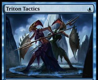
Jaime Jones – 4
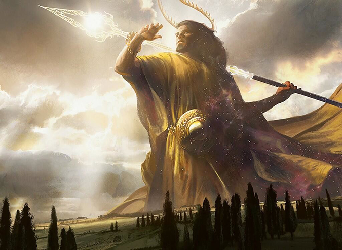
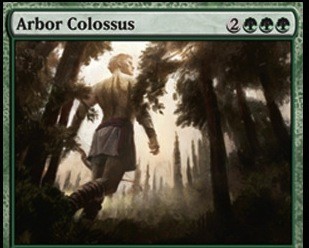
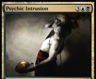
Jaime has, arguably, the best god depiction of the set. I think it’s the best definition of Theros, and the decision to use it to announce Theros is not lost on me. He swung at that hanging curve and crushed it out of the park. If that doesn’t get some art awards, there is no god of justice, sweet baby Jesus.
As a side note on the Benthic Giant, I also wondered why it had hexproof until I read Doug’s blog post comparing the giant to the sea. You can’t stop an inevitable force.
James Ryman – 3
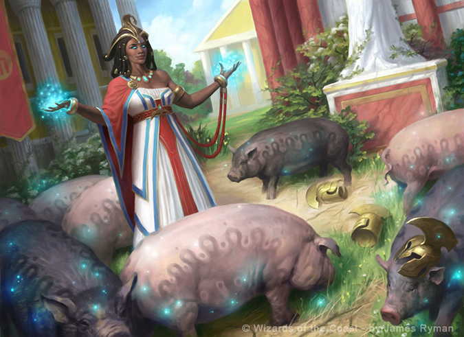
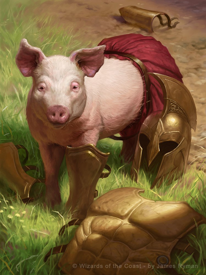
Greedy as a pig indeed.
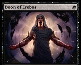
Giving him a low-hanging, awesome card art like Curse of the Swine will be some good PR for him since his Triumph of Ferocity was damn awful. It’s arguably one of the worst images in the past decade for Magic, and it was printed over a year ago. I’m still ever raising an eyebrow to his work, but notice these three commissions—there’s not a single warrior woman or deviation into that sort of situation. That area of work might be closed off for a while, so I’m happy he’s still getting work, not being wholly blackballed—because that’s a career killer. Even being threatened by it had Guay and her fans in a huff not so long ago.
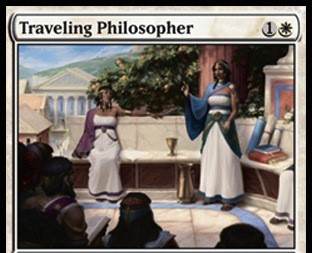
Traveling Philosopher is a great image for a Z-Man game title, don’t you think? It feels like that or Talisman to be honest—very open-ended.
James Zapata – 1
I just found his Twitter page. It’s more of a reposting of Facebook posts instead of RK Post yapping about alterations or at Randy Gallegos—for now, that is.
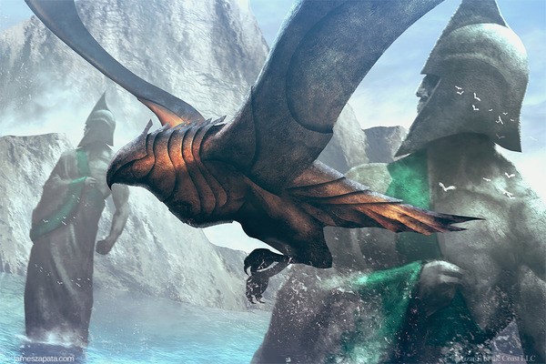
James, that be a pretty concepty bird. The background is fantastic. It’s flavorfully-fitting marble statue in water has worked from Lord of the Rings to Rhodes itself.
I do question if the bird was moved a couple times, whether by James or by art director Jeremy Jarvis—the robe on the far right looks . . . painted over perhaps. Was it retouched? Perhaps a few times? I can’t tell, but maybe.
Jason A. Engle – 1
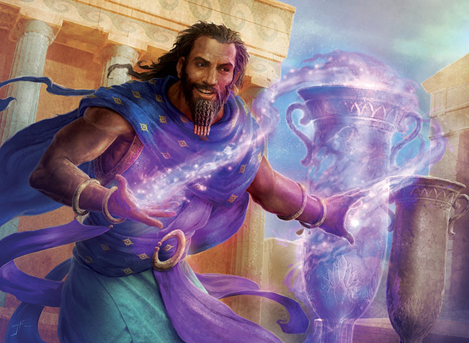
That purple is just . . . wowsers. It’s serious business. This digital usage is great with the magical usage, but the waves at the top of the structure are what show it isn’t traditional art-making.
I keep thinking this is one of those illustrated Bible depictions they’d have as an infomercial on TV. It’s the bright color with the marble. Most temples, just like most medieval cathedrals, were painted. They weren’t marble, white, or black. Most were colorful as hell, gaudy even. They always painted eyes on statues. Makes you think most religious areas looked like Ripley’s Believe It or Not compared to a place of quiet contemplation. Why wouldn’t garish buildings have garish characters, dressed to the brightest, boldest pastels possible? Well, perhaps they did.
Good work, Jason. Love that you’re exploring color.
Jason Chan – 3
Ugh, they’re all good.
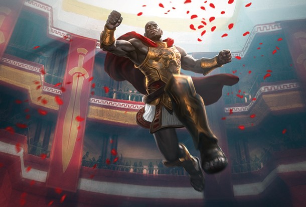
Xenagos seems about a head above Thassa in terms of effort from Jason. Dude loves making planeswalkers, and the more passionate someone is, generally, the better the image is. You’ll notice that I grabbed a very dark version of Xenagos to point out that even the silhouette is creepy and foreboding. This is our antagonist, our villain, but since he’s R/G, I doubt he’s an antihero. That’s black’s jam.
It’s a simplistic illustration, but the restraint is in not making the robes flopping everywhere. Possibly, more brush was added into the design or was art-directed out, but maybe Jason’s been doing enough planeswalkers that he knows how to edit out the unnecessary details by now. In any case, I look forward to seeing more from Xenagos in the near future!
Jason Felix – 1
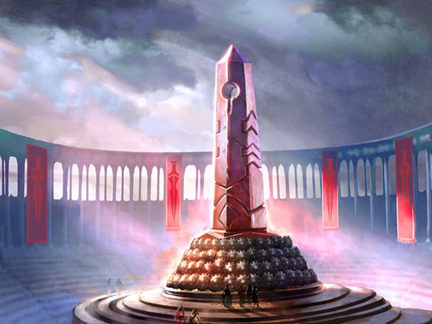
Yup, that’s a temple.
Are these shields significant at the base of this obelisk? What is the purpose of this temple? What happens here?
Lands like this are great at card size; they’re easily recognizable, and people play them in Standard. I just wish we knew more about them. Jason, write about this piece! Maybe it could be a blog post to explain what’s going on and perhaps a few sketches to explain the process to help us understand. That would be mighty cool.
Jasper Sandner – 3
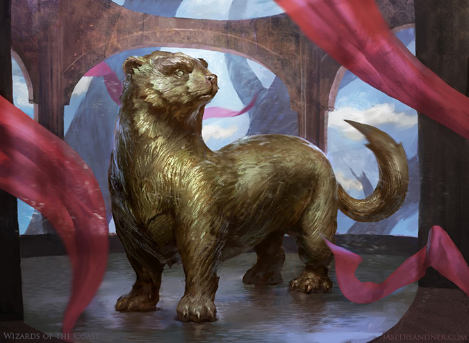
GOD, WHY YOU U MAKE DAT FURRY CREATURE A PAINTING!?
Ugh, that’s so amazing-looking in oil on a board. That would be wonderful. I hope Jasper sells a bajillion prints of this little guy. A shame he’s just a vanilla 2/1 creature. If it was a strong creature, deck-playable and such, biscuits would those artist proofs sell. Cute is popular—ask Palumbo about Totally Lost. Seriously, he’s making money off it. I wish more cutesy animals would be on more than Limited fodder. Remember Phelddagrif? Seriously, make those legends. We could use a little more whimsy.
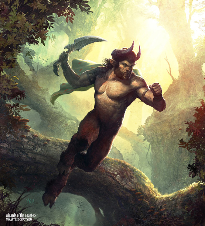
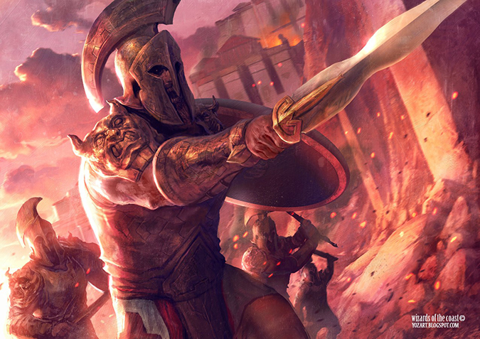
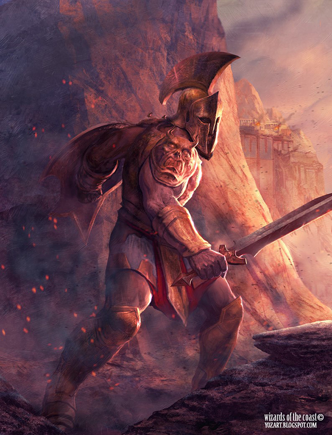
Johann Bodin – 2 (5)
- Akroan Crusader
- Polukranos, World Eater
- Human Token
- Satyr Token
- Soldier Token
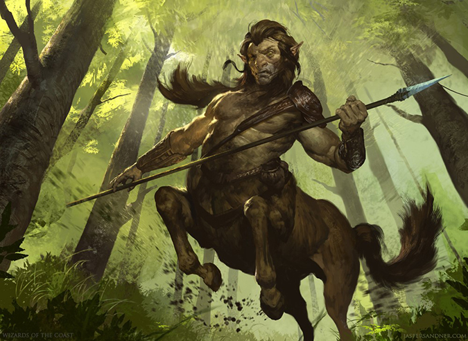
When I thought of how Magic would cover Greek imagery, I was nervous. I am still nervous. While doing this review, Johann makes me pause and really stare at his satyr and hydra, nodding at all the elements. I get into a rhythm on writing these, when my dachshunds and wife aren’t asking me to do something, but every few artworks slow me down. They make me stand up, forcing me to look closer. Theros is about the interaction of gods and humans and monsters. I would rather have the gods mysterious, like Rise of the Eldrazi, only to be thought as something else. By showing the gods, the humans and creatures really receive the stage because not every encounter can be a God of War moment with a miniscule human attacking a mountain.
Johann’s tokens show what the interaction is from god to human and the lush world that surrounds them. I hope he makes considerably more tokens in this block and especially promotional ones!
As for the Satyr, that’s A+ work with lighting.
John Severin Brassell – 2
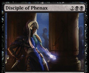
John! Damn it, why is that pillar so enormous in the Disciple of Phenax? This is the block with sweeping meadows like Russell Crowe’s Gladiator or armies gathering like Caligula or schemes unfolding in the atriums. Let us see what’s going on! That pillar blocks at least twenty-five percent of a painting. If you remove it, the painting goes from a-figure-plus-things to an actual Greek-inspired piece. Add a layer, and you have any fantasy artwork with a few tweaks, of any time period. Make it Greek!
If that pillar is removed, it moves it into the Donato Giancola Archivist territory, showing a figure against an oil painting to give perspective into the character. It’s solid, but the move to silly-awesome is just that much more.
John Stanko – 3
While you may not know this, John loves doing human illustrations. You know the Innistrad humans he did? That’s Stanko’s jam of hyper-realistic faces with imperfections—you know, humans! When you see him illustrate a creature or some sort of nonfigure piece, raise an eyebrow. Scars of Mirrodin obviously wasn’t his jam compared to Igor. Artists prefer to work on some subjects, and if you see John’s digital (hard to tell, right?) work, you’ll see his effort in making the brushstrokes real.
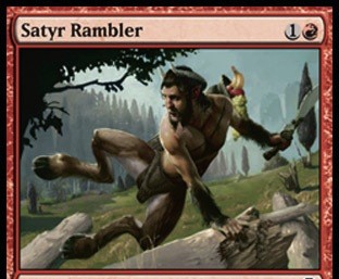
The Satyr Rambler carries as much softness as he can muster with a digital medium. Hair is super-, super-hard to draw correctly or make believable in Adobe Photoshop or Painter. That said, the white fur between his legs looks like an expertly-made SyFy Network episode of FaceOff and bunny-like in imagined texture. The piece is great. I know John only makes one digital “original” that he prints, mounts, and then paints over to give it texture and depth. If anyone sees the Satyr, I would love to see it up close. Pieces like that belong in the party room of a Liberal Arts college, preferably near the Greek Studies group. It’s a $1,000 piece easily. Were it all in oil, considering the size it’d be, biscuits that’d be expensive.
Jung Park – 2
Again, this is a concept artist who was given an item—not a concept or environment . . . an item.
Magic still has item folk, right? Just looking for high-resolution images, I’m confronted with . . . art shame. An artist should only post the best art he or she has made, but when I see a commission so out of the blue, I wonder if someone dropped the ball in the set or got sick—or had a grandmother die or something of the sort. Why I mention it is that this type of crap happens all the time, even at the top at a place like Wizards. They aren’t immune to dropped projects—or even flaky artists.
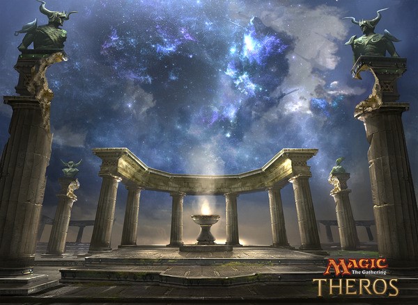
Nykthos is great. Good sky. The Boundary Waters national park in Northern Minnesota has views like of the Aurora (Northern Lights) due to the low light pollution or interference. I’m sure it’s what Siberians or rural Canadians see all the time.
Karl Kopinski – 6 (7)
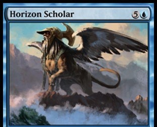
- Horizon Scholar
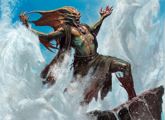
- Master of Waves
- Reaper of the Wilds
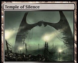
- Temple of Silence
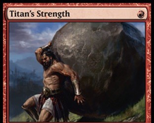
- Titan's Strength
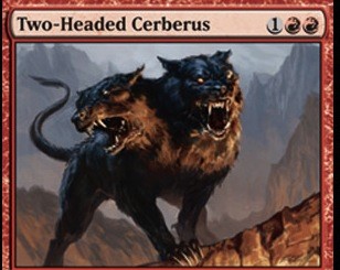
- Two-Headed Cerberus
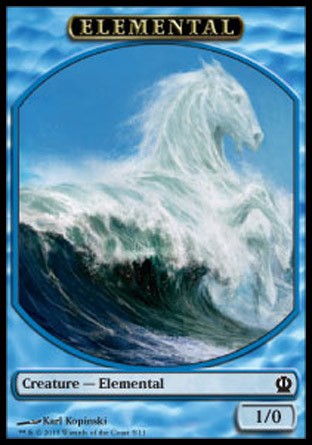
- Elemental Token
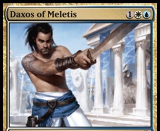
Master of Waves, winner chicken dinner is you!
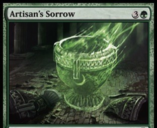
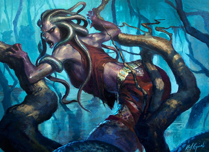
Three figures only emerge as you stare at a higher-resolution image. The card reads from a distance, it’ll be altered forever, it’ll be in Legacy and Modern Merfolk decks, and there’s negative space to add to on the card. Karl, that piece is incredible. Mind you, he had seven images and still had time to knock one out of the park. All the pieces have great weight shown in their muscle movement. Check out the heroin chic gorgon’s arms compared to the giant’s toned rock-throwing tautness. Both are expertly made. There’s a reason Karl worked on staff for Games Workshop—he can do basically anything with figures that you need him to. Look at his sketches on his Facebook page; those be grounds for learning!
Karla Ortiz – 2
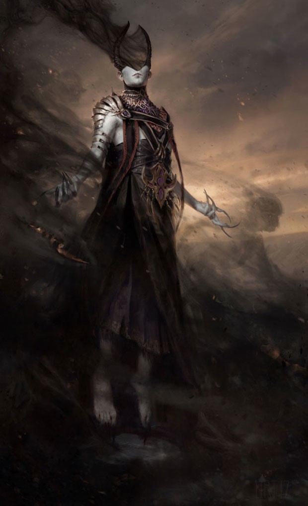
What can be said of Ashiok that hasn’t already been said? It’s a figure created without gender, and people frickin’ love it—despite Sie Germans trying to fit Ashiok into a gendered box. After she gave the step-by-step instructions on Teysa, a planeswalker was bound to happen. With some artists, you just know they get it. Nibbles won’t keep them happy; they need something meaty and important that changes the game for the better. Damn Karla and her digital art-making tools! I so wish that planeswalker were in oils because it’s an auto-inclusion into a future art exhibition, showing the exact time when Wizards woke up. Christ this image is impressive. I can’t even handle it. I want to see it at original size and just stare. I need to e-mail Karla soon.
Kev Walker – 6
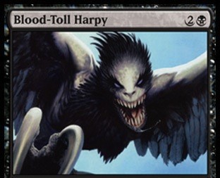
- Blood-Toll Harpy
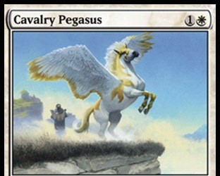
- Cavalry Pegasus
- Centaur Battlemaster
- Destructive Revelry
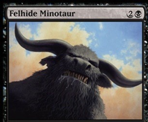
- Felhide Minotaur
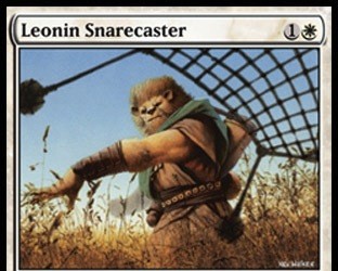
- Leonin Snarecaster
It’s just so close to being perfect.
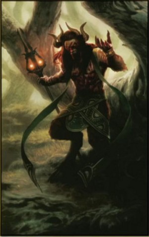
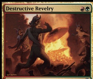
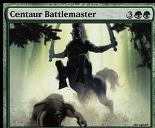
Destructive Revelry shows a bunch of satyrs doing their thing: burning, drinking, and partying Ke$ha hard. Now, I’m not saying I haven’t created fireballs at friends’ cabins in high school—haven’t we all? Kevin rarely gets scenes as of late, he’s been doing a lot of singular creatures or figures. I’m happy to see him showing some variety and really taking that freedom to a lot of interesting places. A minotaur that’s just a head? Huh, I would never expect that.
Back to the revelry, you guys!
Satyrs have women now apparently. That’s great because the “real” ones were only male, and they were just terrible creatures, as I mentioned previously. Pretty sure they were also always naked. If the foreground male (man doesn't work) and the right-side female (woman satyr? Satyress?) would change spots, keeping the creatures in their nakedness of wanton destruction would make a little more sense and remove the need for the out-of-place clothing.
Okay, sure, let’s keep it all PG-13, but that tube top really, really sticks out like a sore thumb.
I love that piece, but I’ll forever want a character swap, keeping conservative parents happy and the flavorful depiction of a high level of party.
That’s it for today!
Here’s a quick note for everyone:
You’ll notice a few community members mentioning big-name artists like Chris Rahn selling oil paintings on eBay for big money. Don’t confuse this trend with all Magic art. If it isn’t scooped up on eBay within a few months, that piece will sit a long, long while. The random beast or centaur art, among others, will be priced lower because there are just fewer collectors for that sort of thing. Angels and dragons go quick. Even after the big pieces are scooped up, you’ll notice that collectors went into frenzy mode and will find another piece to find, selling their original pieces shortly thereafter. Pieces aren’t gone for a decade or more anymore. It just no longer happens due to social media.
And for artists, the best advice I can give is that if you auction, start low, and if you set a fixed price, aim high with a best offer in mind. If you have data, great. If not, you best find some folks who are tracking the market—soon.
More coming out next week!


