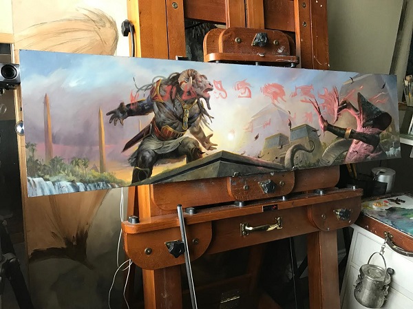
Artist Lucas Graciano has his diptych for the split card Insult // Injury. The card is spoken as “Insult to Injury” when stated. This split card is unique in Magic because it is a traditionally painted diptych. It’s been a while since I talked art history in broad terms, so today, we’re going to dive in a little, explaining what a diptych is and its historical significance, and ending with a little insight from Lucas himself on his newest painting for Magic: The Gathering’s new set, Amonkhet.
With a full Amonkhet art review coming, shedding a little insight into a unique commission challenge and traditional painting technique to extend an image is today’s analysis. Before we talk, we need to level set on terms, most specifically one term, a diptych.
What’s a diptych?
From Encyclopedia.com: Diptych is an ancient writing tablet consisting of two hinged leaves with waxed inner sides for writing on with a stylus; the word is recorded in English in this sense from the early 17th century.
From Wikipedia: A diptych (/?d?pt?k/; from the Greek δ?πτυχον, di "two" + ptych? "fold") is any object with two flat plates attached at a hinge.
In most cases, a traditional diptych consists of two panels of the same size, joined together somehow, usually with a hinge. This connective idea is from antiquity, where Romans in the 4th-6th centuries CE, late in the empire, would have these mini tablets. The tablets themselves had wax on them, where a consul or a noble person could write with a stylus and more importantly than stone, could be erased if necessary. They were their notebooks.
The very wealthy had them, and as such, they were a symbol of literacy and wealth. One example of a Pompeii fresco is shown below.

Fresco Portrait of Paquius Proculus and his Wife, artist unknown, circa 79 CE.
When Christianity took hold in the Roman empire, and without a printing press, diptychs made it easy to copy and transfer recorded prayers for the living and funerals. As Christianity and the iconography spread, the central story of birth, crucifixion and resurrection of Jesus Christ was shown on triptychs (three panels), a central scene with leaves that close on either side. A great example would be the Miraflores Altarpiece, shown below.

Mary Altarpiece (Miraflores Altarpiece)
c. 1440
Oil on oak panel, 71 x 43 cm (each)
Staatliche Museen, Berlin
 Larger diptychs and triptychs stood atop altars in churches, with smaller ones closed and carried by preachers. Depictions of biblical stories were shown more widely to an illiterate mass of people with ease, rather than having a preacher constantly on call. Churches were used for a variety of things beyond just a sermon and mass. As preachers had to explain simultaneous stories of baby Jesus to resurrection, having a triptych or even polyptychs, like the one below, that could swing open to the timeline helped explain.
With Martin Luther translating the Bible into German from Latin, the Biblical stories themselves became more accessible with images and text, text and images. I visited the Minneapolis Institute of Arts exhibition on Martin Luther, which had the Gotha Panel Altar, shown below complete with its 160 mini paintings able to be revealed and shuttered with ease.

Heinrich Fuellmaurer (workshop)
Mixed media on fir panel.
1539/1541
Middle panel 201?×?210 cm, Outside wing 98?×?105 cm, Inner wing 96?×?48 cm; Stiftung Schloss Friedenstein Gotha © Stiftung Schloss Friedenstein Gotha
As altarpieces increased in size and narrative, winged altarpieces became full teaching tools. Sometimes seeing helped with understanding. From about 500 CE to the late 1100s, stories had to be explained. Gothic churches were still centuries away, with their enormous stained glass windows. Engineering had to catch up, making walls thinner, taller and stress relieved with pointed arches opening up the wall. Later in the Renaissance, with Protestants making images more accessible with text to explain the scene in their common language German, in this case.
Shaking the connotation from the original wood panels is tough, though the term diptych is now stripped down to mean any two images, with triptych meaning three, and a polyptych being multiple images next to each other. Today, contemporary art considers any two images that are made or intended to be shown next to each other as diptychs:

William Wegman (American, b. 1943)
Second and Third Steps (diptych), 1989
Two gelatin silver prints mounted together
7-1/2 x 7-1/2 inches (19.1 x 19.1 cm) (each)
Signed, dated, and editioned '36/50' in pencil mount recto
Image accessed via HA.com

Claudia Scarsella (Italian, b. 1979)
Elizabeth Diptych, 2014
Collage on mixed media
29 9/10 × 24 inches (76 × 61 cm)
Diptychs in Magic
I encourage you to visit one of the best Imgur threads on Magic art, to be brought up to speed on how many Magic artworks have been made since 1993 as continuous paintings. We have seen nearly every creation, with basic land being notable. The Wayne Reynolds ones I play in one of my vintage artist constructed decks.

Not all diptychs are one painting. In some cases, like the B.F.M. (Big Furry Monster) shown below, paintings are utterly separate, and joined digitally if the need ever arose. And if you’re curious, these paintings are still available for $12,000 from the artist himself.

B.F.M. by Doug Shuler
Oil on board, 10x14” each piece
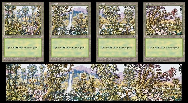
As the need for four to five card artworks for a cycle of basic lands or types have been created in Magic, the term panorama is used. The Mirage forests from Tony Roberts are a panorama, but when the cards are placed next to each other, they are technically a polyptych. Since every iPhone can take a “panorama” photo, a horizontal image is the standard definition.
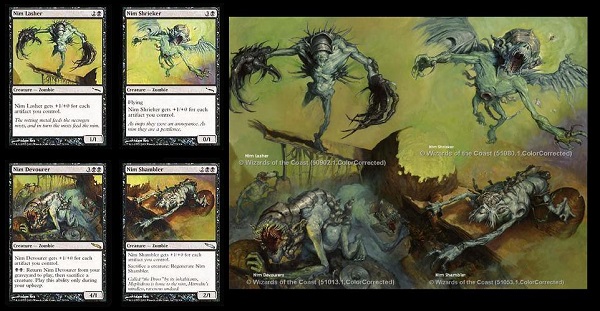
To note, not all multiple image paintings are horizontal. Adam Rex created his set of Nim paintings, called a “mural” by Wizards back in 2004:
Connective paintings
Think of the -tych as the framing and panels. While in Western religious art any paneled artwork over three images had a central depiction, Japanese Edo period art with ukiyo-e printmakers didn’t follow the central image as standard. I’m not as familiar with printmaking and the Japanese works on paper, I’ll admit. Future study would supplement understanding, in addition to the countless sources online that only mention altarpieces, diptychs, and more.
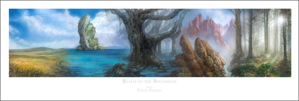
As for Magic in contemporary commissioning, we still see diptychs, even panoramas, though quite a bit less often. A judge promo set of basic lands by Terese Nielsen, called “Realms of the Boundless” was the newest panorama of basic lands as Magic judge promotional cards.

A high quality, numbered and signed print can still be purchased for $225, which is quite reasonable for stellar art that will carry its value going forward due to the limited print run.
Revealed mere days ago, the cartouche cycle of Amonkhet also had a panorama, though it was vertical, not horizontal, like most previous iterations.

It took the community a little bit to find it, though with a little nudge, a known associate put it all together. I’m sure image sharing sites will post and repost it for years to come.
https://twitter.com/TheProxyGuy/status/849638426311786496
With a strong basis under you, we dive into the most recent painting, traditionally created by Lucas Graciano, Insult to Injury.

Insult // Injury by Lucas Graciano
I went in depth with Lucas talking about art, preparing for the Magic Art Show at Grand Prix Las Vegas and we talked on how he had a phenomenal painting being auctioned. While I couldn’t turn out an article in mere hours, he needed zero help in reaching $7300 on MTG Art Market for his diptych painting, saving himself an auction house’s fees and opening the opportunity for payment plans, allowing a greater number of buyers to emerge.
Why it reached such a price has something to do with how it was made, its uniqueness and how Lucas creates. With that, let’s find out with a little interview he and I had a few days ago.

When did you decide to make this a diptych? After reading both art descriptions?
I did go back and forth about whether to do two paintings or just one large one. In the end, I thought it would make a unique format painting if I did one large painting. The one big challenge I ran into was to find the exact size I wanted to do the painting in. Because the ratio was very skewed, every inch I went in height, extending the painting lengthwise by 3-4 inches.
Notice the lengthening, yes! Did you have to make that art board? Glue things together? Special order something?
No, it was cut down from an 8 foot piece of masonite I got from Lowes. I just buy several 8 foot sheets at a time, I have the store cut them in half and haul the rest in my truck. I then use my table saw to cut them to my desired sizes
I can imagine the sight. Did you send the sketches to the art directors of Wizards as separate images?
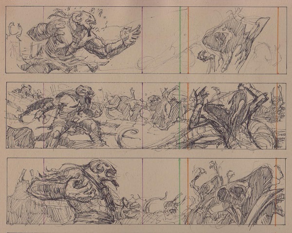
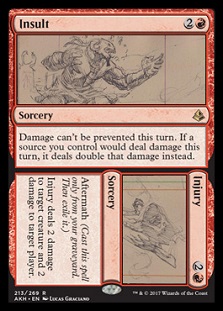
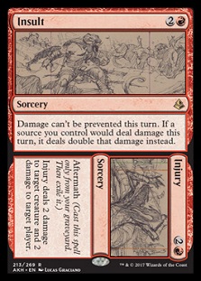
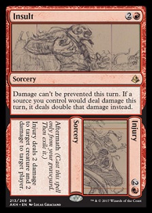
They’re kinda cool actually. They are continuous and I have colored borders for each of the parameters I had to work in. I sent both sketches individually and one file with them together. Lots of specific file uploads with Wizard.
Check them out, and mocked up, below:
 |  |  |
Do you have any reference shots, perhaps showing yourself posing as the minotaur?
Yeah I've got a cool reference shot. My daughter totally photo bombed my shot:
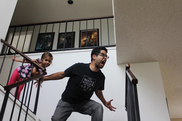
That’s amazing. You should’ve tried to fit her in the painting too! Any inspiration you took in the background buildings?
I try and stay pretty close to the shape language from the style guides that are given to the artists.
Ok fair, I get that. Was there anything potentially difficult in painting this that surprised you?
It was mainly trying to figure out how to get each part of the illustration to work on it's own and also together. Getting the placement of the two figures so that each was dynamic but also both cool in the bigger picture.

Dynamic they surely are, you can see how the goatataur builds and pushes to the right. So did you close an eye or play with placement?
Because there is such a dynamic angle on the minotaur (goatataur?), the snake guy was lower on the horizon and that doesn't always make for an impactful image. I think the gesture in the snake guy helps keep the image dynamic. As a whole the characters start to go outside the cone of vision. It's kind of like a scrolling image.
I totally see.
Thanks Lucas, congrats on the sale and great work on painting that brought Amonkhet a piece of diptych history.
— Mike


