I’m Mike.
I talk about Magic: The Gathering’s art.
The Hour is of Devastation.
I write art reviews.
Let’s go.
The marquee card, trending the highest in price of the set, no question had to be the master of motion Raymond Swanland himself. Showing utter destruction would be far from a serene scene and going with the artist who consistently delivers motion is a non-choice. It makes an art director’s job easier. You can argue with who should get the vanilla 3/3 beast, or who should get a combat trick to, “just get them one to stay current,” those are fun arguments with other art directors.
To recap, we’re in a two set block system where the first set both introduces the plane and also the conflict. The second set is all out war, from Eldritch Moon’s human on humanoid/eldrazi battles to Aether Revolt’s sect of artificer’s uprising to today’s set, a facade of Herculean tasks engineered to create super zombies for an Elder Dragon, who suddenly cares about reanimation and necromancy.
And then, we see the other Nicol Bolas in the set.
For posterity’s sake, everyone has thought the bent back and hands outstretched looks like Nicol Bolas is dunking a basketball:
https://twitter.com/MishrasFotoshop/status/876471574249058304
Sometimes, having just one actual athlete on the proofing or creative team might’ve come in useful here. I want to see a Zack Stella Nicol Bolas version of Behold My Grandeur to show the epic nature of the dragon Planeswalker and instead, I can’t unhear an NBA Jam pronouncement of, “he’s heating up.”

I must say, the dragon with just an interesting sky full of devastation, fire and smoke would not have been as interesting as the Bolas horns flanking the “hour.” This image needs them as it places the Planeswalker dragon in a moment in time. He may change in future iterations. As for now, he still loves his scarf and the pyramid acts as the left anchor in the scene to prevent a full triangle of light, forcing the image off kilter.
Svetlin has been producing incredible work and the sheer amount of work has him amongst a few artists, set to replace the gap that Kieran Yanner will create from heading to Wizards.
The thick digital brush setting, like wider, thicker actual brushes, looks fantastic here for the purple/blue effect of magical hailfire. Tight detail is not needed here, nor is it wanted. What we are to see is the magical effect, not be confused that this is a creature spell in the art, and convey the devastation of the hour.
I studied art history to understand the unwritten symbols of art. That, and I wished to avoid being misled by experts who claim to know art from the past when they actually don’t know what they’re talking about. In short, to know which religious artworks are propaganda and which are just good stories to teach morality. That brings us to the image below. Let’s return to this plague of hail and fire soon. It’s relevant.

The Seventh Plague by John Martin (1823)
I do enjoy that everywhere else on the plane of Amonkhet, the Nicol Bolas depictions show only his horns. Of course we’ll see an artisan happened to have a memory (or vision?) of his exact features, right as the hour is nigh.
Interesting to note are the four gods, two on either side of Nicol Bolas and yet Oketra, the white aligned cat god is not present. I would've thought Bontu the traitor would be missing but she's on the left top.
To touch on story, I have been waiting for an artist to talk more about it in depth and found Daarken’s blog, one of the better Magic artist blogs to explain more in depth:
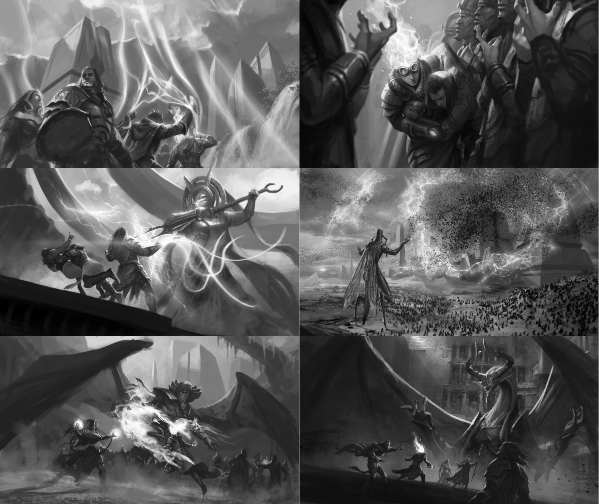
These illustrations weren’t going to be in the style guide and were basically just going to be seen internally for the writers. Once previews of Amonkhet and Hour of Devastation started showing up, I noticed that some of the scenes I concepted were turned into Magic illustrations. I’m not sure if my story illustrations were given to the artists as reference, or if the ADs simply gave them the same brief. Either way, it was fun to see what other artists came up with when given the same brief.
The Gatewatch was intended to have a major role all along. They liberated Egyptians and plagues happened.
. . .
. . .
Considering Kaladesh, a plane based on mechanics, rules really, trying to achieve Magic steampunk that happened to be on India.
Known associate and fellow Vorthos John Dale Beety noted that, “Kaladesh seems bizarrely bereft of religion.” That is true, because it was not a top-down set. Bottom up sets don’t have the depth of culture.
The Kaladesh planeshift guide reiterates it on page 8:
The Magic at PAX: Kaladesh World-Building Panel had a viewer question from Shivam Bhatt asking why they used the set as window dressing. More to the point, if you haven’t the time to rewatch the video. Members explained how they wanted to avoid the loxodon creature type because of the real-world religious connotations. The same avoidance was for colonialism, despite steampunk being so often tied to Victorian England.
At this point, they compared Theros being able to use Greek gods as being ok, as that deity worship is no longer current, and Indian, specifically the Hindu religion, is still very much alive. Wizards (or someone there) doesn’t want people on Earth visiting, yet parts of Earth are ok to be visited, at least visually.
And now, we’re in a set with full on religious references. They’re yelling at us. They were working on Amonkhet at the time and no one noticed the plagues that reference Judaism? It’s an odd gotcha moment, but really, perhaps Judaism isn’t considered as controversial.
For those who aren’t following, the story of the ten plagues of Egypt relates to a biblical story in the book of Exodus. The story is that the Hebrew people living in Egypt were enslaved or at best, suffering under the Pharaoh rule. Moses inquired to the Pharoah to let the Hebrew people return to their homeland, Canaan. (It’s basically the location of present-day Syria, Jordan, Lebanon and Israel. The Phoencians, if you know your classical sculpture, are also the same people and area.) Obviously the Pharaoh said no and then the ten plagues were released on the Egyptian people as an act from God, showing religious might, convincing them to let the people be free and return home. The ten were water to blood, frogs gnats or lice, flies, diseased livestock, boils, thunder and hail, locusts, darkness, and death of the first borns. The sacrifice of humans isn’t a perfect analog, but card like Opposition and the entire idea of The Locust God are more than coincidence.
https://twitter.com/wizardbumpin/status/879743871919566849
Personally, I think it’s fine. It’s like eating a donut for breakfast, it’s fine.
You’re not eating a full avocado toast with a bloody mary and a protein you enjoy. It’s a donut and it’s fine.
Amonkhet is a little at odds with the previous stated stance on learning to work on for the future with community engagement, especially the community you utilize for a setting. In the next block, we have a new story to tell. The Gatewatch is scattered with another based on a real-world society in Ixalan and we’ll keep note, again, how much realism is in our fantasy.
Points aside, let’s get back to art.
The rising action of this set is the gathering of the Gatewatch to fight back against Nicol Bolas. As players we are supposed to see hope, a glimmer of possibility that a recovery is possible.
Oh how lulled into a safe narrative we have walked. We haven’t had a plane annihilated since Mirrodin turned into New Phyrexia. “Yes, my lord. Overwhelmingly, my lord.”
Yes, artists will paint elves from full humans with elf ears to almost insect-like, borrowing from Warhammer Fantasy. With each time Nissa is depicted, I look to see if reference was used for Yolandi Visser, a friend, or pushed hard into elfish territory. Here, she looks like a human, almost like a cosplayer with well applied ear prosthetics. This is a good thing and here’s why: it breathes life into cosplayers work. It makes it more realistic, more doable to create.
And then we have this.
Her face is really marginal and it’s such a shame because Kasper’s fire is really quite strong. It reminds me Dave Dorman’s Blockbuster for quality.
This also starts the part of the art review where I question art director’s choices. It’s fun to know a little, it’s troublesome to know too much, and it’s the worst when you see things yet don’t have answers for. I ask myself, why are pieces so busy?
Visually, I have been noticing a trend. Required components are being written into art descriptions and staying there post sketch stage. These are incredibly subtle and without staring at images for hours on end, players will comment that something feels off and they will move on. Jeremy Jarvis is no longer commissioning art. These two points are not mutually exclusive.
Is Chandra needed in Inferno Jet? No, but it makes sense.
Is the naga here needed? No, and it makes sense, but it not needed.
In writing an art description for any TCG, the art box is at best 2.25 x 3.25” (~50x70mm) and instant recognition, readability should trump place. Meaning, a spell doesn't need pyramids and the Bolas horns to be read as a spell. It also doesn't need sand for people to grok that it is Amonkhet and not Mirrodin. Stripping away the unnecessary is no longer expected to make a tighter image, a better artwork.
Again, you see it, it just doesn’t manifest so obviously. The following is masterfully created, the scene is just awkward. At sketch stage, this should’ve come through as awkward. Why it was chosen is baffling. It’s a prom pose, even with the 1980s disembodied snake head in the upper right.
And Oketra's Last Mercy below, look at it, piece by piece.
Could the following be zoomed in, showing just hands, a white background of a god and the man waking from death? The image could use everything from the Ecstasy of Saint Teresa, which you know Howard knows how to paint, to an easter egg throwing back to a heal spell from the late 1990s.
Instead, a god holds a doll, needing devastation motion behind her, with the Bolas horns and sun. Start counting how many times you see that. It’s like playing Killer Bunnies where you see the background planets that have a special effect. And this was Howard, a living master! It creates stiffness that should occur at sketch stage because the art description wrote in too many things to include and placement being so precise.

Oketra's Last Mercy by Howard Lyon
Always search for higher resolution images when you aren’t quite sure what is happening in an artwork. The best way is to of course visit a painting up close, but we can’t have an art show every month. What I was looking for was the shimmering white protecting spell. Was it being removed from, or being placed upon the god?
Now, we can see that Gideon tried to save Oketra and has since failed. She saved countless others and yet, she cannot be helped.
His grief is visceral, visible.
Her death is dignified, serious and the betrayal real.
Gideon will not have any more of your -1/-1 business on the plane. He will now be channeling the god and protecting everything . . . for a moment.
It’s stark.
The air is heavy.
No children are heard, only cries, exclamations of anguish and verbal pain.
Shock value has its place in art, to arrest the senses with sensationalism. For the killing of a god, and throwing down the living embodiments of the mana lines on Amonkhet, to have their deaths off screen would be a disservice to their importance in the world. Proper world building built the gods as real; inhabitants of the plane “knew” them and upon their death, public grief should be substantial and long lasting.
Meehan has a few great depictions here, adding an oil effect to blood, keeping the gruesome scene as fantasy and his treatment of different materials worn on the figures. From golden wings, to gold leaf and dyed linen, everything feels correct. Often with some sort of variety, modern advances in screenprinting, for example, will show up on clothing. Here, everything is in its right place, whether we want it to be or not.
We turn the page and find a great image by an artist that never gets enough credit. He painted a strong woman, one of the few inclusions of Magic’s style guide rules:
We see a 2/2 human, wearing literally zero armor, without a heavy weapon, showing in full command of the scene. Her mechanic also is able to remove any one creature from battle with a small hoop to jump through.
It’s another busy scene, forcing the Bolas horns, rivers of blood, undead, scene of interaction with two zombies and a creature card, forcing the figure to be the central focus. This is a very difficult composition to achieve, a more normal requirement as of late.
I thought this was Dan Scott when I first saw it especially on how he applies distance.
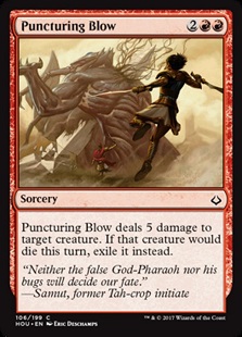
At card size, it’s incredibly difficult to see that the obelisk is the puncturing blow to the scorpion god. Personally, I would not have chosen this sketch because the focal point is Samut in the foreground and at card size, it doesn’t read.
Go ahead, look at this card in the card frame.
The composition doesn’t read.
This is an art director miss. Eric tried to make the best of it and conceptually, it’s interesting to show scale but it’s just not right.
Samut just gave you the speech you asked for, giving you something to fight for whether you’re a skeptic or still a True Believer. Rhonas, the Green snake god, is killed and they have a rallying cry now against Nicol Bolas. I wouldn’t argue with her, and considering all my buddies from the same crop are going to join her, I might as well. This image has space for the Bolas horns but we don’t see them here. It’s more similar to the Mirrodin Besieged cards that reference the humans, the Mirrodin Pure, who had a chance against the Phyrexians.
Liliana won’t be there to save the day like she did on Innistrad. There are mummies everywhere so you’d think, since she can control zombies, this would be like having a high level cleric vs. a level one dungeon in D&D, but that’s if she’s there and she was scattered . . .
I like this scene. Showing the allusion of lemmings falling off a cliff to their “death” and yet the idea the straight legged mummy will land on the ground and keep walking is clever. The background gets a little muddy, making the building behind the lead mummy unnecessary and reinforces that Magic’s normally impeccable art direction falters from time to time without Jeremy Jarvis at the helm. He was a titan of his craft and to assume anyone can fill his shoes easily is comically impossible.
This is a great Magic illustration.
Here’s why:
- All the needed information is clearly rendered and tight.
- All the background information is simplified, using Kev Walker’s technique to narrow in on the actual requirement of the card illustration.
- I like the bend of the arrow, showing torque and giving us the optimal illusion of movement without needing motion blur on the arrow itself.
- The smoke and fire effects are minimal and understated for how much could be added for a digital illustration.
It’s simple, effective and mindfully created.
Many people called out the figure holding onto the drake’s tail after I posted a higher resolution image. I can’t stop looking at the light source to the bottom right, exploding and giving us some warm oranges with precise subtlety. The dust clouds, sure, are nice. The light is what gets me from a muted palette. His work is good and were he to make this a traditional painting, he’d probably do well in the secondary market.
I should speak more about this work, but I would prefer you to just soak it up. It’s quite good.
Yes, the idea of adding fire adds +1/0 and first strike.
Indeed, fire doesn’t affect stone much other than the horn tips, white hot from the heat.
I’m happy this art description was made, allowing us to get a closer look at the Lazotop stone as it relates to anatomy. I see some Wayne Reynolds triangles in there, with the highly angular edges, mimicking acrylic paint.
Smart usage of light to show action here.
We see the broken glass and rubble to show us that an action has happened, the creature unaffected by the impact which ties to the mechanic, indestructibility.
I like the smoothness of the head skull. I look above at Kindled Fury and perhaps think, this was a female minotaur while alive. Fun.
Speaking of Lazotep . . .

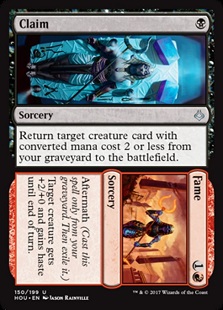
Claim from Jason Rainville
Digital
This is the image that we Vorthos players, those who look for beauty to experience in the game, want to see in better resolution. It shows an important ceremony of creating an eternalized warrior, one made of Lazotep stone, similar to lapis lazuli. It comes in as a flat stone and then leaves as the creatures shown shortly before.
Notable here is a more idealized female warrior, complete with cartouches to show she passed some trials of the gods, yet no brutal wounds to show how she died. It’s idealized.
More notable is the alignment. Look below. Originally, I bet claim was on the bottom, with Fame on top. As the Fame portion was used extensively in promotional materials, I bet that card was significantly better in play-testing. It’s a trail left behind by art. You don’t see those very often anymore.

Fame by Jason Rainville
Digital

Appeal by Jason Rainville
Digital
I really like this combination.
It’s a prayer and a response, all wrapped up neatly in one card. Showing this normally would be near impossible, breaking a sequential art rule in Magic that they only show one point in time.
Nice connective light. It works here nicely.

Authority by Jason Rainville
Digital

Neheb, the Eternal by Chris Rahn
Red flames are fun.

Grind by Josh Hass
Digital
Purple flames are fun.

Farm by Victor Adame Minguez
Digital
I love this Farm image. It’s one of my favorites in the entire set. It’s so quiet. I am allowed to watch the battle, cheering for the human to prevail against the undead.
In the next scene, seemingly unrelated to the first, the mummy did indeed win, though I am unsure what purpose a mummy would have after a battle, obtaining knowledge represented by fruit. It’s a bit odd mechanically though the colors and how they balance each artwork is lovely.

Market by Victor Adame Minguez
Digital

Reason MtG Art by Daarken
Ok, that’s a nice hydra with human feet on that tablet.
Yup, that’s a hydra.
All the heads appear to doing things on their own. As if the hyenas in Lion King were all represented here, except smarter. These are both clean, straightforward images at a high quality level with dynamic lighting for Magic.

Believe MtG Art by Daarken

Hazoret's Undying Fury by Victor Adame Minguez
This is perfect art direction, needing something dark to force the focus left and not on the figur itself? The plan started back with Karona’s decrees in Scourge. Lovely!
https://twitter.com/victoradameart/status/882617863718281216
Look for two things here that stand out: thick, quick brushstrokes and his usage of yellow.
The foreground right brushing of sand, bringing yellows into a saturated tan piece is welcome. As if you’re searching for water, color and he gives you a few snippets in sand that echo his hood. Victor must’ve had some strong reference, as everything feels and reads right.
One thing to note about his is the difference from painting to final. While many cards are printed darker, color swaps are pretty rare. I can think of Switcheroo and Silver Seraph which differed as easy examples, amongst the few.
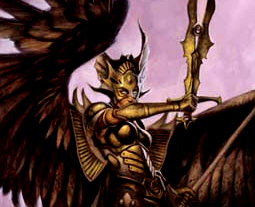 | 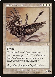 |
Scott explained the switch thusly:
You can see the change below and the blood river, of course.
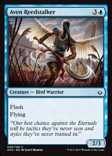
Yes, the before/after zombie Magic art rule sure is fun. We have seen it a few times, most notably with everyone’s favorite turtle:
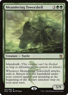 | 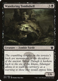 |
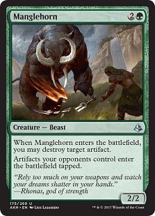
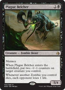
While a perfect before example doesn’t exist for our zombie beast here, the 3/3 beast is established and we can look to the previous two examples for horn placement to see the alignment. I like the 3/3 turning into 4/2 for a zombified creature, making it stronger, yet weaker in toughness. It changes the thought that zombies can take on more damage because they’re undead and shows that the barely held together body would rather fall apart faster.
As for the art, some great browns, tans and purples to show an “older” mummified undead creature.
 |  |
You see these animals all the time but you don’t actually process what they look like at joints moving. There are entire art blogs dedicated to poorly drawn horses. It’s also often a test for an aspiring TCG artist: paint two people talking to each other, with one of them on a horse. The hard version is the two of them are in a battle scene together.
I enjoy Lucas giving us blurry points to disregard for our next viewing, like the destroyed structures in the left hand background, or the rough shape of a horse on the right side.
The token gives us a distance image of how far these horses are from the main city where the plane is contained, Naktamun. They’re far and the horizon battling the distance shows that there is more to the plane than just Nicol Bolas’s plane, the life just isn’t that friendly to outsiders, if at all.
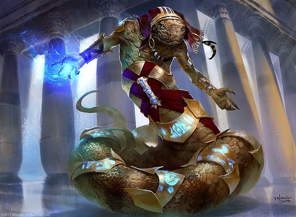
Yes, the Naga’s tail is behind him in the top middle and top right. The torso is pushing forward toward us. The breastplates want me to think this is a woman naga? Seems humanoid pushing a design in a style guide to me.
I’d like to point out that we see blue, green, red, yellow and a bit of orange on the spit dart. All he needs is purple and we’d see all primary and secondary colors. That blue sure does pop, doesn’t it?
And finally, Magic uses harriers a bit arbitrarily. The word means to harass, especially from repeated attacks. It also means a cross country runner, which is always a delight to think of a weird magical creature running through golf courses.
There is some great light intersection on the naga’s left forearm. We see blinding white light on one side and blue activating Magic in one area, being basically the same color. I don’t quite understand how a discarding activation (a bad thing) results in milling an opponent, yet the art shows some sort of insight gained about lies. It’s all a bit confusing, no?
Since I play Szadek for my Dollar General or 1DH deck, I’m always on the hunt for cheap mill cards. This card is the lowest costed mill card that isn’t fragile. A ¼ is HUGE for mill. It can block and doesn’t die to everything! The discard activating cost is easily acceptable in the drawing card color of Blue and nets you repeatable mill for three cards instead of two. This is a minor change, though notable that it’s not strictly better than any precedents shown below, though I find it incredibly strong.
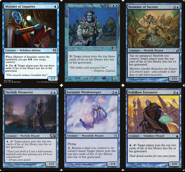
Let’s place this naga wizard on Amonkhet.
She’s a Blue card, involving card draw, inside some large structure, dealing with Blue magic. I’d say she’s working with Kefnet and, despite having a little flavor added to her cartouche, she finished at least a few trials, including Kefnet’s Blue trial, and Nicol Bolas was able to eternalize her.
Her head is enormous, though at this looking up your nose angle, creating visible character aspects is needed for clarity.
The front figure looks great. You can feel the reference imagery she used. The shifted weight just looks right.
The motion blur is frankly, unneeded, as evidenced below, Sara knows how to paint dust, sand and light interaction. Perhaps she tried as an arch, to make them look different so gameplay wasn’t affected with confusion and misplays. The white/tan to white/yellow is contrasted and art like this should be looked at from an art director. So it may seem like the rock she’s holding, the motion blur and the background character are oddly placed, they work by themselves and alongside a similar concepted image also made by Sara.
She certainly can paint women in horror in clear detail.
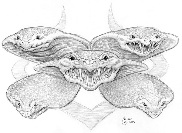
Take a snake, add sand and a hydra and this is what you get. I’m pretty against going to the well repeatedly for real life cultures and yet, Burns received the commission for this. It’s not real, has nothing to do with Egypt and feels perfect in the set. It’s fantasy yet grounded, far enough from the source material, yet at home in the Magic universe.
I like the red of the hood, which we could’ve seen more of that. It’s a sketch stage decision, sure. I just love me some color on creatures.
Mike still has a few of his supplemental drawings as well on his site.
It’s Kev, his thick dark lines show us the edges of the crocodile.
His soft whites contrasting the green with a gouache watercolor base to blend gives us realism and movement. His smoky background reflects the color of the prominent figure, keeping us knowing exactly who this card is to depict. You can see the light even lands more on the crocodile’s teeth, as if obscured trees above this oasis allow us to see the scene without a torch or squinting.
Those thick brushstrokes on the water are incredible. Interesting to note is that the river of blood concept we have been seeing often was not encouraged here. Aaron had to color correct the river. I wonder why that would be? He did a great job changing it so it isn’t abundantly obvious or awkward too. Sometimes the trope image is not to be interacted with, only shown from afar like technology for going back to the future.
There is a point in time for every painter when they stop using the color black. No matte black, nothing, and instead good painters use a dark purple, a version of brown or maroon and let the painting make it feel darker than it actually appears. The yellows here? They push even red darker if you outline the camel in a maroon. Photographs won’t show you this, you need to practice plein air paintings to get that correct.
It’s just a really nice looking camel during this sunset. The original is available yet too.
That sure is up close and personal.
I love the perspective here, as it fits perfectly in a card art box area. The card might not see a ton of standard play but for commander, it’s well worth it to pick up a few foils for that friend in the future.
I like the balance of horde to sand dune to sunset to the unseen barrier.
This is a wrath spell, that which removes globally everyone from the game. The biblical wrath of god makes sense as an easy to understand trope. Here, we’re given more of a marketing art piece, showing the apex of the indoctrinated people and the card mechanic explaining that they’re all killed in the process. How sad.
It’s not gigantic either, as my autocorrect keeps trying to fix me.
This is a fun concept, and showing the igneous rock connective tissue is a nice touch. It just doesn’t look like granite:

With everything so light and airy, Kev’s signature atmospheric looking art, the floral motif looks like candy. It’s halloween candy that still has some dusty sugar in it, with the muted color, right?
While the left paw (the cat’s right paw) may look off, the carpal bone is actually correct. It’s a bit higher up than you believe at first view. Kev paints quality at such a consistent level, his reason for having the most card commissions becomes obvious.
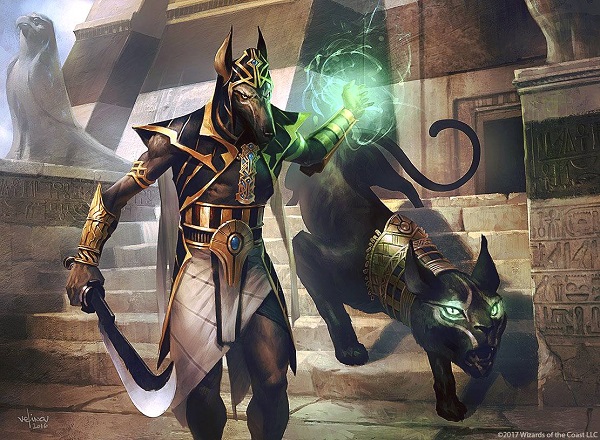
I’m not sure how or why Nicol Bolas felt it necessary to eternalize a cat.
House cats, or even undomesticated ones were not in the trials of the gods.
It doesn’t quite make sense to me.
The art itself is well done though. The application of then to now is exceptionally done in regards to the weathering on the stairs for Slawomir and the continuation of the eight spike collar to reference the eight total gods of Amonkhet.
See the gold.
Then you should proceed to see the purple and pink dust storm.
The missing hands on the sarcophagus took you all of one second to see a mummified hand pushing off the lid.
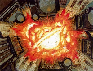
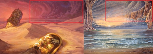
While you were trying to understand how that was working, I was staring at the upper right and wondering how many other landscape images unintentionally echo and reference Underground Sea’s curve of “ceiling.” It’s probably a coincidence of having to paint for a 2x3” box.
This card spawned a sizable amount of love for the style of art it evoked, a nostalgic past and
It looks like “Borderlands,” which means a more cel-shaded style and why it feels that way is due to a choice from Craig. He explained:
“At card size the fins almost looked outlined, but that's just the bony part of the fin. In hindsight I probably should have made the fins entirely yellow instead of two-tone with blue.” - Craig
To a layman, it pops.
To a trained eye, it’s a calculated risk to try something a little more retro.
It’s a good artwork. I’m happy it was used on a good card with some playability outside of the Limited format. The Bolas horns are subtle too, it’s amazing he fit them in.
Without a card frame, this card still speaks, breathes as red. The digital effect of adding red concentric lines from the effect works wonderfully. It works so well, in fact, that future creature cards that have a magical effect, I’ll be looking to see if they utilize this again.
Yup, they used it again. They’re using art rules. I like that.
How large is that cat?!
Check out the sword and how it was added ornamentation after death. Though, the clothes and armor remain the same. How strange . . .
These were the preview cards that Ant Tessitore and I received for the SnackTime podcast.
The change from then to now with the red river turning to blood is the tell of time changing and the literal hour of devastation happening. The hoop earrings live on as well, though I’m not sure on the headscarf if it’s historically Egyptian accurate or not. It feels correct from past sculptures I’ve seen in museums.
Making this digital has some elements from the original, Basking Rootwalla. Both creatures are not actually green, but rather the scene around them. In the original, it’s the background. Here, we see flowing runes reflecting light onto our lizard buddy. Considering there is a card frame, this isn’t needed, especially as Red card = red image has been nixed from a requirement for well over a decade.
Digitally, the reflected light is done with ease and this should be a digital illustration. Only a few great Magic artists working traditionally should be given animals that require a ton of reference. Lars Grant-West is one of them who studies animal form and anatomy. Most folks just don’t within Magic’s rolodex, so grabbing a digital artist who can do good always works instead of calling Lars and hoping he’s not busy for excellent.
That’s a 1990s feeling wurm artwork, isn’t it?
Soak it up. Give yourself 15 seconds. Look at the edge work.
How about that?
This is a Portal Three Kingdoms card reprinted back into the modern format. That’s surprising and unexpected.
Also unexpected is how large Jace looks in this image. Artist license allows a more balanced painting of figures and I appreciate that. It makes for a better painting and shows that Planeswalkers of the Gatewatch are friends, valuing each other equally.
The political commentary writes itself.

Fervent Paincaster by Matt Stewart
Oil on hardboard, 14 x 18"
Original still for sale by the artist.
This card is so much stronger than the art makes it appear. A 3/1 for 3 mana is incredible strong, especially with a tap for damage, or ping, ability. The art makes it seem like she’s in a last ditch effort to do anything when in reality, she’s quite strong in playability. The art should make you wonder if this card was switched in development. It doesn’t quite add up, despite being close. She’s exerted, not nearly dead. I like looking for those in sets.
Tomasz sure can add chaos to his painting, attacking the canvas as if he has a vendetta against it. The brushstrokes are thick and flat, like applying paint with a palette knife except done so quickly, with a reference model that hates their outfit and the artist has thirty minutes to get a good value and color study. Of course, Tomasz didn’t rush this, though the frantic nature is absolutely needed here. I quite enjoy it, considering how different it looks compared to the rest of the set.
I want bird familiars in this set now, so bad. They don’t align to any faction, are helpers and could be intensely flavorful to the Egyptian setting. Perhaps in a future return to the plane after near annihilation of their sole city.
Nice things I see:
- Lily pads
- Sand to water in the hourglass
- Radical 1990s shaved shades
He needs to get better commissions. He’s being underutilize. Look at how good this image is. This looks like someone made a speedpaint, then spent twenty hours fixing all the shortcuts to make a really strong image with light reference.
This is nightmare inducing. Thanks for that Victor.
How many times have you seen this card and image?
At what number did you realize that his arms are skeletal?
This is the zombie god and yet, it doesn’t yell zombie to you. I like that. It offers easter eggs for those willing to make a casual or theme deck. We get to see the various zombies, eternalized creatures, in the background from naga and human to jackal khenra. The scale birds show the scale of this gigantic creature and the subtle dark and blue, hinting at ![]()
![]() color combination flow seamlessly here.
color combination flow seamlessly here.
The scorpion atop the head really fills the space doesn’t it?
Those scale humans sure do help the scene.
None of the gods have sex organs? Or do they? I’m not sure anymore.
This creature is again dead, or was. Or he is. Check out the forearm bones.
And yes, with the Rock looking into public office, every Adobe Photoshop mockup will involve this card art and his memorable scorpion king CGI mess. Sure.
What a perfect composition. Even the clouds are balanced around the god’s head. It’s busy on bottom and quiet on top. The light focal point pushes us to the middle of the artwork and we’re rewarded by looking at the decimated Hekma in light blue, dissipating to nothing. A similar effect is of translucent wings is done with minimal effort yet maximum recognizability.
If he makes a 1/1 token every turn (or more), the amount of hoops to jump through in Commander approach zero for sheer power level. Cards like this, especially with good art, last around forever.
Invocations
I don’t know why there are random pots flying around this impeccable angel.
I do know why Bastien was given this, he can do conceptual angel with smoky background better than Kev Walker. It’s emotive and he can convey raw emotion with ease.
The angel of color is important to see as well. Representation is huge for marketing efforts and when an artist can paint anyone with ease, an art director is best to ask them to push the envelope.
Originally made for the Duels game, the card’s effect wasn’t clear to me until I saw the laying down figure in front. You wouldn’t cast a sacrifice creature spell on yourself.
This creature grows as the dead rise in number. As the Hekma, the protection barrier around the city of Naktamun has fallen, this elemental rises from elsewhere to wreak havoc on the city. Check out the scale of this monstrosity. In a set full of the undead, this creature rival Nicol Bolas for size, though its power is strength, not magical might.
The disintegrating hands are fun, despite me not understanding what this thing is made from.

Omniscience by Josh Hass
I’m over the Bolas horns.
I’m over them.
Nice wings though, they feel like a bat’s from great reference. Sorry you had to paint elements that don’t help inform the card and instead are uniformly needed on all cards despite them adding nothing to the narrative.
That’s a busy scene. It’s a great intentionally busy scene.
As the mechanic creates madness during declare attacker, upkeep and end of turns, I understand the chaos and feel it works with insects in the background, the midground and up close in front of our face. It’s not a mage’s duel, no, it is a mage manipulating his creatures to impact his foe. This is what a good Cube matchup should look like. Stellar art description and execution by Svetlin.
It’s also one of the ten biblical plagues in Egypt, after all. It best be on point.
Oh, it’s a bird warrior the warrior is about to end.
I’m also not sure how this is a pact, considering all the eternalized creatures all do the pretty much same thing, kill everything in sight. Maybe the pact is the creation, and inevitably it’ll kill something and if you don’t pay mana, you as well?
The highlights here are quite nice, from the stone lazotep zombie’s head, to the Bolas horn shadows (done masterfully I must add) to the blood splatter line, intentional is this scene and it reads like a narrative of time.
What does an Unsummon effect look like?
In Dungeons and Dragons, the spell “Dispel Magic” is one to remove enchantments, spells cast upon places with hexes that may negatively impact the visitor.
Is it a magical effect, fading away, or deconstructing itself.
Titus was given direction to have landmarks deconstruct as if being destroyed from the Hour of Devastation itself. It works out, it just doesn’t have the same punch as the original Sunder showing Tolarian Academy, the card you want to tap for a bunch of mana and replaying, being removed. There is no cabal coffers here being removed and likely recast. Perhap that is asking for too much.
That’s a fun way to show scale, those birds are even fully painted. The creatures in the middle ground are concept art rough, indeed. They are also secondary to the main element of the card art, the giant creature coming into play.
This is a stellar scene, from opening in the sky for the creature, to the trees on either side creating a frame to the non-descript humans. It’s simply yet shows incredibly restraint to not overinform and over direct the scene.
Notable Artworks

Island by Lucas Graciano
Oil on masonite, 16x20"
Original sold
I didn’t cover the other basic lands because this one is so notable. We have a full conceptual land card artwork fitting the setting. It represents the setting while also maintaining some of Graciano in it, it doesn’t fully bend to Bolas horns, sand and Egypt. Works like this, ones that take a risk, are to be cherished just like Striped Riverwinder. Going off style guide is a risk and a dangerous one at that.
It’s incredibly good and it’s no shock to me that it sold well at auction.
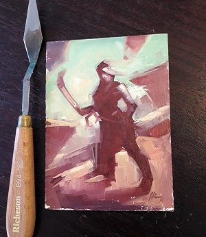
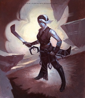
You may not know who Jeremy Wilson is from his Magic work. He only has one token previously an it was dynamite. It was the Kor Ally, which he had for longer than I would’ve thought including a color study, shown below. I have been getting into collecting really standout color studies from Jesper Ejsing and Jeremy might be added to that niche I’m examining. It’s often cheaper than a full painting and still gives you an original of rough paint, larger brushstrokes and raw. I find them fun to put up for people to guess and most are a lot more detailed than you would think.
 |  |
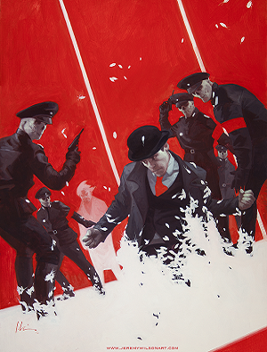
Outside of Magic, he has done countless covers and his usage of red and black as negative space mixed with forms is quite astonishing. It reminds me of a James Bond title sequence every time I see some of his work. It’s very cool up close.
 | 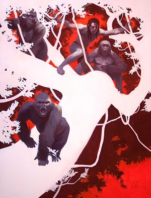 |
As Jeremy explained the prompt for Unquenchable Thirst, it’s quite simple:
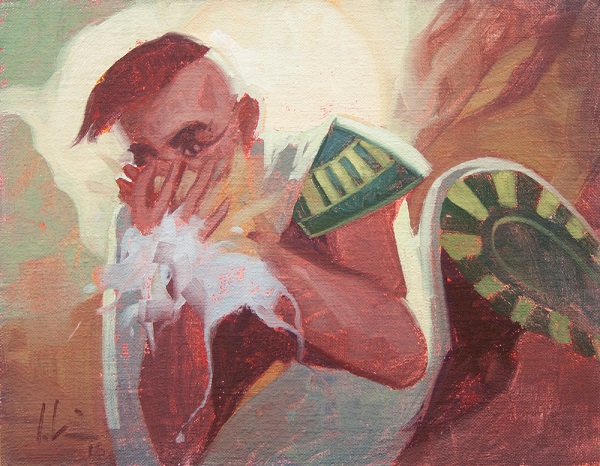
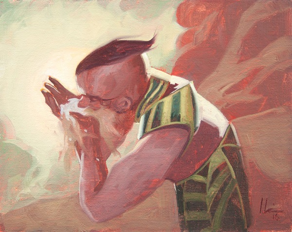
He did a few color studies, shown below. Each are pretty inexpensive, though the card isn’t a mythic rare, in many decks or highly valuable as a card. Yes, many people will see this card in draft or sealed formats, he is dipping his toe into Magic and I cannot wait for him to get something highly playable. He’ll meet the art collecting community quickly.
As for the art itself, his ability to show dynamic changes in color, evoking shadow is phenomenal. You can deconstruct his thought process by showing the required scene, then seeing how he was able to beautifully render the setting. It’s all so effortless and I know we’ll be returning to see his process and ability to execute soon. Stellar work.

Each color study is oil on Belgian portrait Linen mounted on pine panels. 7" x 5.5"
All are still available on his web store.
I end with the image that made me audibly gasp.

Moaning Wall by Piotr Jab?o?ski
Very rarely am I shocked when seeing new art.
Piotr was a breath of fresh air.
His art is referential and yet, it leans on itself for explanation. Is Moaning Wall just a card for the plane of Amonkhet, or did he use the concept, then expand out to all zombies, to the piles of bodies during the holocaust? Did he really tie the holocaust to a card game that’s largely antiseptic of political commentary? The Amonkhet citizens were butchered for profit from an outside force not unlike concentration camps?
The mere fact that I’m curious if Piotr decided to find a connective thread about one of the world’s worst atrocities to a game is absurd. Guillermo Del Toro does often say that all art is political, after all.
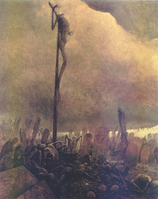
I think of Zdzis?aw Beksi?ski, whose works have spurred countless studies by current Imaginative Realism students. He also has a show going on until September 5 in Chicago. I’d definitely go if you’re close. Guillermo del Toro owns some of his paintings and once you look, you’ll see the haunting realism, the fantasy mixed with deeply emotional art.
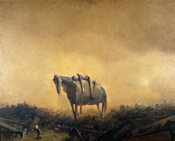
Piotr is the best new artist I’ve seen; and, in addition to his wall, his Apocalypse Demon is sheer joy. We get to see the background hall akin to Lord of the Rings and its balrog, yet see a gleeful demon chasing down creatures inevitably racing to their doom. Who said whimsy was only Steve Prescott’s thing?

Apocalypse Demon by Piotr Jab?o?ski
I like the destruction of the plane, the new feeling of freedom and personal pushes some artists challenged themselves to make, and the references to biblical plagues. I would’ve loved them if Wizards didn’t say Kaladesh couldn’t have Hindu references because of religion and go back on that statement literally months later. A ton of stiff compositions plague this set, where visually the ten biblical plagues of Egypt could not be ignored due to ease of finding reference, logical inclusions and inevitable trope usage as Magic’s Egypt is not Modern, it finds a foundation in ancient Egypt mixed with tropes, not with their current reality, a serious miss.
We have another masterful artist joining Magic’s ranks, and another set passes that held onto Terese and Howard. Cherish them, they won’t be making Magic forever. With Christopher Rush passing and artists like Donato Giancola and Rebecca Guay graduating out, enjoy the greatness.
Best,
—Mike


