
Daily MTG Arcana. Azusa, Lost but Seeking by Todd Lockwood.
I’ve been altering cards for about three years now. In this article, I walk through the steps from initial inquiry to finished alter. I’ve heard there are great tutorial videos on altering out there on YouTube, and I got started through the tips and how-to’s Jeremy Froggatt and Eric Klug put out back in the day. Other than that, I’m self-taught. I did well in art class in high school, and I took some art school classes, but I never had a formal education. This article will give you an idea of the time commitment in my process of creating original alter art, and if you’re new to the craft of altering and are interested, it should have some useful tidbits to give you a jumping-off point.

Full art replacement Mayael the Anima
While it’s a blast to get rowdy with extensions and partial replacements, my favoritest thing to do is original, full-art replacements on cards I love. This commission definitely fit the bill, so you can imagine how excited I was.
Hurray! A unique take on Azusa, from scratch. Right up my alley. Plus, Azusa is such a badass lady in both Modern and Commander. I’d done an Azusa extension before and really enjoyed it—jumping in and swimming naked in the warm waters of her effulgent green fire and all that—but I’d never done an Azusa full art. My next move was to e-mail Joshua with a few questions that would help me develop his concept.

Azusa, Lost but Seeking extension
MJ:
-for Azusa, did you want to keep her look similar or deviate? Change in ethnicity/hair color at all? on outfit, do your prefer "PG" or "PG13+..."? lol.
-if there are any reference pics you can send of imagery you like (female sorcerers, or plant types, for example) please do. If not no worries we'll figure it out.
-if you have a decklist or part of one, that would be helpful too

“Sakuya-hime” by Getabo Hagiwara
Joshua responded with answers to my questions, and he included a ton of great reference material:
- Japanese myth of Konohanasakuya-hime. So....Cherry blossoms!
- http://08.wir.skyrock.net/wir/v1/resize/?c=isi&im=%2F6839%2F63326839%2Fpics%2F3100864499_1_5_AykICkzZ.jpg&w=450
- https://journeyingtothegoddess.wordpress.com/tag/konohana-sakuya-hima/
- http://www.etsy.com/listing/54703888/cherry-blossom-goddess-8x10-art-print-of?ref=related-0
- http://www.deviantart.com/art/Konohanasakuya-hime-Craig-Yeung-274917374
- Avenger of Zendikar is usually my go to "finishing move" (alongside Craterhoof Behemoth with Tooth and Nail). So, perhaps some idea that some of the plants/flowers are more "alive" than just plant life, as in turning to walking beings
- http://static2.cdn.ubi.com/emea/gamesites/mm/media/art/HoMM5_Druidess.jpg
- http://s14.photobucket.com/user/isaiahthegreat/media/Fantasy%20Art/druidess.jpg.html
- http://s14.photobucket.com/user/isaiahthegreat/media/Fantasy%20Art/druidess.jpg.html
- Decklist: Turned out I did this already, though needs to be udpated (Sylvan Primordial!) http://hectomagic.wordpress.com/2014/01/10/azusa-go-big-or-go-home/
- In terms of "color", I like the "brightness or color qualities" of the colors in these works:
- http://tsabo6.deviantart.com/art/Amulet-of-destiny-326928970
- http://tsabo6.deviantart.com/art/Forest-faerie-310561363
- The Hymn to Tourach here:
- http://www.gatheringmagic.com/jeremyfroggatt-030712-february-review/
- http://dianephotos.deviantart.com/art/Nimue-Wallpaper-108113243
Over the course of the following week, I drafted three concept sketches for Joshua and added color to one to represent the palette I intended to use. I sent them to him for feedback along with a verbal description of each concept.
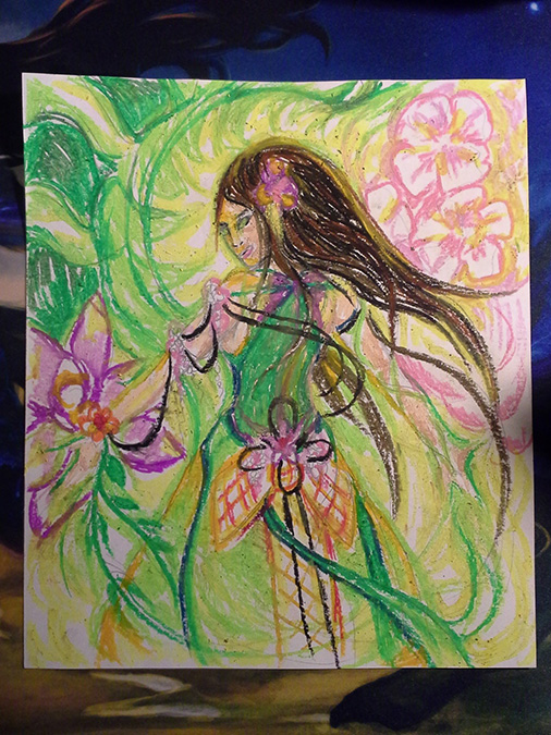
Azusa Goddess (colorized) – This is a very sensually verdant interpretation, and in my mind, it has a more voluptuous Azusa representing feminine, natural bounty. I was inspired by Hawaiian/islander women and tropical colors as well as traditional Japanese elements (see the stylized obi at the back of her dress). The dress could also be backless. Her hair could also be up in a riff on a complex geisha style. Omnath, Locus of Mana is the backdrop seen in the upper-left-hand corner, and the cherry blossoms and exotic flowers are bursting to life as she calls upon her green-fire magic. This Azusa is ready to scorch battlefields with bouquets of power, fueled by her innate and indomitable forces of nature. I envision her dress as warm-weather flowing and textured, perhaps dark green/jade/orange elements.

Azusa Acolyte (kneeling) – This is the ingénue/anime version of Azusa with a much more contemplative feel than either of the other two. She has oversized obviously supernatural eyes, a more waifish figure, white robes, and a complexion that would indicate many hours spent in reflective prayer beneath the shade of the plants who shelter her and answer to her powers. She could also have bangs. Avenger of Zendikar watches over her loyally in the upper-right-hand corner, she kneels on an Expedition Map, and her hair ties into the branches around her. Her magic swirls in cherry-blossom forms of many shades of pink, while lilies and orchids cover the shrine round her. It’s still colorful, but there are more blacks than the other two versions, representing a seeker who is simultaneously both innocent and dark in aspect.

Azusa Planeswalker (floating in sky hero shot) – This Azusa is the movie-poster, Planeswalker-style seeker who's comfortable in her high-profile role, confident in her abilities, and a little bit cocky. Her build is athletic and lithe, indicative of a life on the move and in tune with the wild. The background is less abstract than the other two, with cultural/historic/personal details visible upon close inspection (like Kamigawan buildings). The sun is either rising or setting behind her right shoulder (your choice), and her flames of power are violet, fading to green at the bottom of the card. Her magic ties her to both the colorful sky (ref. Seek the Horizon) as well as the various flora that are buoying her upward and flowing into her dress. I see her dress as ombre green, lighter on top, her skin ivory, and her eyes green perhaps, too.
Joshua’s response was gratifying:
First off, the colors nail it. The palette represented is perfect. I particularly like the pinks used for the blossoms, and the really vibrant green. As far as the design goes, I'm totally sold on the "Planeswalker" concept. The way her hair, body and dress all "flow" in curves is amazing. The flame is amazing, the flower petals appearing in her hand, and the blossoms lifting her up, all spot on, captures the essence of what I was thinking. I really like the buildings in the distance, as well. I think I would prefer a sunrise to a sunset. Perhaps in the bottom right could be the edge of a pond which would add a bit more "blues", with koi in the water?
Thank you so much! Your work is amazing!
My next step was to colorize the selected “Planeswalker” concept sketch. I haven’t always done this, and I think it really helps a lot to have a good road map before you start putting an original on the tiny, tiny canvass of a Magic card. It is especially relevant in a composition like this one where there are many layered details and small set pieces coupled with an extensive palette.

Jackin’ my son’s Crayola products for Mom’s work.
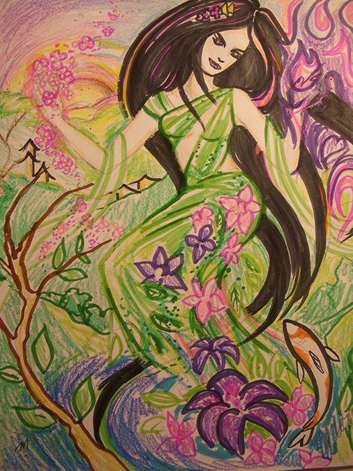
I did a final check-in with Joshua to make sure the game plan looked good to him.
MJ:
Joshua:
With everything set and having the green light from the client, it was time to start painting. Keep in mind this process took a little over a month, given the e-mail back-and-forth, accommodating other work commitments, and so on. Considering I went to the Card Kingdom Pro Tour Qualifier in the middle of this process and then had several orders to fill after that event, this was a pretty good turnaround. Still, an artist is always thankful when we can work with nice people, like Joshua, who are good communicators, enthusiastic, and flexible. Collaborative processes like this take extra time and energy, so having a great client is, simply put, awesome.
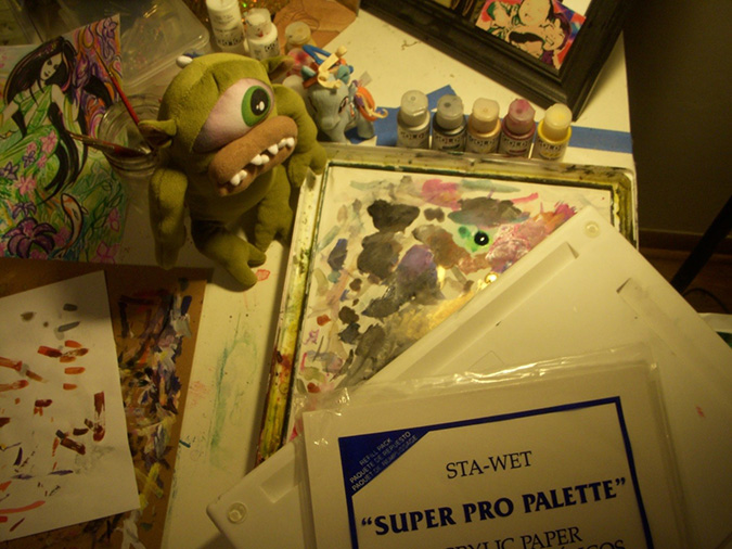
Basics: Masterson Sta-Wet Palette and Golden fluid acrylics. The palette comes with a foam insert and special paper that you dampen to help keep your paints wet for multiple projects.
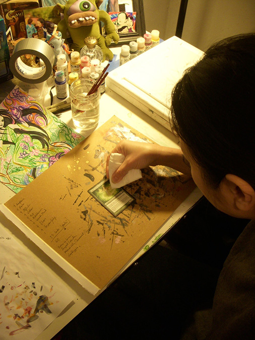
Always clean the card—prior to painting—with a damp paper towel or soft rag. Fingers leave invisible oil patches on cards that you don’t notice until your paint is beading in the corner.

First, I apply a thin coat of neutral gray. It just gives you a nice, simple clean slate to work with.
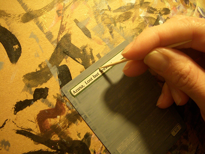
Always check for areas that need tooth-picking after you apply a layer—don’t wait until the end, when you have hard, thicker paint to scratch off. Tooth-picking is the cleanup of card altering. Gently scratch away paint that has escaped into places it shouldn’t be.
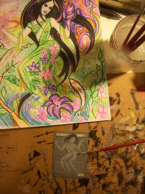
My next step is to block in the major elements of the piece using shades of gray.

The goal of this step is to give you a good paint-by-numbers foundation for applying the color.

I spent a long time making the sunrise and sky background right. I didn’t want to have to go back and redo parts of that after I had finalized her hair and other more forward elements.

Next, I added texture to the grass and put in part of the foreground tree, the body of the fish, and the main flower. You can see that, in general, we’re building the composition from back to front.
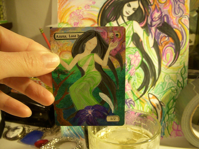
After I was satisfied with her skin tone, I put on the dress. I used very thin layers of paint to retain a lightweight, semi-sheer look. At this step, we have all the major elements present.
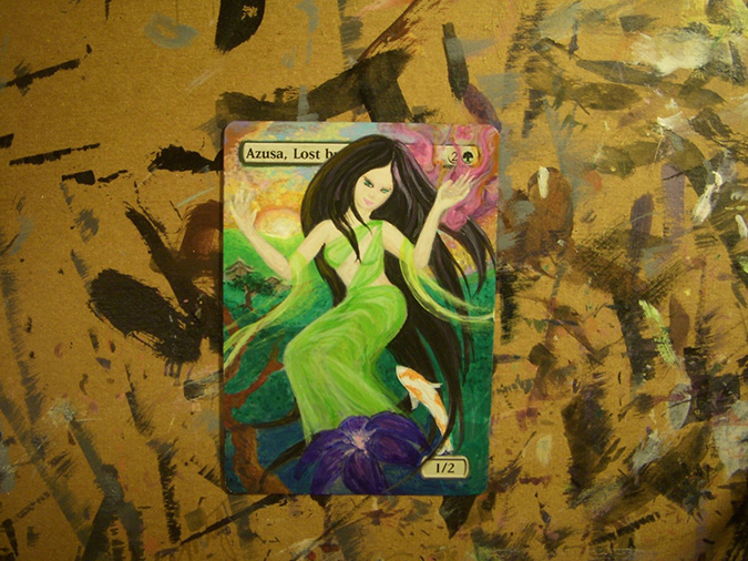
Now it’s time to add imperfect detail. I worked on her hands and fingers, shading her dress, colorizing the fish and the flower, and highlighting her hair. I sketched in her facial features.
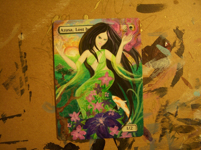
Still working up details, I sketched in all the magical foliage on her dress, brought the tree branch across her into the foreground, added her arm-scarves and the vines near her P/T box.
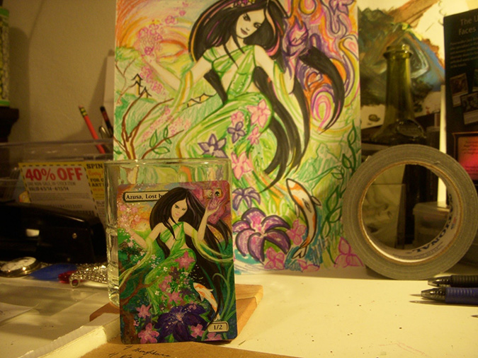
This is the final level of detail I had before I started inking. You can see the addition of the cherry blossoms in her right hand and the improved ball of flowery purple flame in her left. On to ink!
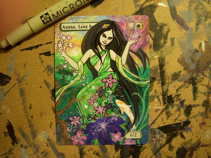
In this step, it’s all about adding definition and weight—it’s a game of feeling out what to highlight and what to leave less defined. I basically learned figure-drawing from replicating X-Men trading card illustrations, so I love this step—well, except for my over-thirty shakes! Make sure you take frequent breaks when altering. The physical strain is real. I use Sakura Micron pens, usually with a .20 mm line width.
Ready to see the final alter?

Azusa, Verdant Goddess — Planeswalker
I hope you enjoyed this walkthrough. Let me know what you think of the final results! If you ever have any questions on altering, hit me up at moxymtg at gmail dot com.
Till next time, may Magic be your lost and found.
-MJ


