I took one look at the poster of Nicol Bolas being released as a San Diego Comic Con and said to myself, "Holy crap, it's Gustave Doré."
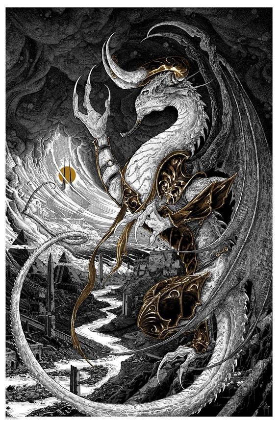
It's not literally Gustave Doré of course — Doré could not be commissioned for this project as he was a 19th century French printmaker, and is very, very dead. No, it's Brandon Holt, a Minneapolis tattoo and poster artist who appears to be a bit of a ghost online . . . but that's probably fine, as the quality of his work speaks for itself. I don't mean to diminish the piece by the comparison to Doré — not at all! This is, hands down, my favorite depiction of Nicol Bolas, Holt's incredible, gnarled detail finding a hoary middle ground between Bolas's modern, dynamic character design and his original depiction as an impossibly ancient creature.
Still, there's definitely a lineage here, one that makes Holt an excellent choice for this illustration. It's a lineage that crosses through other masters of pen and ink — Moebius and Bernie Wrightson, both adept at creating images of the strange and fantastic in exacting detail — back through etching and woodblock illustration traditions to Doré's era. Holt's illustration is in communication with these other artists and eras; it talks to them. Moreover, they talk back.
Holt's illustration brought Doré to mind because, to me, it has much the same feel as Doré's famous illustrations for Paradise Lost, probably his best known work. Doré's Satan writhes, broods, falls, rises in dark triumph, broods and falls some more. Nicol Bolas as a character isn't Milton's Satan or even Doré's Milton's Satan, but he feels a lot like a Doré character. He strikes a pose, he stands, commanding, in a way that feels a little theatrical, a little staged. The mark of Holt's pen combines with a composition that, like Doré's compositions, is makes no effort to hide its composed-ness, with the result that the picture feels a step removed from reality.
This makes sense for subject matter that feels, like Paradise Lost, somewhat biblical. The scope of Amonkhet's story is on a level hardly conceivable, perhaps the first time in its 25 year history that an apocalypse feels well and truly apocalyptic. This is, for all that the setting is Egyptian, beyond plagues and into the realms of whole cities being obliterated, great floods destroying all of humanity, witnesses turning into pillars of salt, that sort of thing.
The mechanics of how this is conveyed are pretty interesting and something I want to dig into at some point, but what I want to hone in on today is the contrast between the style of most of the artwork compared to this piece. Amonkhet's visions of catastrophe are largely . . . let's say . . . blockbuster? They opt for a kind of fantastic naturalism, a frodorealism 1 that attempts to render as faithfully as possible these unimaginable scenes of civilizational ruin. Holt's piece operates in a different way. By existing at a remove from the naturalistic, it conveys a sense that Bolas's destruction of Amonkhet is something that might only be rendered somewhat abstractly, symbolically.
This lines up with the mythic frame given to the stories of Hour of Devastation. Here's Alison Luhrs, adopting a register worthy of King James:
This isn't just referencing the substance of biblical, apocalyptic stories, it's referencing the style as well, or at least the style as translated through a particular European cultural touchstone. This portrait of Bolas brings that strategy into the art just by existing in the same tradition as Doré. That's what's so great about art historical heritage: it doesn't need to do anything so overt as copy a Doré illustration, it just sort of . . . exists in that space, a space that also includes more contemporary tattoo art and comics.
Most excitingly, this history allows the piece to stand out. Rather than being bold black and white alone, the piece is marked by a yellow ochre tone that colors both Bolas's armor and the ominous second sun of Amonkhet. This handily emphasizes the godlike possession Bolas has over Amonkhet and this second sun in particular — the sun that marks his return — while also setting the piece apart as doing something new, putting a twist on an older illustrative tradition.
 |  |  |
All of this — the piece's intriguing uniqueness, its relationship to traditions that go back to the 19th century, and its manipulation of those traditions to further Amonkhet's larger narrative — does stand out to me as odd, though. Not because there's anything wrong with the piece itself. To the contrary, the odd feeling I can't shake off is the sense that Magic could be doing much more with art like this.
This isn't a dig at any individual Magic artist. Magic is blessed with an incredible stable of illustrators. Nor is it a dig at the concept artists and narrative designers that lay the groundwork for card illustrations through each world's Style Guide — a set of standards used to unify the artwork, sent to Magic's illustrators in order to help them maintain consistency between character designs, costume designs, locations, and so on. That team has done some amazing work over the years.
No, if anything my discontent is with a wider trend I see in fantasy and science fiction art in general. My academic background, or at any rate part of my weird and wide ranging background, is in art history, and one of the tools that we employ is what I've done here: connecting different pieces of art, different art movements, styles, techniques, and so on . . . and then exploring what exactly that connection means, how that connection can tell us something meaningful about the works in question. It's a process of making audible the conversation that the works are having together, and when we're talking about contemporary art it's a process of uncovering what new thing a work or body of work brings to the table.
And I gotta say, to me it feels like a lot of fantasy art is mostly just sort of talking to itself.
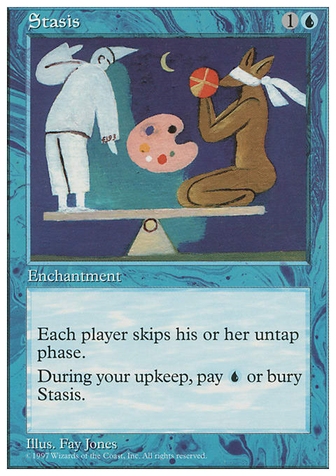
By this I mean that some portion of contemporary fantasy art, Magic's art included, shares a pretty insular group of conventions and influences. Frodorealism is the order of the day, and AAA games, tabletop games, fantasy novel cover art, and blockbuster cinema have gravitated toward a pretty contiguous set of aesthetic priorities (and narrative priorities but that's a tale for another day). I'm not talking just about things like the much maligned brown and grey aesthetic in video games, but something broader, a reliance on styles that try to express immersion into a naturalistically rendered fantasy world. I'm talking about the fact that fantasy art over the last century has drawn from Impressionism, Surrealism, Fauvrism, Constructivism, Abstract Expressionism, and on and on, forward and backward in time to a wide variety of traditions, some of which strove for naturalism but many others of which were far more abstract and experimental. Magic's art is part of this tradition as well — from the start cards like Stasis and Time Walk graced the cards.
Frodorealism, however, meshes well with things like style guides and brands, allowing for a strict continuity of imagery across artists (almost to the point where the individual artists are interchangeable). But for the kind of storytelling I'm interested in, where works and aesthetics talk to each other and generate new meanings, the dominance of frodorealism can be stifling, if only for its absolutism. As unpopular as it might be today to say so, abstract art — yes, even art as abstract as the utterly bizarre Stasis — add to the game a sense that magic cannot be crammed merely into what you can render with cutting edge CGI. Some things have to be rendered abstractly, poetically, circuitously, with an eye to older traditions that can speak to us and clarify the art through connection.
 |  |  |
It's not that I want ALL Magic art to be like this promo piece. There are real, practical reasons for frodorealism's use! Look no further than the frankly bewildering number of off-model depictions of Planeswalkers by different artists over the years. In total this can definitely feel a bit, let's say, disorganized? Developing detailed style guides has certainly allowed for some incredible, vibrant worlds. If they are worlds that talk only to themselves, if they primarily draw aesthetically on other contemporary fantasy art, we lose access to everything that wider conversation between art can bring.
Is there any way of reconciling these things? I think so. The incredible Amonkhet Invocations, for example, introduced some amazing non-literal imagery! And Magic has survived higher rates of experimental art before (I'd recommend taking a look at Kamigawa, Lorwyn, Shadowmoor, and Time Spiral for places where some astonishing illustrations cropped up in the context of settings that nevertheless feel very unified). If one or two pieces per set are given to Chengo McFlingers, or they can get Chippy to go back to creating really weird stuff like he was doing during Prophecy and Invasion, or they just give Seb McKinnon a few more cards, I'll probably be happy. I don't ask for much!
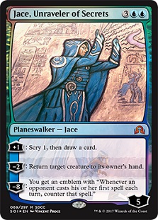
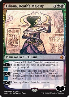
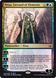
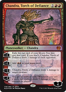
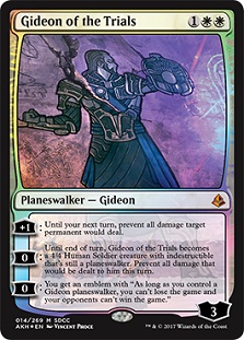
But there's another approach that finds a middle ground between frodorealism and the wider range of possible styles: incorporating other art traditions into the naturalistic depictions of the settings themselves. This is the approach used by the other SDCC promos, Vincent Proce's set of six planeswalker cards representing the Gatewatch and Nicol Bolas, where Bolas is depicted as a (quite skilled) artist carving representations of his enemies on a wall in Amonkhet. It's an incredible piece that has so much symbolism crammed into it that I expect the fandom will be pouring over it quite a while, but what's really amazing to me is the way that they managed to introduce the incredible abstraction of Egyptian art into Magic by simply introducing it in-world. It makes a lot of sense — after all, just because our culture tends to represent things naturalistically, that shouldn't mean the cultures we see in Magic should have the same aesthetic regimes. The result though is that the conversation is expanded in a weird and fascinating way, one that takes the fictional setting and brings its imagined culture into the same conversation as real artists.
That's the kind of magic trick that only fantasy can pull off, and it's for these kind of artistic games that I keep coming back to Magic: The Gathering's art, again and again.
1 Stolen from a description of the works of Greg and Tim Hildebrandt, former Magic illustrators and iconic Lord of the Rings painters.


