Artwork has always been a fundamental component of Magic: The Gathering. It was the abstract art of Richard Kane Ferguson, the iconic art of Melissa Benson, and the comic and colorful art of Kaja and Phil Foglio that originally caught my eye and provoked my imagination when exploring this game. I always look back fondly at these memories.
That being said, from a technical standpoint, modern-day Magic art is unrivaled in quality and detail. As the game's artwork evolved over the years, my interest in the game's art also grew - from casual appreciation to a passionate pursuit, culminating in my purchasing of a couple modest original art pieces from the game.
This week, I want to talk about one of the transformational sets whose artwork grabbed my attention, shifting away my focus from gameplay and toward a different aspect of Magic. That set is Innistrad: Midnight Hunt.
Why Innistrad: Midnight Hunt?
I wanted to focus on a relatively new set, while also staying true to my personal interests in Magic artwork. Midnight Hunt was the perfect balance of the two because I've always had an appreciation for the gothic horror theme from the Innistrad plane. What can I say? There's just something about creepies and crawlies prowling through graveyards that piques my imagination.
Bereaved Survivor by Zara Alfonso is the perfect example of the kind of art that attracts my eye from Midnight Hunt.

Bereaved Survivor by Zara Alfonso
In the illustration we see a mourning woman, covered in leaves, alone in a spooky graveyard. The scene has its creepiness, but there's still a bit of brightness to the card with the gray fog and bright colors on the woman's clothes. The flavor text brings it all together, "I wept for a sister who would never return."
Clarion Cathars, by Leanna Crossan, is another fantastic piece - I love how even the white cards from this set still have dark undertones.
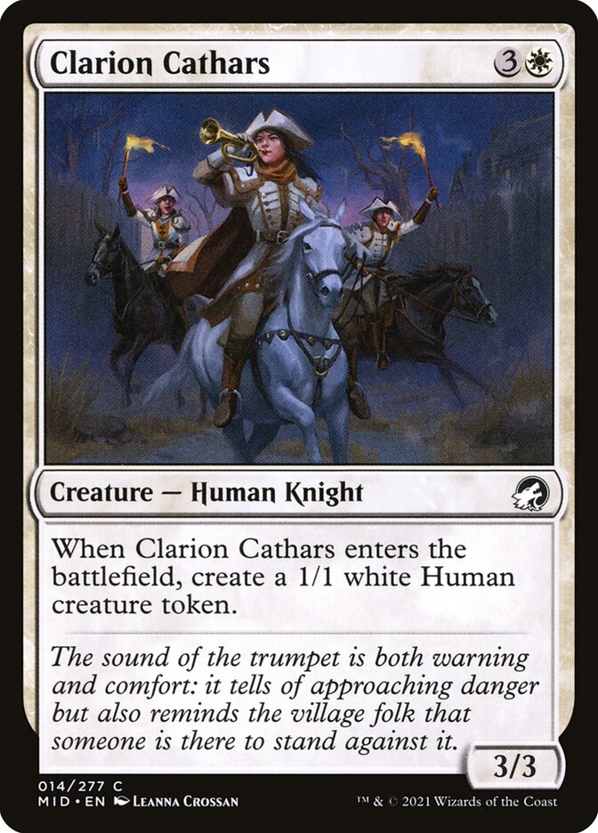
These soldiers provide hope, riding their stallions and wielding torches to combat the evil lurking outside the village walls. Yet, the background still gives this ominous sense of foreboding: dense fog, bare trees, a dark building, and a sense of urgency on the faces of each figure. It's apparent everything is certainly not all right.
The Darkest Corners of Innistrad: Midnight Hunt
If the White cards illustrate a desperate sort of hope, then the deliberately dark cards in Black are nothing but pure nightmare. Contrast Bereaved Survivor above with one of the most powerful cards from this set: Graveyard Trespasser, by Chris Rallis.

Graveyard Trespasser by Chris Rallis
We're back in the graveyard again, but this time the central figure isn't a mourning woman. Instead, we're looking at a deranged human werewolf scouring the graveyard for who-knows-what. Gone are the bright colors and hopeful visages, replaced by dark and decaying grave stones and a torn outfit of black and white.
Then there's the literal, fear-invoking art in the set. Cards like Crawl from the Cellar (Igor Krstic) and Ghoulish Procession (Vincent Proce).
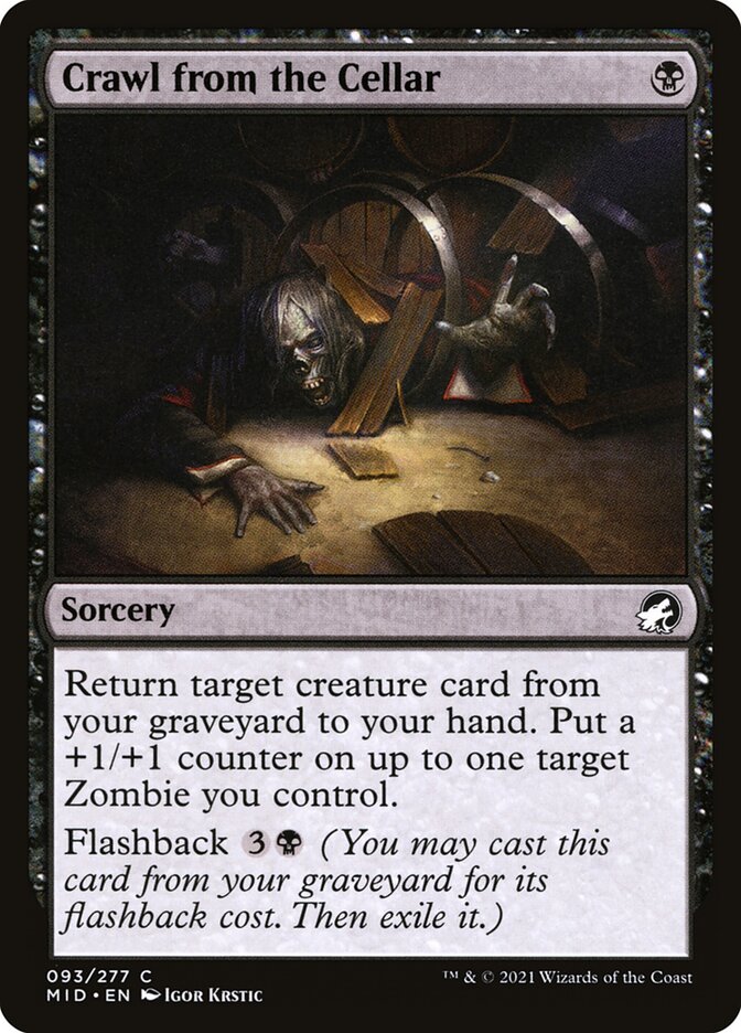 | 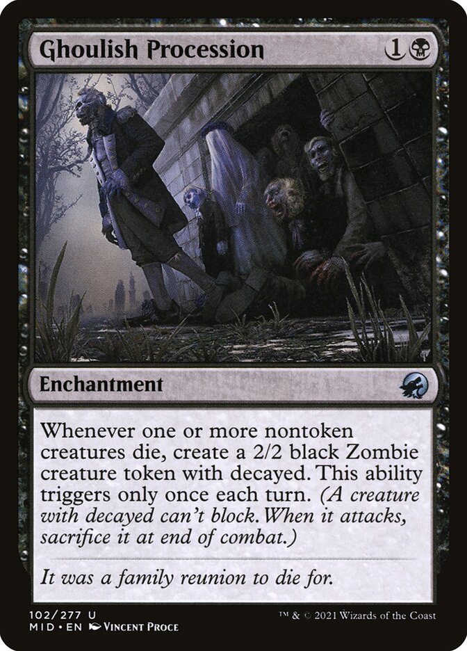 |
These illustrations could have been hand-plucked right out of someone's nightmare. I would not want to be the one who discovers the zombie literally crawling out of a cellar and into my home. As for Ghoulish Procession, I think it's the faces on each zombie that gives me the creeps. They just look unnatural. Plus, the figure with the white sheet adds to the horror. Don't forget the graveyard in the background and the dead grass in the foreground, emphasizing death and decay. These are both bone-chilling images.
Other Colors Exploring Their Darkness
Normally when I think of Blue, Red, and Green in Magic, I think of water, fire, and nature, respectively. I know there's a lot more to the color pie than these simplistic images, but they're convenient shortcuts for my brain as I engage with Magic's colors.
What I especially love about the art of Innistrad: Midnight Hunt is that these colors also get to intermingle with the horror theme. Black doesn't monopolize the creepy nature of the set, and it's interesting to see how other colors bring the gothic horror theme to life.
For example, consider Fading Hope illustrated by Rovina Cai.
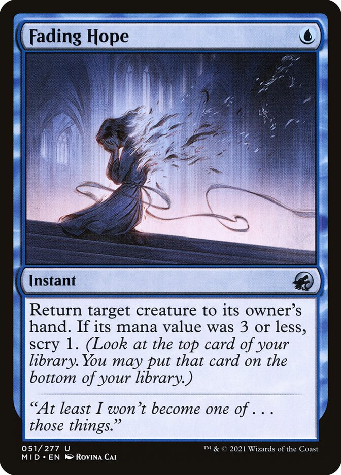
One quick glance at this card, and I can immediately tell it's Blue. Not only do the rules text remain consistent with that, but the art itself uses a lot of blue tones in the background. Despite the fact that this is a Blue card, the card still manages to convey a sense of sadness and foreboding. The central figure is crying while they're fading away with the wind. Talk about creepy! The flavor text really brings this home: "At least I won't become one of...those things." I absolutely love this piece, and it fits in perfectly with this set's theme.
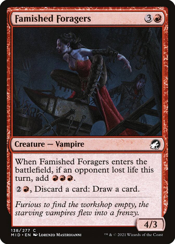
Red participates in the horror theme much more directly than Blue. The color takes the concept of vampires and supercharges them with orange and red tones in its art. This comes to life in cards like Falkenrath Pit Fighter (Anna Fehr) and Famished Foragers (Lorenzo Mastroianni).
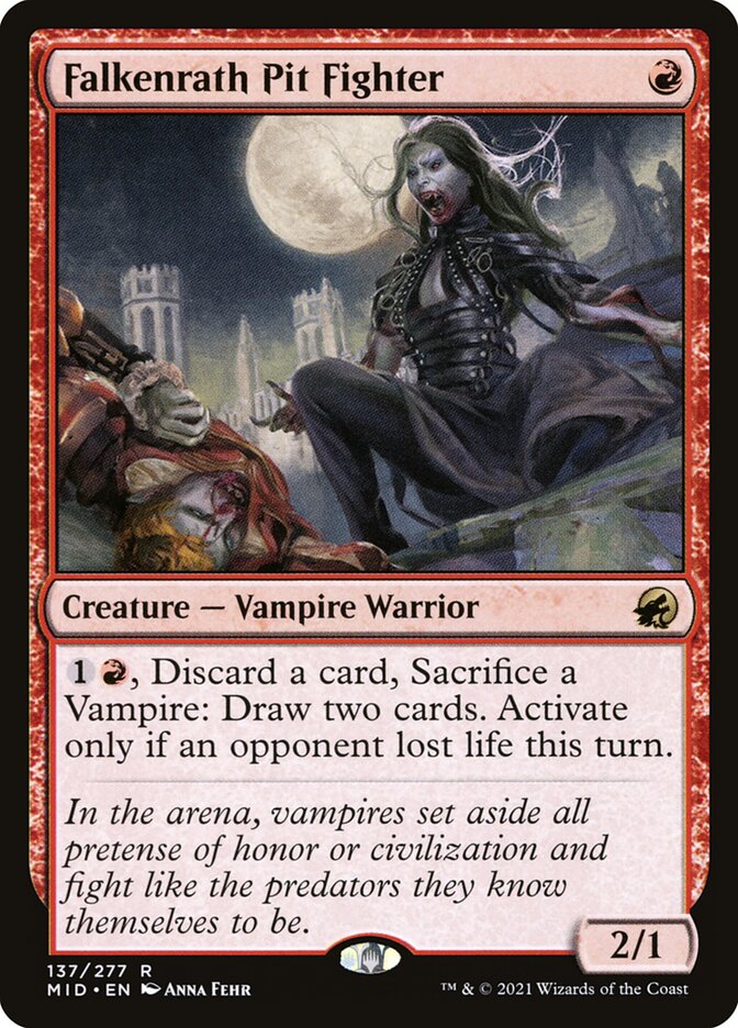 |  |
These vampires are very much out-and-about, on the prowl, looking to feed and destroy. Both artists use red and orange colors strategically. Rather than washing out most the card with bright reds and oranges, the artists instead paint a dark theme and use color to accentuate certain features. In Falkenrath Pit Fighter, one's eyes are immediately drawn to the red blood on the both the vampire's mouth and her victim. The backdrop is a moonlit, gothic city.
In Famished Foragers, red is used on the central figure's formal attire - it almost feels like she left a wedding to find her next victim. Looking closely, I suspect that's blood on her chin, as well. I wouldn't want to bump into either figure in their natural habitat, that's for sure!
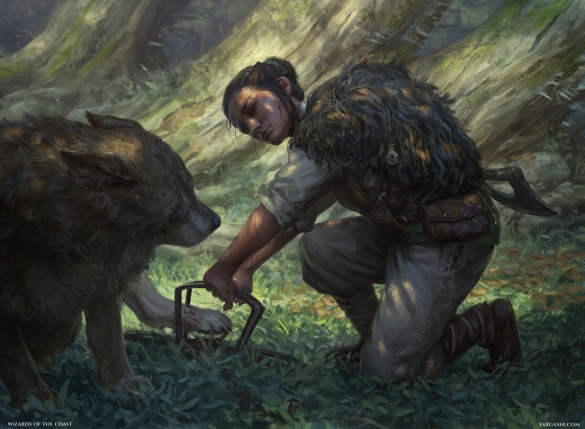
Then there's Green. The color had a heavy werewolf theme in the set, so a handful of its cards depict a troubled human on the front side and a fearsome werewolf on the other side. Outland Liberator // Frenzied Trapbreaker (Randy Vargas) is one such example.
 |
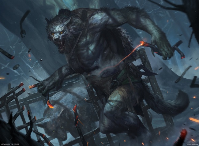 |
The front side is a human rescuing a trapped canine in the middle of a green field. There's green everywhere, and the theme of nature shines through readily. The reverse side, however, depicts a much darker scene with a werewolf breaking a cage to rescue a wolf. The colors in Frenzied Trapbreaker are much darker, eschewing the bright green colors of nature in favor of shading and darkness in theme with this set.
In addition to werewolves, there's a heavy wolf theme in green (just your regular garden variety of wolf, without the "were" part). Since wolves have existed for a long time in Magic, I'll admit this theme in Innistrad: Midnight Hunt isn't as evocative as some of the others.
However, one of my favorite Green cards from this set has to be Tapping at the Window by Nils Hamm.
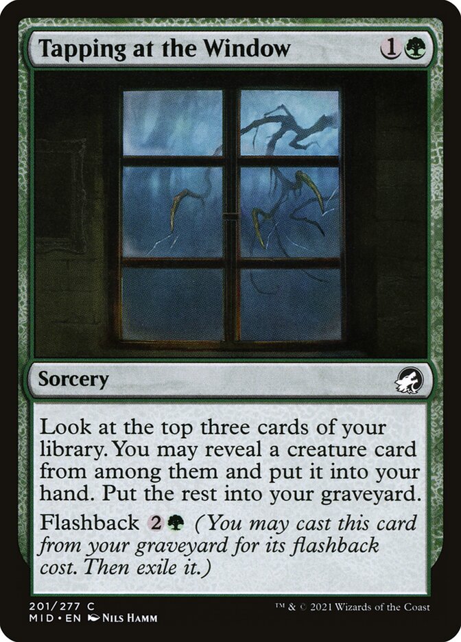
This isn't a complicated piece of art. There's no abstractness to speak of. The card literally depicts a tree tapping at a window.
Why do I like this art so much, then? I think it fits in perfectly with the gothic horror theme of this set, and it offers a perfect marriage with Green's "nature" theme. One of the most iconic horror images in history is this concept of a tree blowing in the wind, tapping on a window, and creating a frightening ambiance. Where is that sound coming from? Is someone trying to get into the house? The words unsaid are more foreboding than anything tangible - the audience's imagination fills in the blanks, and you have your horror theme from something as innocent as a tree.
Wrapping It Up with an Honorable Mention
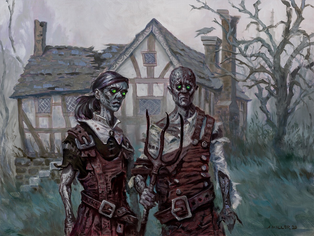
Before wrapping up, there's one piece of art from Midnight Hunt that deserves special, honorable mention. That is the art for Rotten Reunion, by Aaron Miller. If the art looks vaguely familiar, you may be remembering the artwork's inspiration, American Gothic by Grant Wood!
 |
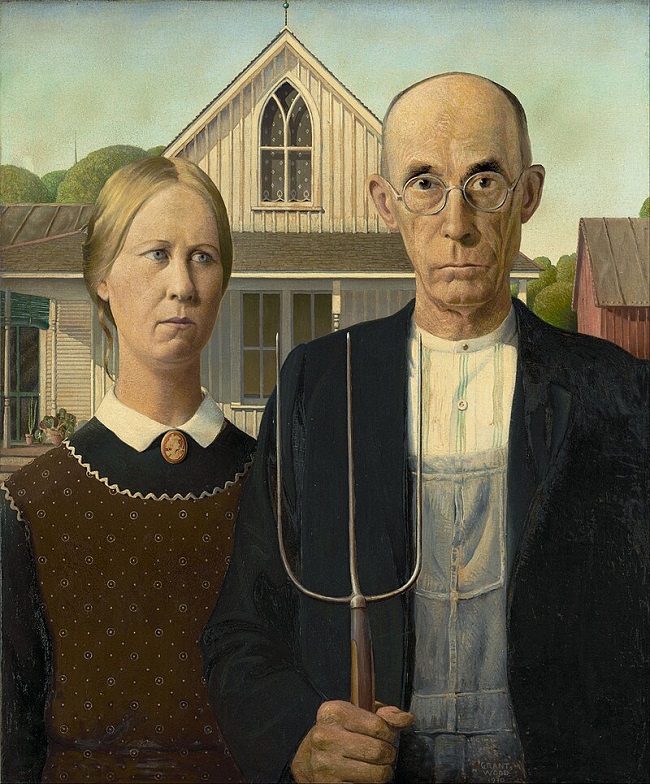 |
I love how Miller takes the gothic horror theme from Midnight Hunt and combines it with a "gothic" painting (namely, the Carpenter Gothic style of the house). The pun is not lost on me, and it's a fitting inclusion in this set!
The artwork from Innistrad: Midnight Hunt is so rich that I could easily spend another three or four articles on the subject. Rather than drone on with my praises of this set, I'll instead encourage readers to browse through the artwork to appreciate many of its gems. If you're interested in the gothic horror genre as I am, then you won't regret browsing the set's many pieces of scary, fear-inducing artwork.
If you're really feeling inspired, you could always pick up a draft booster box of this set - despite being a couple years old, these boxes are still some of the cheapest you can find on the market. Perhaps you gather some friends together for a horror draft come Halloween, or save the box for a gloomy, rainy night. The expected value of the set may be depressed right now, but that doesn't take away from the experience one feels when opening a booster pack of this set.


