Hello.
I'm Vorthos Mike. I talk about Magic art and how it collides with society and culture. I have five War of the Spark previews today given to me by Wizard of the Coast for free and they wanted me to share them with you. A tall order to discuss each art having enough space, so I asked for some help.
I have two partners today, and we will have some insight from the artists.
For previews these days, I specifically request world-building level card artworks. As of late, that request has been for the basic lands of a new Magic: The Gathering set, the building block of the game itself.
The basic lands I received are the "middle five" of the cycle, showing the progression into the war and my best analogy is the cyclical nature of an empire, the Course of Empire by Thomas Cole.
Cole was the center of the Hudson River School of environment/landscape paintings in the mid 1800s in America. I wrote on the school in a previous article if you wish to learn more. Cole painted a very War of the Spark group of paintings called Course of Empire, and they elevated him to a higher status of artist. They warned the United States of commercialism, of greed, and the frailty of Roman culture, not unlike their own. He also implied that nature will reclaim America. It was a warning to America, and everyone understand what he meant.
Let us examine them.

The Savage State by Thomas Cole
Oil on canvas, 1834, 39.5" (100.3 cm) x 63.5? (161.2 cm)
The human references are minimal, symbolizing what white Europeans experienced when arriving in America. There are no structures, yet the weather is chaos, of untamed wilderness.
This would be similar to the wilderness of Ravnica, back when the Gruul were the park rangers. They made sure the wilderness was healthy and forest fires weren't too wild. This Ravnica no longer exists, and the Gruul clan's main purpose no longer exists.

The Arcadian or Pastoral State by Thomas Cole
Oil on canvas, 1834, 39.5" (100.3 cm) x 63.5? (161.2 cm)
The wilderness is now settled and there is organized agriculture represented. Notice the calm weather, clear backgrounds. That is to say, this time in Cole's timeline of empire means a civilization is taking hold. There is a temple with smoke in the mid ground, and we are to look at it and think of a primitive religion. But since this is also the past and future, the land had been inhabited by an indigenous people, and they are destined to be temporary there, in the way of empire and destiny.
White men, women and children live in peaceful harmony with nature, but truly you have to understand the commentary at the time. Cole is showing his anxiety about the populist elements of Jackson's democracy, especially that of expansionism and a potential mob rule to institute those beliefs. He is leaning more into his landscapes as philosophical lessons. They are morality tales, not unlike James Turner's ships and their often negative commentary on empire.
This stage of Ravnica is when Gruul and Selesnya were pretty close friends still. One liked to do the controlled burns to open pinecones, and the other grew food to feed families. It's peaceful, serene.

The Consummation of Empire by Thomas Cole
Oil on canvas, 1836, 51" (129.5 cm) x 76? (193 cm)
At this stage, we are to see the wealth, the riches of statues. The wilderness is entirely absent, being subdued and relegated to gardens. The natural order and normal is a city. We see trade, architecture and crowds, an allegorical height of business that leaves only a near blank sky not saturated with figures, color, and materials.
It's meant to imply that this is the peak of empire and alludes to that it is not sustainable.
We see the comparison most clearly to Festival of the Guildpact, a single day a year when all the guilds lay down arms and celebrate all the guilds coming together and signing the Guildpact, a spell by Azor that established much of Ravnica's laws, magic, and largely everything to allow it to grow into a plane spanning city. (Jace, the Living Guildpact fills that role today, basically.)

Festival of the Guildpact by Alex Horley-Orlandelli
Of course, if you played in the original Ravnica block or read the novels, you learned that the Decamillennial, the 10,000 year celebration of Ravnica was ruined by Szadek wishing to break the Guildpact. He was not successful, but being arrested and being outed, Dimir was then revealed as a real and still active guild, breaking the original secrecy given to them by the Guildpact, and that destroyed the world enchantment spell.

The Destruction of Empire by Thomas Cole
Oil on canvas, 1836, 39.5" (100.3 cm) x 63.5? (161.2 cm)
We now see utter chaos both in sky and on the ground. People are running in all directions, places are burning, boats are sinking. We see a broken statue in the top right and in the bottom center, a woman in white is running from a seeming invader and would rather die than be caught.
This is the exact moment of Ravnica.
The Destruction of Empire by Nicol Bolas and his army of Eternals, 2019
The five paintings of the Course of Empire now meet their same timeline to the five basic lands I have received from Wizards. Let us examine in proper ![]()
![]()
![]()
![]()
![]() order for basic lands that represent each aspect of the Game Design color pie that Magic invented for the game.
order for basic lands that represent each aspect of the Game Design color pie that Magic invented for the game.

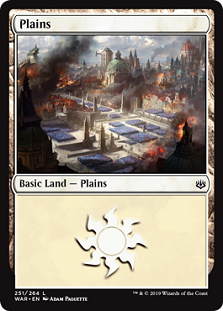
Plains by Adam Paquette
Digital
I spoke with Adam Paquette (@AdamPaquette) at length to be able to discuss his art her for us to see and understand more than just crowds of eternals in a burning Prague feeling city.
Mike: What are we looking at here Adam, besides the obvious. They're in a city and in formations not unlike the Boros Legion...
Adam: Right, we're looking over a large, military-parade type of scene intended to show the sheer scale of the Eternal army. This isn't a Boros-specific territory, although notes of the guild flavor are there. It is a central location and if you look closely at the background architecture you might get a sense of where we are and why the main force of the Eternals would be forming rank here...
I see, they're in the Gateway Plaza. Got it.
Since we cannot see the map made internally, can you talk more on composition and placement?
For most of the Ravnica work, I used a very basic 3D model based on the layout of Ravnica's key districts to orient the camera to the action and find my composition. A lot of the briefs for this set had specific requirements for buildings to be shown in the foreground/background to get the right spatial orientation happening for the story, so it helped to block things out and keep them on the grid. This meant my sketches were a bit more technical and 'layout' style than I would normally do them.
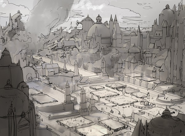
The shadowed buildings on the bottom left and right push us to stare the middle, what are you wanting us to see first?
This card was an interesting challenge in tackling storytelling at the scale of a panoramic cityscape. When we are pulled this far back, you can't see any characters to read into their motivation, and with so much going on city-wide in the shot, there isn't really a 'before' or 'after' moment to go after. So you have to treat the biggest scale elements (the army, the city) as characters in themselves. The city is shown smoldering and in ruins, and mostly cast in the shadow of the billowing smoke. By contrast, the army of Eternals is organised, undamaged, and cast in the largest pool of light in the image. Icons of Ravnica's cityscape are hit by beams of light breaking through the smoke - and so we have a kind of proxy character relationship between these monuments and the hope they represent, against the regimented and dominant force of the invaders.
Can you speak about What do you find successful and what might've been a little challenging?
The main difficulty was getting the ranks of soldiers to look like an army and not like flowerbeds!
Yeah, I have seen that! Dots on a stick means flower.
At this scale, we can't even see weapons to signal what we're looking at. In the beginning I didn't have soldiers on the stairs or bridge - adding them in a location that wouldn't be logical for anything immobile made the read much better.
I like the complexity of the cityscape with just a few holes punching through to the distant background showing just how far this environment reaches out. I think each layer of depth rewards the eye with different information and elements of the story, which is a nice subtle way to approach landscape-storytelling.
Anything else you'd like to share? Like how much Prague it feels like here?
As far as extra research - for the plains image I looked at a lot of Russian military parades and tried to capture the wide open feeling of the Red Square. The rest of the research came from looking at European cities, mostly Prague yes - but also shooting some reference of buildings here in Berlin and also looking at Belgium and Luxembourg for different elements. Most of the compositional intention went into getting as much depth and complexity into the environments as I could, because I wanted the city to feel dense as well as sprawling. I loved China Mieville's Perdido Street Station when I was younger; this and a few other books really sparked my love of overcrowded cities and cities built on top of themselves over generations - and this love is there in this set as well as my older work for Return to Ravnica.
Beautiful work Adam, thank you for the time.
Moving from the warring landscape of Adam's plains, let us see Kirsten's Island.

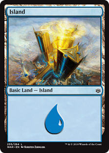
Island by Kirsten Zirngibl
Digital
The Immortal Sun has never been more clear. But to hear more, I had to speak with Kirsten such that players could meet her and have her share her super unique process to making art.
Mike: This site is definitely from the style guide. It's storyline important. How did you approach it to make it feel fresh, to make it feel like you?
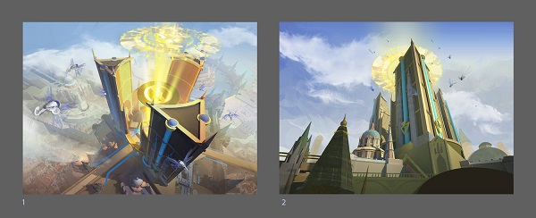
Kirsten: I pushed to do a bird's eye view of the towers, which I knew would be more challenging... but also more awesome. It meant significantly more render time since I would need to portray all the rooftops below. Also, the brief specified that the New Prahv towers needed to look imposing, which is harder to sell if you're looking down at them. The path of least resistance would have been to display a worm's eye view, which was the alternative sketch I submitted. However, it was less interesting visually so I'm glad it went how it did. I love rooftop views and the visual complexity they offer, and keep going that route when I get a chance as an artist...so I guess it's a "thing" at this point.
Mike: I suppose so but the effect sure is striking.
Moving to impact, this set has your first basic land. Did you treat that part any differently?
Kirsten: I consider the assignment an honor! The total eyeball time does seem significantly higher. But I didn't treat it any differently than any other card during development. The top priority was communicating the specific story beat well. But I the composition reads as an island on an abstract level, despite the lack of surrounding body of water. The towers function as a vignette poking out of ![]()
![]() turbulence
turbulence
Did you make this environment in your 3D modeling program? I would kill to be able to see any sketches or process you have. Those are incredible and people love seeing those.
I did. I used 3DS Max to model it and V-Ray to render it out a mockup for lighting and perspective. But I ended up painting over all of it in order to give it a warmer, softer feel. Attached is a screenshot of a wireframe during its development. I have also included a couple sketches I sent to Wizards for review. The advantage of working in 3D is I can try many camera angles to try out composition options.
I have attached a wireframe screenshot of the 3D scene (which I think is the coolest-looking process image I had). And a flat wirecolor "masking" render + zdepth render as supplements. I also attached the original color comps submitted to Wizards as sketches.
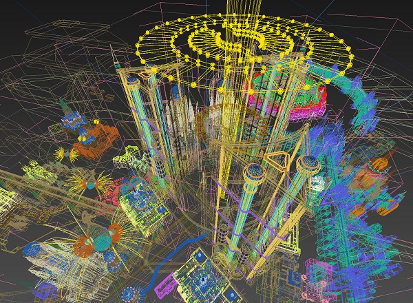
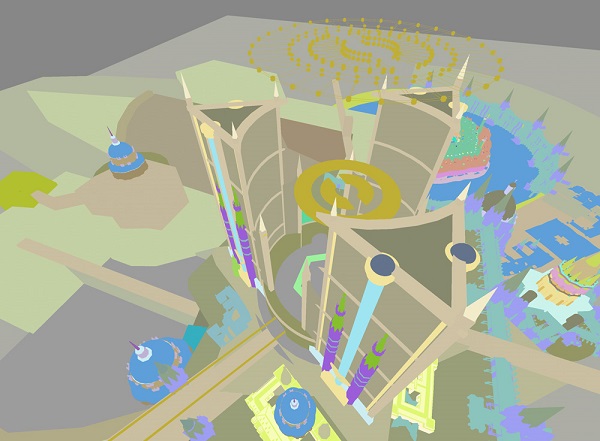
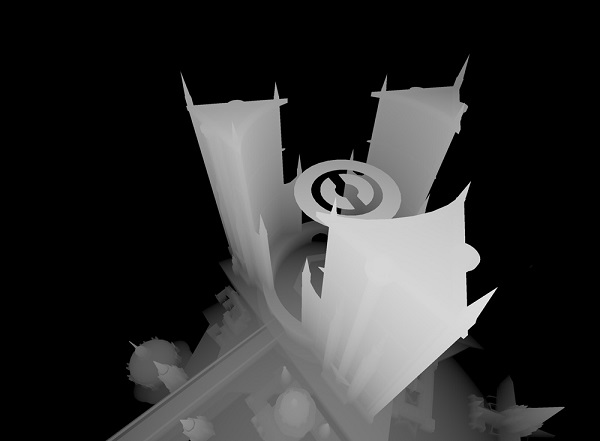
Yeah, those are utterly incredible. You build, then use as your own reference. Perhaps let's ask on the process of painting itself, what was the greatest challenge in producing this piece?
It tried my patience near the end, mainly. I'd been used to a combination of quick 2D sketching and 3D render work rather tightly-rendered painting in the couple months leading up to it. I had difficulty getting into that flavor of concentration while going over all those teeny buildings.
Clearly that worked out, they're evocative while showing the height of the building with scale clouds. And from those, the thopters are there. Can you speak to those at all?
If you look closely at the original image, there are water fountains on top of the towers, and a waterfall happening on the inside of the towers. The aether pipes were installed by Dovin Baan, and resemble those from Kaladesh. It features a stabilizer disk in the middle. When viewed from above, the Azorius symbol can be seen in the center of the structure's base.
Cool! And thank you Kirsten.
Since we're on a very important storyline piece, the impact of just the one image has a greater impact than just any old island. The art has greater meaning, greater importance and I wanted to take that idea and zoom out 10,000 feet to understand this island as its place outside of Magic.
After the Japan art show, I can't look at Magic the same way anymore. The Gathering part is now only more important to me. Magic is a global game and I felt compelled to invite a known associate from Brazil to offer their insight into the card. I asked Fanny, aka Anjo Serra to weigh in on what the island means to her. I asked if she could help out and she doubled down and made it accessible both in English and Portuguese. For all the Brazilian and Portuguese Magic fans who found their way to this preview. Hello and I hope to visit you with an art show soon.
And here she is:

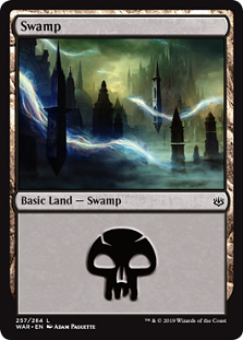
Swamp by Adam Paquette
Digital
We finally see the sparks leaving planeswalkers, being harvested by the eternals, to be given to Nicol Bolas. The current storyline is that the elder dragon planeswalker wishes to regain his former god-like power and has tried schemes for years like converging the five Shards of Alara during the conflux which faired. Ajani interrupted that. Now, after luring all the planeswalkers he can attract to Ravnica, he has placed The Immortal Sun on the plane, conveniently shown in the island above by the Azorius guild and binding all planeswalkers to the plane. With a near unstoppable army harvesting sparks, this art shows us the destruction in action.
I asked Adam Paquette later about this piece.
Mike: So this is a swamp, how did you approach it because Ravnica's basic lands are more...evocative.
Adam: As with the Plains, I wasn't aware of any guild affiliation when I painted this, and it was treated as a mono swamp under the art direction of Ravnica (plus story elements) - although the Dimir shape language was definitely there through the style guide reference, the Dimir would be very displeased to be pigeon-holed into foggy environments. They also like shadows.
I see. The swamp spirit comparable to sparks being harvested is a nice touch.
Can you talk more on it, because this one is more unique.
This question is pretty appropriate for all the lands of Ravnica! It was actually fairly easy to interpret this one because Swamp cards are more about mood than about a specific element (Trees) or shape of land (flat plains). The eerie, quiet feeling of a Swamp already exists in a lot of cities at night, including Berlin, where I live. When I was painting this I was thinking a lot about a night-time walk I took through the cemetery in Montmartre, Paris some years ago.
Oh I can feel that. I lived in Montmartre during a study abroad in college.
How did you handle all the dark to show up at card size? That can often be a challenge.
Probably the biggest challenge was just dealing with the overall darkness of the image and its empty spaces, making sure there was enough detail to have it look finished, while being aware that the atmosphere was the main character here. I like the painting compositionally, and I'm please with the balance I managed to find with so many levels of overlap between the spires, lightning bolts and fog.
Thank you Adam, you completed the prompt, the main point, and gave us a beautiful spirit feeling swamp to use going forward.

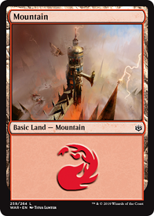
Mountain by Titus Lunter
Digital
The angels in the bottom left should tip you off that this is the Parhelion II. You see, the first one was destroyed in the novels of the first Ravnica block by Agrus Kos. This is the rebuilt one, a flying ship fortress that is actually two warships. It is also considerably harder to storm now.
I asked Titus Lunter a few questions to give us some insight.
Mike: I'm most interested in the composition, how did you choose this perspective? (were there other you didn't choose that played with height?)
Titus: This model of the Izzet tower is something I had made during the concept push many moons ago. It's a quite dramatic scene dubbed 'Sky Theater' and I wanted to capture the same feel that we'd seen during World War 2 and the pacific theater. Images from above the clouds, spying on the enemy fleet. That sense of scale and drama I feel is built in to people and resonates on a subconscious level.
How did you decide how much blue sky to add? That feels very intentional!
This is an area of battle, of storms but it's artificial. Just beyond the scope of those involved in the battle is tranquility, calm, the time before the war and a reminder of what you are fighting for. Peace.
I like that, clever way to show the next step in the Course of Empire. Thanks for the quick notes Titus.

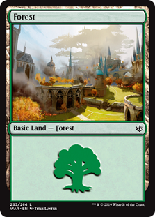
Forest by Titus Lunter
Digital
This basic land has a lot to deconstruct and I have omitted much of my analysis for someone else. This is Groucho Marco, a brand new YouTube content creator that has caught my eye for his deep analysis on Magic art's tie to culture. His video on Dimir and Film Noir is fantastic. Part of our role as creators is to create our own content, but also to build a community. It's one thing to add another wood to the already raging fire of someone important. I find it much more important to see someone finding their voice, then confirm that what they're doing is important, valuable and use my pulpit to let fellow known associates that what they're doing is not just good, but great. I invited him to collaborate with me on his first preview of hopefully many in his career.
I asked him to take his magnifying glass to examine what he sees, and this is what he saw:
Thank you Marco and Titus. We will talk again soon.
As we turn the page, let us examine each land quickly. The Plains shows the armies of war mobilizing with fire around them. The Island shows the seat of the generals, where the heroes must wage war to complete the conflict. The Swamp shows the heroes not doing well in their quest to stop Nicol Bolas. The Mountain shows all over destruction, high atop the flying fortress. The Forest gives us a glimpse, reinforced by Marco, that you can't sit idle or the war will come to you. There are no bystanders anymore.
This brings us to my final point. What is next?
What's next for Ravnica?
Returning to Thomas Cole, the next is inevitable.

Desolation by Thomas Cole
Oil on canvas, 1836, 51" (129.5 cm) x 76? (193 cm)
The painting by Cole shows us that in his final painting of the Course of Empire, nature has reclaimed the landscape. Nature can be tamed, but it is powerful, and civilization is temporary, transient, only to be defeated by the inevitable state of man. Time will grind buildings to salt.
And Gruul will be happy again.
Welcome to the War and thanks to a pair of new known associates. Follow them both and celebrate their hustle.
-Mike
 |  |
 |  |  |


