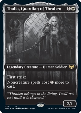
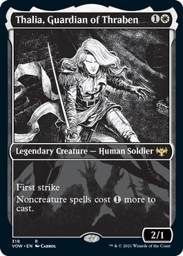
Innistrad is one of Magic's greatest planes and its Limited formats have by and large been some of the most enjoyable in the game's history. Innistrad itself is often among the greatest of all time and both Shadows and Eldritch Moon had pretty great Limited formats as well (though the less said about Avacyn Restored the better). So, when they announced that we would not only be getting Midnight Hunt and Crimson Vow as sets but we'd also be getting a special set merging them together into one unique format, I was extremely interested!
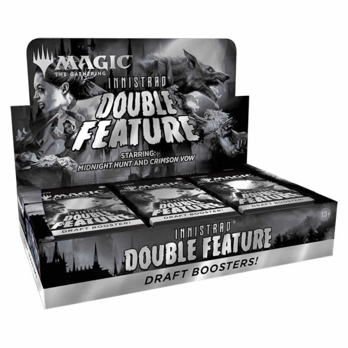
Innistrad: Double Feature was the name of the product and was touted as sporting black and white treatments of cards reminiscent of horror's golden age films. Think Dracula, Frankenstein, The Wolfman, Creature from the Black Lagoon, The Mummy, The Invisible Man, and so on. To me, a longtime horror nerd who adores classic films like these, I was on board from the get-go. Not only did it seem like a great way to honor what Innistrad represented for the horror genre, but also as what it claimed to be as a Limited environment. That is to say a format that - and I quote - "combines select cards from two separate sets... into one unique draft experience."
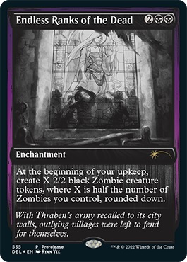
They even announced a sweet black and white treatment of classic card Endless Ranks of the Dead as a promo for the set. Everything seemed to look good for this release... until last week when the set list dropped - alongside images of every card in the set. And this is where people started scratching their heads in confusion when they finally started to grasp what the set actually was.
The first thing everyone noticed was that all of the cards were black and white, and boy did this seem to frustrate people. Players seemed in favor of the use of more B&W style cards, but a whole set of them? Not so much. Referenced frequently here were the Eternal Night showcase style basics from Midnight Hunt and Crimson Vow. They look great on their own and seem like a sweet idea on paper, but once you start playing with a bunch of them across different colors, it starts to become hard to tell what's what. Everything starts looking the same.
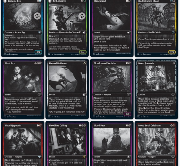
Players quickly noticed that this issue would be magnified tenfold with Double Feature. Every single card gets the black and white treatment here - with a heavier focus on a distinctly colored frame to help differentiate the cards a bit. The problem, though, is that given how everything looks in the art, it gets very difficult to tell what's going on in the game and the draft itself. Picks blur together and you can also easily misread what a card is on the table due to it blending in with others on the table or in your hand.
This was easily one of the biggest issues most players seemed to have. Not only was it hard to tell cards apart at a glance, but players noted that it also creates accessibility issues for people with certain disabilities as well. It was a massive part in players going from curious and interested to turned off and disinterested. Suddenly players just didn't seem to want to play it because of how difficult it appeared to be with regards to identifying cards. The way they grayscaled the cards didn't help either, looking dark and murky, especially when compared to mockups made by others, like this one a friend of mine shared on Twitter:
Someone in my server took the 20 seconds to up the brightness just a bit and look at the difference it made. Just kinda disappointing in my mind. pic.twitter.com/GGTW33GgSy
— Mike, Cubesatz Haderach (@cubesatz) November 17, 2021
There was also a lot of confusion as to what cards would even be black and white. Much of the official talk on Double Feature seemed to state that everything would get this treatment. However, reading the official product overview, it's never really made explicitly clear as to how often this treatment would show up. Some players seemed to think it would only be select cards with original colorized versions entering the mix as well, or that the special "Silver Screen" foil treatment cards would be the only way the B&W versions would show up. I had to pull up a specific timestamp on the Crimson Vow preview show just to explain to a few friends that they said everything was getting the B&W treatment and that the foils were something else entirely.
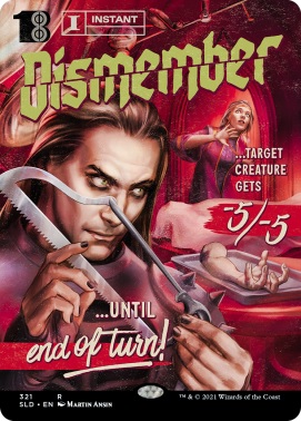
In addition to the problems with the black and white treatment in general, there were also a number of people who got the wrong impression from the product description itself. The implication was that the B&W style was meant to invoke the classic monster films and movie posters of the previously mentioned golden age movies. A lot of people took this to mean we'd get cards looking like the movie poster or pulp horror fiction styles from the recent Secret Lair drops in October. Instead, it was just a quick slapdash grayscale rendition of versions that we'd already seen and a lot of people just thought it was lazy when they'd already seen what could've been.
This all leads me to the next point: the set itself and the cards in it. By all accounts, Wizards made the set sound like it was going to be the curation of a special unique Limited experience. What we got instead was literally the entirety of Midnight Hunt and Crimson Vow compiled into one with the "select cards" bit ultimately meaning the removal of the basic lands. So now you get half a pack of just Midnight Hunt cards and another pack that's Crimson Vow cards plus a foil that can be from either set.
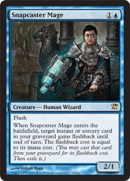
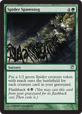
There's such a missed opportunity here. Like, there has to have been a way to narrow the card pool down or tweak rarities to craft a completely different draft experience. Think something like Kaladesh Remastered or Amonkhet Remastered. They could've even gone the Time Spiral Remastered route and given us alternate versions of cards from neither of those sets that were still relevant to Innistrad as a plane. Most people are quick to jump to powerful cards like Snapcaster Mage or Liliana of the Veil here, but what about other big Limited role players? Things like Spider Spawning, Mist Raven, and Thraben Inspector. Heck, put in some madness cards like Fiery Temper or Asylum Visitor to work alongside the new Blood tokens. These would've been awesome inclusions and a great way to spice up this as a special release.
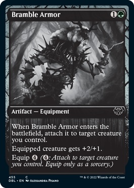
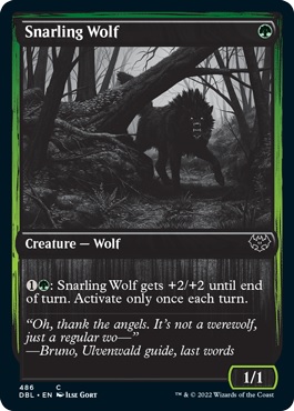
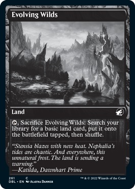
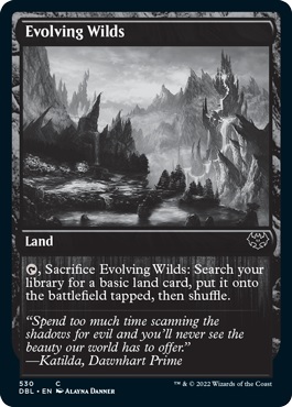
Instead, we got literally just Midnight Hunt and Crimson Vow smashed together in a single release. Like, it's to the point where it's even possible to get multiple versions of the same card in a single pack. Bramble Armor, Snarling Wolf, and Evolving Wilds were each in both releases, and they're represented the same way here. So, you can open an Evolving Wilds in both the Midnight Hunt side of your pack and in the Crimson Vow side as well. Here's side-by-side images for an example:
The only way you can even notice a difference here is in the set symbols and it really just feels unnecessary. Getting two Evolving Wilds is probably okay in a set with lackluster fixing overall, but do we really need two chances at Snarling Wolf or Bramble Armor? Frankly, no. This should've just had one set symbol (which it feels shocking from an LGS perspective that this release has separate symbols but the same set code in the corner) and been curated into a more focused card pool. At least then, people would probably be more on board with it as a release as opposed to dismissing it due to the black and white treatment.
Here, you'd just be best off doing a sort of super draft with two packs of Midnight Hunt and Crimson Vow and you'd get basically the same thing but without the accessibility issues. I know what some of you might be thinking too: that's just more expensive! But is it really? So far, we don't know how much these packs are going to cost. What we do know, though, is that they have two rares and a guaranteed foil in every pack. This feels comparable to a Masters set in that regard, or at least something that tends to be pricier like a set booster pack or something like Commander Legends. What's more, there's only 24 packs in a box, since it's supposed to be just drafted.
All signs point to these packs having a relatively higher price point than the packs we've already seen. At that point, why not just get some packs of the actual set and draft those? Or do a sealed tournament with a couple friends. The second option is great in the era of quarantine and SpellTable's webcam Magic. It's cheaper and is probably going to just be a better experience for almost everyone involved.
At the end of the day, though, Double Feature comes across as a lazy, misguided attempt at a neat Magic novelty. It was something that could've been great but ended up missing the mark in several areas. Personally, I'm looking forward to drafting it once and getting a box or two as a cool collector's display item. For most people, though, it's going to be more about buying a pack to open here or there for some cool versions of cards or else buying specific singles that interest them. Even then, though, there's several versions that are more likely to appeal to players that already exist.
Would you want the Thalia, Guardian of Thraben from Double Feature or the showcase variant from Crimson Vow? And that's not even taking into account the other versions of the card that already exist. We don't even get the special showcase frames from either set here, lending further to the disappointment of what might have been. And at the end of the day, that's all I'm left with: lamenting what could have been done with this set and seeing what we're getting instead. I still love the concept and the idea. I just wish more could've been done with it is all, and I hope Wizards does more with these kinds of releases if they do them in the future.
Kendra Smith
Twitter: @TheMaverickGal
Twitch: twitch.tv/themaverickgirl
YouTube: Kendra Smith


