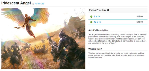
I love writing about art and I haven’t been writing about it enough as of late.
I know.
There’re always so many other things to cover that revolve around art but that isn’t the art of Magic: The Gathering. The game has found a place in popular culture, breaking into this odd area of being geek chic, which is new, but still difficult to approach. Art is among the easiest things for us to engage the game and was often among the first things you and I saw when we began. It was Jester's Cap for me; maybe it was Shivan Dragon for you—or Serra Angel if you’re Heather.
Art moves us, and that which arises in us nothing is bad art. An upcoming product from Wizards of the Coast, this From the Vault: Angels, is far from poor when it comes to art inclusions. In a limited release, often a highly valued product, having alternate, stellar art will help its price on the secondary market to keep these promotional cards special.
I looked through the list of cards and noticed something odd: Iridescent Angel was a scene I knew, but I couldn’t place it.
From my curiosity, I give you an interview with Ryan Alexander Lee, a normal conversation I would have on Facebook chat to learn about a piece. This is something I do every single week but haven’t considered that “an interview” before; it was just me finding out some information about an artwork. It just never occurred to me that interviews need not be formal. They can be conversations, and with that, welcome to a little chat Ryan and I had for me to answer one question:
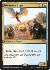

Iridescent Angel by Ryan Alexander Lee, copyright Wizards of the Coast
Mike: How did you read through this first, what were your first thoughts after reading this?
Ryan: Well, as they tend to do very well—the description from AD Mark Winters built a pretty clear image in my mind to strive for, so the first thing I did was started to gather reference for the things I knew I would need to pull it off. Some of the obvious things had to do with lighting effects and how that would look on an angel’s wings: the reflective effect on armor, color palette, etc. I also started looking at film screenshots that mirrored closely what the art description had put into my head so that I could see how others had tackled the problem.
Any in particular?
No, nothing so much in particular—I would basically just scan through film blog websites until I saw the palette I felt captured what I was looking for.
Ah, that's interesting—quick, Google-like searches.
Basically yes, just for mood and color to start.
Any websites you use for film scenes more than others? (I know Gurney pushes to use them all the time.
I used to use Evan Richards’s blog, and I've collected the contents of his site from I friend so that I have access to it on and offline. From there, I went a bit more into subjective territory to try and capture a mood.

The Cinematography of “Amélie” (2001)
Cinematographer: Bruno Delbonnel
Nominated for the 2002 Academy Award for Best Cinematography
Any period or type of plate armor you were looking for?
As for the armor type, I basically got the okay from Mark Winters to seek out anything Western European or medieval.
Interesting. You check in with armor types with the art directors?
It's usually a good idea to check in, yes—just in case something has a specific location in which it takes place. There was nothing too specific there, as it wasn't necessarily meant to belong to any one type of plane. They'll often mention beforehand if so, but never hurts to verify
Ah. "Make it more Ravnica," or, "Crap, yes, Ryan; we forgot to add that."
Haha, yeah.
After reference, I notice the art description doesn't call for horses.
Right, that's where I start getting into finding a tone I want to set that still fits into the description—some leg room, as it were.
Please walk me through that.
So I start seeking influences that capture a mood I want. For instance, one of my first thoughts brought me to a series I've been a fan of for a long time by Kentaro Miura called Berserk. There were a lot of scenes in that series of regular humans or mortal characters being obliterated by large, supernatural beings.
I loved the way that artist conveyed that, so I would study how he handled the motion of bodies flying about.
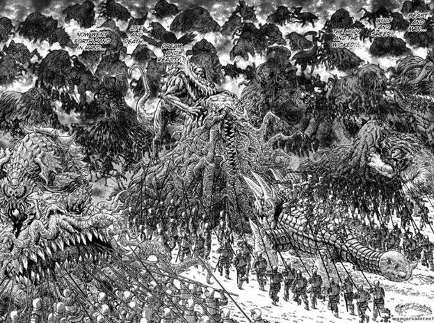

Images from the manga Berserk by Kentaro Miura
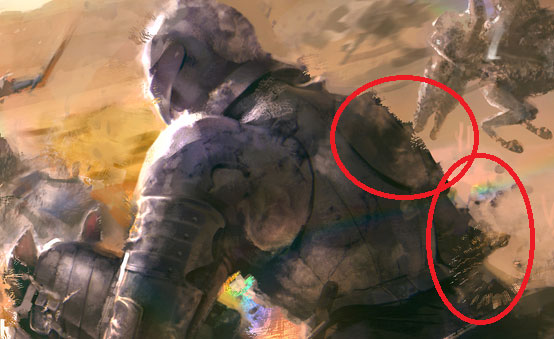
In one of the earlier passes of the illustration, I had the soldiers deteriorating a bit more from the effect of the blast, bits and pieces breaking off the armor and being knocked back.
I see a bit of that displacement still in there.
Yeah, they let me keep some!
It's almost Albrecht Durer–esque in its depictions, except instead of religious iconography of Death as a horseman of the apocalypse, it's monsters and evil beings of unknown nature.
Absolutely right on the Albrecht Durer and older depictions of religious iconography—and the sense of fear and awe that those things can still inspire in a viewer.
I knew something felt familiar.
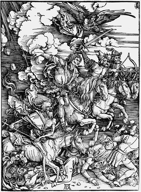
From holy blast to, well . . . holy blast. That . . . sits beneath the surface on this, and now, is impossible to ignore.
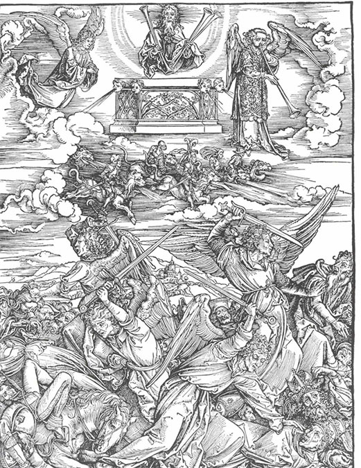
So . . . in your mind, what is this scene?
I guess, essentially, I was imagining that these warriors or knights were up against a threat they didn't really have any experience facing. An angel like this one was just not something they could really wrap their heads around before charging into battle.
So they come in racing with lances and swords and have no idea that they're about to be rent apart by "iridescent rainbow wind." Ha!
And horses? You chose to add one of the hardest creatures to paint?
I also looked at images of horse jockeys wearing GoPro cameras. That helped tremendously with putting the viewer into the scene.
Wow. That's pretty brilliant.
Whatever it takes, man!
Did your sketches start out this way with the angel above the soldiers? I figure if you played with perspective . . .
Yes, in this case, since the description was so strong ahead of time, the initial sketch was scrawled on a napkin basically. Often, it'll take a lot of iterations and pushing and pulling things.
Okay, so, technically, it's on old shoebox tissue paper, but here is the initial thumbnail:
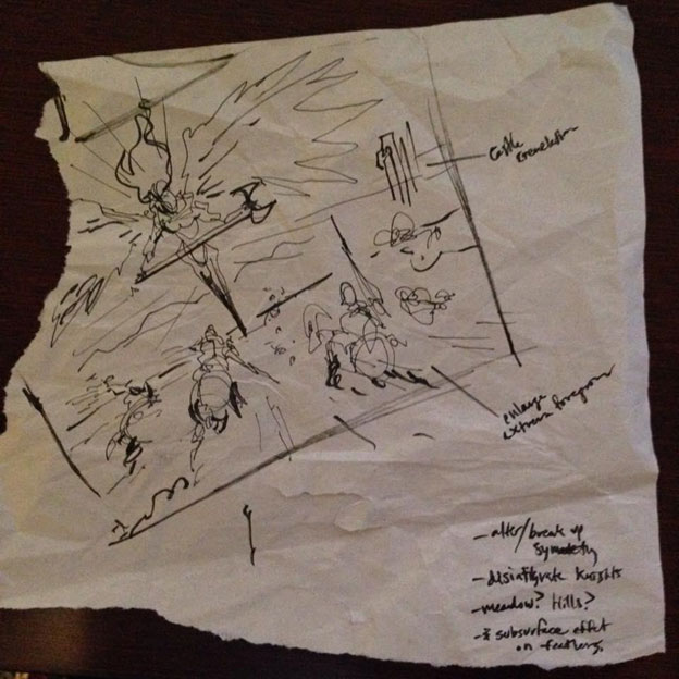
There is something magical about seeing an artist work digitally and begin in pencils, a napkin, or the like.
I am starting to do it a lot more—there are things I find that one thinks of with a real pen to paper that may not come to fruition starting strictly with digital.
How so?
It’s difficult to explain, I guess—not knocking a digital start at all, but for me personally, I suppose I started that way as an artist, so there's something very familiar to it. It goes back to the ideation days of doodling in class during school or something.
The best ideas always came when I was supposed to be listening to a lecture on calculus or chemistry. So every now and then using a pencil, I still do.
It’s easier to be freeform and disregard a bad idea—flipping the paper over is easy.
Right! I had a professor always say never to trust the digital world.
Then the question must be posed, do you keep some of your original sketches?
I do keep some of the sketches, but they are crude! They’re hardly more than scribbles, just enough to help me see it. Once I see it, I take it into Photoshop immediately and revise it. Here's also an early digital sketch:
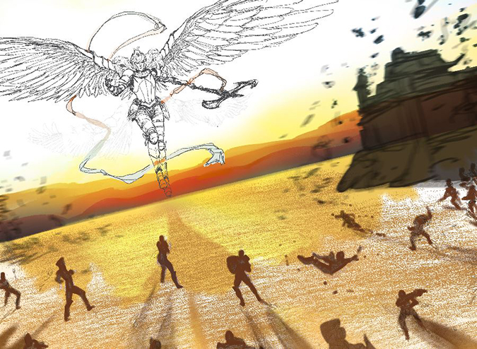
You know there are these collectors . . .
Haha, I know; I'll be bringing them to conventions!
What were some of the last things you went in to polish?
A lot of the values for the soldiers and their respective silhouettes. I wanted each one to work together as part of the entire composition, while also having their own individual stories. I really made sure they were as defined as they could be without breaking that harmony. It was really important to me that they maintained a hierarchy and that one didn’t stand out where one wasn’t supposed to.
So no leaders!?
Yeah, I'd say the foreground character could definitely be a "hero," but no specific leader. I felt that would add order to these figures who were being literally "scattered to the winds" in defeat.
That feels and is intentional—got it. As the soldiers all seem similar, it makes the angel stand out even more, especially in armor. Like her helmet! What is the angel's helmet based on?
Ah! Good question.
It was sort of a collage from multiple references. I wanted to veer away from the tendency to be generic with medieval fantasy, so I cherry-picked from various statues and cosplayer references.
I was looking for ways to inject symbolism as well.
How so?
The angel in this image more or less represents the sun from where she's hovering. The pointed rays crest around her brow. Also keeping them sharp and pointy to let those horsemen know she means business, in case the death by angel wind blast wasn't enough for them.
No bare-chested weirdness here, only warriors
Ha!
Can I safely assume there will be prints available soon on inprnt.com?
Absolutely! I really wanted to bring some to Grand Prix Las Vegas, but at that time, it hadn't been spoiled yet.
Struggle. Such is life. Do you know what your schedule is shaping up to be?
Things will be a bit busy, but I would like to try to make it to another convention soon. Anything close to home (San Francisco) would certainly be easier right now, but I'm looking into it and will have event updates on my website soon!
Wonderful. I'll be sure to let some tournament organizers know that you'd be interested in coming to more events close to home!
That would be rad! Thank you!
Many thanks, Ryan, and great job on the angel!
Sweet. Thanks again! Cheers!
I hope you enjoyed the little chat.
Want to read more snapshots into artworks like this? Let me know in the comments!
-Mike


