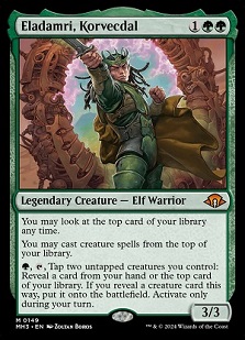
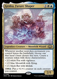
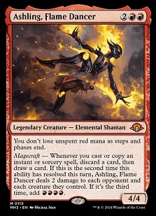
I'm fascinated by the concept of "slush art." In our industry, commissioned artworks that aren't ultimately used have become increasingly rare due to tight budgets. But what happens to those truly exceptional pieces that are created but never find their intended use, locked away by non-disclosure agreements? Shouldn't we find a way to preserve and showcase them instead?
Hundreds of new artworks are commissioned annually, yet very little "slush" accumulates each year. Even so, there exists a thoughtful process for utilizing these occasional unused artworks, often repurposing them in expansions like Horizons and other supplemental sets.
In 2024, the era of open-ended art descriptions has largely passed. Nowadays, directives are hyper-specific, sometimes overly so, which can stifle artistic interpretation. As players, we scrutinize artwork closely, questioning its origin and potential adaptations. Was this piece originally intended for a different set, or was it freshly created? Artists occasionally hint at these origins on social media, though there's often a desire to maintain the mystique of artistic creation.
As someone deeply invested in Magic's art, these musings lead me to contemplate each new release like a curated art exhibition. It is a quest to uncover which artworks are repurposed from earlier projects and which represent recent creative breakthroughs. This journey of discovery, akin to identifying the origins of each piece, adds a layer of excitement and intrigue to the Magic community.
At its core, the artistic essence lies in the concept of "slush." These sets allow us to revisit and appreciate the past, offering glimpses into creative decisions and adaptations that enrich the game's visual narrative.

Marketing art by Hugh Pindur (Pindurski)
After seeing Emily Teng in a short video on the art of the set, I was able to ask a few questions on art and Wizards was kind enough to get me a few selected questions back from Emily and Michael.
ET = Emily Teng, Senior Game Designer
MM = Michael Majors, Senor Game Designer
As always, we like to hear - who is Emily, what does she do, and what did she do exactly for Modern Horizons 3?
ET: I'm a senior worldbuilding game designer, which means I do worldbuilding and narrative game design for Magic. I was the creative lead on Modern Horizons 3.
Sorin - you showed him as a teenager. Why?
ET: The idea behind the flipwalkers was to show them living their pre-sparked life on the front side and then immediately after sparking on the back side. For Sorin, we wanted to show a drastic contrast between his pre- and post-sparked selves. So whereas on the back he's feral and consumed by his new vampiric hunger, on the front he's a bored, petulant young lord.

Sorin, of House Markov by Matt Stewart
Why the heavy focus on legendaries?
MM: Modern Horizons is an opportunity to show off legendary creatures and story characters in a manner that we can't necessarily do in our frontlist product, because their story is either over canonically or they simply don't have a place on the plane or setting. Not to mention, Commander is our most popular format and giving players more opportunities to express themselves with exciting Commander build-arounds is always an exciting proposition, especially when we have access to so many types of mechanics and themes.
What was YOUR favorite Easter egg in the set? Or favorite call back from the team?
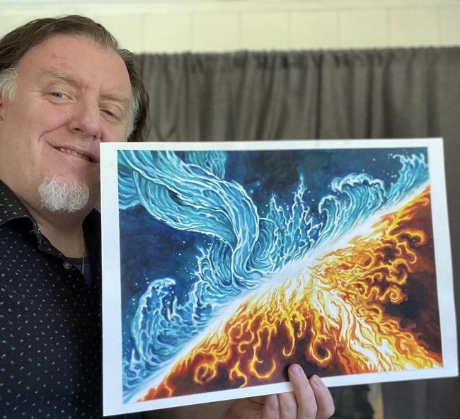
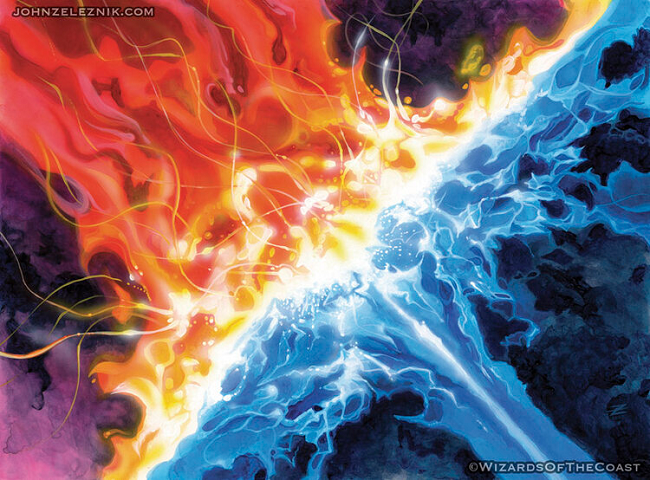
ET: I find Powerbalance really cute as a callback to Counterbalance. The fact that the art is just a flipped version of Counterbalance just makes it extra satisfying.
 |
 |
How do you choose what legendaries to bring back and whether they get a new printing. Examples, Eldamri Korvecdal new card, Kaalia old card, Breya old card. What does that conversation look like?
MM: Some of these are nostalgic call backs for players who have been around the game for a long time (Eladamri), some of them are opportunities to show off story characters that we haven't made before (Genku). Sometimes we just have a cool idea for a mechanical execution and we want to find a way to "skin" it properly. Ashling felt like a fun way to give character to a mechanical identity, a build-up of iconic Elemental mechanics, as well as give a new card to a beloved character that hasn't received on in a long time.
How do you choose to make a strong card to be plane specific or not? Harbinger of the Seas for example - could be a ravnica merfolk or not. Roil Cartographer though, very much is placed.
ET: Typically, the card's mechanics helped guide us toward making cards plane-specific or not.
To use Roil Cartographer as an example, it has Landfall and cares about Energy. For Modern Horizons 3 we wanted to explore what Energy could be outside of Kaladesh, so I leaned into Landfall to set it on Zendikar and interpreted Energy as the power of the Roil. Meanwhile, Harbinger of the Seas doesn't have mechanics that point toward any plane in particular, so I kept it non-specific to give the artist more freedom in the merfolk's design. How strong a card is doesn't factor much into deciding what plane each card is set on, though I'll do a pass to make sure we don't accidentally have, say, all the rares and mythics set on a single plane or anything like that.
For unnamed locations on art descriptions places, do you have any actual places you had in mind, like perhaps a planechase plane things are from?
ET: Nope! If an art description leaves someplace unnamed, that's us giving the artist freedom to draw the location as they like.
A Touch on Greatness
In the ever-evolving, and ever more being created landscape of card design, Modern Horizons 3 stands as a testament to artistic innovation and narrative depth. Within these cards lie tales of heroism, arcane mysteries, and fantastical realms brought to life by the best artists in the industry. Each stroke of the brush or pixel reveals a world waiting to be explored, a narrative waiting to unfold. As the set is a compilation of many times, eras and locations, it is a variety of journeys you make embark on as the artist sets you forth.
Today, we celebrate five exceptional artworks that transcend mere illustrations, capturing moments of drama, wonder, and sheer artistic prowess. These pieces not only enrich the gameplay experience but they also stand as exemplars of contemporary fantasy illustrated art. From intricate details that invite closer inspection to compositions that ignite the imagination, each artwork in this selection embodies the essence of what makes Magic: The Gathering a visual and narrative masterpiece.
Join me as I delve into this short curated collection, where every artwork tells a story and every card becomes a portal to boundless creativity. Prepare to be mesmerized, enchanted, and inspired by the magic woven into the fabric of these five extraordinary artworks from Modern Horizons.
I have to check my eyes
We have seen homages and tributes to the Hudson River School before.
And I appreciate every time we do.
Exceptional work.

Mount Corcoran by Albert Bierstadt, 1876-1877
Now that is a command of value. Donny agreed as well.
Of the seven elements of art, Chris Rahn has shown himself to be a master at value. The other six are color, form, line, shape, space and texture.
Being able to command the tonal value, the luminosity so it doens't become muddy, midtone forward or hard to decipher is shockingly difficult. Here, Chris even used a limited palette to create the work. You get reds - ok show us a volcano, dragon, trees, mountains and also be able to show details. They all read, at card size. Impressive.
He is "good" because he paints good on a technical level. Adding in that you get great cards, and have a history of great creations, you embody that moniker of being a living great artist.
But why he's good?
To be the smart one at FNM, he has a hugh level of control when making decisions when it comes to value, luminosity and tones all in oil paint.

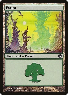
Forest by Lars Grant-West
Oil on board
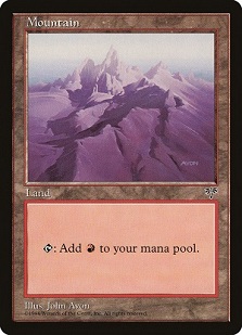
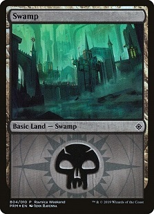
Lars takes the assignment of trees in a forest and forged a new path that was driven by John Avon back in 1996. You don't have to make forest green, or swamps black. Frankly, I've seen a lifetime enough of purple on swamp illustrations and love the push for more variety in color palettes. We have Secret Lair and Universes Beyond for wacky basic lands, I just want seasonal, appropriately looking for the setting, lands.
It made sense for Mirrodin to have a green moon to influence yellow.
On Mirage - John Avon just simply wanted to paint it purple, so he did.
And for the stellar Ravnica Weekend and guild kit lands, I love the allied colors getting the focus in the art. Comically though, that's an orzhov land, despite being green.
Lars found an angle through the impenetrable task of creating a scene that feels fresh by going small. What if this orange plant was the focus, and the big trees are the basic land? That little orange leafed tree gives autumn vibes, a more interesting narrative than just giant tree trunks. And since it is Lars, you know he went one-hundred percent overboard for details being exacting.
An honorable mention
Yes, it is the easily found callback to Gift of Orzhova, the first foil card that stood out because of its foiling despite the card being largely unplayable in competitive circles.
Craig here executes on the callback, but that part doesn't really excite me.
Her hair sure does though.
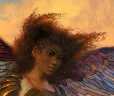
We have seen endless white, blonde women angels, adorned in armor to modest robes. Never seen enough are angels with curls, natural afros, anything poufy, crimped, corkscrews or heaven forbid, interlaced or woven hair.
I loved Separatist Voidmage back in Origins in my art review and this little depiction in a greater work is notable.
-Mike


